> ## Documentation Index
> Fetch the complete documentation index at: https://domoinc-openapi-sync-dataflows.mintlify.site/llms.txt
> Use this file to discover all available pages before exploring further.

# Properties for Bar Charts

### Intro

This topic provides information about chart properties available for bar and bar-type charts, such as those for configuring bar width and height, regression lines, and last value projections.

***

### General Properties

The properties in the following table are found in the **General** category in Chart Properties.

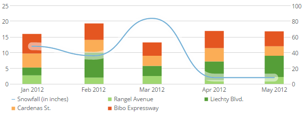
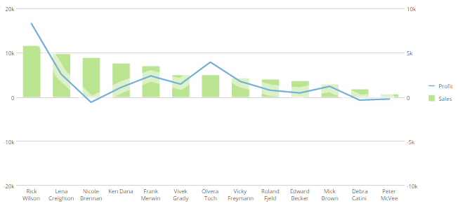
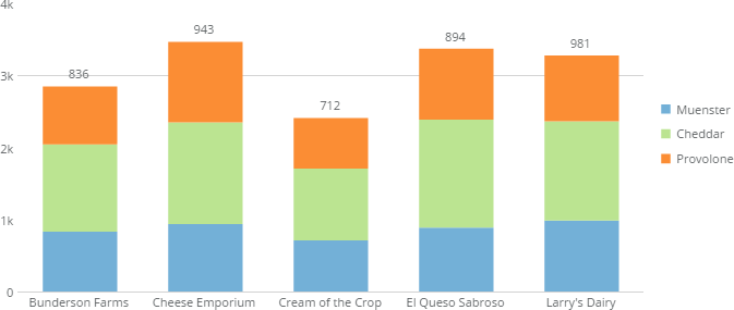
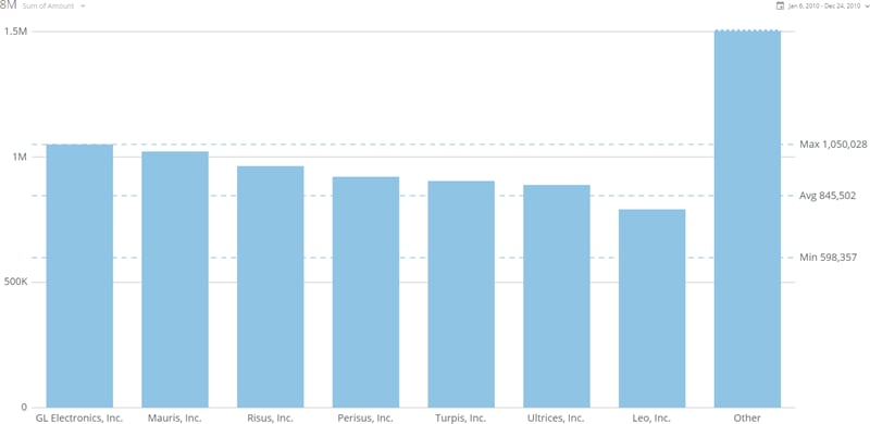
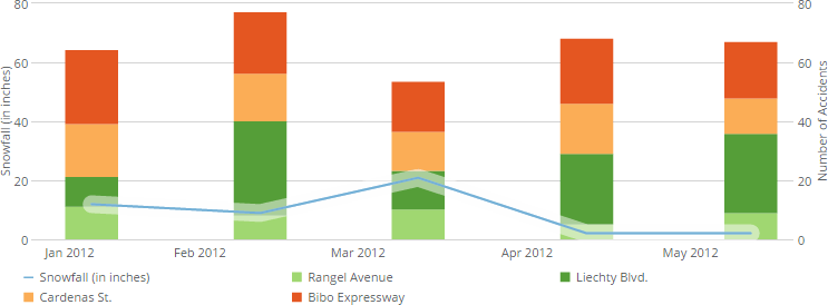
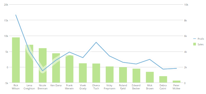
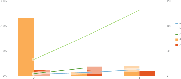
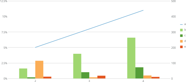
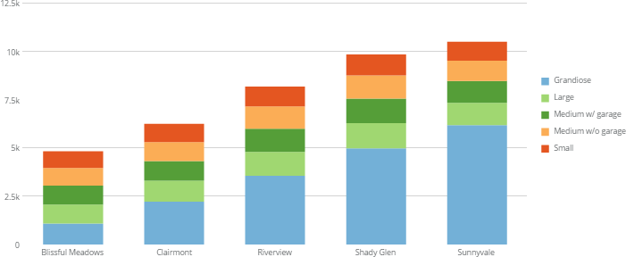
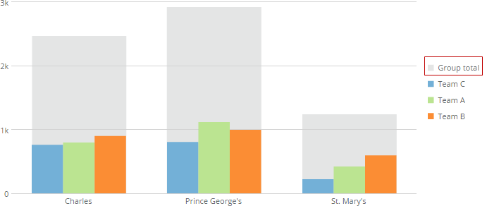
<table data-aura-rendered-by="33:209;a"><thead><tr><th colspan="1" rowspan="1"><p> Option </p></th><th colspan="1" rowspan="1"><p> Description </p></th><th colspan="1" rowspan="1"><p> Examples </p></th></tr></thead><tbody><tr><td colspan="1" rowspan="1"> Sort Each Category </td><td colspan="1" rowspan="1"><p> Allows you to sort the items in each individual category in most kinds of multi-series Bar and Lollipop charts. You can choose an ascending or descending sort. If you select <b> Default </b>, the default sort is applied. This option does not work when the <b> Value Scale > Log Scale </b> box is checked. </p><p> In the example at right, bars within all categories are sorted in descending order. </p></td><td colspan="1" rowspan="1"><a target="_blank" title="/@api/deki/files/4171/sort_each_category.png"><img alt="" src="https://mintcdn.com/domoinc-openapi-sync-dataflows/U1MglXZKeJZebGlP/images/kb/ka05w00000123km-00N5w00000Ri7BU-0EM5w000005vOzS.png?fit=max&auto=format&n=U1MglXZKeJZebGlP&q=85&s=489eb9cfc6359f2c782eb6b53955eca5" width="600" height="206" data-path="images/kb/ka05w00000123km-00N5w00000Ri7BU-0EM5w000005vOzS.png" /></a></td></tr><tr><td colspan="1" rowspan="1"> Sort on Totals </td><td colspan="1" rowspan="1"><p> Allows you to sort categories in many kinds of Bar and Lollipop charts by their total values, in either ascending or descending order. If you select <b> Default </b>, the default sort is applied. This option does not work when the chart has automatic time scaling applied. (You can turn off automatic time scaling by checking the box for <b> Category Scale > Never Use Time Scale </b>. </p><p> In the example at right, the categories are sorted by their totals in ascending order. </p></td><td colspan="1" rowspan="1"><a target="_blank" title="/@api/deki/files/4170/sort_on_totals.png"><img alt="" src="https://mintlify.s3.us-west-1.amazonaws.com/domoinc-openapi-sync-dataflows/images/kb/ka05w00000123km-00N5w00000Ri7BU-0EM5w000005vOzh.png" /></a></td></tr><tr><td colspan="1" rowspan="1"><p> Maximum Bars </p></td><td colspan="1" rowspan="1"><p> Allows you to specify the number of bars that appear in your Bar chart. Data for all remaining bars is lumped into a single "Other" bar (unless you hide this bar using the <b> Hide 'Other' Bar </b> toggle. </p><p> The example at right shows a Bar chart in which the maximum number of bars has been set to 7. </p></td><td colspan="1" rowspan="1"><p><a target="_blank" title="/@api/deki/files/5982/maximum_bars.png"><img alt="maximum_bars.png" src="https://mintcdn.com/domoinc-openapi-sync-dataflows/KRKoASQJgRuO8wHw/images/kb/ka05w00000123mx-00N5w00000Ri7BU-0EM5w000005vP6O.png?fit=max&auto=format&n=KRKoASQJgRuO8wHw&q=85&s=c1d6d535d46241a6332166bb7a285007" width="800" height="390" data-path="images/kb/ka05w00000123mx-00N5w00000Ri7BU-0EM5w000005vP6O.png" /></a></p></td></tr><tr><td colspan="1" rowspan="1"><p> Hide 'Other' Bars </p></td><td colspan="1" rowspan="1"><p> Hides or shows the "Other" bar that appears when you set a maximum number of bars using the <b> Maximum Bars </b> option. </p></td><td class="mt-align-center" colspan="1" rowspan="1"><p> — </p></td></tr><tr><td colspan="1" rowspan="1"><p> Series on Left Scale </p></td><td colspan="1" rowspan="1"><p> Refers to the number of lines and bars in Grouped Bar with Line, Stacked Bar with Line, and Grouped and Stacked Bar with Line graphs. By default, the first series that appears in your legend for these chart types becomes a line, and all remaining series become bars. However, you can convert series from bars to lines by entering the desired number of lines in <b> Chart Properties </b>. For example, if your chart had three series, the first series appearing in your legend would appear as a line, and the remaining two series would appear as bars. You could turn the second series into a line by entering <code> 2 </code> in the <b> Series on Left Scale </b> field. For more information about Grouped Bar with Line, Stacked Bar with Line, and Grouped and Stacked Bar with Line graphs, see <a href="/s/article/360042924594" target="_self" title="Grouped Bar with Line Graph"> Grouped and Stacked Bar with Line Chart </a>, respectively. </p></td><td colspan="1" rowspan="1"><p class="mt-align-center"> — </p></td></tr><tr><td colspan="1" rowspan="1"><p> Line Style </p></td><td colspan="1" rowspan="1"><p> Lets you change the line style in Grouped Bar with Line, Stacked Bar with Line, and Grouped and Stacked Bar with Line graphs. By default, lines in these chart types appear angular. If you want, you can change the line style to be curved. The example shows a Stacked Bar with Line chart in which the <b> Curved </b> line style has been set. </p></td><td colspan="1" rowspan="1"><p><a target="_blank" title="/@api/deki/files/737/line_bar_with_curved_line.png"><img alt="" src="https://mintcdn.com/domoinc-openapi-sync-dataflows/U1MglXZKeJZebGlP/images/kb/ka05w00000123lK-00N5w00000Ri7BU-0EM5w000005vP16.png?fit=max&auto=format&n=U1MglXZKeJZebGlP&q=85&s=30f2ed82d40efd37cb99998d20256274" width="613" height="229" data-path="images/kb/ka05w00000123lK-00N5w00000Ri7BU-0EM5w000005vP16.png" /></a></p></td></tr><tr><td colspan="1" rowspan="1"><p> Number of Symbol Series </p></td><td colspan="1" rowspan="1"><p> Refers to the number of series in Grouped Bar with Symbol and Stacked Bar with Symbol graphs in which symbols appear in place of lines. By default, the first series that appears in your legend is made up of symbols, and all remaining series become bars. However, you can convert series from bars to symbols by entering the desired number of symbols series in <b> Chart Properties </b>. For example, if your chart had three series, the first series appearing in your legend would appear as symbols, and the remaining two series would appear as bars. You could turn the second series into symbols by entering <code> 2 </code> in the <b> Number of Symbol Series </b> field. For more information about Grouped Bar with Line and Stacked Bar with Line graphs, see <a href="/s/article/360043428053" target="_blank" title="Grouped Bar with Line Graph"> Stacked Bar with Line Graph </a>, respectively. </p></td><td colspan="1" rowspan="1"><p> — </p></td></tr><tr><td colspan="1" rowspan="1"><p> Sync Value Scales </p></td><td colspan="1" rowspan="1"><p> Determines whether value scales in dual-scale graphs (such as Grouped Bar with Line and Stacked Bar with Line graphs) are synced. For more information, see <a href="/s/article/360043429773" target="_self" title="Syncing Value Scales in a Dual-Scale Graph"> Syncing Value Scales in a Dual-Scale Chart </a>. The example shows a chart with synced value scales. </p></td><td colspan="1" rowspan="1"><p><a target="_blank" title="/@api/deki/files/1316/synced_scales.png"><img alt="" src="https://mintcdn.com/domoinc-openapi-sync-dataflows/U1MglXZKeJZebGlP/images/kb/ka05w00000123lK-00N5w00000Ri7BU-0EM5w000005vP12.png?fit=max&auto=format&n=U1MglXZKeJZebGlP&q=85&s=765fb77b6834a6d2ce31bbd37a55d4f7" width="743" height="274" data-path="images/kb/ka05w00000123lK-00N5w00000Ri7BU-0EM5w000005vP12.png" /></a></p></td></tr><tr><td colspan="1" rowspan="1"><p> Hide Second Scale </p></td><td colspan="1" rowspan="1"><p> Hides the second value scale in dual-scale graphs (such as Grouped Bar with Line and Stacked Bar with Line graphs) in which you have synced the scales using the <b> Sync Value Scales </b> option. For more information, see <a href="/s/article/360043429773" target="_self" title="Syncing Value Scales in a Dual-Scale Graph"> Syncing Value Scales in a Dual-Scale Chart </a>. </p></td><td colspan="1" rowspan="1"><p> — <br /></p></td></tr><tr><td colspan="1" rowspan="1"><p> Sync Zero Lines </p></td><td colspan="1" rowspan="1"><p> Syncs the zero lines in dual-scale graphs with negative values so the "0" values match. </p><p> The first example at right shows a dual-scale graph with scales that do not match. The right-side graph is being used to measure sales, which are always going to be positive; hence the scale starts at 0. However, the left-side scale is being used to measure profit, which may dip below 0. In this case, the scale starts at -2000. Because the scales do not match, the graph is difficult to interpret. </p><p> The second example shows the same graph with the zero lines synced. Even though the other values do not match, the viewer can easily use the zero line as a reference point to interpret the line and bars simultaneously. </p></td><td colspan="1" rowspan="1"><p><a target="_blank" title="/@api/deki/files/1317/zero_line_unsynced.png"><img alt="" src="https://mintcdn.com/domoinc-openapi-sync-dataflows/U1MglXZKeJZebGlP/images/kb/ka05w00000123lK-00N5w00000Ri7BU-0EM5w000005vP14.png?fit=max&auto=format&n=U1MglXZKeJZebGlP&q=85&s=21b8bfd059c580f3e815b7c2d9242a45" width="659" height="303" data-path="images/kb/ka05w00000123lK-00N5w00000Ri7BU-0EM5w000005vP14.png" /></a></p><p><img alt="" src="https://mintcdn.com/domoinc-openapi-sync-dataflows/U1MglXZKeJZebGlP/images/kb/ka05w00000123lK-00N5w00000Ri7BU-0EM5w000005vP0d.png?fit=max&auto=format&n=U1MglXZKeJZebGlP&q=85&s=50d1285ac6a5ba764257ceee8d02a6f0" width="652" height="297" data-path="images/kb/ka05w00000123lK-00N5w00000Ri7BU-0EM5w000005vP0d.png" /></p></td></tr><tr><td colspan="1" rowspan="1"><p> Number of Running Total Lines </p></td><td colspan="1" rowspan="1"><p> Lets you specify the number of lines in line-bar combination charts that are running total lines. Lines that become running total lines are determined by your chart series order as it appears in your legend. For example, if you indicated that you wanted two running total lines, the lines corresponding to the first two line series in your legend would become running total lines. </p><p> In the example, the blue and light green lines are running total lines; the dark green line is not. </p></td><td colspan="1" rowspan="1"><p><a target="_blank" title="/@api/deki/files/1319/number_of_running_totals_lines.png"><img alt="" src="https://mintcdn.com/domoinc-openapi-sync-dataflows/U1MglXZKeJZebGlP/images/kb/ka05w00000123lK-00N5w00000Ri7BU-0EM5w000005vP0v.png?fit=max&auto=format&n=U1MglXZKeJZebGlP&q=85&s=0ff0a662dec7b112d8f4ec7cc487a710" width="627" height="276" data-path="images/kb/ka05w00000123lK-00N5w00000Ri7BU-0EM5w000005vP0v.png" /></a></p></td></tr><tr><td colspan="1" rowspan="1"><p> Number of Running Total Bars </p></td><td colspan="1" rowspan="1"><p> Lets you specify the number of bars in line-bar combination charts that are running total bars. Bars that become running total bars are determined by your chart series order as it appears in your legend. For example, if you indicated that you wanted two running total bars, the bars corresponding to the first two bar series in your legend would become running total bars. </p><p> In the example, the light and dark green bars are running total bars; the other bars are not. </p></td><td colspan="1" rowspan="1"><p><a target="_blank" title="/@api/deki/files/1320/number_of_running_totals_bars.png"><img alt="" src="https://mintcdn.com/domoinc-openapi-sync-dataflows/U1MglXZKeJZebGlP/images/kb/ka05w00000123lK-00N5w00000Ri7BU-0EM5w000005vP15.png?fit=max&auto=format&n=U1MglXZKeJZebGlP&q=85&s=357f50b87afd800dad401411ee831dc3" width="626" height="276" data-path="images/kb/ka05w00000123lK-00N5w00000Ri7BU-0EM5w000005vP15.png" /></a></p></td></tr><tr><td colspan="1" rowspan="1"><p> Number of Running Total Series </p></td><td colspan="1" rowspan="1"><p> Lets you choose the number of aggregated series in most Running Total charts. Series that remain aggregated are determined by your chart series order as it appears in your legend. For example, if you had a Running Total Grouped Bar chart and you indicated that you wanted two running total series, the bars corresponding to the first two bar series in your legend would remain aggregated, and all other bars would show their literal values. </p><p> In the example, only one series has been selected as a running total series. This is the blue series at the bottom of each stack. All other series are shown with their literal values. </p></td><td colspan="1" rowspan="1"><p><a target="_blank" title="/@api/deki/files/1321/running_total_one_series.png"><img alt="" src="https://mintcdn.com/domoinc-openapi-sync-dataflows/D4XP-ZUu0hZKYNDT/images/kb/ka05w00000123mL-00N5w00000Ri7BU-0EM5w000005vP4P.png?fit=max&auto=format&n=D4XP-ZUu0hZKYNDT&q=85&s=4c18a02c91bccae386c3427a0bd0d04a" width="701" height="288" data-path="images/kb/ka05w00000123mL-00N5w00000Ri7BU-0EM5w000005vP4P.png" /></a></p></td></tr><tr><td colspan="1" rowspan="1"><p> Hide Group in Legend </p></td><td colspan="1" rowspan="1"><p> Hides the legend text for the "group bars" in Nested Bar graphs (the vertical or horizontal gray bars that show the total for each category). </p></td><td colspan="1" rowspan="1"><p> — </p></td></tr><tr><td colspan="1" rowspan="1"><p> Group Legend Text </p></td><td colspan="1" rowspan="1"><p> Lets you specify the legend text for the "group bars" in Nested Bar graphs (the vertical or horizontal gray bars that show the totals for each category). In the example, the default group bar legend text has been replaced with the words "Group Total." </p></td><td colspan="1" rowspan="1"><p><a target="_blank" title="/@api/deki/files/1323/vertical_nested_group_legend.png"><img alt="" src="https://mintcdn.com/domoinc-openapi-sync-dataflows/KRKoASQJgRuO8wHw/images/kb/ka05w00000123mx-00N5w00000Ri7BU-0EM5w000005vP6P.png?fit=max&auto=format&n=KRKoASQJgRuO8wHw&q=85&s=5e802c63d9c47069238ffcb66e8abf64" width="691" height="292" data-path="images/kb/ka05w00000123mx-00N5w00000Ri7BU-0EM5w000005vP6P.png" /></a></p></td></tr></tbody></table>
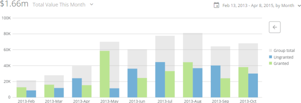
### Bar Settings Properties

The properties in the following table are found in the **Bar Settings** category in Chart Properties.

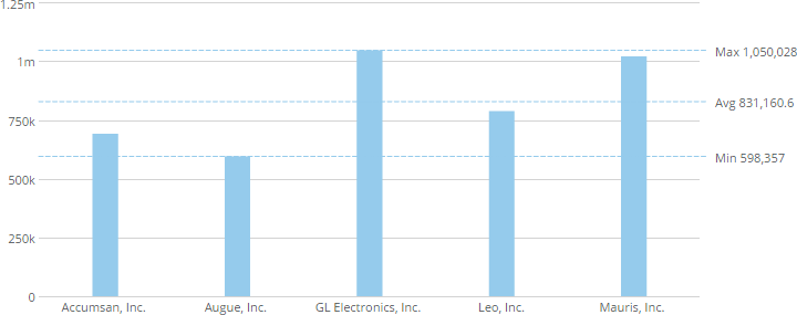
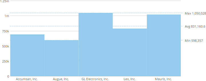
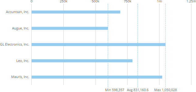
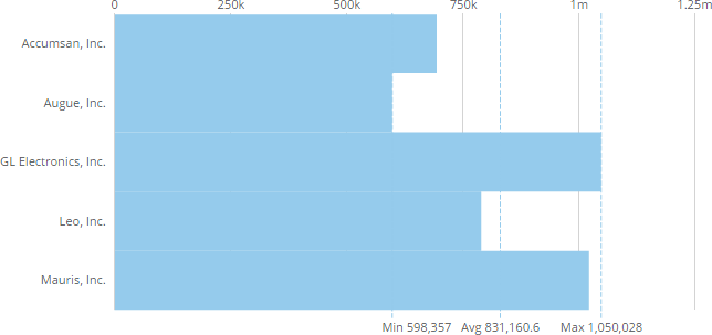
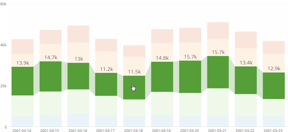
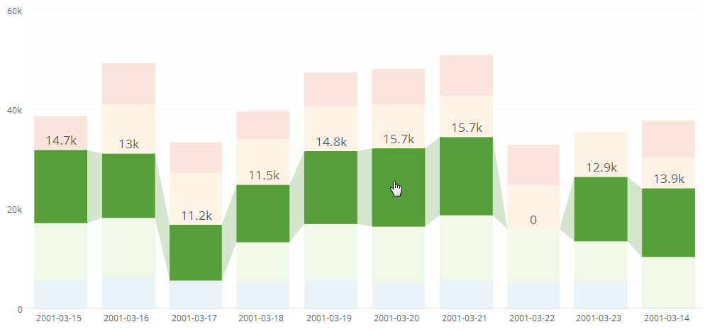
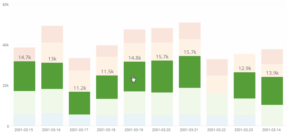
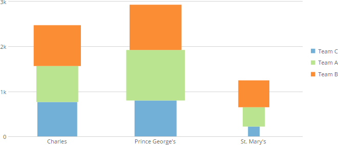
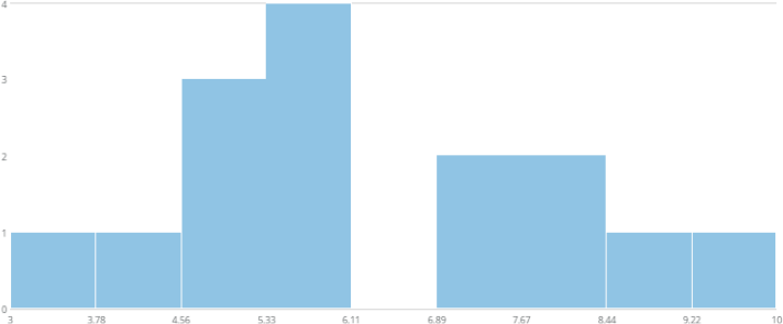
<table class="mt-responsive-table" data-aura-rendered-by="33:209;a"><thead><tr><th class="mt-column-width-15" colspan="1" rowspan="1"><p> Option </p></th><th class="mt-column-width-35" colspan="1" rowspan="1"><p> Description </p></th><th class="mt-column-width-20" colspan="1" rowspan="1"><p> Examples </p></th></tr></thead><tbody><tr><td class="mt-column-width-15" colspan="1" rowspan="1"><p> Width Percentage </p></td><td class="mt-column-width-35" colspan="1" rowspan="1"><p> Determines the percentage of space taken up by each bar in a vertical bar chart. For more information, see <a href="/s/article/360042925294" target="_self" title="Specifying the Size of Bars in Bar Graphs"> Specifying the Size of Bars in Bar Charts </a>. The first example shows a Vertical Bar graph with a <b> Width Percentage </b> of <code> 20 </code>. The second example shows the same graph with a <b> Width Percentage </b> of <code> 100 </code>. </p></td><td class="mt-column-width-20" colspan="1" rowspan="1"><p><a target="_blank" title="/@api/deki/files/5/20_percent_width.png"><img alt="" src="https://mintcdn.com/domoinc-openapi-sync-dataflows/DfXQTn5UA-Ig8rT5/images/kb/ka05w000001242w-00N5w00000Ri7BU-0EM5w000005vZ7e.png?fit=max&auto=format&n=DfXQTn5UA-Ig8rT5&q=85&s=c03252db8e9c4c733c1db1fcaecafa15" width="720" height="285" data-path="images/kb/ka05w000001242w-00N5w00000Ri7BU-0EM5w000005vZ7e.png" /></a></p><p><a target="_blank" title="/@api/deki/files/8/100_percent_width.png"><img alt="" src="https://mintcdn.com/domoinc-openapi-sync-dataflows/DfXQTn5UA-Ig8rT5/images/kb/ka05w000001242w-00N5w00000Ri7BU-0EM5w000005vZ7f.png?fit=max&auto=format&n=DfXQTn5UA-Ig8rT5&q=85&s=1522bc196cbddd2295eb93632bf2515a" width="720" height="285" data-path="images/kb/ka05w000001242w-00N5w00000Ri7BU-0EM5w000005vZ7f.png" /></a></p></td></tr><tr><td class="mt-column-width-15" colspan="1" rowspan="1"><p> Height Percentage </p></td><td class="mt-column-width-35" colspan="1" rowspan="1"><p> Determines the percentage of space taken up by each bar in a horizontal bar chart. For more information, see <a href="/s/article/360042925294" target="_self" title="Specifying the Size of Bars in Bar Graphs"> Specifying the Size of Bars in Bar Charts </a>. The first example shows a Horizontal Bar graph with a <b> Height Percentage </b> of <code> 20 </code>. The second example shows the same graph with a <b> Height Percentage </b> of <code> 100 </code>. </p></td><td class="mt-column-width-20" colspan="1" rowspan="1"><p><a target="_blank" title="/@api/deki/files/98/20_percent_height.png"><img alt="" src="https://mintcdn.com/domoinc-openapi-sync-dataflows/8E3HpyZujsEhQGNi/images/kb/ka0Vq000000CVzJ-00N5w00000Ri7BU-0EM5w000005vP1A.png?fit=max&auto=format&n=8E3HpyZujsEhQGNi&q=85&s=44817d8b9ed5f158ef760178af1bdf80" width="644" height="303" data-path="images/kb/ka0Vq000000CVzJ-00N5w00000Ri7BU-0EM5w000005vP1A.png" /></a></p><p><a target="_blank" title="/@api/deki/files/7/100_percent_height.png"><img alt="" src="https://mintcdn.com/domoinc-openapi-sync-dataflows/8E3HpyZujsEhQGNi/images/kb/ka0Vq000000CVzJ-00N5w00000Ri7BU-0EM5w000005vP1E.png?fit=max&auto=format&n=8E3HpyZujsEhQGNi&q=85&s=dd84b38aaa6b3091aef6ce4a89220ffe" width="644" height="303" data-path="images/kb/ka0Vq000000CVzJ-00N5w00000Ri7BU-0EM5w000005vP1E.png" /></a></p></td></tr><tr><td class="mt-column-width-15" colspan="1" rowspan="1"><p> Fixed Bar Width </p></td><td class="mt-column-width-35" colspan="1" rowspan="1"><p> Determines a fixed width for all bars in a vertical bar graph, in pixels. If a <b> Width Percentage </b> value has been specified, this property supersedes that percentage. If the <b> Fixed Bar Width </b> exceeds the total space allocated to each bar, bars will overlap. For more information, see <a href="/s/article/360042925294" target="_self" title="Specifying the Size of Bars in Bar Graphs"> Specifying the Size of Bars in Bar Charts </a>. </p></td><td class="mt-column-width-20" colspan="1" rowspan="1"><p> — </p></td></tr><tr><td class="mt-column-width-15" colspan="1" rowspan="1"><p> Fixed Bar Height </p></td><td class="mt-column-width-35" colspan="1" rowspan="1"><p> Determines a fixed height for all bars in a horizontal bar graph, in pixels. If a <b> Height Percentage </b> value has been specified, this property supersedes that percentage. If the <b> Fixed Bar Height </b> exceeds the total space allocated to each bar, bars will overlap. For more information, see <a href="/s/article/360042925294" target="_self" title="Specifying the Size of Bars in Bar Graphs"> Specifying the Size of Bars in Bar Charts </a>. </p></td><td class="mt-column-width-20" colspan="1" rowspan="1"><p> — <br /></p></td></tr><tr><td class="mt-column-width-15" colspan="1" rowspan="1"><p> Non-Stacked Interactivity </p></td><td class="mt-column-width-35" colspan="1" rowspan="1"><p> Turns off the default Stacked Bar graph interactivity. When you hover over any series in a Stacked Bar, 100% Stacked Bar, or Running Total Stacked Bar graph, all of the corresponding series are highlighted and connected across the graph, as shown in the first screenshot at right. However, if series data is missing for any stack in the graph, the highlighting is removed and a "0" appears in the stack, as shown in the second screenshot. By checking <b> Non-Stacked Interactivity </b>, the connecting lines, highlighting, and "0" no longer appear upon hover, as shown in the third screenshot. For more information about DataSet columns, see <a href="/s/article/360043428713" target="_blank" title="Applying DataSet Columns to Your Chart"> Applying DataSet Columns to Your Chart </a>. </p></td><td class="mt-column-width-20" colspan="1" rowspan="1"><p><a target="_blank" title="/@api/deki/files/1333/stacked_interactivity1.png"><img alt="" src="https://mintcdn.com/domoinc-openapi-sync-dataflows/KRKoASQJgRuO8wHw/images/kb/ka05w00000123pf-00N5w00000Ri7BU-0EM5w000005vPIJ.png?fit=max&auto=format&n=KRKoASQJgRuO8wHw&q=85&s=a921a7a958574ea360e821c0cf7125a4" width="982" height="451" data-path="images/kb/ka05w00000123pf-00N5w00000Ri7BU-0EM5w000005vPIJ.png" /></a></p><p><a target="_blank" title="/@api/deki/files/1332/stacked_interactivity2.png"><img alt="" src="https://mintcdn.com/domoinc-openapi-sync-dataflows/KRKoASQJgRuO8wHw/images/kb/ka05w00000123pf-00N5w00000Ri7BU-0EM5w000005vPIL.png?fit=max&auto=format&n=KRKoASQJgRuO8wHw&q=85&s=1ed836bd80b0fd3fa5cb11ac9ff2aa0c" width="994" height="471" data-path="images/kb/ka05w00000123pf-00N5w00000Ri7BU-0EM5w000005vPIL.png" /></a></p><p><a target="_blank" title="/@api/deki/files/1331/stacked_interactivity3.png"><img alt="" src="https://mintcdn.com/domoinc-openapi-sync-dataflows/KRKoASQJgRuO8wHw/images/kb/ka05w00000123pf-00N5w00000Ri7BU-0EM5w000005vPIE.png?fit=max&auto=format&n=KRKoASQJgRuO8wHw&q=85&s=ca61a36068192fc953d8b28022840e6a" width="993" height="463" data-path="images/kb/ka05w00000123pf-00N5w00000Ri7BU-0EM5w000005vPIE.png" /></a></p></td></tr><tr><td class="mt-column-width-15" colspan="1" rowspan="1"><p> Set Bar Width/Height by Value </p></td><td class="mt-column-width-35" colspan="1" rowspan="1"><p> A vertical or horizontal Stacked Bar graph causes individual bars in a stack to be sized according to their value, which may make it easier to see differences between series. For example, in the screenshot at right, the viewer can quickly see that Team A sold the most widgets in Prince George's County, and Team C sold the least widgets in St. Mary's County. </p></td><td class="mt-column-width-20" colspan="1" rowspan="1"><p><a target="_blank" title="/@api/deki/files/119/bar_width_by_value.png"><img alt="" src="https://mintcdn.com/domoinc-openapi-sync-dataflows/KRKoASQJgRuO8wHw/images/kb/ka05w00000123ph-00N5w00000Ri7BU-0EM5w000005vPHu.png?fit=max&auto=format&n=KRKoASQJgRuO8wHw&q=85&s=995785f6a7bec5dc76086e971d68d15b" width="660" height="285" data-path="images/kb/ka05w00000123ph-00N5w00000Ri7BU-0EM5w000005vPHu.png" /></a></p></td></tr><tr><td class="mt-column-width-15" colspan="1" rowspan="1"><p> First Bar Series Count </p></td><td class="mt-column-width-35" colspan="1" rowspan="1"><p> Lets you specify how many series make up the first bar of any category in Grouped and Stacked Bar graphs. The default setting for this property is <code> 1 </code>, meaning the first bar is made up of only one series, and the second bar is divided up into all the remaining series. If you change this value, the first bar is divided into the indicated number of series, and the second bar is adjusted accordingly. For example, if a category contained three series, by default, the first bar would contain one series, and the second would contain the other two. However, if you entered <code> 2 </code> for <b> First Bar Series Count </b>, the first bar would be divided into two series, and the second bar would contain only one. </p></td><td class="mt-column-width-20" colspan="1" rowspan="1"><p> — </p></td></tr><tr><td class="mt-column-width-15" colspan="1" rowspan="1"><p> Symbol Color </p></td><td class="mt-column-width-35" colspan="1" rowspan="1"><p> Allows you to set the color for bins in Histograms. The default is blue. </p></td><td class="mt-column-width-20" colspan="1" rowspan="1"><p> — </p></td></tr><tr><td class="mt-column-width-15" colspan="1" rowspan="1"><p> Histogram Bins </p></td><td class="mt-column-width-35" colspan="1" rowspan="1"><p> Lets you change the number of bins that appear in a Histogram. An optimal number of bins is determined automatically by Domo, but you can choose any number between 3 and 20. Changing the number of bins may create "gaps" for ranges with no data. The example at right shows one such gap in the 4.9-5.0 data range. This indicates that there were no items in the DataSet with a value between 4.9 and 5.0. </p></td><td class="mt-column-width-20" colspan="1" rowspan="1"><p><a id="grid_lines_properties" target="_blank" title="/@api/deki/files/589/histogram_gap.png"><img alt="" src="https://mintcdn.com/domoinc-openapi-sync-dataflows/KRKoASQJgRuO8wHw/images/kb/ka05w00000123nf-00N5w00000Ri7BU-0EM5w000005vP97.png?fit=max&auto=format&n=KRKoASQJgRuO8wHw&q=85&s=203028f78b33da7d95f7260c5a0474c4" width="712" height="295" data-path="images/kb/ka05w00000123nf-00N5w00000Ri7BU-0EM5w000005vP97.png" /></a></p></td></tr></tbody></table>

### Grid Line Properties

The properties in the following table are found in the **Grid Lines** category in Chart Properties.

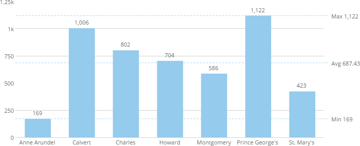
<table class="mt-responsive-table" data-aura-rendered-by="33:209;a"><thead><tr><th class="mt-column-width-15" colspan="1" rowspan="1"><p> Option </p></th><th class="mt-column-width-35" colspan="1" rowspan="1"><p> Description </p></th><th class="mt-column-width-20" colspan="1" rowspan="1"><p> Examples </p></th></tr></thead><tbody><tr><td class="mt-column-width-15" colspan="1" rowspan="1"><p> Remove Min/Max/Avg Lines </p></td><td class="mt-column-width-35" colspan="1" rowspan="1"><p> Removes the minimum, maximum, and average lines that normally display on mouse-over in many kinds of Bar and Line graphs. </p></td><td class="mt-column-width-20" colspan="1" rowspan="1"><p> — </p></td></tr><tr><td class="mt-column-width-15" colspan="1" rowspan="1"><p> Calculated Line </p></td><td class="mt-column-width-35" colspan="1" rowspan="1"><p> Determines whether a median or average line appears in your Bar chart. If you select <b> None </b>, no line appears. </p></td><td class="mt-column-width-20" colspan="1" rowspan="1"><p> — <a id="data_label_settings" target="_blank" /></p></td></tr></tbody></table>

### Data Label Settings Properties

The properties in the following table are found in the **Data Label Settings** category in Chart Properties.

<table class="mt-responsive-table" data-aura-rendered-by="33:209;a"><thead><tr><th class="mt-column-width-15" colspan="1" rowspan="1"> Option </th><th class="mt-column-width-35" colspan="1" rowspan="1"> Description </th><th class="mt-column-width-20" colspan="1" rowspan="1"> Examples </th></tr></thead><tbody><tr><td class="mt-column-width-15" colspan="1" rowspan="1"><p> Show (Data Label) </p></td><td class="mt-column-width-35" colspan="1" rowspan="1"><p> Determines whether data labels are shown parallel to the bars or rotated 90 degrees in vertical Bar-type charts and Pareto charts. For Pareto charts, you can also select an <b> On Hover </b> option for this property. </p><p> Chart hovers are separate from data labels and have their own settings. For more information about data labels and hovers, see <a href="/s/article/360043429693" target="_blank" title="Formatting Data Label and Hover Text in Your Chart"> Formatting Data Label and Hover Text in Your Chart </a>. </p><p> The example shows a chart in which data labels are shown parallel to the bars. </p></td><td class="mt-column-width-20" colspan="1" rowspan="1"><p><a target="_blank" title="/@api/deki/files/262/data_label_always.png"><img alt="" src="https://mintcdn.com/domoinc-openapi-sync-dataflows/8E3HpyZujsEhQGNi/images/kb/ka0Vq000000CVzJ-00N5w00000Ri7BU-0EM5w000005vP17.png?fit=max&auto=format&n=8E3HpyZujsEhQGNi&q=85&s=d323d1a9779dcd906cd96b43bf1f9397" width="701" height="285" data-path="images/kb/ka0Vq000000CVzJ-00N5w00000Ri7BU-0EM5w000005vP17.png" /></a></p></td></tr><tr><td class="mt-column-width-15" colspan="1" rowspan="1"><p> Show One Label </p></td><td class="mt-column-width-35" colspan="1" rowspan="1"><p> Determines whether a single label is shown for an entire stack in a Vertical Stacked Bar or Running Total Stacked Bar graph. This property applies only to data labels that have been set to always appear (by selecting <code> Always </code> for the <b> Show </b> property). By default, this single label represents the topmost data item in a stack, but you can change the represented data item by entering the desired macro in the <b> Text </b> field. For example, to implement a single label that represents the total value of a stack, you would enter <code> %\_CATEGORY\_TOTAL </code> in the <b> Text </b> field. This is the data label that is shown in the example at right. </p></td><td class="mt-column-width-20" colspan="1" rowspan="1"><p><a id="category_scale" target="_blank" title="/@api/deki/files/1340/show_one_label.png"><img alt="" src="https://mintcdn.com/domoinc-openapi-sync-dataflows/KRKoASQJgRuO8wHw/images/kb/ka05w00000123ph-00N5w00000Ri7BU-0EM5w000005vPHv.png?fit=max&auto=format&n=KRKoASQJgRuO8wHw&q=85&s=cb493d4577d0ee7e3a48ce21057bbbc5" width="673" height="285" data-path="images/kb/ka05w00000123ph-00N5w00000Ri7BU-0EM5w000005vPHv.png" /></a></p></td></tr></tbody></table>

### Category Scale Properties

The properties in the following table are found in the **Category Scale** category in Chart Properties.

<table class="mt-responsive-table" data-aura-rendered-by="33:209;a"><thead><tr><th class="mt-column-width-15" colspan="1" rowspan="1"><p> Option </p></th><th class="mt-column-width-35" colspan="1" rowspan="1"><p> Description </p></th><th class="mt-column-width-20" colspan="1" rowspan="1"><p> Examples </p></th></tr></thead><tbody><tr><td class="mt-column-width-15" colspan="1" rowspan="1"><p> Fixed Area Width </p></td><td class="mt-column-width-35" colspan="1" rowspan="1"><p> Determines a fixed width for the category label area in horizontal Bar, horizontal Symbol, and Category Scatter graphs. </p></td><td class="mt-column-width-20" colspan="1" rowspan="1"><p> — </p></td></tr><tr><td class="mt-column-width-15" colspan="1" rowspan="1"><p> Fixed Width Margin </p></td><td class="mt-column-width-35" colspan="1" rowspan="1"><p> Determines the margin between category labels and the graph in horizontal Bar, horizontal Symbol, and Category Scatter graphs. This property does not work unless <b> Fixed Area Width </b> has been set. </p></td><td class="mt-column-width-20" colspan="1" rowspan="1"><p> — </p></td></tr><tr><td class="mt-column-width-15" colspan="1" rowspan="1"><p> Justification (Category Scale) </p></td><td class="mt-column-width-35" colspan="1" rowspan="1"><p> Determines the justification for multi-line category item labels in horizontal Bar, horizontal Symbol, and Category Scatter graphs—either <code> Left </code> or <code> Right </code>. This works only when the <b> Fixed Area Width </b> property has been set. </p></td><td class="mt-column-width-20" colspan="1" rowspan="1"><p> — </p></td></tr><tr><td class="mt-column-width-15" colspan="1" rowspan="1"> Fill Missing Dates </td><td class="mt-column-width-35" colspan="1" rowspan="1"><p> When date data displays on the axis, missing months, quarters, or years between the start and end dates are added. This option applies to non-fiscal calendar data only. </p><p><b> Note: </b> This option is selected by default. <a id="last_bar_value_projection" target="_blank" /></p></td><td class="mt-column-width-20" colspan="1" rowspan="1"> — </td></tr></tbody></table>

### Last Bar Value Projection Properties

The properties in the following table are found in the **Last Bar Value Projection** category in Chart Properties.

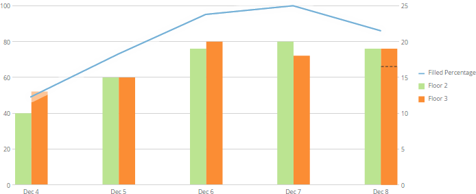
<table class="mt-responsive-table" data-aura-rendered-by="33:209;a"><thead><tr><th class="mt-column-width-15" colspan="1" rowspan="1"><p> Option </p></th><th class="mt-column-width-35" colspan="1" rowspan="1"><p> Description </p></th><th class="mt-column-width-20" colspan="1" rowspan="1"><p> Examples </p></th></tr></thead><tbody><tr><td class="mt-column-width-15" colspan="1" rowspan="1"><p> Project Using </p></td><td class="mt-column-width-35" colspan="1" rowspan="1"><p> Determines whether a final value is projected for bars in a Grouped Bar with Line graph and, if so, how this value is determined. You can enter a specific value for a projection or set Domo to project a value automatically either by taking the average of the previous points in the graph or by using linear regression. The example at right shows a Grouped Bar with Line graph in which a final value for the bars has been projected using the average of the four previous values. For more information, see <a href="/s/article/360043429713" target="_blank" title="Projecting the Last Value in Your Chart"> Projecting the Last Value in Your Chart </a>. </p></td><td class="mt-column-width-20" colspan="1" rowspan="1"><p><a target="_blank" title="/@api/deki/files/755/linebar_projection_bar.png"><img alt="" src="https://mintcdn.com/domoinc-openapi-sync-dataflows/U1MglXZKeJZebGlP/images/kb/ka05w00000123lK-00N5w00000Ri7BU-0EM5w000005vP0h.png?fit=max&auto=format&n=U1MglXZKeJZebGlP&q=85&s=7a77a5676022284847391c0778380e11" width="694" height="283" data-path="images/kb/ka05w00000123lK-00N5w00000Ri7BU-0EM5w000005vP0h.png" /></a></p></td></tr><tr><td class="mt-column-width-15" colspan="1" rowspan="1"><p> Projection Value </p></td><td class="mt-column-width-35" colspan="1" rowspan="1"><p> Lets you specify the final projected value for the bars in a Grouped Bar with Line graph. This only works if you have selected <b> Specified Value </b> as the <b> Project Using </b> property. For more information, see <a href="/s/article/360043429713" target="_blank" title="Projecting the Last Value in Your Chart"> Projecting the Last Value in Your Chart </a>. </p></td><td class="mt-column-width-20" colspan="1" rowspan="1"><p> — </p></td></tr><tr><td class="mt-column-width-15" colspan="1" rowspan="1"><p> Previous Values to Average </p></td><td class="mt-column-width-35" colspan="1" rowspan="1"><p> Lets you specify the number of points to average to determine the final projected value for the bars in a Grouped Bar with Line graph. This only works if you have selected Average Previous Values as the Project Using property. For more information, see <a href="/s/article/360043429713" target="_blank" title="Projecting the Last Value in Your Chart"> Projecting the Last Value in Your Chart </a>. </p></td><td class="mt-column-width-20" colspan="1" rowspan="1"><p><a id="last_line_value_projection" target="_blank" /> — </p></td></tr></tbody></table>

### Last Line Value Projection Properties

The properties in the following table are found in the **Last Line Value Projection** category in Chart Properties.

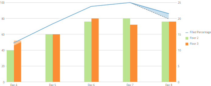
<table class="mt-responsive-table" data-aura-rendered-by="33:209;a"><thead><tr><th class="mt-column-width-15" colspan="1" rowspan="1"><p> Option </p></th><th class="mt-column-width-35" colspan="1" rowspan="1"><p> Description </p></th><th class="mt-column-width-20" colspan="1" rowspan="1"><p> Examples </p></th></tr></thead><tbody><tr><td class="mt-column-width-15" colspan="1" rowspan="1"><p> Project Using </p></td><td class="mt-column-width-35" colspan="1" rowspan="1"><p> Determines whether a final value is projected for lines in a Grouped Bar with Line graph and, if so, how this value is determined. You can enter a specific value for a projection or set Domo to project a value automatically either by taking the average of the previous points in the graph or by using linear regression. The example at right shows a Grouped Bar with Line graph in which a final value for the lines has been projected using the average of the four previous values. For more information, see <a href="/s/article/360043429713" target="_blank" title="Projecting the Last Value in Your Chart"> Projecting the Last Value in Your Chart </a>. </p></td><td class="mt-column-width-20" colspan="1" rowspan="1"><p><a target="_blank" title="/@api/deki/files/759/linebar_projection_line.png"><img alt="" src="https://mintcdn.com/domoinc-openapi-sync-dataflows/U1MglXZKeJZebGlP/images/kb/ka05w00000123lK-00N5w00000Ri7BU-0EM5w000005vP1N.png?fit=max&auto=format&n=U1MglXZKeJZebGlP&q=85&s=f12454a44a43e7e95aaab13de7dc27d7" width="694" height="283" data-path="images/kb/ka05w00000123lK-00N5w00000Ri7BU-0EM5w000005vP1N.png" /></a></p></td></tr><tr><td class="mt-column-width-15" colspan="1" rowspan="1"><p> Projection Value </p></td><td class="mt-column-width-35" colspan="1" rowspan="1"><p> This lets you specify the final projected value for the lines in a Grouped Bar with a Line graph. It only works if you have selected the <b> Specified Value </b> as the <b> Project Using </b> property. For more information, see <a href="/s/article/360043429713" target="_blank" title="Projecting the Last Value in Your Chart"> Projecting the Last Value in Your Chart </a>. </p></td><td class="mt-column-width-20" colspan="1" rowspan="1"><p> — </p></td></tr><tr><td class="mt-column-width-15" colspan="1" rowspan="1"><p> Previous Values to Average </p></td><td class="mt-column-width-35" colspan="1" rowspan="1"><p> Lets you specify the number of points to average to determine the final projected value for the lines in a Grouped Bar with Line graph. This only works if you have selected <b> Average Previous Values </b> as the <b> Project Using </b> property. For more information, see <a href="/s/article/360043429713" target="_blank" title="Projecting the Last Value in Your Chart"> Projecting the Last Value in Your Chart </a>. </p></td><td class="mt-column-width-20" colspan="1" rowspan="1"><p> — <a id="regression_line" target="_blank" /></p></td></tr></tbody></table>

### Regression Line Properties

The properties in the following table are found in the **Regression Line** category in Chart Properties.

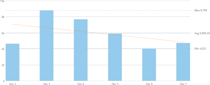
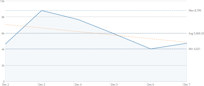
<table class="mt-responsive-table" data-aura-rendered-by="33:209;a"><thead><tr><th class="mt-column-width-15" colspan="1" rowspan="1"><p> Option </p></th><th class="mt-column-width-35" colspan="1" rowspan="1"><p> Description </p></th><th class="mt-column-width-20" colspan="1" rowspan="1"><p> Examples </p></th></tr></thead><tbody><tr><td class="mt-column-width-15" colspan="1" rowspan="1"><p> Show Linear Regression Line </p></td><td class="mt-column-width-35" colspan="1" rowspan="1"><p> Allows you to add a regression line to single-series Vertical Bar and Line charts and most Line chart subtypes. In the examples at right, the dashed orange line represents the regression line. </p></td><td class="mt-column-width-20" colspan="1" rowspan="1"><p><a target="_blank" title="/@api/deki/files/118/bar_regression_line.png"><img alt="" src="https://mintcdn.com/domoinc-openapi-sync-dataflows/U1MglXZKeJZebGlP/images/kb/ka05w00000123lK-00N5w00000Ri7BU-0EM5w000005vP0i.png?fit=max&auto=format&n=U1MglXZKeJZebGlP&q=85&s=d19f69c3ee8b93b4b0631cab94d27c56" width="686" height="280" data-path="images/kb/ka05w00000123lK-00N5w00000Ri7BU-0EM5w000005vP0i.png" /></a></p><p><a target="_blank" title="/@api/deki/files/743/line_regression_line.png"><img alt="" src="https://mintcdn.com/domoinc-openapi-sync-dataflows/U1MglXZKeJZebGlP/images/kb/ka05w00000123lK-00N5w00000Ri7BU-0EM5w000005vP10.png?fit=max&auto=format&n=U1MglXZKeJZebGlP&q=85&s=35a05c09c1420ea13bbb3edc8443655c" width="686" height="290" data-path="images/kb/ka05w00000123lK-00N5w00000Ri7BU-0EM5w000005vP10.png" /></a></p></td></tr><tr><td class="mt-column-width-15" colspan="1" rowspan="1"><p> Include Last Data Point </p></td><td class="mt-column-width-35" colspan="1" rowspan="1"><p> Determines whether the last data point in your Bar or Line chart is included in the calculation for the regression line. If your chart shows a timeline that is not complete (for example, November appears as the last month in the timeline but has not yet ended), you should check this box. </p></td><td class="mt-column-width-20" colspan="1" rowspan="1"><p> — </p></td></tr><tr><td class="mt-column-width-15" colspan="1" rowspan="1"><p> Line Style </p></td><td class="mt-column-width-35" colspan="1" rowspan="1"><p> Lets you specify whether your regression line is solid or dashed (default). </p></td><td class="mt-column-width-20" colspan="1" rowspan="1"><p> — </p></td></tr><tr><td class="mt-column-width-15" colspan="1" rowspan="1"><p> Line Color </p></td><td class="mt-column-width-35" colspan="1" rowspan="1"><p> Lets you select the color for the regression line. </p></td><td class="mt-column-width-20" colspan="1" rowspan="1"><p><a id="hints_properties" target="_blank" /> — </p></td></tr></tbody></table>

### Hints Properties

The properties in the following table are found in the **Hints** category in Chart Properties.

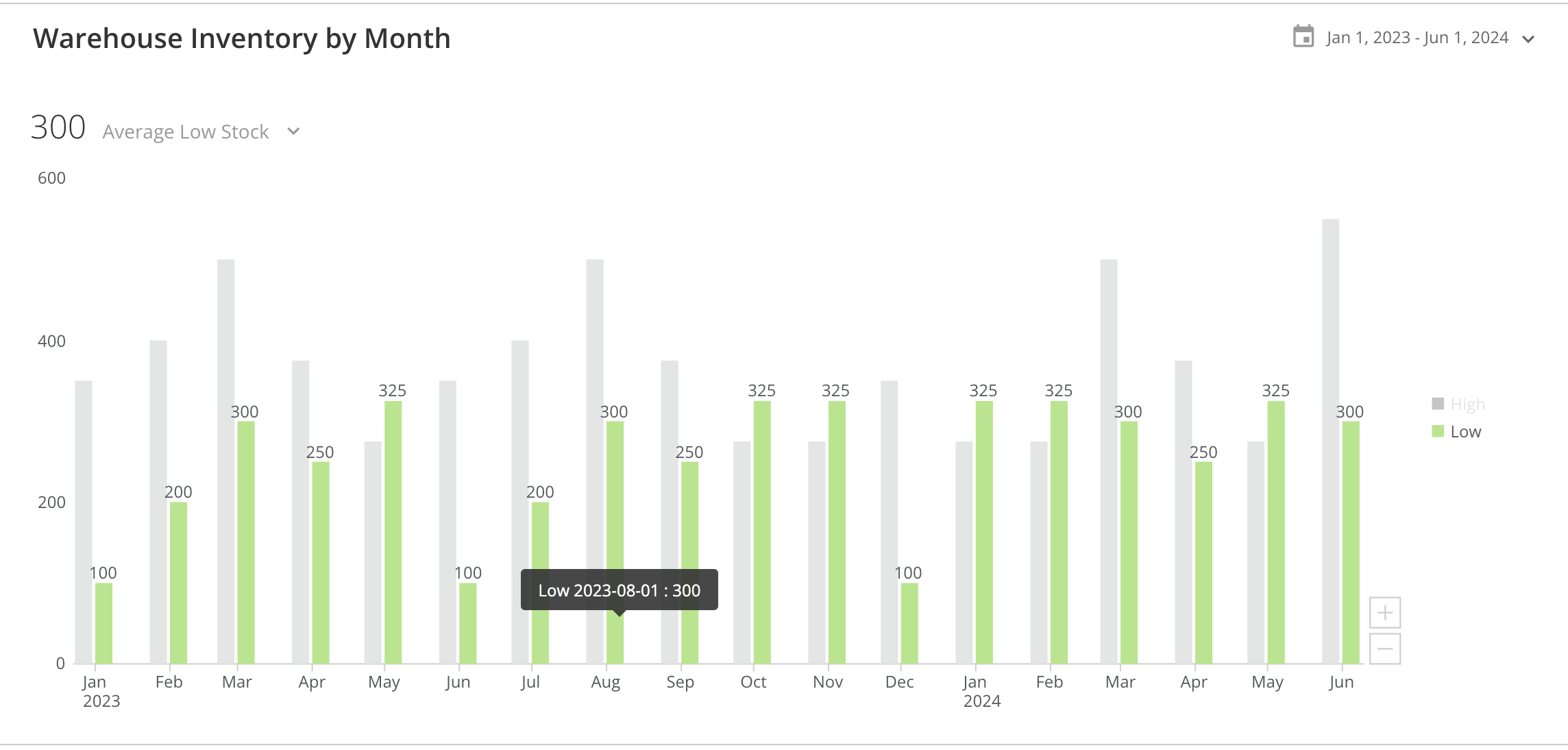
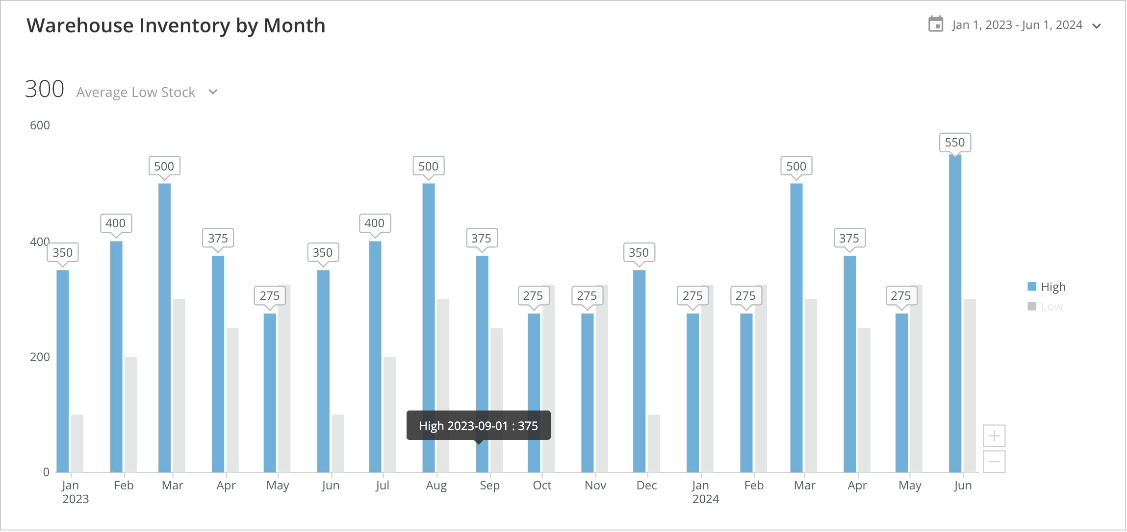
<table class="mt-responsive-table" data-aura-rendered-by="33:209;a"><thead><tr><th class="mt-column-width-15" colspan="1" rowspan="1"><p> Option </p></th><th class="mt-column-width-35" colspan="1" rowspan="1"><p> Description </p></th><th class="mt-column-width-15" colspan="1" rowspan="1"><p> Examples </p></th></tr></thead><tbody><tr><td colspan="1" rowspan="1"><p> Allow Hint Overlay </p></td><td colspan="1" rowspan="1"><p> When selected, <b> all </b> hints display, even if they overlap with other hints. </p></td><td colspan="1" rowspan="1"><p> — </p></td></tr><tr><td class="mt-column-width-15" colspan="1" rowspan="1"><p> Remove Hints </p></td><td class="mt-column-width-35" colspan="1" rowspan="1"><p> Prevents value labels from appearing over each bar or line point in a chart in the Details view. </p></td><td class="mt-column-width-15" colspan="1" rowspan="1"><p> — </p></td></tr><tr><td class="mt-column-width-15" colspan="1" rowspan="1"><p> Style </p></td><td class="mt-column-width-35" colspan="1" rowspan="1"><p> Lets you select a style for the value labels that appear over each bar or line point in a chart in the Details view. Options include <b> Plain </b> (the default) and <b> Tooltip </b>. The first example at right shows a chart with <b> Plain </b> selected. The second example shows the same chart with the <b> Tooltip </b> selected. </p></td><td class="mt-column-width-15" colspan="1" rowspan="1"><p><img alt="Screenshot 2024-09-05 at 1.44.47 PM.png" src="https://mintcdn.com/domoinc-openapi-sync-dataflows/8E3HpyZujsEhQGNi/images/kb/ka0Vq000000CVzJ-00N5w00000Ri7BU-0EMVq000002ZUq5.jpg?fit=max&auto=format&n=8E3HpyZujsEhQGNi&q=85&s=fdcca008f1ec98a27f167fa02d8bc8a1" style={{width: 780, height: 373}} width="2288" height="1094" data-path="images/kb/ka0Vq000000CVzJ-00N5w00000Ri7BU-0EMVq000002ZUq5.jpg" /></p><p><img alt="Screenshot 2024-09-05 at 1.44.09 PM.png" src="https://mintcdn.com/domoinc-openapi-sync-dataflows/8E3HpyZujsEhQGNi/images/kb/ka0Vq000000CVzJ-00N5w00000Ri7BU-0EMVq000002ZUrh.jpg?fit=max&auto=format&n=8E3HpyZujsEhQGNi&q=85&s=0cb904f6c5de8c6eeae85ee7a4cb013c" style={{width: 777, height: 367}} width="2298" height="1086" data-path="images/kb/ka0Vq000000CVzJ-00N5w00000Ri7BU-0EMVq000002ZUrh.jpg" /><a id="value_options_change_value" target="_blank" /></p></td></tr></tbody></table>

### Value Options and Change Value Options Properties

For information about these Spark Bar properties, see [Properties for Miscellaneous Chart Types](/s/article/360042925394 "Properties for Miscellaneous Chart Types").