> ## Documentation Index
> Fetch the complete documentation index at: https://domoinc-openapi-sync-dataflows.mintlify.site/llms.txt
> Use this file to discover all available pages before exploring further.

# Properties Available for Most Charts

export const InlineImage = ({src, alt = '', height = '1.6em'}) => {
  return <img noZoom src={src} alt={alt} style={{
    display: 'inline',
    verticalAlign: 'start',
    height: height,
    margin: '0'
  }} />;
};

### Intro

This topic provides information about chart properties available for most chart types, such as configuring data labels and hovers, scale markers, value and category scale labels, and context-sensitive chart properties.

***

### General

The properties in the following table are found in the **General** category in Chart Properties.

<table border="1" cellpadding="1" cellspacing="1"><thead><tr><th colspan="1" rowspan="1"><p> Property </p></th><th colspan="1" rowspan="1"><p> Description </p></th><th colspan="1" rowspan="1"><p> Examples </p></th></tr></thead><tbody><tr><td colspan="1" rowspan="1"><p> Font Family </p></td><td colspan="1" rowspan="1"><p> Allows you to change the font used in the text in your chart/table. </p><p> The available font families include the Default Domo font, Sans, Serif, Slab, Condensed, and Monospace. </p></td><td colspan="1" rowspan="1"><p> — </p></td></tr><tr><td colspan="1" rowspan="1"><p> Font Size </p></td><td colspan="1" rowspan="1"><p> Allows you to increase or decrease the font size for category and value scale labels in many chart types. </p><p> For Textboxes, a number of sizes are available ranging from Small to XX-Large. If you select <b> Default </b>, the size is chosen that best matches the amount of available space. So, if you had the maximum amount of space available, the "XX-Large" size would be used. </p><p> For more information, see <a href="/s/article/360042925214" target="_blank" title="Changing the Font Size in Your Chart"> Changing the Font Size in Your Chart </a>. </p></td><td colspan="1" rowspan="1"><p> — </p></td></tr><tr><td colspan="1" rowspan="1"><p> Font Style </p></td><td colspan="1" rowspan="1"><p> Allows you to change the font style of the text in your chart/table. </p><p> The available font styles include the Default Domo style, Plain, Italic, Light, Light Italic, Medium, Medium Italic, Bold, and Bold Italic. </p></td><td colspan="1" rowspan="1"><p> — </p></td></tr><tr><td colspan="1" rowspan="1"><p> Portrait View Legend Position </p></td><td colspan="1" rowspan="1"><p> Determines where legends appear in charts in portrait view. By default, legends appear on the bottom of the chart in this view. For more information, see <a href="/s/article/360043429673" target="_blank" title="Changing the Legend Position in Your Chart"> Changing the Legend Position in Your Chart </a>. <a id="grid_lines" target="_blank" /></p></td><td colspan="1" rowspan="1"><p /><p> — </p><p /></td></tr><tr><td colspan="1" rowspan="1"><p> Landscape View Legend Position </p></td><td colspan="1" rowspan="1"><p> Determines where legends appear in charts in landscape view. By default, legends appear on the right of the chart in this view. If you select <b> Auto </b>, the legend appears to the right of the chart if it contains 10 or fewer items. Otherwise it appears at the bottom of the chart. For more information, see <a href="/s/article/360043429673" target="_blank" title="Changing the Legend Position in Your Chart"> Changing the Legend Position in Your Chart </a>. </p></td><td colspan="1" rowspan="1"><p> — </p></td></tr><tr><td colspan="1" rowspan="1"><p> Reverse Legend Layout Order </p></td><td colspan="1" rowspan="1"><p> Reverses the order in which legend items appear. </p></td><td colspan="1" rowspan="1"><p> — </p></td></tr><tr><td colspan="1" rowspan="1"><p> Disable Animation </p></td><td colspan="1" rowspan="1"><p> Turns off the animations that play when the viewing a chart in the Details view. </p></td><td colspan="1" rowspan="1"><p> — </p></td></tr></tbody></table>

### Grid Lines

The properties in the following table are found in the **Grid Lines** category in Chart Properties for most kinds of charts.

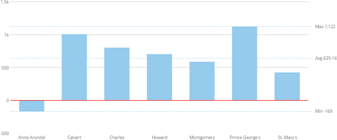
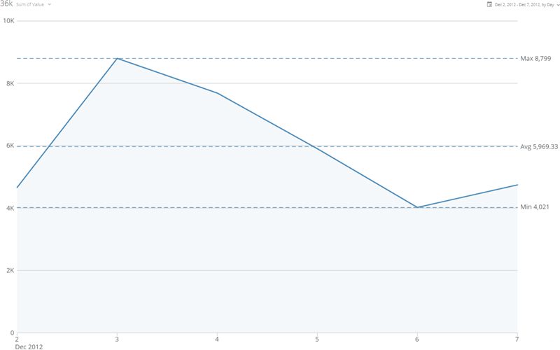
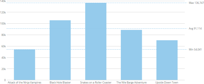
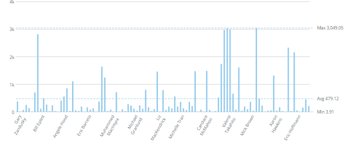
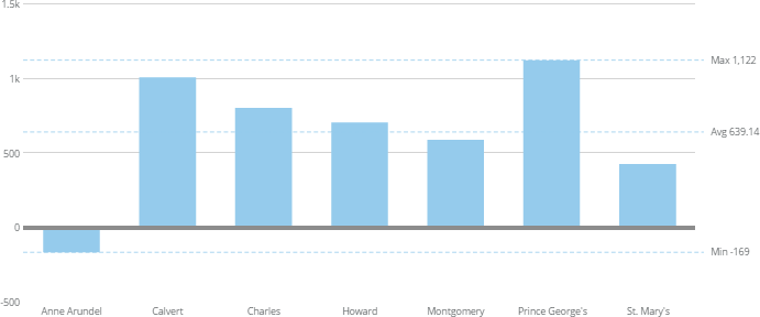
<table border="1" cellpadding="1" cellspacing="1" data-aura-rendered-by="33:209;a"><thead><tr><th colspan="1" rowspan="1"><p> Property </p></th><th colspan="1" rowspan="1"><p> Description </p></th><th colspan="1" rowspan="1"><p> Examples </p></th></tr></thead><tbody><tr><td colspan="1" rowspan="1"><p> Zero Line Color </p></td><td colspan="1" rowspan="1"><p /> Determines the color for the "zero line" on most single-axis charts. You can enter either the name of the color or the hexadecimal color code (such as <code> FF0000 </code> for red). This attribute does not work if the zero line is also the baseline (that is, the chart must contain negative values). In the example, this property has been set to <code> red </code>. <p /></td><td colspan="1" rowspan="1"><p><a href="/s/article/360043429793" target="_blank" title="/@api/deki/files/1339/zero_line_color.png"><img alt="" src="https://mintcdn.com/domoinc-openapi-sync-dataflows/AxiXLKkg9sLcFgsR/images/kb/ka0Vq0000006Gmr-00N5w00000Ri7BU-0EM5w000005vZ6d.png?fit=max&auto=format&n=AxiXLKkg9sLcFgsR&q=85&s=075a56f5dbf11fb38355e11dcfa1981f" width="691" height="288" data-path="images/kb/ka0Vq0000006Gmr-00N5w00000Ri7BU-0EM5w000005vZ6d.png" /></a></p></td></tr><tr><td colspan="1" rowspan="1"><p> Zero Line Width </p></td><td colspan="1" rowspan="1"><p /> Determines the width of the "zero line" on most single-axis charts, in pixels. This attribute does not work if the zero line is also the baseline (that is, the chart must contain negative values). In the example, this property has been set to <code> 5 </code>. <a id="data_label_settings" target="_blank" /><p /></td><td colspan="1" rowspan="1"><p><a href="/s/article/360043429793" target="_blank" title="/@api/deki/files/1338/zero_line_width.png"><img alt="" src="https://mintlify.s3.us-west-1.amazonaws.com/domoinc-openapi-sync-dataflows/images/kb/ka0Vq0000006Gmr-00N5w00000Ri7BU-0EM5w000005vZ6i.png" /></a></p></td></tr><tr><td colspan="1" rowspan="1"><p> Calculated Line </p></td><td colspan="1" rowspan="1"><p> Lets you set an additional grid line that denotes the median or average value in the chart. In the example, the user has selected <b> Average </b>. </p></td><td colspan="1" rowspan="1"><p><img alt="gridline_average.png" src="https://mintcdn.com/domoinc-openapi-sync-dataflows/AxiXLKkg9sLcFgsR/images/kb/ka0Vq0000006Gmr-00N5w00000Ri7BU-0EM5w000005vZ6r.png?fit=max&auto=format&n=AxiXLKkg9sLcFgsR&q=85&s=a8adfd842236f34adf2686bbd0a166fa" width="800" height="500" data-path="images/kb/ka0Vq0000006Gmr-00N5w00000Ri7BU-0EM5w000005vZ6r.png" /></p></td></tr></tbody></table>

### Data Label Settings

The properties in the following table are found in the **Data Label Settings** category in Chart Properties.

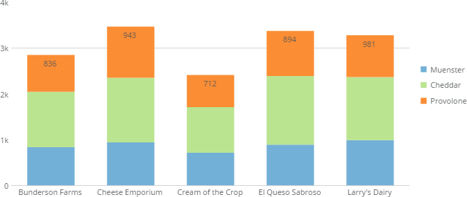
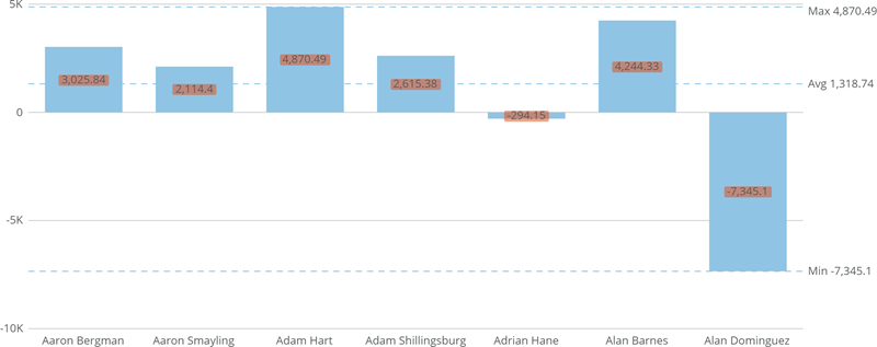
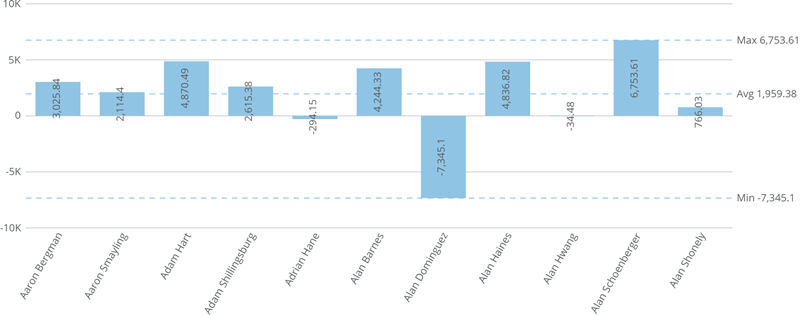
<table border="1" cellpadding="1" cellspacing="1" data-aura-rendered-by="33:209;a"><thead><tr><th colspan="1" rowspan="1"><p> Property </p></th><th colspan="1" rowspan="1"><p> Description </p></th><th colspan="1" rowspan="1"><p> Examples </p></th></tr></thead><tbody><tr><td colspan="1" rowspan="1"><p> Text </p></td><td colspan="1" rowspan="1"><p /><p> Specifies text for data labels. This property is the "on switch" for data labels—you must specify text for them to appear. </p><p> For more information about creating data label text, including a list of available macros, see <a href="/s/article/360043429693" target="_blank" title="Formatting Data Label and Hover Text in Your Chart"> Formatting Data Label and Hover Text in Your Chart </a>. </p><p /></td><td colspan="1" rowspan="1"><p> — </p></td></tr><tr><td colspan="1" rowspan="1"><p> Position </p></td><td colspan="1" rowspan="1"><p /><p> Determines where data labels are shown in relation to their corresponding data items. </p><p> Available positions differ between chart types. For example, Pie and Funnel graphs include <b> Outside Leaders </b> and <b> Outside Arranged Leaders </b> options. Leaders are lines that connect data labels to their associated data items in the graph. If you select <b> Outside Leaders </b>, diagonal leaders are used; if you select <b> Outside Arranged Leaders </b>, the leaders are horizontal. </p><p> The example shows a chart in which the data label position is set to <b> Inside Top </b> for a Vertical Bar graph. </p><p /></td><td colspan="1" rowspan="1"><p><a href="/s/article/360043429793" target="_blank" title="/@api/deki/files/654/inside_top_labels.png"><img alt="" src="https://mintcdn.com/domoinc-openapi-sync-dataflows/DfXQTn5UA-Ig8rT5/images/kb/ka05w0000012431-00N5w00000Ri7BU-0EM5w000005vZ7T.png?fit=max&auto=format&n=DfXQTn5UA-Ig8rT5&q=85&s=8f6057ee07ada73a031402654d20e0df" width="673" height="285" data-path="images/kb/ka05w0000012431-00N5w00000Ri7BU-0EM5w000005vZ7T.png" /></a></p></td></tr><tr><td colspan="1" rowspan="1"><p> Fill </p></td><td colspan="1" rowspan="1"><p /> Lets you add a colored fill to your data labels. The example at right shows a chart in which a red fill color with 45% transparency has been added. <p /></td><td colspan="1" rowspan="1"><p><img alt="data_labels_fill.png" src="https://mintcdn.com/domoinc-openapi-sync-dataflows/DfXQTn5UA-Ig8rT5/images/kb/ka05w0000012431-00N5w00000Ri7BU-0EM5w000005vZ7S.png?fit=max&auto=format&n=DfXQTn5UA-Ig8rT5&q=85&s=969d72b7c2daabcb3ad3098b1ff4a073" width="800" height="317" data-path="images/kb/ka05w0000012431-00N5w00000Ri7BU-0EM5w000005vZ7S.png" /></p></td></tr><tr><td colspan="1" rowspan="1"><p> Fill Color </p></td><td colspan="1" rowspan="1"><p> Lets you specify the color for the fill in your data labels. This property is only available when you check the <b> Fill </b> box. </p></td><td colspan="1" rowspan="1"><p /><p> — </p><p /></td></tr><tr><td colspan="1" rowspan="1"><p> Fill Transparency Percent </p></td><td colspan="1" rowspan="1"><p> Lets you specify the fill transparency for data labels. You can specify any number between 0 and 100, in which 0 is completely opaque and 100 is completely transparent. This property is only available when you check the <b> Fill </b> box. </p></td><td colspan="1" rowspan="1"><p> — </p></td></tr><tr><td colspan="1" rowspan="1"><p> Rotate </p></td><td colspan="1" rowspan="1"><p> Lets you rotate data labels 90 degrees. The example at right shows a chart in which this has been done. </p></td><td colspan="1" rowspan="1"><p><img alt="data_labels_rotated.png" src="https://mintcdn.com/domoinc-openapi-sync-dataflows/DfXQTn5UA-Ig8rT5/images/kb/ka05w0000012431-00N5w00000Ri7BU-0EM5w000005vZ7E.png?fit=max&auto=format&n=DfXQTn5UA-Ig8rT5&q=85&s=95aa23266478c2e0c7004da30756e518" width="800" height="315" data-path="images/kb/ka05w0000012431-00N5w00000Ri7BU-0EM5w000005vZ7E.png" /></p></td></tr><tr><td colspan="1" rowspan="1"><p> Justification </p></td><td colspan="1" rowspan="1"><p> Determines the justification for multi-line data labels—either <b> Left </b>, <b> Center </b>, or <b> Right </b>. For information about creating data label text, see <a href="/s/article/360043429693" target="_blank" title="Formatting Data Label and Hover Text in Your Chart"> Formatting Data Label and Hover Text in Your Chart </a>. The example graph includes multi-line data labels that have been left-justified (by selecting <b> Left </b> for the <b> Justification </b> property). </p></td><td colspan="1" rowspan="1"><p><a href="/s/article/360043429793" target="_blank" title="/@api/deki/files/718/left_justified.png"><img alt="" src="https://mintcdn.com/domoinc-openapi-sync-dataflows/DfXQTn5UA-Ig8rT5/images/kb/ka05w0000012431-00N5w00000Ri7BU-0EM5w000005vZ7B.png?fit=max&auto=format&n=DfXQTn5UA-Ig8rT5&q=85&s=d2b49f06ab840eaffe6a0c3008c9b4f8" width="708" height="320" data-path="images/kb/ka05w0000012431-00N5w00000Ri7BU-0EM5w000005vZ7B.png" /></a></p></td></tr><tr><td colspan="1" rowspan="1"><p> Show When Zero </p></td><td colspan="1" rowspan="1"><p> Determines whether data labels are shown for graph elements with a value of 0. </p></td><td colspan="1" rowspan="1"><p> — </p></td></tr><tr><td colspan="1" rowspan="1"><p> Use Scale Format </p></td><td colspan="1" rowspan="1"><p> Determines whether data labels use the same formatting that has been set for the value scale. </p></td><td colspan="1" rowspan="1"><p> — </p></td></tr><tr><td colspan="1" rowspan="1"><p> Use Scale Abbreviation </p></td><td colspan="1" rowspan="1"><p> Determines whether data labels use the same scale abbreviation that has been set for the value scale. <a id="hover_text_settings" target="_blank" /></p></td><td colspan="1" rowspan="1"><p> — </p></td></tr><tr><td colspan="1" rowspan="1"><p> Percent Value Decimal Places </p></td><td colspan="1" rowspan="1"><p> Determines the number of decimal places used in percentage values in data labels. </p></td><td colspan="1" rowspan="1"><p> — </p></td></tr><tr><td colspan="1" rowspan="1"><p> Allow Overlap </p></td><td colspan="1" rowspan="1"><p> Determines whether data labels are still shown when they overlap. </p></td><td colspan="1" rowspan="1"><p> — </p></td></tr><tr><td colspan="1" rowspan="1"><p> Show Data Labels On </p></td><td colspan="1" rowspan="1"><p> Determines whether data labels appear for lines, bars, or both in line-bar combination charts. </p></td><td colspan="1" rowspan="1"><p> — </p></td></tr></tbody></table>

### Hover Text Settings

The properties in the following table are found in the **Hover Text Settings** category in Chart Properties.

<table border="1" cellpadding="1" cellspacing="1" data-aura-rendered-by="33:209;a"><thead><tr><th colspan="1" rowspan="1"><p> Property </p></th><th colspan="1" rowspan="1"><p> Description </p></th><th colspan="1" rowspan="1"><p> Examples </p></th></tr></thead><tbody><tr><td colspan="1" rowspan="1"><p> Hover Text </p></td><td colspan="1" rowspan="1"><p> Lets you set the text that appears in chart hovers. A variety of macros for showing chart values in your hovers is available. For more information and a list of available macros, see <a href="/s/article/360043429693" target="_blank" title="Formatting Data Label and Hover Text in Your Chart"> Formatting Data Label and Hover Text in Your Chart </a>. </p></td><td colspan="1" rowspan="1"><p> — </p></td></tr><tr><td colspan="1" rowspan="1"><p> Use scale format </p></td><td colspan="1" rowspan="1"><p> Determines whether hovers use the same formatting that has been set for the value scale. This property overrides the <b> Hover Format </b>, <b> Divide Value By </b>, <b> Decimal Places </b>, and <b> Negative Numbers </b> properties. </p></td><td colspan="1" rowspan="1"><p> — </p></td></tr><tr><td colspan="1" rowspan="1"><p> Use scale abbreviation </p></td><td colspan="1" rowspan="1"><p> Determines whether hovers use the same scale abbreviation that has been set for the value scale. </p></td><td colspan="1" rowspan="1"><p> — </p></td></tr><tr><td colspan="1" rowspan="1"><p> Hover Format </p></td><td colspan="1" rowspan="1"><p> Determines whether values in hovers have currency or percent symbols affixed. This property is overridden by the <b> Use scale format </b> property. <a id="value_scale" target="_blank" /></p></td><td colspan="1" rowspan="1"><p> — </p></td></tr><tr><td colspan="1" rowspan="1"><p> Divide Value By </p></td><td colspan="1" rowspan="1"><p> When set, values in hovers are divided by the specified factor. This option is useful when the values in your chart are very large and you want to abbreviate them by dividing by a common number. For example, if the values in your chart represented millions of dollars, you could choose to divide by millions—all of the values in the hovers would then be reduced to more manageable single digits. When you choose to divide by <b> Percentage </b>, the numbers in the value scale are multiplied by 100. This property is overridden by the <b> Use scale format </b> property. </p></td><td colspan="1" rowspan="1"><p> — </p></td></tr><tr><td colspan="1" rowspan="1"><p> Decimal Places </p></td><td colspan="1" rowspan="1"><p> Determines the number of decimal places in values in hovers. This property is overridden by the <b> Use scale format </b> property. </p></td><td colspan="1" rowspan="1"><p> — </p></td></tr></tbody></table>

### Value Scale (Y)

The properties in the following table are found in the **Value Scale** category in Chart Properties.

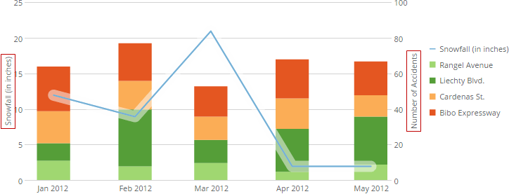
<table border="1" cellpadding="1" cellspacing="1" data-aura-rendered-by="33:209;a"><thead><tr><th colspan="1" rowspan="1"><p> Property </p></th><th colspan="1" rowspan="1"><p> Description </p></th><th colspan="1" rowspan="1"><p> Examples </p></th></tr></thead><tbody><tr><td colspan="1" rowspan="1"><p> Title </p></td><td colspan="1" rowspan="1"><p> Determines whether labels appear alongside value scales. For more information, see <a href="/s/article/360042925174" target="_self" title="Adding Scale Titles to Your Chart"> Adding Scale Titles to Your Chart </a>. The example shows a Grouped Bar with Line chart in which value scale labels are used to distinguish the line and bar data. </p></td><td colspan="1" rowspan="1"><p><a href="/s/article/360043429793" target="_blank" title="/@api/deki/files/1341/scale_labels.png"><img alt="" src="https://mintcdn.com/domoinc-openapi-sync-dataflows/DfXQTn5UA-Ig8rT5/images/kb/ka05w000001243P-00N5w00000Ri7BU-0EM5w000005vZ8E.png?fit=max&auto=format&n=DfXQTn5UA-Ig8rT5&q=85&s=486cca27a2b53ed30555629eb645a1d2" width="724" height="277" data-path="images/kb/ka05w000001243P-00N5w00000Ri7BU-0EM5w000005vZ8E.png" /></a></p></td></tr><tr><td colspan="1" rowspan="1"><p> Show Label </p></td><td colspan="1" rowspan="1"><p> Determines whether labels appear for value items. </p></td><td colspan="1" rowspan="1"><p> — </p></td></tr><tr><td colspan="1" rowspan="1"><p> Label Format </p></td><td colspan="1" rowspan="1"><p> Determines the general number format for value scale numbers and data labels. For more information, see <a href="/s/article/360042924134" target="_blank" title="Formatting Values in Your Chart"> Formatting Values in Your Chart </a>. </p></td><td colspan="1" rowspan="1"><p> — </p></td></tr><tr><td colspan="1" rowspan="1"><p> Divide Scale By </p></td><td colspan="1" rowspan="1"><p> Refers to the number that values in the value scale are to be divided by, if any. This option is useful when the numbers on your value scale are very large and you want to abbreviate them by dividing by a common number. For example, if all of the numbers on the value scale represented millions of dollars, you could choose to divide by millions—all of the numbers on the scale would then be reduced to more manageable single digits. When you choose to divide by <b> Percentage </b>, the numbers in the value scale are multiplied by 100. </p></td><td colspan="1" rowspan="1"><p /><p> — </p><p /></td></tr><tr><td colspan="1" rowspan="1"><p> Decimal Places </p></td><td colspan="1" rowspan="1"><p> Determines the number of decimal places used in decimal values. You can choose from <b> Default </b>, <b> None </b>, and options for numbers of decimal places (from ".0" to ".00000"). By default, Domo automatically determines the optimal number of decimal places for each number in the chart. When you select <b> None </b>, all values are rounded to the nearest whole number. </p></td><td colspan="1" rowspan="1"><p> — </p></td></tr><tr><td colspan="1" rowspan="1"><p> Negative Numbers </p></td><td colspan="1" rowspan="1"><p> Determines the format for negative numbers. If you select <b> -100 </b>, all negative numbers have a minus symbol affixed. If you select <b> (100) </b>, all negative numbers are enclosed in parentheses. </p></td><td colspan="1" rowspan="1"><p> — </p></td></tr><tr><td colspan="1" rowspan="1"><p> Max </p></td><td colspan="1" rowspan="1"><p> Determines the maximum values on a value scale. For more information, see <a href="/s/article/360043429753" target="_self" title="Setting the Minimum or Maximum Value on Your Chart's Value Scale"> Setting the Minimum or Maximum Value on Your Chart's Value Scale </a>. </p></td><td colspan="1" rowspan="1"><p> — </p></td></tr><tr><td colspan="1" rowspan="1"><p> Min </p></td><td colspan="1" rowspan="1"><p> Determines the maximum values on a value scale. For more information, see <a href="/s/article/360043429753" target="_self" title="Setting the Minimum or Maximum Value on Your Chart's Value Scale"> Setting the Minimum or Maximum Value on Your Chart's Value Scale </a>. </p></td><td colspan="1" rowspan="1"><p> — </p></td></tr><tr><td colspan="1" rowspan="1"><p> Divisions </p></td><td colspan="1" rowspan="1"><p> Determines the number of value scale gridlines in a chart. For more information, see <a href="/s/article/360042925274" target="_blank" title="Specifying the Number of Value Scale Gridlines in Your Chart"> Specifying the Number of Value Scale Gridlines in Your Chart </a>. The example shows a chart with eight value scale gridlines. <a id="category_scale" target="_blank" /></p></td><td colspan="1" rowspan="1"><p><a href="/s/article/360043429793" target="_blank" title="/@api/deki/files/781/many_divisions.png"><img alt="" src="https://mintcdn.com/domoinc-openapi-sync-dataflows/DfXQTn5UA-Ig8rT5/images/kb/ka05w000001242y-00N5w00000Ri7BU-0EM5w000005vZ7M.png?fit=max&auto=format&n=DfXQTn5UA-Ig8rT5&q=85&s=9ac46757335f098e38fb8d6dbf994c60" width="699" height="288" data-path="images/kb/ka05w000001242y-00N5w00000Ri7BU-0EM5w000005vZ7M.png" /></a></p></td></tr><tr><td colspan="1" rowspan="1"><p> Log Scale </p></td><td colspan="1" rowspan="1"><p> Determines whether the value scale increments logarithmically. On a logarithmic scale, each successive increase is exponential. These scales are useful when you have a wide range of data that doesn't fit well on a regular linear scale. The example shows a chart that uses a logarithmic scale to handle a wide range of data. </p></td><td colspan="1" rowspan="1"><p><a href="/s/article/360043429793" target="_blank" title="/@api/deki/files/766/logarithmic_scale.png"><img alt="" src="https://mintlify.s3.us-west-1.amazonaws.com/domoinc-openapi-sync-dataflows/images/kb/ka0Vq0000006Gmr-00N5w00000Ri7BU-0EM5w000005vZ6m.png" /></a></p></td></tr><tr><td colspan="1" rowspan="1"><p> Include Zero </p></td><td colspan="1" rowspan="1"><p> Determines whether a line for "0" appears in the chart. </p></td><td colspan="1" rowspan="1"><p> — </p></td></tr></tbody></table>

### Category Scale (X)

The properties in the following table are found in the **Category Scale** category in Chart Properties.

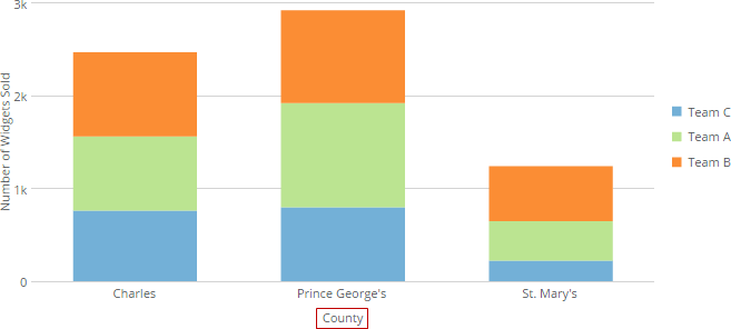
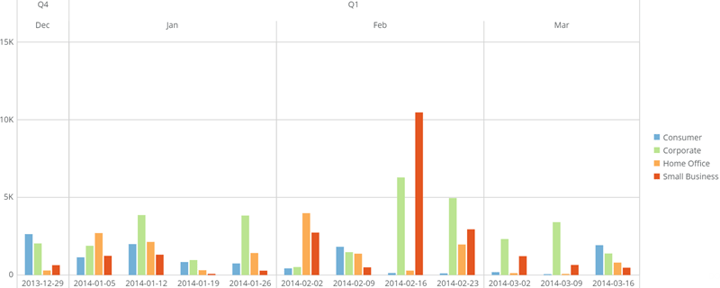
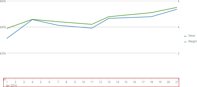
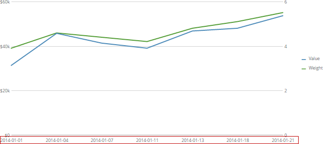
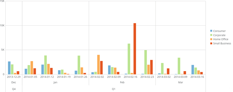
<table border="1" cellpadding="1" cellspacing="1" data-aura-rendered-by="33:209;a"><thead><tr><th colspan="1" rowspan="1"><p> Property </p></th><th colspan="1" rowspan="1"><p> Description </p></th><th colspan="1" rowspan="1"><p> Examples </p></th></tr></thead><tbody><tr><td colspan="1" rowspan="1"><p> Title </p></td><td colspan="1" rowspan="1"><p> Determines whether labels appear alongside category scales. For more information, see <a href="/s/article/360042925174" target="_self"> Adding Scale Titles to Your Chart. </a> The example shows a chart in which a category scale label is used. </p></td><td colspan="1" rowspan="1"><p><a href="/s/article/360043429793" target="_blank" title="/@api/deki/files/168/category_scale_label.png"><img alt="" src="https://mintcdn.com/domoinc-openapi-sync-dataflows/AxiXLKkg9sLcFgsR/images/kb/ka0Vq0000006Gmr-00N5w00000Ri7BU-0EM5w000005vZ6b.png?fit=max&auto=format&n=AxiXLKkg9sLcFgsR&q=85&s=2443a5da7022ab1d64af362a28a1eed7" width="657" height="296" data-path="images/kb/ka0Vq0000006Gmr-00N5w00000Ri7BU-0EM5w000005vZ6b.png" /></a></p></td></tr><tr><td colspan="1" rowspan="1"><p> Show Label </p></td><td colspan="1" rowspan="1"><p> Determines whether labels appear for category items. </p></td><td colspan="1" rowspan="1"><p> — </p></td></tr><tr><td colspan="1" rowspan="1"><p> Tired Dates </p></td><td colspan="1" rowspan="1"><p> Determines whether multiple levels of dates are shown and, if so, how many. You can have up to 3 levels of dates. For example, if the dates in your chart were represented by week and you selected <b> 3 Tiers </b>, the timeline would continue to show weekly data but the weeks would be broken out into monthly divisions, and the months would be broken out into quarters, as shown in the screenshot. </p></td><td colspan="1" rowspan="1"><p><img alt="tiered_dates_example.png" src="https://mintcdn.com/domoinc-openapi-sync-dataflows/3WBVqiq9QkFE9G7d/images/kb/ka05w00000129u4-00N5w00000Ri7BU-0EM5w000005vOjw.png?fit=max&auto=format&n=3WBVqiq9QkFE9G7d&q=85&s=a5fe61dbbf296b7564ddc15aa24ec68e" width="800" height="320" data-path="images/kb/ka05w00000129u4-00N5w00000Ri7BU-0EM5w000005vOjw.png" /></p></td></tr><tr><td colspan="1" rowspan="1"><p> Date Output Format </p></td><td colspan="1" rowspan="1"><p> Determines how dates appear in the chart. For more information, see <a href="/s/article/360042924074" target="_blank" title="Changing the Date Format in Your Chart"> Adding Filters to Your Chart </a>. </p></td><td colspan="1" rowspan="1"><p> — </p></td></tr><tr><td colspan="1" rowspan="1"><p> Label Interval </p></td><td colspan="1" rowspan="1"><p> The interval at which labels appear for items on the category scale when there are too many items to show. By default, when there are more labels than fit on the category scale, Domo automatically trims out enough labels to prevent label overlapping. However, you can specify the interval at which labels are trimmed. For example, if you wanted every third label to appear in your chart and all others to be trimmed, you would enter <code> 3 </code> in the <b> Label Interval </b> field. The example shows a chart in which the user set the <b> Label Interval </b> property to <code> 8 </code>, so a label appears for every eighth item in the chart. </p></td><td colspan="1" rowspan="1"><p><a href="/s/article/360043429793" target="_blank" title="/@api/deki/files/769/label_interval.png"><img alt="" src="https://mintcdn.com/domoinc-openapi-sync-dataflows/AxiXLKkg9sLcFgsR/images/kb/ka0Vq0000006Gmr-00N5w00000Ri7BU-0EM5w000005vZ6c.png?fit=max&auto=format&n=AxiXLKkg9sLcFgsR&q=85&s=696a12d7ab4334e78bd9a31fa91dfa6d" width="697" height="289" data-path="images/kb/ka0Vq0000006Gmr-00N5w00000Ri7BU-0EM5w000005vZ6c.png" /></a></p></td></tr><tr><td colspan="1" rowspan="1"><p> Max Length Label </p></td><td colspan="1" rowspan="1"><p> Determines the maximum number of characters that appear for each category label. This property does not work unless a value is also entered for <b> Max Rotated Label Length </b>. The example shows a chart in which the <b> Max Label Length </b> has been set to <code> 5 </code>. </p></td><td colspan="1" rowspan="1"><p><a href="/s/article/360043429793" target="_blank" title="/@api/deki/files/1342/shortened_labels.png"><img alt="" src="https://mintcdn.com/domoinc-openapi-sync-dataflows/AxiXLKkg9sLcFgsR/images/kb/ka0Vq0000006Gmr-00N5w00000Ri7BU-0EM5w000005vZ6f.png?fit=max&auto=format&n=AxiXLKkg9sLcFgsR&q=85&s=233c41b7fd1404d2e72dfe60a793e6d2" width="706" height="288" data-path="images/kb/ka0Vq0000006Gmr-00N5w00000Ri7BU-0EM5w000005vZ6f.png" /></a></p></td></tr><tr><td colspan="1" rowspan="1"><p> Allow Label Rotation </p></td><td colspan="1" rowspan="1"><p> Determines whether labels are rotated if necessary in most kinds of Line charts. </p></td><td colspan="1" rowspan="1"><p> — </p></td></tr><tr><td colspan="1" rowspan="1"><p> Max Rotated Label Length </p></td><td colspan="1" rowspan="1"><p> Determines the maximum number of characters that appear when labels are rotated. This property does not work unless a <b> Max Label Length </b> value is specified. </p></td><td colspan="1" rowspan="1"><p /></td></tr><tr><td colspan="1" rowspan="1"><p> Never Use Time Scale </p></td><td colspan="1" rowspan="1"><p> Determines which type of time scale is used in supported chart types with time data. By default, when time data is used in supported charts, such as Line and Bar charts, Domo automatically makes it appear using a <a target="_blank" title="Adding Filters to Your Chart"> date grain </a> appropriate for your data. This is shown in the first example at right, in which the timeline takes date data spanning several months and shows it by month. If there are periods with no data, gaps are shown accordingly in the timeline. If you check this box, however, date data appears as it does in your DataSet, using individual dates and applying the <b> Date Output Format </b> setting. This is shown in the second example at right, in which the time scale uses individual dates, as in the DataSet. If there are periods with no data, gaps are not shown for those periods in the timeline. <a id="trellis_tiered_date_settings" target="_blank" /></p></td><td colspan="1" rowspan="1"><p><a href="/s/article/360043429793" target="_blank" title="/@api/deki/files/1343/timescales_on.png"><img alt="" src="https://mintcdn.com/domoinc-openapi-sync-dataflows/D4XP-ZUu0hZKYNDT/images/kb/ka05w00000123ms-00N5w00000Ri7BU-0EM5w000005vP6n.png?fit=max&auto=format&n=D4XP-ZUu0hZKYNDT&q=85&s=ec118aabd88a90046f1f33d33e98b0bd" width="650" height="288" data-path="images/kb/ka05w00000123ms-00N5w00000Ri7BU-0EM5w000005vP6n.png" /></a></p><p><a href="/s/article/360043429793" target="_blank" title="/@api/deki/files/1343/timescales_on.png"><img alt="timescales_off.png" src="https://mintcdn.com/domoinc-openapi-sync-dataflows/D4XP-ZUu0hZKYNDT/images/kb/ka05w00000123ms-00N5w00000Ri7BU-0EM5w000005vP6c.png?fit=max&auto=format&n=D4XP-ZUu0hZKYNDT&q=85&s=285f4910167c3325d2377b0058b5d68d" width="650" height="290" data-path="images/kb/ka05w00000123ms-00N5w00000Ri7BU-0EM5w000005vP6c.png" /></a></p></td></tr><tr><td colspan="1" rowspan="1"><p> Show Tiered or Extra Categories </p></td><td colspan="1" rowspan="1"><p> In the event that your chart includes either <a href="/s/article/360043428713" target="_blank" title="Applying DataSet Columns to Your Chart"> additional dimensions </a>, this option determines whether the extra category names appear above (default) or below the chart. In the example at right, the names appear below. </p></td><td colspan="1" rowspan="1"><p><img alt="tiered_dates_below.png" src="https://mintcdn.com/domoinc-openapi-sync-dataflows/AxiXLKkg9sLcFgsR/images/kb/ka0Vq0000006Gmr-00N5w00000Ri7BU-0EM5w000005vZ6Y.png?fit=max&auto=format&n=AxiXLKkg9sLcFgsR&q=85&s=2a421d019331e62315e75978906afe7c" width="800" height="316" data-path="images/kb/ka0Vq0000006Gmr-00N5w00000Ri7BU-0EM5w000005vZ6Y.png" /></p></td></tr></tbody></table>

### Trellis/Tiered Date Settings

<table border="1" cellpadding="1" cellspacing="1" data-aura-rendered-by="33:209;a"><thead><tr><th colspan="1" rowspan="1"><p> Property </p></th><th colspan="1" rowspan="1"><p> Description </p></th><th colspan="1" rowspan="1"><p> Examples </p></th></tr></thead><tbody><tr><td colspan="1" rowspan="1"><p> Show As </p></td><td colspan="1" rowspan="1"><p> Lets you either turn on trellis categories or tiered dates in most chart types. When you turn on trellis categories, new fields in which you can drag and drop additional series are added above the chart preview. When you turn on tiered dates, multiple levels of dates are activated in your chart. Both of these features are discussed in <a href="/s/article/360043428713" target="_self" title="Applying DataSet Columns to Your Chart"> Applying DataSet Columns to Your Chart </a>. </p></td><td colspan="1" rowspan="1" /></tr><tr><td colspan="1" rowspan="1"><p> Tiered Date Levels </p></td><td colspan="1" rowspan="1"><p> Determines how many levels of dates are shown. You can have up to 3 levels of dates. For example, if the dates in your chart were represented by week and you selected <b> 3 Levels </b>, the timeline would continue to show weekly data but the weeks would be broken out into monthly divisions, and the months would be broken out into quarters, as shown in the screenshot. </p><p> For more information about tiered dates, see <a href="/s/article/360043428713" target="_self" title="Applying DataSet Columns to Your Chart"> Applying DataSet Columns to Your Chart </a>. </p></td><td colspan="1" rowspan="1"><p><a href="/s/article/360043429793" target="_blank" title="/@api/deki/files/654/inside_top_labels.png"><img alt="tiered_dates_example.png" src="https://mintcdn.com/domoinc-openapi-sync-dataflows/3WBVqiq9QkFE9G7d/images/kb/ka05w00000129u4-00N5w00000Ri7BU-0EM5w000005vOjw.png?fit=max&auto=format&n=3WBVqiq9QkFE9G7d&q=85&s=a5fe61dbbf296b7564ddc15aa24ec68e" style={{width: 798, height: 319}} width="800" height="320" data-path="images/kb/ka05w00000129u4-00N5w00000Ri7BU-0EM5w000005vOjw.png" /></a></p></td></tr><tr><td colspan="1" rowspan="1"><p> Divider Color </p></td><td colspan="1" rowspan="1"><p /> Lets you specify the color for the dividing lines in your trellis chart or tiered dates chart. In the example at right, the dividing lines have been set to blue-green. <p /></td><td colspan="1" rowspan="1"><p><img alt="trellis_divider_color.png" src="https://mintlify.s3.us-west-1.amazonaws.com/domoinc-openapi-sync-dataflows/images/kb/ka0Vq0000006Gmr-00N5w00000Ri7BU-0EM5w000005vZ6t.png" style={{width: 800, height: 345}} /></p></td></tr><tr><td colspan="1" rowspan="1"><p> Mid Word Title Wrap </p></td><td colspan="1" rowspan="1"><p> Determines whether category name titles wrap in the middle of words and not just on spaces. </p></td><td colspan="1" rowspan="1"><p /><p> — </p><p /></td></tr><tr><td colspan="1" rowspan="1"><p> Show Tiered or Extra Categories </p></td><td colspan="1" rowspan="1"><p> Determines whether the extra category names appear above (default) or below your trellis or tiered dates chart. In the example at right, the names appear below. </p></td><td colspan="1" rowspan="1"><p><img alt="tiered_dates_below.png" src="https://mintcdn.com/domoinc-openapi-sync-dataflows/AxiXLKkg9sLcFgsR/images/kb/ka0Vq0000006Gmr-00N5w00000Ri7BU-0EM5w000005vZ6Y.png?fit=max&auto=format&n=AxiXLKkg9sLcFgsR&q=85&s=2a421d019331e62315e75978906afe7c" style={{width: 803, height: 317}} width="800" height="316" data-path="images/kb/ka0Vq0000006Gmr-00N5w00000Ri7BU-0EM5w000005vZ6Y.png" /></p></td></tr><tr><td colspan="1" rowspan="1"><p> Maximum Bars </p></td><td colspan="1" rowspan="1"><p> Sets the maximum bars to be displayed in each group. This can be used with the "Sort on Totals" property to create a Top 10 type chart. <a id="number_format" target="_blank" /></p></td><td colspan="1" rowspan="1"><p><img alt="Top_N_Trellis_Chart_edit.png" src="https://mintcdn.com/domoinc-openapi-sync-dataflows/AxiXLKkg9sLcFgsR/images/kb/ka0Vq0000006Gmr-00N5w00000Ri7BU-0EM5w000005vZ6I.png?fit=max&auto=format&n=AxiXLKkg9sLcFgsR&q=85&s=6a00ebc0a8979a5ae59dc0559dc0de6b" style={{width: 799, height: 400}} width="691" height="288" data-path="images/kb/ka0Vq0000006Gmr-00N5w00000Ri7BU-0EM5w000005vZ6I.png" /></p></td></tr><tr><td colspan="1" rowspan="1"><p> Justification </p></td><td colspan="1" rowspan="1"><p> Determines the justification for multi-line data labels—either <b> Left </b>, <b> Center </b>, or <b> Right </b>. For information about creating data label text, see <a href="/s/article/360043429693" target="_blank" title="Formatting Data Label and Hover Text in Your Chart"> Formatting Data Label and Hover Text in Your Chart </a>. The example graph includes multi-line data labels that have been left-justified (by selecting <b> Left </b> for the <b> Justification </b> property). </p></td><td colspan="1" rowspan="1"><p><a href="/s/article/360043429793" target="_blank" title="/@api/deki/files/718/left_justified.png"><img alt="" src="https://mintcdn.com/domoinc-openapi-sync-dataflows/DfXQTn5UA-Ig8rT5/images/kb/ka05w0000012431-00N5w00000Ri7BU-0EM5w000005vZ7B.png?fit=max&auto=format&n=DfXQTn5UA-Ig8rT5&q=85&s=d2b49f06ab840eaffe6a0c3008c9b4f8" width="708" height="320" data-path="images/kb/ka05w0000012431-00N5w00000Ri7BU-0EM5w000005vZ7B.png" /></a></p></td></tr></tbody></table>

### Number Format

The properties in the following table are found in the **Number Format** category in Chart Properties.

<table border="1" cellpadding="1" cellspacing="1" data-aura-rendered-by="33:209;a"><thead><tr><th colspan="1" rowspan="1"><p> Property </p></th><th colspan="1" rowspan="1"><p> Description </p></th><th colspan="1" rowspan="1"><p> Examples </p></th></tr></thead><tbody><tr><td colspan="1" rowspan="1"><p> Currency Symbol </p></td><td colspan="1" rowspan="1"><p /> Refers to the symbol for currency numbers. The default currency symbol is "\$." You must select <b> Currency </b> as your label format for this to work. For more information, see <a href="/s/article/360042924134" target="_blank" title="Formatting Values in Your Chart"> Formatting Values in Your Chart </a>. <p /></td><td colspan="1" rowspan="1"><p> — </p></td></tr><tr><td colspan="1" rowspan="1"><p> Currency Symbol Position </p></td><td colspan="1" rowspan="1"><p /> Determines whether a currency symbol appears before or after its value. The default currency symbol position is <b> Before </b>. You must select <b> Currency </b> as your label format for this to work. For more information, see <a href="/s/article/360042924134" target="_blank" title="Formatting Values in Your Chart"> Formatting Values in Your Chart </a>. <p /></td><td colspan="1" rowspan="1"><p> — </p></td></tr><tr><td colspan="1" rowspan="1"><p> Decimal Separator </p></td><td colspan="1" rowspan="1"><p /> Determines the symbol for separate decimal values. The default decimal separator is a period. <a id="scale_marker" target="_blank" /><p /></td><td colspan="1" rowspan="1"><p> — </p></td></tr><tr><td colspan="1" rowspan="1"><p> Thousands Separator </p></td><td colspan="1" rowspan="1"><p> Determines the symbol for separate thousands in large numbers. The default thousands separator is a comma. </p></td><td colspan="1" rowspan="1"><p /><p> — </p><p /></td></tr></tbody></table>

### Scale Marker

The properties in the following table are found in the **Scale Marker** category in Chart Properties.

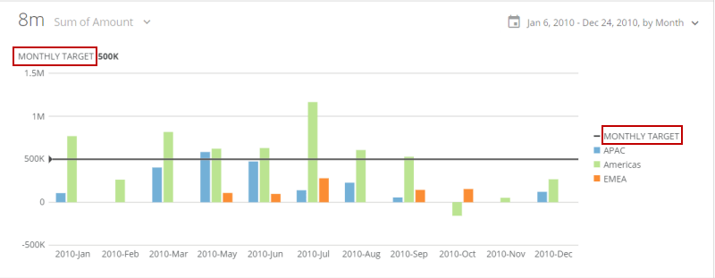
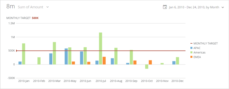
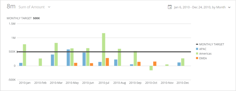
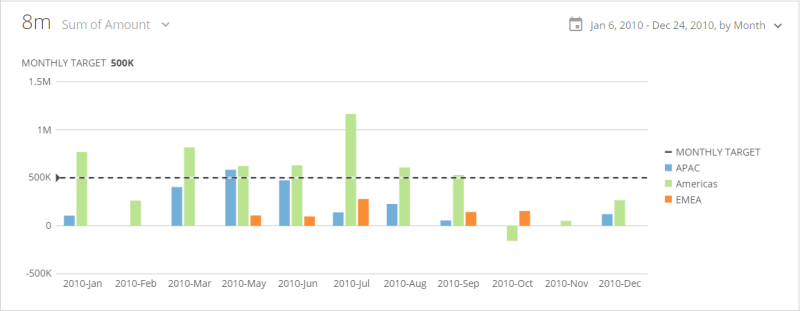
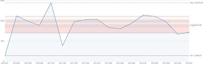
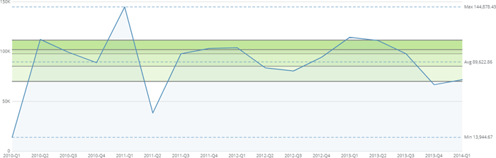
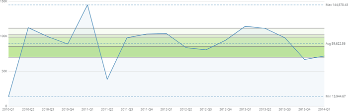
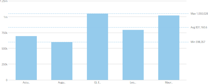
<table border="1" cellpadding="1" cellspacing="1"><thead><tr><th colspan="1" rowspan="1"><p> Property </p></th><th colspan="1" rowspan="1"><p> Description </p></th><th colspan="1" rowspan="1"><p> Examples </p></th></tr></thead><tbody><tr><td colspan="1" rowspan="1"><p> Text </p></td><td colspan="1" rowspan="1"><p /><p> Lets you specify text to replace the default word "GOAL" that normally appears above the top left corner of the chart when a scale marker has been set. If the graph contains a legend, an item for the scale marker is added to the legend with this text (unless you hide it by checking the <b> Scale Marker > Hide in Legend </b> box). </p><p> The example shows a chart in which "MONTHLY TARGET" has been entered as the custom text. </p><p /></td><td colspan="1" rowspan="1"><p><a href="/s/article/360043429793" target="_blank" title="/@api/deki/files/4297/scale_marker_text.png"><img alt="" src="https://mintcdn.com/domoinc-openapi-sync-dataflows/U1MglXZKeJZebGlP/images/kb/ka05w00000123kT-00N5w00000Ri7BU-0EM5w000005vOyv.png?fit=max&auto=format&n=U1MglXZKeJZebGlP&q=85&s=af7233b32ac9a93fafb07ff6c7e537e1" width="800" height="311" data-path="images/kb/ka05w00000123kT-00N5w00000Ri7BU-0EM5w000005vOyv.png" /></a></p></td></tr><tr><td colspan="1" rowspan="1"><p> Scale </p></td><td colspan="1" rowspan="1"><p> In dual-scale graphs, lets you specify whether the goal in the graph is associated with the left or right scale. </p></td><td colspan="1" rowspan="1"><p> — </p></td></tr><tr><td colspan="1" rowspan="1"><p> Type </p></td><td colspan="1" rowspan="1"><p> Lets you specify whether the scale marker consists of a single line, a range of values, or a set of quantiles. </p></td><td colspan="1" rowspan="1"><p> — </p></td></tr><tr><td colspan="1" rowspan="1"><p> Value Type </p></td><td colspan="1" rowspan="1"><p> Lets you determine how the scale marker line is calculated. A range of options is available, such as minimum and maximum, average, standard deviation, and more. If you select <b> Manual </b> (the default), you enter the desired value in the <b> Value </b> field. Otherwise the value is calculated from the data in the graph. </p></td><td colspan="1" rowspan="1"><p /><p> — </p><p /></td></tr><tr><td colspan="1" rowspan="1"><p> Value </p></td><td colspan="1" rowspan="1"><p> Lets you specify the value of your scale marker line when you have selected <b> Manual </b> (or <b> Default) </b> for <b> Value Type </b>. This option is only available when you select <b> Line </b> in the <b> Type </b> menu. </p></td><td colspan="1" rowspan="1"><p> — </p></td></tr><tr><td colspan="1" rowspan="1"><p> Percentile Value </p></td><td colspan="1" rowspan="1"><p> Lets you calculate the value of your line based on a specified percentile value between 0 and 100. This option is available only when you select <b> Line </b> in the <b> Type </b> menu and <b> Percentile </b> in the <b> Value Type </b> menu. </p></td><td colspan="1" rowspan="1"><p> — </p></td></tr><tr><td colspan="1" rowspan="1"><p> Percentage Of </p></td><td colspan="1" rowspan="1"><p> Lets you specify whether your percentage is derived from the maximum, minimum, average, or median value of the chart. This option is available only when you select <b> Line </b> in the <b> Type </b> menu and <b> Percentage </b> in the <b> Value Type </b> menu. </p></td><td colspan="1" rowspan="1"><p> — </p></td></tr><tr><td colspan="1" rowspan="1"><p> Percentage Value </p></td><td colspan="1" rowspan="1"><p> Lets you specify the percentage value calculated from the maximum, minimum, average, or median value of the chart (as selected in the <b> Percentage Of </b> field). This option is available only when you select <b> Line </b> in the <b> Type </b> menu and <b> Percentage </b> in the <b> Value Type </b> menu. </p></td><td colspan="1" rowspan="1"><p> — </p></td></tr><tr><td colspan="1" rowspan="1"><p> Standard Deviations </p></td><td colspan="1" rowspan="1"><p> Lets you calculate your scale marker value based on a specified number of standard deviations from the mean. If you enter a positive value, your scale marker value will be above the mean. If you enter a negative value, your scale marker value will be below the mean. </p></td><td colspan="1" rowspan="1"><p> — </p></td></tr><tr><td colspan="1" rowspan="1"><p> Color </p></td><td colspan="1" rowspan="1"><p> Lets you specify the color of your scale marker line, together with the color of the goal value that appears above the top left corner of the graph. This option is only available when you select <b> Line </b> in the <b> Type </b> menu. </p><p> In the example, the user has selected a red-orange color for the line and value. </p></td><td colspan="1" rowspan="1"><p><a href="/s/article/360043429793" target="_blank" title="/@api/deki/files/4298/scale_marker_color.png"><img alt="" src="https://mintcdn.com/domoinc-openapi-sync-dataflows/U1MglXZKeJZebGlP/images/kb/ka05w00000123kT-00N5w00000Ri7BU-0EM5w000005vOyq.png?fit=max&auto=format&n=U1MglXZKeJZebGlP&q=85&s=b4214f685d20ca222f2efc8d4facf8fd" style={{width: 803, height: 313}} width="800" height="312" data-path="images/kb/ka05w00000123kT-00N5w00000Ri7BU-0EM5w000005vOyq.png" /></a></p></td></tr><tr><td colspan="1" rowspan="1"><p> Width </p></td><td colspan="1" rowspan="1"><p> Lets you specify the width of your scale marker line—either <b> Thin </b> (the default), <b> Medium </b>, and <b> Thick </b>. This option is only available when you select <b> Line </b> in the <b> Type </b> menu. </p><p> In the example, the user has selected <b> Thick </b> for this option. </p></td><td colspan="1" rowspan="1"><p><a href="/s/article/360043429793" target="_blank" title="/@api/deki/files/4300/scale_marker_thick.png"><img alt="" src="https://mintcdn.com/domoinc-openapi-sync-dataflows/U1MglXZKeJZebGlP/images/kb/ka05w00000123kT-00N5w00000Ri7BU-0EM5w000005vOyy.png?fit=max&auto=format&n=U1MglXZKeJZebGlP&q=85&s=81ba08e643cec8304ff3ae5f8cee7b13" width="800" height="311" data-path="images/kb/ka05w00000123kT-00N5w00000Ri7BU-0EM5w000005vOyy.png" /></a></p></td></tr><tr><td colspan="1" rowspan="1"><p> Style </p></td><td colspan="1" rowspan="1"><p> Lets you select whether your scale marker line appears solid (default) or dashed. This option is only available when you select <b> Line </b> in the <b> Type </b> menu. </p><p> In the example, the user has selected <b> Dashed </b> for this option. </p></td><td colspan="1" rowspan="1"><p><a href="/s/article/360043429793" target="_blank" title="/@api/deki/files/4299/scale_marker_dashed.png"><img alt="" src="https://mintcdn.com/domoinc-openapi-sync-dataflows/U1MglXZKeJZebGlP/images/kb/ka05w00000123kT-00N5w00000Ri7BU-0EM5w000005vOym.png?fit=max&auto=format&n=U1MglXZKeJZebGlP&q=85&s=107feceb971106e4bd7d07d21cf9fcd9" width="800" height="311" data-path="images/kb/ka05w00000123kT-00N5w00000Ri7BU-0EM5w000005vOym.png" /></a></p></td></tr><tr><td colspan="1" rowspan="1"><p> Upper Value Type </p></td><td colspan="1" rowspan="1"><p> Lets you determine how the upper boundary of your scale marker range is calculated. A range of options is available, such as minimum and maximum, average, standard deviation, and more. If you select <b> Manual </b> (the default), you enter the desired value in the <b> Upper Value </b> field. Otherwise the value is calculated from the data in the graph. </p></td><td colspan="1" rowspan="1"><p> — </p></td></tr><tr><td colspan="1" rowspan="1"><p> Upper Value </p></td><td colspan="1" rowspan="1"><p> Lets you select the value for the upper line in your scale marker range. This option is only available when you select <b> Range </b> in the <b> Type </b> menu. </p></td><td colspan="1" rowspan="1"><p> — </p></td></tr><tr><td colspan="1" rowspan="1"><p> Upper Percentile Value </p></td><td colspan="1" rowspan="1"><p> Lets you calculate the value of your range's upper boundary based on a specified percentile value between 0 and 100. This option is available only when you select <b> Range </b> in the <b> Type </b> menu and <b> Percentile </b> in the <b> Upper </b><b> Value Type </b> menu. </p></td><td colspan="1" rowspan="1"><p> — </p></td></tr><tr><td colspan="1" rowspan="1"><p> Upper Percentage Of </p></td><td colspan="1" rowspan="1"><p> Lets you specify whether the percentage for your range's upper boundary is derived from the maximum, minimum, average, or median value of the chart. This option is available only when you select <b> Range </b> in the <b> Type </b> menu and <b> Percentage </b> in the <b> Upper </b><b> Value Type </b> menu. </p></td><td colspan="1" rowspan="1"><p> — </p></td></tr><tr><td colspan="1" rowspan="1"><p> Upper Percentage Value </p></td><td colspan="1" rowspan="1"><p> Lets you specify the percentage value for your range's upper boundary calculated from the maximum, minimum, average, or median value of the chart (as selected in the <b> Upper </b><b> Percentage Of </b> field). This option is available only when you select <b> Range </b> in the <b> Type </b> menu and <b> Percentage </b> in the <b> Upper </b><b> Value Type </b> menu. </p></td><td colspan="1" rowspan="1"><p> — </p></td></tr><tr><td colspan="1" rowspan="1"><p> Upper Standard Deviations </p></td><td colspan="1" rowspan="1"><p> Lets you calculate your upper range boundary's value based on a specified number of standard deviations from the mean. If you enter a positive value, your scale marker value will be above the mean. If you enter a negative value, your scale marker value will be below the mean. </p></td><td colspan="1" rowspan="1"><p> — </p></td></tr><tr><td colspan="1" rowspan="1"><p> Lower Value Type </p></td><td colspan="1" rowspan="1"><p> Lets you determine how the lower boundary of your scale marker range is calculated. A range of options is available, such as minimum and maximum, average, standard deviation, and more. If you select <b> Manual </b> (the default), you enter the desired value in the <b> Lower Value </b> fields. Otherwise the value is calculated from the data in the graph. </p></td><td colspan="1" rowspan="1"><p> — </p></td></tr><tr><td colspan="1" rowspan="1"><p> Lower Value </p></td><td colspan="1" rowspan="1"><p> Lets you select the value for the lower boundary in your scale marker range. This option is only available when you select <b> Range </b> in the <b> Type </b> menu. </p></td><td colspan="1" rowspan="1"><p> — </p></td></tr><tr><td colspan="1" rowspan="1"><p> Lower Percentile Value </p></td><td colspan="1" rowspan="1"><p> Lets you calculate the value of your range's lower boundary based on a specified percentile value between 0 and 100. This option is available only when you select <b> Range </b> in the <b> Type </b> menu and <b> Percentile </b> in the <b> Lower </b><b> Value Type </b> menu. </p></td><td colspan="1" rowspan="1"><p> — </p></td></tr><tr><td colspan="1" rowspan="1"><p> Lower Percentage Of </p></td><td colspan="1" rowspan="1"><p> Lets you specify whether the percentage for your range's lower boundary is derived from the maximum, minimum, average, or median value of the chart. This option is available only when you select <b> Range </b> in the <b> Type </b> menu and <b> Percentage </b> in the <b> Lower </b><b> Value Type </b> menu. </p></td><td colspan="1" rowspan="1"><p> — </p></td></tr><tr><td colspan="1" rowspan="1"><p> Lower Percentage Value </p></td><td colspan="1" rowspan="1"><p> Lets you specify the percentage value for your range's lower boundary calculated from the maximum, minimum, average, or median value of the chart (as selected in the <b> Lower </b><b> Percentage Of </b> field). This option is available only when you select <b> Range </b> in the <b> Type </b> menu and <b> Percentage </b> in the <b> Lower </b><b> Value Type </b> menu. </p></td><td colspan="1" rowspan="1"><p> — </p></td></tr><tr><td colspan="1" rowspan="1"><p> Lower Standard Deviations </p></td><td colspan="1" rowspan="1"><p> Lets you calculate your lower range boundary's value based on a specified number of standard deviations from the mean. If you enter a positive value, your scale marker value will be above the mean. If you enter a negative value, your scale marker value will be below the mean. </p></td><td colspan="1" rowspan="1"><p> — </p></td></tr><tr><td colspan="1" rowspan="1"><p> Fill Color </p></td><td colspan="1" rowspan="1"><p> Lets you select the fill color for your scale marker range. This option is only available when you select <b> Range </b> in the <b> Type </b> menu. </p></td><td colspan="1" rowspan="1"><p> — </p></td></tr><tr><td colspan="1" rowspan="1"><p> Fill Transparency Percent </p></td><td colspan="1" rowspan="1"><p> Lets you enter an transparency percentage for the fill in your scale marker range. This should be a value between 0 and 100. The higher the value, the more transparent the fill. This option is only available when you select <b> Range </b> in the <b> Type </b> menu. </p></td><td colspan="1" rowspan="1"><p> — </p></td></tr><tr><td colspan="1" rowspan="1"><p> Border Color </p></td><td colspan="1" rowspan="1"><p> Lets you select the border color for your scale marker range. This option is only available when you select <b> Range </b> in the <b> Type </b> menu. </p></td><td colspan="1" rowspan="1"><p> — </p></td></tr><tr><td colspan="1" rowspan="1"><p> Border Style </p></td><td colspan="1" rowspan="1"><p> Lets you select whether the borders of your scale marker range appear solid (default) or dashed. This option is only available when you select <b> Range </b> in the <b> Type </b> menu. </p></td><td colspan="1" rowspan="1"><p> — </p></td></tr><tr><td colspan="1" rowspan="1"><p> Number of Quantiles </p></td><td colspan="1" rowspan="1"><p> Lets you specify the number of quantiles that appear in your chart. You can specify any number between 3 and 10. This option is only available when you select <b> Quantiles </b> in the <b> Type </b> menu. </p><p> The example shows a Line chart in which 6 quantiles (sextiles) have been added. </p></td><td colspan="1" rowspan="1"><p><a href="/s/article/360043429793" target="_blank" title="/@api/deki/files/4672/quantiles_example.png"><img alt="" src="https://mintlify.s3.us-west-1.amazonaws.com/domoinc-openapi-sync-dataflows/images/kb/ka0Vq0000006Gmr-00N5w00000Ri7BU-0EM5w000005vZ6v.png" /></a></p></td></tr><tr><td colspan="1" rowspan="1"><p> Quantile Line Color </p></td><td colspan="1" rowspan="1"><p> Lets you specify the color for your quantiles. The default is gray. This option is only available when you select <b> Quantiles </b> in the <b> Type </b> menu. </p></td><td colspan="1" rowspan="1"><p> — </p></td></tr><tr><td colspan="1" rowspan="1"><p> Quantile Line Style </p></td><td colspan="1" rowspan="1"><p> Lets you specify whether your quantiles are solid (default) or dashed. This option is only available when you select <b> Quantiles </b> in the <b> Type </b> menu. </p></td><td colspan="1" rowspan="1"><p> — </p></td></tr><tr><td colspan="1" rowspan="1"><p> Quantile Fill Color </p></td><td colspan="1" rowspan="1"><p> Lets you select a fill color for the spaces between your quantiles. If you select <b> Default </b>, no fill color is applied. This option is only available when you select <b> Quantiles </b> in the <b> Type </b> menu. </p></td><td colspan="1" rowspan="1"><p><a href="/s/article/360043429793" target="_blank" title="/@api/deki/files/4673/quantiles_fill_color.png"><img alt="" src="https://mintcdn.com/domoinc-openapi-sync-dataflows/AxiXLKkg9sLcFgsR/images/kb/ka0Vq0000006Gmr-00N5w00000Ri7BU-0EM5w000005vZ6M.png?fit=max&auto=format&n=AxiXLKkg9sLcFgsR&q=85&s=1e162c9eb760726b6179d640fded7a0f" width="700" height="223" data-path="images/kb/ka0Vq0000006Gmr-00N5w00000Ri7BU-0EM5w000005vZ6M.png" /></a></p></td></tr><tr><td colspan="1" rowspan="1"><p> Quantile Fill Transparency Percent Start </p></td><td colspan="1" rowspan="1"><p> Lets you select the transparency for the upper portion of your quantiles. You can enter a value from 0 (totally opaque) to 100 (totally transparent). This option is only available when you select <b> Quantiles </b> in the <b> Type </b> menu. </p><p> In the example at right, this property has been set to <code> 10 </code>. </p></td><td colspan="1" rowspan="1"><p><a href="/s/article/360043429793" target="_blank" title="/@api/deki/files/4675/quantiles_transparency_start.png"><img alt="" src="https://mintcdn.com/domoinc-openapi-sync-dataflows/AxiXLKkg9sLcFgsR/images/kb/ka0Vq0000006Gmr-00N5w00000Ri7BU-0EM5w000005vZ6Q.png?fit=max&auto=format&n=AxiXLKkg9sLcFgsR&q=85&s=ca6a8593b08129cf63da785b2fd71973" width="700" height="223" data-path="images/kb/ka0Vq0000006Gmr-00N5w00000Ri7BU-0EM5w000005vZ6Q.png" /></a></p></td></tr><tr><td colspan="1" rowspan="1"><p> Quantile Fill Transparency Percent End </p></td><td colspan="1" rowspan="1"><p> Lets you select the transparency for the lower portion of your quantiles. You can enter a value from 0 (totally opaque) to 100 (totally transparent). This option is only available when you select <b> Quantiles </b> in the <b> Type </b> menu. </p><p> In the example at right, this property has been set to <code> 10 </code>. </p></td><td colspan="1" rowspan="1"><p><a href="/s/article/360043429793" target="_blank" title="/@api/deki/files/4674/quantiles_transparency_end.png"><img alt="" src="https://mintcdn.com/domoinc-openapi-sync-dataflows/AxiXLKkg9sLcFgsR/images/kb/ka0Vq0000006Gmr-00N5w00000Ri7BU-0EM5w000005vZ6T.png?fit=max&auto=format&n=AxiXLKkg9sLcFgsR&q=85&s=966f2ede86de8f6326fd788b9700aab0" width="700" height="223" data-path="images/kb/ka0Vq0000006Gmr-00N5w00000Ri7BU-0EM5w000005vZ6T.png" /></a></p></td></tr><tr><td colspan="1" rowspan="1"><p> Decimal Places </p></td><td colspan="1" rowspan="1"><p> Lets you specify the number of decimal places in the goal value, both in the title as well as in the hover text. </p></td><td colspan="1" rowspan="1"><p> — </p></td></tr><tr><td colspan="1" rowspan="1"><p> Value Abbreviation </p></td><td colspan="1" rowspan="1"><p> Lets you specify whether values are abbreviated based on the scale marker abbreviation (default) or 3 significant digits. <a id="data_table" target="_blank" /></p></td><td colspan="1" rowspan="1"><p> — </p></td></tr><tr><td colspan="1" rowspan="1"><p> Hide in Legend </p></td><td colspan="1" rowspan="1"><p> Lets you prevent a scale marker item from being added to the legend (if the graph contains a legend). </p></td><td colspan="1" rowspan="1"><p> — </p></td></tr><tr><td colspan="1" rowspan="1"><p> Hide Title </p></td><td colspan="1" rowspan="1"><p> Hides the goal text and value that normally appear over the top left corner of the graph. </p></td><td colspan="1" rowspan="1"><p> — </p></td></tr></tbody></table>

### Data Table

The properties in the following table are found in the **Data Table** category in Chart Properties.

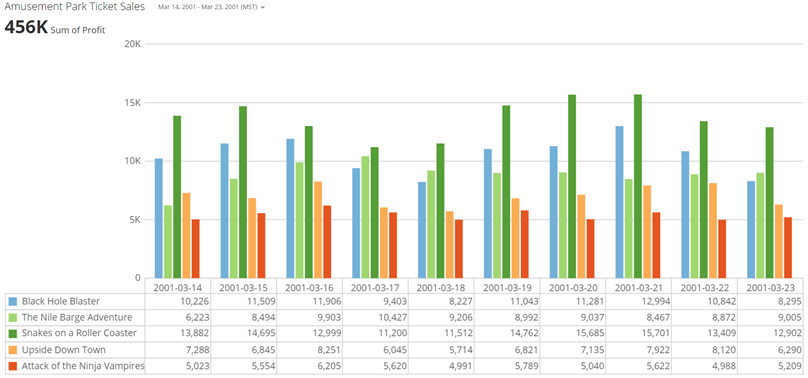
<table border="1" cellpadding="1" cellspacing="1" data-aura-rendered-by="33:209;a"><thead><tr><th colspan="1" rowspan="1"><p> Property </p></th><th colspan="1" rowspan="1"><p> Description </p></th><th colspan="1" rowspan="1"><p> Examples </p></th></tr></thead><tbody><tr><td colspan="1" rowspan="1"><p> Show Data Table </p></td><td colspan="1" rowspan="1"><p /><p> Allows you to include a data table under your chart. This data table appears in the Details view of the chart (though <em> not </em> in the page view). This property is available for most vertical chart types. </p><p> The example at right shows a chart in which the data table option has been enabled. <a id="gradient_colors" target="_blank" /></p><p /></td><td colspan="1" rowspan="1"><p><a href="/s/article/360043429793" target="_blank" title="Properties Available for Most Charts"><img alt="data_table_example.png" src="https://mintcdn.com/domoinc-openapi-sync-dataflows/3WBVqiq9QkFE9G7d/images/kb/ka05w00000129u4-00N5w00000Ri7BU-0EM5w000005vOk3.png?fit=max&auto=format&n=3WBVqiq9QkFE9G7d&q=85&s=f84e4917fa8fef8444c88360b0569768" width="808" height="378" data-path="images/kb/ka05w00000129u4-00N5w00000Ri7BU-0EM5w000005vOk3.png" /></a></p></td></tr><tr><td colspan="1" rowspan="1"><p> Auto Abbreviate Values </p></td><td colspan="1" rowspan="1"><p> Allows you to abbreviate values in the data table. </p></td><td colspan="1" rowspan="1"><p> — </p></td></tr></tbody></table>

### Gradient Colors

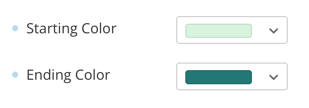
Gradient colors preserve your chart's base color and allow you to visualize differences in values. Gradient colors are supported by over 150 chart types. To configure them, choose a supported chart type in Analyzer, and then go to **Chart Properties** > **Gradient Colors** in the left menu and choose a start and end color from your instance palette. You can choose to use any color, including gray.

<table border="1" cellpadding="1" cellspacing="1" data-aura-rendered-by="33:209;a"><thead><tr><th colspan="1" rowspan="1"><p> Property </p></th><th colspan="1" rowspan="1"><p> Description </p></th><th colspan="1" rowspan="1"><p> Example </p></th></tr></thead><tbody><tr><td colspan="1" rowspan="1"><p> Use Gradient Colors </p></td><td colspan="1" rowspan="1"><p> Toggles using gradient colors on and off. </p></td><td colspan="1" rowspan="1"><p><img alt="Screenshot 2023-10-16 at 12.30.33 PM.png" src="https://mintcdn.com/domoinc-openapi-sync-dataflows/AxiXLKkg9sLcFgsR/images/kb/ka0Vq0000006Gmr-00N5w00000Ri7BU-0EM5w000006w93q.jpg?fit=max&auto=format&n=AxiXLKkg9sLcFgsR&q=85&s=e5cadca3f2594137eaa60fce1427a6b3" style={{width: 231.996, height: 61.9957}} width="444" height="118" data-path="images/kb/ka0Vq0000006Gmr-00N5w00000Ri7BU-0EM5w000006w93q.jpg" /></p></td></tr><tr><td colspan="1" rowspan="1"><p> Reverse Direction </p></td><td colspan="1" rowspan="1"><p> Reverses the direction that the gradient is applied. </p></td><td colspan="1" rowspan="1"><p><img alt="Screenshot 2023-10-16 at 12.31.22 PM.png" src="https://mintcdn.com/domoinc-openapi-sync-dataflows/AxiXLKkg9sLcFgsR/images/kb/ka0Vq0000006Gmr-00N5w00000Ri7BU-0EM5w000006w945.jpg?fit=max&auto=format&n=AxiXLKkg9sLcFgsR&q=85&s=b6432d4de6cf4e5748bf56000a5c1890" style={{width: 231.996, height: 61.9957}} width="450" height="120" data-path="images/kb/ka0Vq0000006Gmr-00N5w00000Ri7BU-0EM5w000006w945.jpg" /></p></td></tr><tr><td colspan="1" rowspan="1"><p> Order By Value </p></td><td colspan="1" rowspan="1"><p> When set, the gradient colors are applied to elements by greatest to least value. <a id="context_sensitive" target="_blank" /></p></td><td colspan="1" rowspan="1"><p><InlineImage src="/images/kb/ka0Vq0000006Gmr-00N5w00000Ri7BU-0EM5w000006w94P.jpg" /></p></td></tr><tr><td colspan="1" rowspan="1"><p> Starting/Ending Color </p></td><td colspan="1" rowspan="1"><p> Use the color picker to choose starting/ending colors and opacity levels. </p></td><td colspan="1" rowspan="1"><p /><p><img alt="Screenshot 2023-10-16 at 12.36.12 PM.png" src="https://mintcdn.com/domoinc-openapi-sync-dataflows/AxiXLKkg9sLcFgsR/images/kb/ka0Vq0000006Gmr-00N5w00000Ri7BU-0EM5w000006w94U.jpg?fit=max&auto=format&n=AxiXLKkg9sLcFgsR&q=85&s=581eb0ebef470586a6506f489b6a17c9" style={{width: 243.999, height: 85}} width="612" height="214" data-path="images/kb/ka0Vq0000006Gmr-00N5w00000Ri7BU-0EM5w000006w94U.jpg" /></p><p /></td></tr></tbody></table>

### Context Sensitive Chart Properties

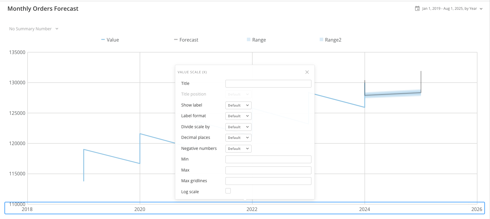
Context Sensitive Chart Properties in Analyzer allow you to right-click on chart elements and see the list of applicable chart properties.

For example, if you right-click on the x-axis of your chart, the **Value Scale (x)** setting displays and allows you to configure the x-axis.

Context Sensitive

<Frame>
  <img alt="Screenshot 2025-01-07 at 8.44.54 AM.png" src="https://mintcdn.com/domoinc-openapi-sync-dataflows/AxiXLKkg9sLcFgsR/images/kb/ka0Vq0000006Gmr-00N5w00000Ri7BU-0EMVq000004g0nh.jpg?fit=max&auto=format&n=AxiXLKkg9sLcFgsR&q=85&s=ab3b16051e21fd25fd88e39397be023d" style={{width: 879, height: 393}} width="1652" height="738" data-path="images/kb/ka0Vq0000006Gmr-00N5w00000Ri7BU-0EMVq000004g0nh.jpg" />
</Frame>

Context Sensitive Chart Properties are available on any chart element that can be configured in Analyzer.

### Full Size Settings
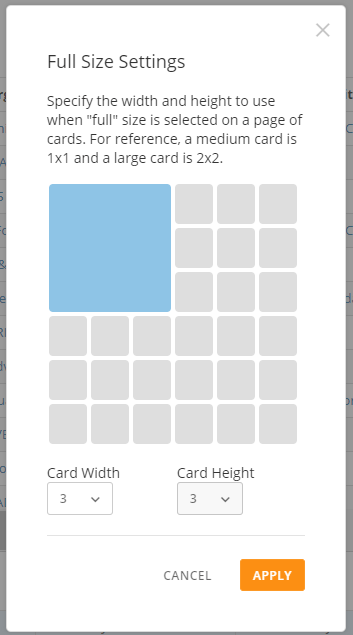
<table border="1" cellpadding="1" cellspacing="1" data-aura-rendered-by="33:209;a"><thead><tr><th colspan="1" rowspan="1"><p> Property </p></th><th colspan="1" rowspan="1"><p> Description </p></th><th colspan="1" rowspan="1"><p> Example </p></th></tr></thead><tbody><tr><td colspan="1" rowspan="1"><p> Full Size Settings </p></td><td colspan="1" rowspan="1"><p> Allows you to set custom sizing on tables in the card view when the "Full Size" option is selected—anywhere from 1 to 6 card sizes in both width and height. For more information about card sizing, see <a href="/s/article/360042923594" target="_blank" title="Changing the Size of Cards in a Page"> Changing the Size of Cards in a Page </a>. </p><p> The first table in the example at right shows a table in the card view that has been set to a 4-card width by a 1-card height. The second table has been set to a 3-card width by a 3-card height. </p></td><td colspan="1" rowspan="1"><p><a class="thumb" href="/s/article/360043429793" target="_blank" title="@api/deki/files/4718/table_card_resize_rn.png"><img alt="table_card_resize_rn.png" src="https://mintcdn.com/domoinc-openapi-sync-dataflows/wtd4JXYHIy_vlcIx/images/kb/ka05w00000129v8-00N5w00000Ri7BU-0EM5w000005vOm4.png?fit=max&auto=format&n=wtd4JXYHIy_vlcIx&q=85&s=ed176f1d962303d61b8661fbc0b6c267" width="353" height="635" data-path="images/kb/ka05w00000129v8-00N5w00000Ri7BU-0EM5w000005vOm4.png" /></a></p></td></tr></tbody></table>