> ## Documentation Index
> Fetch the complete documentation index at: https://domoinc-openapi-sync-dataflows.mintlify.site/llms.txt
> Use this file to discover all available pages before exploring further.
# Changing the Default Colors in Your Chart
## Intro
In maps, heat map tables, and many chart types, you can change the default color settings in the **Chart Properties**.
Colors in maps are determined by "color themes," in which different shades of the same color are used to represent different ranges. For example, if the color theme was set to green, all of the ranges would be represented by different shades of green. The default color theme is orange, but you can change to any of a number of different color themes.
## Changing colors in maps and heat maps
You can change the colors in maps and heat maps by configuring the **Theme** property.
**To change the color theme in a map or heat map,**
1. Open Analyzer for the map you want to edit.
2. In **Chart Properties**, click **Theme**.
3. Select the desired color theme in the dropdown menu.
## Changing colors in other chart types
You can change the chart colors by setting color rules in your card. See [Setting Color Rules for a Chart](/s/article/360043428813) for more information.
## Creating a multi-color bar graph
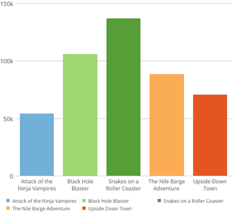
By default, all the bars in a one-series Bar graph are the same color. You can assign each bar to be a different color by simply dragging the same column into both the category and series fields and setting your series to **No Aggregation**. The resulting graph may look similar to the following:
 For more information about data columns, see [Applying DataSet Columns to Your Chart](/s/article/360043428713 "Applying DataSet Columns to Your Chart").
## Controlling chart colors using Beast Mode
You can control when certain colors appear in a chart by creating [Beast Mode calculations](/s/article/360043429913) and then assigning colors to series in the **Chart Properties**.
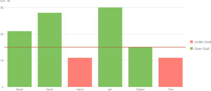
For example, you may want to create a chart in which categories that surpass a goal-line appear green and those that fall below the goal line appear red, as in the following screenshot:
For more information about data columns, see [Applying DataSet Columns to Your Chart](/s/article/360043428713 "Applying DataSet Columns to Your Chart").
## Controlling chart colors using Beast Mode
You can control when certain colors appear in a chart by creating [Beast Mode calculations](/s/article/360043429913) and then assigning colors to series in the **Chart Properties**.
For example, you may want to create a chart in which categories that surpass a goal-line appear green and those that fall below the goal line appear red, as in the following screenshot:
 **To create a chart with colors using Beast Mode,**
1. In Analyzer, select a multi-series chart type from the chart type picker (such as Vertical Stacked Bar).
2. Apply a value column to the chart (such as "Actual").
For more information about applying data columns to a chart, see [Applying DataSet Columns to Your Chart](/s/article/360043428713 "Applying DataSet Columns to Your Chart").
3. Click the value column you just placed to open the additional options pane for the column.
4. Enter a goal value in the **Goal** field. A goal-line appears on your chart.
5. Apply a category value to the chart (such as "Name").
6. Click **Beast Mode**.
7. In **Calculated Field Name**, enter a title indicating that this calculation refers to values over the goal line (such as "Over Goal").
8. In the **Formula** field, enter a Beast Mode calculation similar to the following:
**To create a chart with colors using Beast Mode,**
1. In Analyzer, select a multi-series chart type from the chart type picker (such as Vertical Stacked Bar).
2. Apply a value column to the chart (such as "Actual").
For more information about applying data columns to a chart, see [Applying DataSet Columns to Your Chart](/s/article/360043428713 "Applying DataSet Columns to Your Chart").
3. Click the value column you just placed to open the additional options pane for the column.
4. Enter a goal value in the **Goal** field. A goal-line appears on your chart.
5. Apply a category value to the chart (such as "Name").
6. Click **Beast Mode**.
7. In **Calculated Field Name**, enter a title indicating that this calculation refers to values over the goal line (such as "Over Goal").
8. In the **Formula** field, enter a Beast Mode calculation similar to the following:
`CASE`
`when ``MyColumn`` >= 'GoalValue' then ``MyColumn`` else 0`
`end `
where `MyColumn` is the name of the column containing your actual data and `GoalValue` is the value you entered.
9. Click **Save & Close**.
10. Click **Beast Mode**.
11. In **Calculated Field Name**, enter a title indicating that this calculation refers to values under the goal line (such as "Under Goal").
12. In the **Formula** field, enter a Beast Mode calculation similar to the following:
`CASE`
`when ``MyColumn`` < ``'GoalValue'`` then ``MyColumn`` else 0`
`end `
where `MyColumn` is the name of the column containing your actual data and `GoalValue` is the value you entered.
13. Click **Save & Close**.
14. In your chart, replace the value column you applied to the chart with the "Over Goal" column you created.
15. Add the "Under Goal" column you created as the series for the chart.
16. In **Chart Properties**, click **Colors**.
17. For **Series 1**, select the color you want to see for all categories that surpass the goal line.
18. For **Series 2**, select the color you want to see for all categories that fall under the goal line.
You can use these same techniques to create similar kinds of charts. For example, you could create a chart in which each category has its own unique goal, and different colors would appear depending on whether each category met its own goal.
For more tips and tricks in Beast Mode, see Sample Beast Mode Calculations.