 ***
### Power a Progress Bar Gauge
A Progress Bar gauge requires three columns or rows of data from your DataSet—one contains the current value of the gauge, one contains the maximum value, and the other contains the label that appears above the gauge. If multiple rows are present, only the data from the first row is used; all the others are ignored. If the first category contains more than one series, the series are aggregated to yield a single value for the gauge. Be aware that this aggregates the values for the maximum value column as well. For example, if your spreadsheet included two rows for "Team A" that both had a maximum value of 100, these would be aggregated in your chart to yield a new maximum value of 200. Selecting **No Aggregation** for either the current value or maximum does *not* currently work.
For information about value, category, and series data, see [Understanding Chart Data](/s/article/360043428693 "Understanding Chart Data").
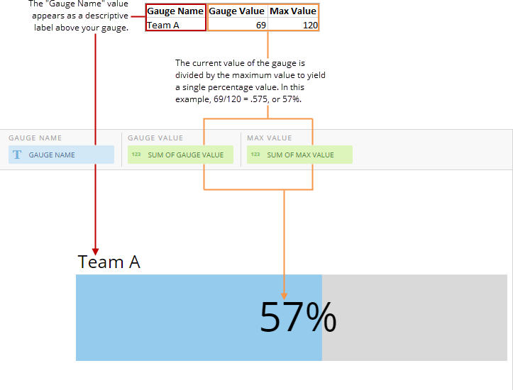
The following graphic shows you how the data from the category and value columns in a typical column-based spreadsheet is converted into a Progress Bar gauge:
***
### Power a Progress Bar Gauge
A Progress Bar gauge requires three columns or rows of data from your DataSet—one contains the current value of the gauge, one contains the maximum value, and the other contains the label that appears above the gauge. If multiple rows are present, only the data from the first row is used; all the others are ignored. If the first category contains more than one series, the series are aggregated to yield a single value for the gauge. Be aware that this aggregates the values for the maximum value column as well. For example, if your spreadsheet included two rows for "Team A" that both had a maximum value of 100, these would be aggregated in your chart to yield a new maximum value of 200. Selecting **No Aggregation** for either the current value or maximum does *not* currently work.
For information about value, category, and series data, see [Understanding Chart Data](/s/article/360043428693 "Understanding Chart Data").
The following graphic shows you how the data from the category and value columns in a typical column-based spreadsheet is converted into a Progress Bar gauge:
 ### Unique Properties — Progress Bar Gauge
You can customize the appearance of a Progress Bar gauge by editing its chart properties. This table describes the properties unique to Progress Bar gauges. For information about other available properties, see [Properties for Gauges](/s/article/360042925354 "Chart Properties").
### Unique Properties — Progress Bar Gauge
You can customize the appearance of a Progress Bar gauge by editing its chart properties. This table describes the properties unique to Progress Bar gauges. For information about other available properties, see [Properties for Gauges](/s/article/360042925354 "Chart Properties").
Property
Description
Example
General > Hide Label
When set, the items will be laid out in a single column.
—
General > Label
The text displayed above the progress bar. The default is %\_SERIES\_NAME.
—
General > Show Indicator
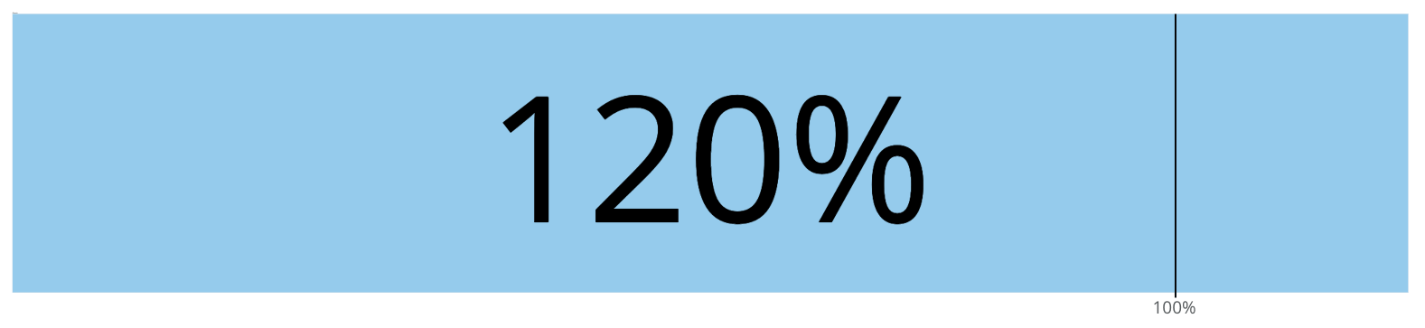
When the General > Allow over 100% property is enabled, this setting displays an indicator to show the position of 100% on the gauge.
Learn about General > Allow over 100% and other shared properties for gauges .