 #### Header Row Properties
* **Header Fill Color** — Select a background color for the header row of your table. If you select **Default**, no color is used.
Note that the names in the upper-left corner of your Pivot Table are considered both row and column names. If you select both a **Header Row** fill color and a **Header Column** fill color, the **Header Row** fill color takes precedence.
#### Header Row Properties
* **Header Fill Color** — Select a background color for the header row of your table. If you select **Default**, no color is used.
Note that the names in the upper-left corner of your Pivot Table are considered both row and column names. If you select both a **Header Row** fill color and a **Header Column** fill color, the **Header Row** fill color takes precedence.
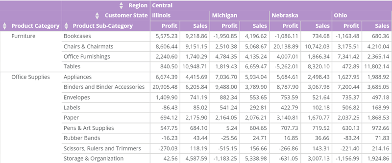 * **Header Font Color** — Select the text color for the column names in your header row. This color overrides the table font color set in **General** > **Font Color**.
Note that the names in the upper-left corner of your Pivot Table are considered both row and column names. If you specify both a **Header Row** font color and a **Header Column** font color, the **Header Row** font color takes precedence.
For example, if you set the general font color to blue and the header row font color to red, the header row font color displays as red instead of blue. If you then select **Default**, the header row color reverts to blue.
* **Header Font Color** — Select the text color for the column names in your header row. This color overrides the table font color set in **General** > **Font Color**.
Note that the names in the upper-left corner of your Pivot Table are considered both row and column names. If you specify both a **Header Row** font color and a **Header Column** font color, the **Header Row** font color takes precedence.
For example, if you set the general font color to blue and the header row font color to red, the header row font color displays as red instead of blue. If you then select **Default**, the header row color reverts to blue.
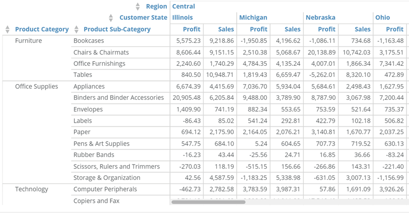 * **Header Alignment** — Select the alignment (left, center, or right) for the column names in the header row. The default setting is **Left**.
Note that the names in the upper-left corner of your Pivot Table are considered both row and column names. If you specify both a **Header Row** alignment and a **Header Column** alignment, the **Header Row** alignment takes precedence.
In the example below, the column names are centered.
* **Header Alignment** — Select the alignment (left, center, or right) for the column names in the header row. The default setting is **Left**.
Note that the names in the upper-left corner of your Pivot Table are considered both row and column names. If you specify both a **Header Row** alignment and a **Header Column** alignment, the **Header Row** alignment takes precedence.
In the example below, the column names are centered.
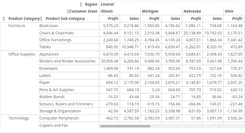
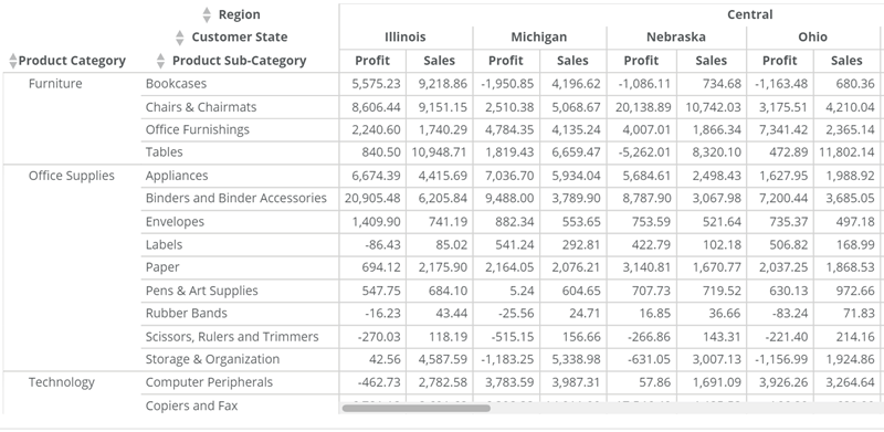 * **Header Font Style** — Select the font style (bold, italic, or bold-italic) for the column names in the header row. The default setting is **Bold**.
Note that the names in the upper-left corner of your Pivot Table are considered both row and column names. If you specify both a **Header Row** font style and a **Header Column** font style, the **Header Row** font style takes precedence.
In the example below, the font style is **Bold-Italic**.
* **Header Font Style** — Select the font style (bold, italic, or bold-italic) for the column names in the header row. The default setting is **Bold**.
Note that the names in the upper-left corner of your Pivot Table are considered both row and column names. If you specify both a **Header Row** font style and a **Header Column** font style, the **Header Row** font style takes precedence.
In the example below, the font style is **Bold-Italic**.
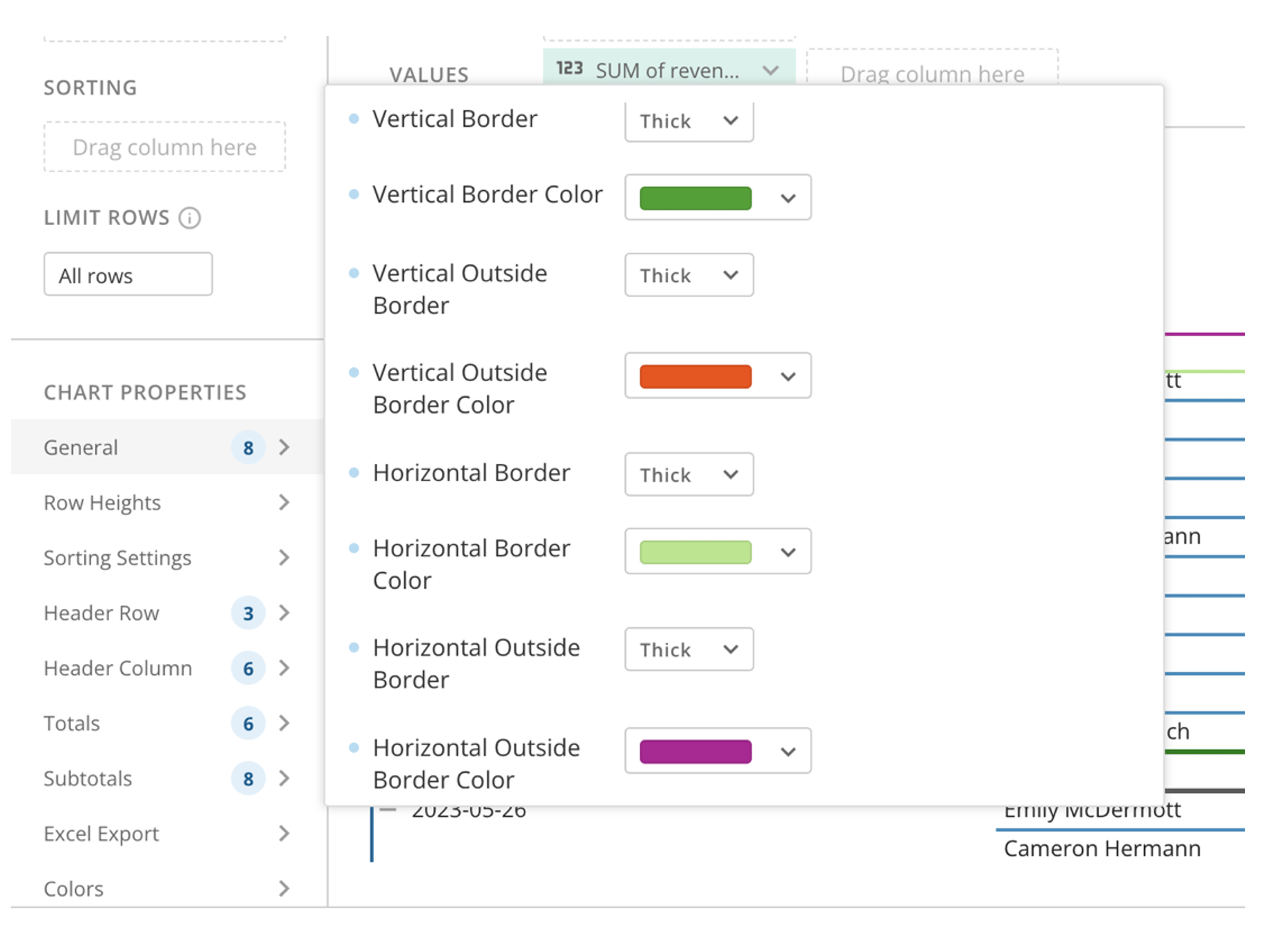
 * Header Row Border Properties — There are several header row properties for border width and color available for Pivot Tables. Learn about these
[border properties](https://domo-support.domo.com/s/article/360043429573?language=en_US#header_row_border_properties).
#### Header Column Properties
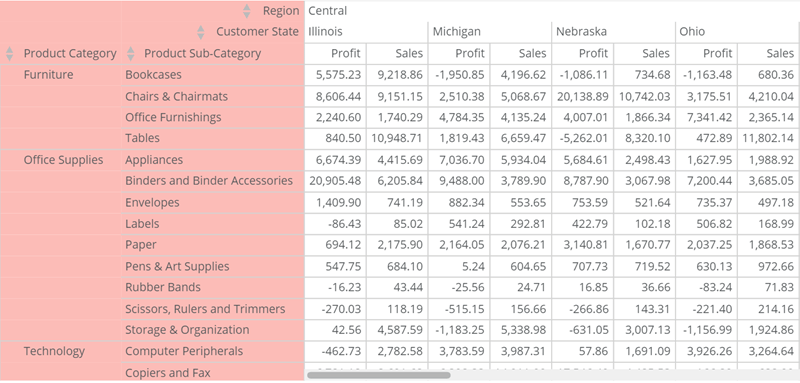
* **Header Fill Color** — Select a background color for the header column of your table. If you select **Default**, no color is used.
Note that the names in the upper-left corner of your Pivot Table are considered both row and column names. If you specify both a **Header Row** fill color and a **Header Column** fill color, the **Header Row** fill color takes precedence.
* Header Row Border Properties — There are several header row properties for border width and color available for Pivot Tables. Learn about these
[border properties](https://domo-support.domo.com/s/article/360043429573?language=en_US#header_row_border_properties).
#### Header Column Properties
* **Header Fill Color** — Select a background color for the header column of your table. If you select **Default**, no color is used.
Note that the names in the upper-left corner of your Pivot Table are considered both row and column names. If you specify both a **Header Row** fill color and a **Header Column** fill color, the **Header Row** fill color takes precedence.
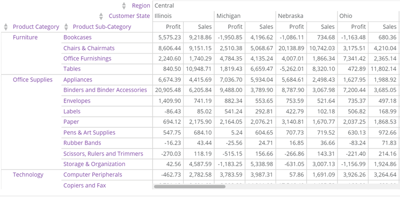
 * **Header Font Color** — Select the text color for the row names in your header column. This color overrides the table font color set in **General** > **Font Color**.
Note that the names in the upper-left corner of your Pivot Table are considered both row and column names. If you specify both a **Header Row** font color and a **Header Column** font color, the **Header Row** font color takes precedence.
For example, if you set the general font color to blue and the header row font color to red, the header row font color displays as red instead of blue. If you then select **Default**, the header row color reverts to blue.
* **Header Font Color** — Select the text color for the row names in your header column. This color overrides the table font color set in **General** > **Font Color**.
Note that the names in the upper-left corner of your Pivot Table are considered both row and column names. If you specify both a **Header Row** font color and a **Header Column** font color, the **Header Row** font color takes precedence.
For example, if you set the general font color to blue and the header row font color to red, the header row font color displays as red instead of blue. If you then select **Default**, the header row color reverts to blue.
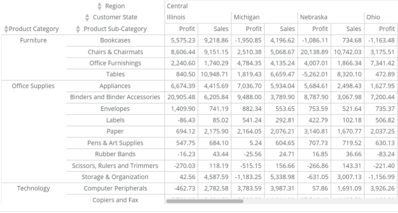
 * **Header Alignment** — Select the alignment (left, center, or right) for the column names in the header column. The default setting is **Left**.
Note that the names in the upper-left corner of your Pivot Table are considered both row and column names. If you specify both a **Header Row** alignment and a **Header Column** alignment, the **Header Row** alignment takes precedence.
In the example below, the row names are centered.
* **Header Alignment** — Select the alignment (left, center, or right) for the column names in the header column. The default setting is **Left**.
Note that the names in the upper-left corner of your Pivot Table are considered both row and column names. If you specify both a **Header Row** alignment and a **Header Column** alignment, the **Header Row** alignment takes precedence.
In the example below, the row names are centered.
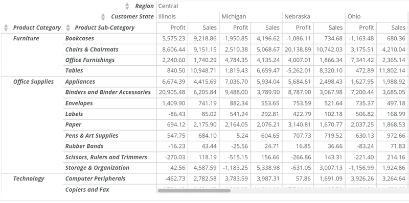
 * **Header Font Style** — Select the font style (bold, italic, or bold-italic) for the row names in the header column. The default setting is **Bold**.
Note that the names in the upper-left corner of your Pivot Table are considered both row and column names. If you specify both a **Header Row** font style and a **Header Column** font style, the **Header Row** font style takes precedence.
In the example below, the font style is **Bold-Italic**.
* **Header Font Style** — Select the font style (bold, italic, or bold-italic) for the row names in the header column. The default setting is **Bold**.
Note that the names in the upper-left corner of your Pivot Table are considered both row and column names. If you specify both a **Header Row** font style and a **Header Column** font style, the **Header Row** font style takes precedence.
In the example below, the font style is **Bold-Italic**.
 #### Totals Properties
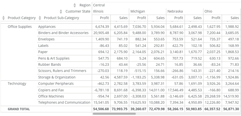
* **Show Total Row —** Add a **Grand Total** row to the bottom of your table. This row sums all value columns and counts any string and date/time columns you added to the **Values** region.
#### Totals Properties
* **Show Total Row —** Add a **Grand Total** row to the bottom of your table. This row sums all value columns and counts any string and date/time columns you added to the **Values** region.
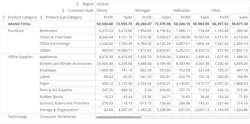
 * **Total Row Position** **—** Specify whether the total row displays after the data rows in your table (default) or before the rows, at the top. This property is available only when the **Totals** > **Show Totals Row** checkbox is selected.
The example below shows a table with the total row placed before the data rows.
* **Total Row Position** **—** Specify whether the total row displays after the data rows in your table (default) or before the rows, at the top. This property is available only when the **Totals** > **Show Totals Row** checkbox is selected.
The example below shows a table with the total row placed before the data rows.
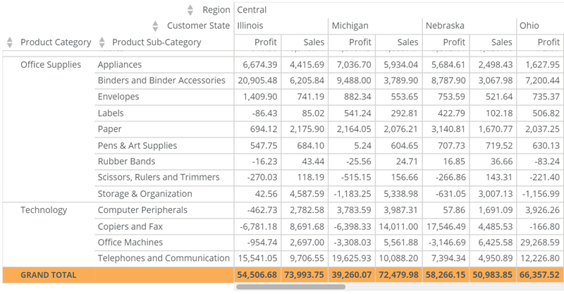
 * **Total Row Fill Color** **—** Select a background color for the total row in your table. If you select **Default**, no color is used. This property is available only when the **Totals** > **Show Total Row** checkbox is selected.
 * **Total Row Font Color —** Select the text color for the content in your total row. This color overrides the table font color set in **General** > **Font Color**, and this property is available only when the **Totals** > **Show Total Row** checkbox is selected.
For example, if you set the general font color to blue and the total row font color to red, the total row font color displays as red instead of blue. If you then select **Default**, the total row color reverts to blue.
* **Total Row Font Color —** Select the text color for the content in your total row. This color overrides the table font color set in **General** > **Font Color**, and this property is available only when the **Totals** > **Show Total Row** checkbox is selected.
For example, if you set the general font color to blue and the total row font color to red, the total row font color displays as red instead of blue. If you then select **Default**, the total row color reverts to blue.
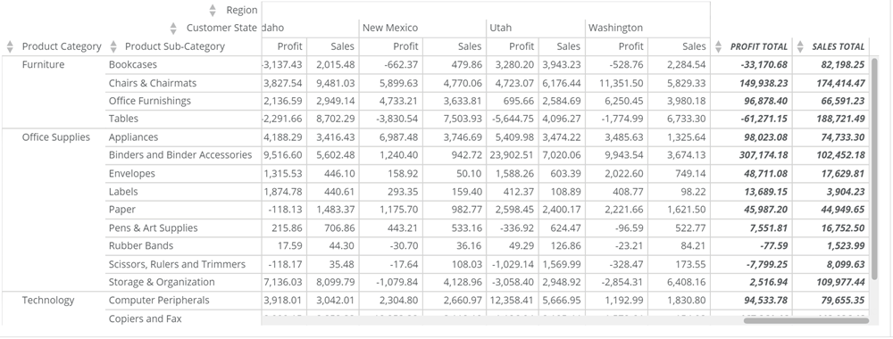
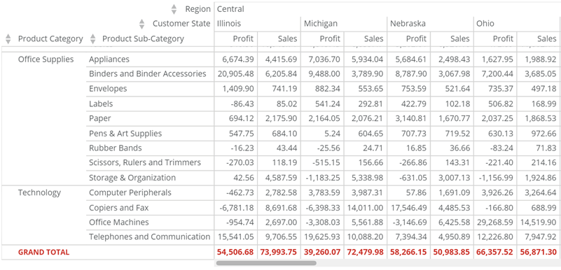 * **Show Total Column** **—** On the right side of your table, add separate totals columns for each column you have dragged into the **Values** region above the chart preview. Each column sums all value columns and counts any string and date/time columns you added to the **Values** region.
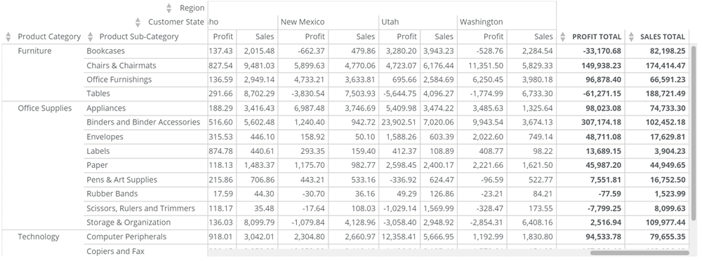
In the example below, a total column displays for both "Profit" and "Sales."
* **Show Total Column** **—** On the right side of your table, add separate totals columns for each column you have dragged into the **Values** region above the chart preview. Each column sums all value columns and counts any string and date/time columns you added to the **Values** region.
In the example below, a total column displays for both "Profit" and "Sales."
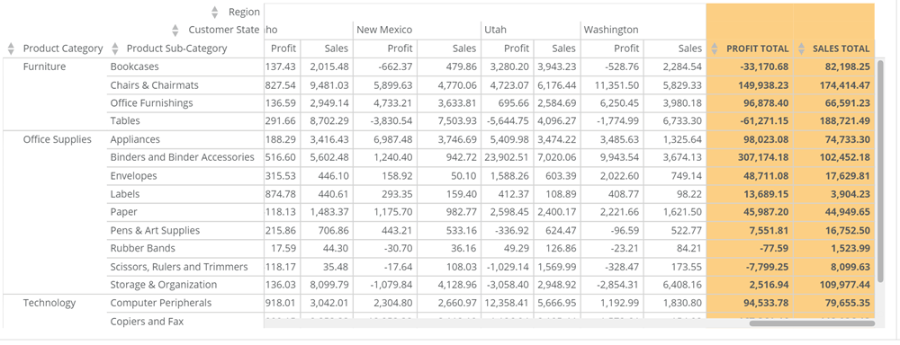
 * **Total Column Fill Color —** Select a background color for the total column(s) in your table. If you select **Default**, no color is used. This property is available only when the **Totals** > **Show Total Column** checkbox is selected.
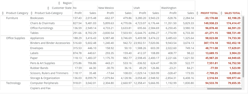
 * **Total Column Font Color —** Select the text color for the content in your total column(s). This color overrides the table font color applied in **General** > **Font Color**, and this property is available only when the **Totals > Show Total Column** checkbox is selected.
For example, if you set the general font color to blue and the total row font color to red, the total column font color displays as red instead of blue. If you then select **Default**, the total column color reverts to blue.
* **Total Column Font Color —** Select the text color for the content in your total column(s). This color overrides the table font color applied in **General** > **Font Color**, and this property is available only when the **Totals > Show Total Column** checkbox is selected.
For example, if you set the general font color to blue and the total row font color to red, the total column font color displays as red instead of blue. If you then select **Default**, the total column color reverts to blue.
 * **Total Column Font Style** **—** Select the font style (bold, italic, bold-italic, or underline) for the cells in the total column(s). The default setting is **Bold**, and this property is only available when the **Totals** > **Show Total Column** checkbox is selected.
In the example below, the font style is **Bold-Italic**.
* **Total Column Font Style** **—** Select the font style (bold, italic, bold-italic, or underline) for the cells in the total column(s). The default setting is **Bold**, and this property is only available when the **Totals** > **Show Total Column** checkbox is selected.
In the example below, the font style is **Bold-Italic**.
 #### Subtotals Properties
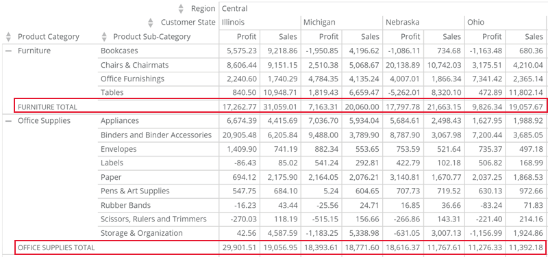
* **Show Subtotal Rows** **—** Add subtotal rows to your Pivot Table. Subtotal rows sum all value columns are summed and count any string and date/time columns you added to the **Values** field. One subtotal row displays for each of the primary **Rows** groupings in your table.
In the example below, one such row displays for the "Furniture" grouping and another for the "Office Supplies" grouping.
#### Subtotals Properties
* **Show Subtotal Rows** **—** Add subtotal rows to your Pivot Table. Subtotal rows sum all value columns are summed and count any string and date/time columns you added to the **Values** field. One subtotal row displays for each of the primary **Rows** groupings in your table.
In the example below, one such row displays for the "Furniture" grouping and another for the "Office Supplies" grouping.
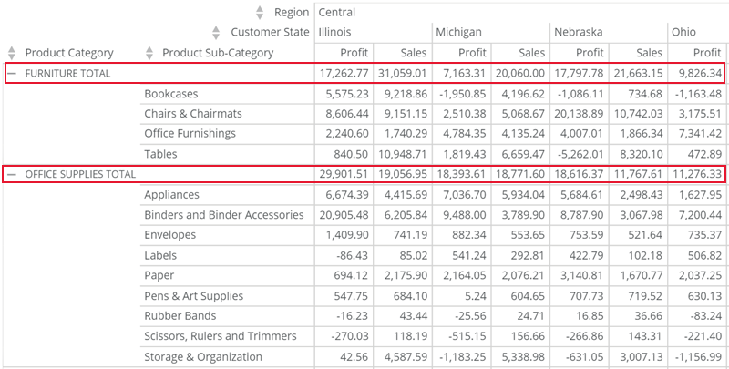
 * **Subtotal Row Position** **—** Specify whether subtotal rows display after the data rows in your table (default) or before the rows, at the top of each grouping. This property is available only when the **Subtotals** > **Show Subtotals Row** checkbox is selected.
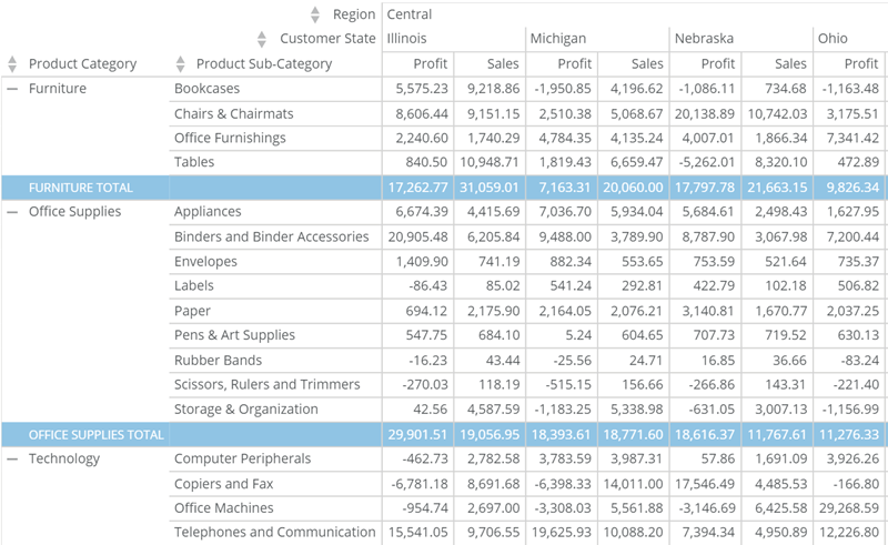
 * **Subtotal Row Fill Color —** Select a background color for the subtotal rows in your table. If you select **Default**, no color is used. This property is only available when the **Subtotals** > **Show Subtotal Rows** checkbox is selected.
 * **Subtotal Row Font Color —** Select the text color for the content in your subtotal rows. This color overrides the table font color set in **General** > **Font Color**, and this property is only available when the **Subtotals** > **Show Subtotal Rows** checkbox is selected.
For example, if you set the general font color to blue and the subtotal row font color to red, the subtotal row font color displays as red instead of blue. If you then select **Default**, the subtotal row color reverts to blue.
* **Subtotal Row Font Color —** Select the text color for the content in your subtotal rows. This color overrides the table font color set in **General** > **Font Color**, and this property is only available when the **Subtotals** > **Show Subtotal Rows** checkbox is selected.
For example, if you set the general font color to blue and the subtotal row font color to red, the subtotal row font color displays as red instead of blue. If you then select **Default**, the subtotal row color reverts to blue.
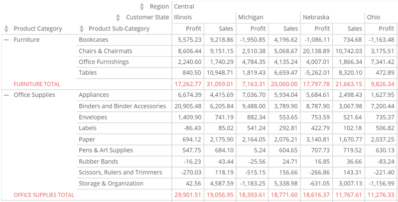 * **Subtotal Row Font Style —** Select the font style (bold, italic, bold-italic, or underline) for the text in the subtotal rows. The default setting is **Bold**, and this property is only available when the **Subtotals** > **Show Subtotal Rows** checkbox is selected.
In the example below, the font style is **Bold-Italic**.
* **Subtotal Row Font Style —** Select the font style (bold, italic, bold-italic, or underline) for the text in the subtotal rows. The default setting is **Bold**, and this property is only available when the **Subtotals** > **Show Subtotal Rows** checkbox is selected.
In the example below, the font style is **Bold-Italic**.
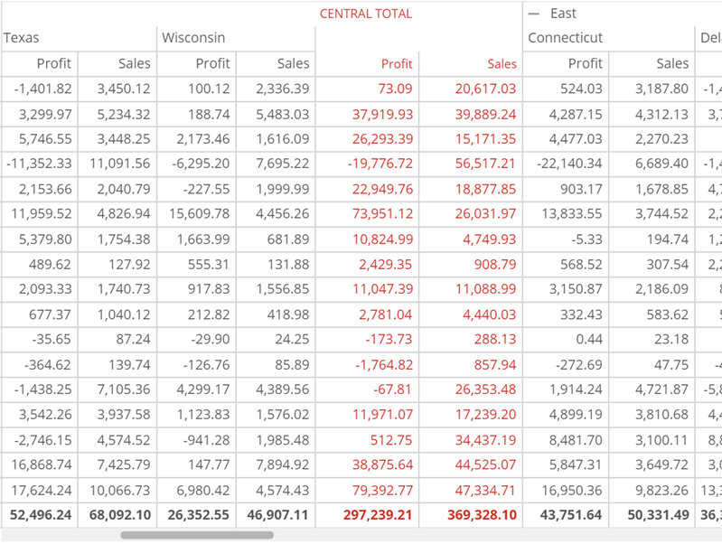
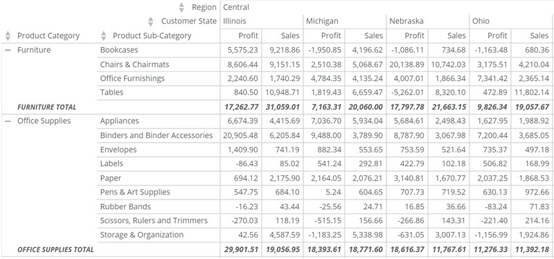 * **Show Subtotal Columns —** Add subtotal columns to your Pivot Table. Subtotal columns sum all value columns and count any string and date/time columns you added to the **Values** field. One subtotal column displays for each of the primary **Columns** groupings in your table.
In the example below, one such column displays for the "Central" regional grouping.
* **Show Subtotal Columns —** Add subtotal columns to your Pivot Table. Subtotal columns sum all value columns and count any string and date/time columns you added to the **Values** field. One subtotal column displays for each of the primary **Columns** groupings in your table.
In the example below, one such column displays for the "Central" regional grouping.
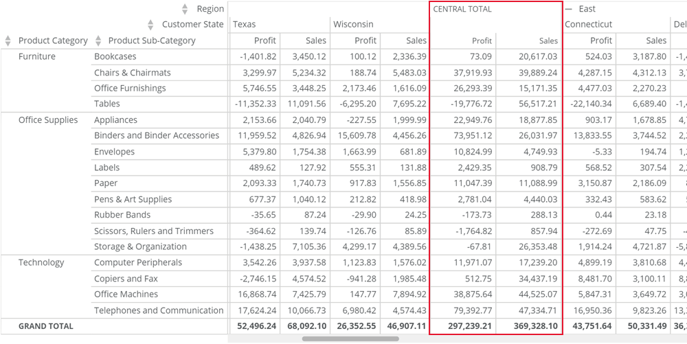 * **Subtotal Column Fill Color** **—** Select a background color for the subtotal columns in your table. If you select **Default**, no color is used. This property is available only when the **Subtotals** > **Show Subtotal Columns** checkbox is selected.
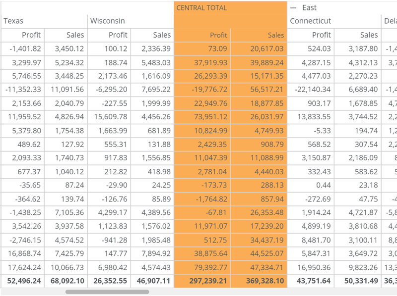 * **Subtotal Column Font Color —** Select the text color for the content in your subtotal columns. This color overrides the table font color set in **General** > **Font Color**, and this property is available only when the **Subtotals** > **Show Subtotal Columns** checkbox is selected.
For example, if you set the general font color to blue and the subtotal column font color to red, the subtotal column font color displays as red instead of blue. If you then select **Default**, the subtotal column color reverts to blue.
* **Subtotal Column Font Color —** Select the text color for the content in your subtotal columns. This color overrides the table font color set in **General** > **Font Color**, and this property is available only when the **Subtotals** > **Show Subtotal Columns** checkbox is selected.
For example, if you set the general font color to blue and the subtotal column font color to red, the subtotal column font color displays as red instead of blue. If you then select **Default**, the subtotal column color reverts to blue.
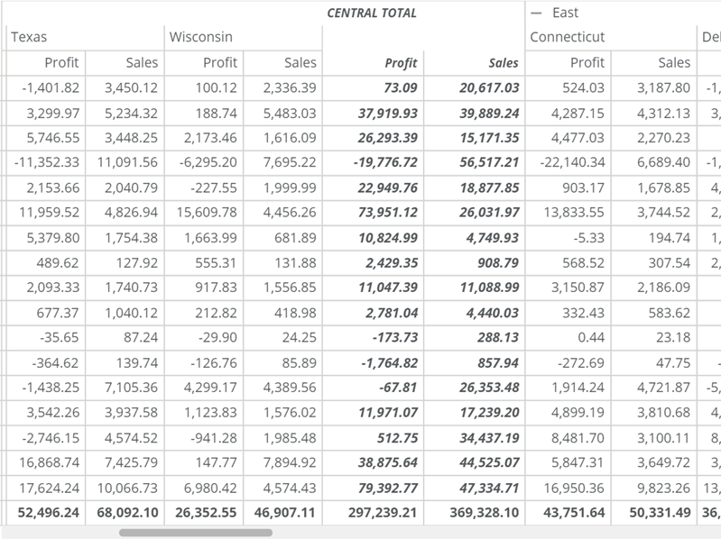
 * **Subtotal Column Font Style —** Select the font style (bold, italic, bold-italic, or underline) for the text in the subtotal columns. The default setting is **Bold**, and this property is available only when the **Subtotals** > **Show Subtotal Columns** checkbox is selected.
In the example below, the font style is **Bold-Italic**.
* **Subtotal Column Font Style —** Select the font style (bold, italic, bold-italic, or underline) for the text in the subtotal columns. The default setting is **Bold**, and this property is available only when the **Subtotals** > **Show Subtotal Columns** checkbox is selected.
In the example below, the font style is **Bold-Italic**.
 * **Suppress Single Item Subtotals —** Hide subtotals for all groupings that contain only one item.
# Specify Table Labels
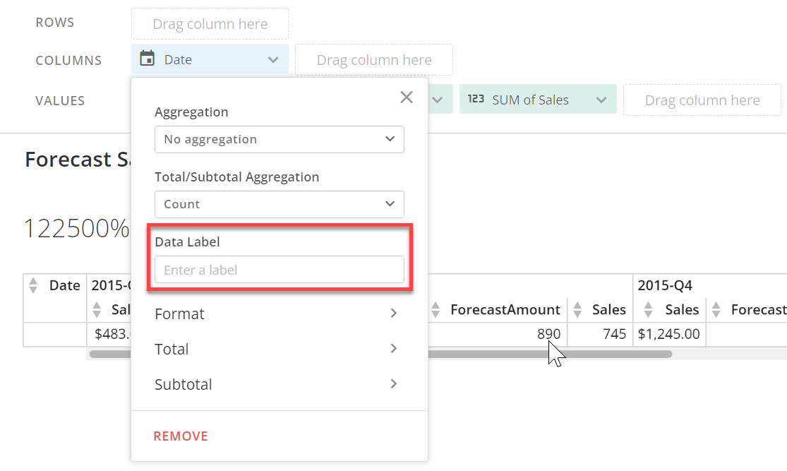
To change the label that displays for any column or row in your table, follow these steps:
1. In the fields region above the chart, select the column for which you want to change the label.
2. Enter your desired label in the **Data Label** field.
* **Suppress Single Item Subtotals —** Hide subtotals for all groupings that contain only one item.
# Specify Table Labels
To change the label that displays for any column or row in your table, follow these steps:
1. In the fields region above the chart, select the column for which you want to change the label.
2. Enter your desired label in the **Data Label** field.
 # Change the Aggregation Type for a Column
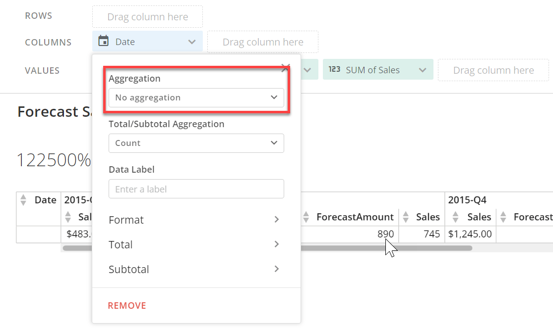
All similar rows in a DataSet are automatically aggregated in a Pivot Table. The default aggregation is **Sum**, which sums the values for similar rows in a given column.
You can change the aggregation type for a column to any of the following:
# Change the Aggregation Type for a Column
All similar rows in a DataSet are automatically aggregated in a Pivot Table. The default aggregation is **Sum**, which sums the values for similar rows in a given column.
You can change the aggregation type for a column to any of the following:
Aggregation Type | Description |
|---|---|
Sum | Adds the values in similar rows. |
Minimum | Displays the lowest value in similar rows. |
Maximum | Displays the highest value in similar rows. |
Average | Displays the average value of all similar rows. |
Count | Displays the number of similar rows. For dimensional columns, this is the only available aggregation type. |
 # Use Case #2
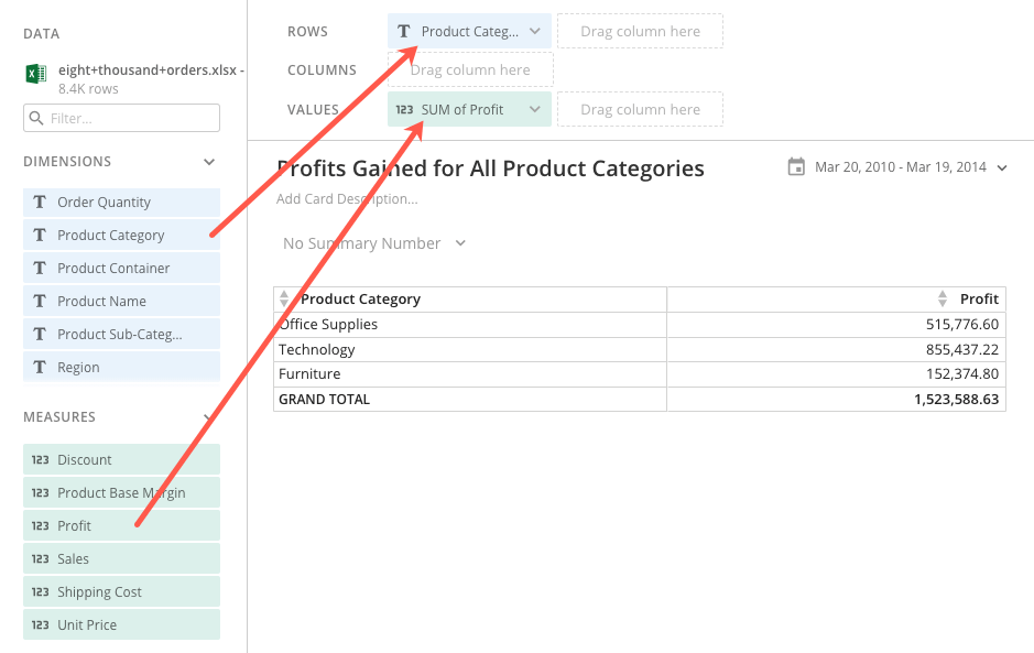
In this example, a sales manager uses a Pivot Table to show the profits earned for all product categories. The sales manager wants to display the product categories in the rows, so they:
1. Drag the "Product Category" column from the ****Dimensions**** pane into **Rows** above the chart preview.
2. Drag the "Profit" column from the **Measures** pane into **Values** above the chart preview.
This generates a basic Pivot Table that displays the profits for the three categories and their grand total, as shown below.
# Use Case #2
In this example, a sales manager uses a Pivot Table to show the profits earned for all product categories. The sales manager wants to display the product categories in the rows, so they:
1. Drag the "Product Category" column from the ****Dimensions**** pane into **Rows** above the chart preview.
2. Drag the "Profit" column from the **Measures** pane into **Values** above the chart preview.
This generates a basic Pivot Table that displays the profits for the three categories and their grand total, as shown below.
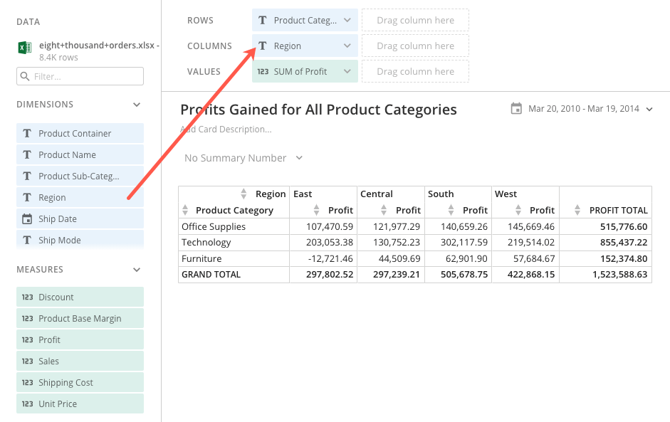
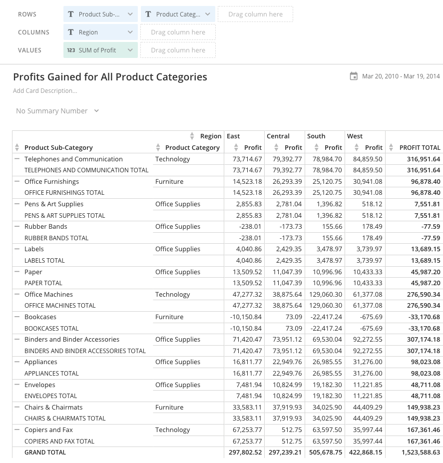
 At this point, the table does not provide much useful information, so the sales manager decides to expand the table to include data for regions. They drag the "Region" column into **Columns** above the chart preview. This adds a "Region" header row at the top of the table, adds a "Profit " column to the right side of the table, and divides the table into four "Profit" columns, one for each region.
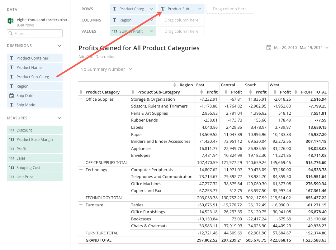
 This is more helpful, but still lacks specifics. The table says that all the furniture generated a total profit of \$152,374.80, but we don't know the breakdown of the furniture types and how they contribute to this total.
The sales manager realizes this, so they decide to add another column, "Product Sub-Category," to the table. They do this by dragging the "Product Sub-Category" column into **Rows** above the chart preview, just as they did with "Product Category." This divides each product category into subcategories, and each subcategory now displays individual profit values.
This is more helpful, but still lacks specifics. The table says that all the furniture generated a total profit of \$152,374.80, but we don't know the breakdown of the furniture types and how they contribute to this total.
The sales manager realizes this, so they decide to add another column, "Product Sub-Category," to the table. They do this by dragging the "Product Sub-Category" column into **Rows** above the chart preview, just as they did with "Product Category." This divides each product category into subcategories, and each subcategory now displays individual profit values.
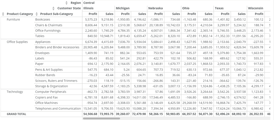
 The sales manager completes their Pivot Table by adding two more columns. They drag "Customer State" into **Columns** and "Sales" into **Values**. This divides the regions into individual states (similar to what the sales manager did with "Product Category" and "Product Sub-Category") and adds a new data column, "Sales," for each state.
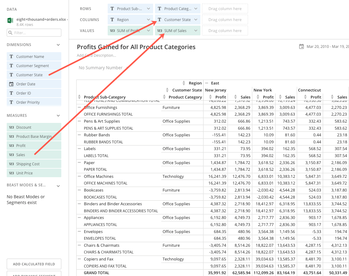 At this point, the sales manager can make various adjustments to the Pivot Table to make it more readable and useful to viewers. They could set color rules to draw attention to values in a certain range, change the sort and aggregation type for certain columns, highlight total and subtotal rows and columns, add a Drill Path, and much more. For more information about these customizations, see the section about [Customizing Pivot Tables](#CustomizingPivotTables) above.