> ## Documentation Index
> Fetch the complete documentation index at: https://domoinc-openapi-sync-dataflows.mintlify.site/llms.txt
> Use this file to discover all available pages before exploring further.

# Percent of Total Chart

## Intro

A Percent of Total chart is a [Bar chart](/s/article/360043428493 "Bar Graph") with a percent scale instead of a value scale—each category bar represents the relative size of its value as a percentage rather than the actual value. Percent of Total charts are essentially Pie charts with bars; however, because no legend is required to match names with categories, these charts are actually easier to read and interpret than Pie-type charts. As with basic Bar charts, both vertical and horizontal versions of Percent of Total charts are available.

## Powering Percent of Total charts

Percent of Total charts require only two columns or rows of data from your DataSet—one for categories and one for values. For information about value, category, and series data, see [Understanding Chart Data](/s/article/360043428693 "Understanding Chart Data").

In the Analyzer, you choose the columns containing the data for your Percent of Total chart. For more information about choosing data columns, see [Applying DataSet Columns to Your Chart](/s/article/360043428713 "Applying DataSet Columns to Your Chart").

For more information about formatting charts in the Analyzer, see [KPI Card Building Part 2: The Card Builder](/s/article/360043428673 "KPI Card Building Part 2: The Card Builder").

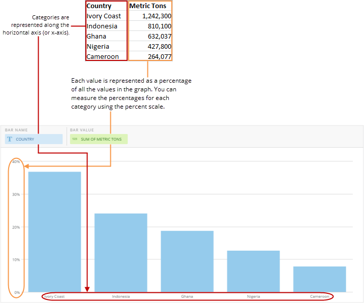
The following graphic shows you how the data from a typical column-based spreadsheet is converted into a vertical Percent of Total chart:

<Frame>
  <img alt="" src="https://mintcdn.com/domoinc-openapi-sync-dataflows/D4XP-ZUu0hZKYNDT/images/kb/ka05w00000123mj-00N5w00000Ri7BU-0EM5w000005vP5k.png?fit=max&auto=format&n=D4XP-ZUu0hZKYNDT&q=85&s=47c8d34e133a5c510335b61bf6c9adb8" style={{width: 716, height: 597}} width="716" height="597" data-path="images/kb/ka05w00000123mj-00N5w00000Ri7BU-0EM5w000005vP5k.png" />
</Frame>

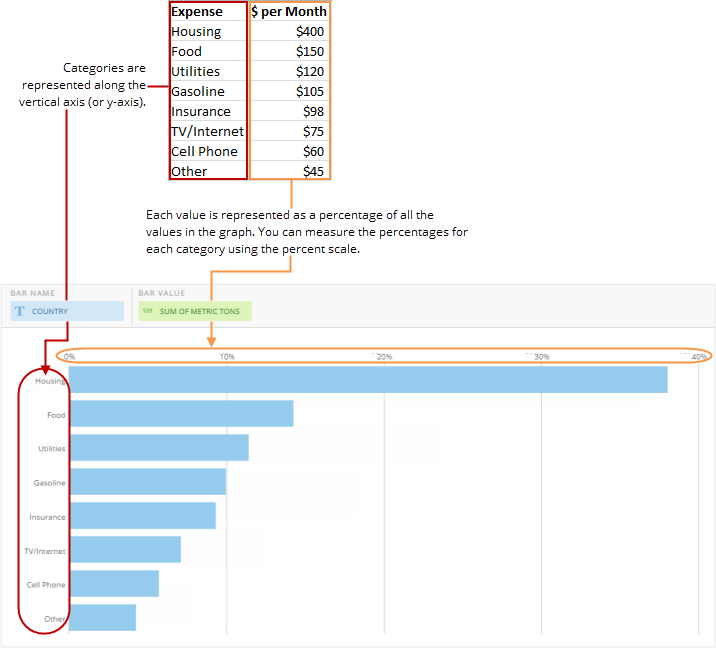
The following graphic shows you how the data from a typical column-based spreadsheet is converted into a horizontal Percent of Total chart:
<Frame>
  <img alt="" src="https://mintcdn.com/domoinc-openapi-sync-dataflows/D4XP-ZUu0hZKYNDT/images/kb/ka05w00000123mj-00N5w00000Ri7BU-0EM5w000005vP5m.png?fit=max&auto=format&n=D4XP-ZUu0hZKYNDT&q=85&s=67a1f5c58d265d1c5dd9a3aa67015fe0" style={{width: 716, height: 648}} width="716" height="648" data-path="images/kb/ka05w00000123mj-00N5w00000Ri7BU-0EM5w000005vP5m.png" />
</Frame>

## Customizing Percent of Total charts

You can customize the appearance of a Percent of Total chart by editing its [Chart Properties](/s/article/360042925154). Unique properties of Percent of Total charts include the following.

<table border="1" cellpadding="1" cellspacing="1" data-aura-rendered-by="33:209;a"><thead><tr><th colspan="1" rowspan="1"><p> Property </p></th><th colspan="1" rowspan="1"><p> Description </p></th></tr></thead><tbody><tr><td colspan="1" rowspan="1"><p> Bar Color </p></td><td colspan="1" rowspan="1"><p> Lets you specify the bar color in Percent of Total charts. Selecting <b> Default </b> sets the bar color to the default color (blue). For more information about setting colors, see <a href="/s/article/360043429653" target="_blank" title="Changing the Default Colors in Your Chart"> Changing the Default Colors in Your Chart </a>. </p></td></tr></tbody></table>
