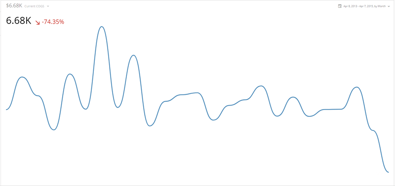
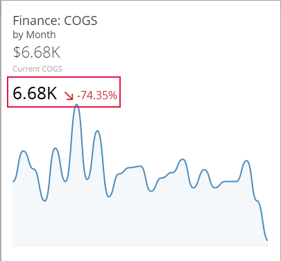
 By default, the gauge shows the degree of change between the first and last data items in the chart; however, you can change this to show the degree of change for the last two data items if you want. You can also change other aspects of Spark Line charts, such as whether the degree of change is a percentage or a value, whether it appears as green or red, the fill color for the chart, etc. You can make all of these changes in the Chart Properties for the chart.
As with most other chart types, Spark Line charts include hover labels that show the specific data for each data point. So even though there are no axes, users can still ascertain values for data points by mousing over them. For more information about hover labels, see [Formatting Data Label and Hover Text in Your Chart](/s/article/360043429693 "Formatting Data Label and Hover Text in Your Chart").
## Powering Spark Line charts
Spark Line charts require only two columns or rows of data from your DataSet—one for categories (generally dates or times) and one for values. As with most other Line charts, categories are represented along the horizontal axis and values are represented on the vertical axis (though these are not shown in a Spark Line chart for the sake of simplicity). To build a Spark Line in Analyzer, you drag your category column into the "X Axis" field and your value column into the "Y Axis" field.
For information about value, category, and series data, see [Understanding Chart Data](/s/article/360043428693 "Understanding Chart Data").
In the Analyzer, you choose the columns containing the data for your Spark Line chart. For more information about choosing data columns, see [Applying DataSet Columns to Your Chart](/s/article/360043428713 "Applying DataSet Columns to Your Chart").
For more information about formatting charts in the Analyzer, see [Visualization Card Building Part 2: The Analyzer](/s/article/360043428673 "KPI Card Building Part 2: The Card Builder").
## Customizing Spark Line charts
You can customize the appearance of a Spark Line chart by editing its **Chart Properties**. For information about all chart properties, see [Chart Properties](/s/article/360042925154 "Chart Properties"). The unique properties of Spark Line charts include the following:
By default, the gauge shows the degree of change between the first and last data items in the chart; however, you can change this to show the degree of change for the last two data items if you want. You can also change other aspects of Spark Line charts, such as whether the degree of change is a percentage or a value, whether it appears as green or red, the fill color for the chart, etc. You can make all of these changes in the Chart Properties for the chart.
As with most other chart types, Spark Line charts include hover labels that show the specific data for each data point. So even though there are no axes, users can still ascertain values for data points by mousing over them. For more information about hover labels, see [Formatting Data Label and Hover Text in Your Chart](/s/article/360043429693 "Formatting Data Label and Hover Text in Your Chart").
## Powering Spark Line charts
Spark Line charts require only two columns or rows of data from your DataSet—one for categories (generally dates or times) and one for values. As with most other Line charts, categories are represented along the horizontal axis and values are represented on the vertical axis (though these are not shown in a Spark Line chart for the sake of simplicity). To build a Spark Line in Analyzer, you drag your category column into the "X Axis" field and your value column into the "Y Axis" field.
For information about value, category, and series data, see [Understanding Chart Data](/s/article/360043428693 "Understanding Chart Data").
In the Analyzer, you choose the columns containing the data for your Spark Line chart. For more information about choosing data columns, see [Applying DataSet Columns to Your Chart](/s/article/360043428713 "Applying DataSet Columns to Your Chart").
For more information about formatting charts in the Analyzer, see [Visualization Card Building Part 2: The Analyzer](/s/article/360043428673 "KPI Card Building Part 2: The Card Builder").
## Customizing Spark Line charts
You can customize the appearance of a Spark Line chart by editing its **Chart Properties**. For information about all chart properties, see [Chart Properties](/s/article/360042925154 "Chart Properties"). The unique properties of Spark Line charts include the following:
Property
Description
Example
General > Background Fill
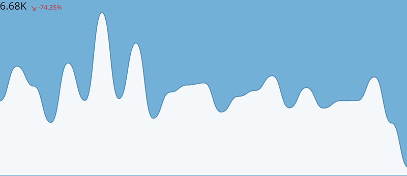
Specifies the background fill color for the chart. If Default is selected, no background color is used.
Value Options > Hide
Hides the summary value in the chart. (This is the first number that appears in the chart's built-in gauge. For example, in the screenshot of the chart at the top of this article, the value is 6.68K.)
—
Value Options > Value
Indicates how the chart's summary value is derived. You can choose from any of the following options for this property:
First Value | The summary value is the first value on your line. |
Last Value | The summary value is the last value on your line. This is the default option. |
Sum | The summary value is the sum of all values on the line. |
Average | The summary value is the average of all values on the line. |
Minimum | The summary value is the minimum value on the line. |
Maximum | The summary value is the maximum value on the line. |
Count | The summary value is a count of the number of values on the line. |
—
Value Options > Size
Specifies the size of the summary value in the chart. You can choose from Medium (default) or Small .
—
Value Options > Value Format
Determines the general number format for your chart's summary value. Options include Number (which includes no special formatting), Currency (in which a currency symbol is affixed), and Percentage (in which a percent symbol is affixed).
—
Value Options > Divide Value By
Refers to the number that the gauge value is to be divided by, if any. This option is useful when the value is very large and you want to abbreviate it by dividing by a common number. For example, if the gauge value represented millions of dollars, you could choose to divide by millions—the gauge value would then be reduced to more comprehendible single digits. When you choose to divide by Percentage , the gauge value is multiplied by 100.
—
Value Options > Decimal Places
Determines the number of decimal places used in the summary value. You can choose from Default , None , and options for numbers of decimal places (from ".0" to ".00000"). By default, Domo automatically determines the optimal number of decimal places for the gauge value. When you select None , the value is rounded to the nearest whole number.
—
Value Options > Negative Numbers
Determines the format for negative numbers.
If you select -100 , negative values have a minus symbol affixed. If you select (100) , negative values are enclosed in parentheses.
—
Change Value Options > Hide
Hides the change value in the chart. (This is the second number that appears in the chart's built-in gauge. For example, in the screenshot of the chart at the top of this article, the value is -74.35%.)
—
Change Value Options > Value
Specifies whether the change value is a percent change (default) or a difference in values.
—
Change Value Options > Data
Specifies whether the change value is derived from the first and last values in the chart (default) or the last two values in the chart.
—
Change Value Options > Size
Specifies the size of the change value in the chart. You can choose from Medium (default) or Small .
—
Change Value Size > Direction Indicator
Specifies whether the symbol used to represent change in the change value is an arrow (default), a curved arrow, or a triangle. Examples of all three of these are shown at right.



Change Values > Reverse Color Direction
By default, if your change value is positive, the value appears green; if it is negative, the value appears red. By setting the Reverse Color Direction property, you can switch this default behavior. This is useful for gauges in which low values are ideal (such as a gauge that keeps track of workplace accidents).
—
Change Value Options > Value Format
Determines the general number format for your chart's change value. Options include Number (which includes no special formatting), Currency (in which a currency symbol is affixed), and Percentage (in which a percent symbol is affixed).
—
Change Value Options > Hover Format
Determines the number format for your chart's hovers (i.e. the text that appears when you mouse over a data point in the chart). Options include Number (which includes no special formatting), Currency (in which a currency symbol is affixed), and Percentage (in which a percent symbol is affixed).
For more information about hovers, see Formatting Data Label and Hover Text in Your Chart .
—
Change Value Options > Hover Decimal Places
Determines the number of decimal places that appear in values in your chart's hovers (i.e. the text that appears when you mouse over a data point in the chart).
For more information about hovers, see Formatting Data Label and Hover Text in Your Chart .
—
Change Value Options > Positive Color
Specifies the color used when the degree of change in your chart is positive.
—
Change Value Options > Negative Color
Specifies the color used when the degree of change in your chart is negative.
—
Line Options > Style
Determines whether the line in your chart is angular ( Plain ) or curved. Plain is the default.
—
Line Options > Thickness
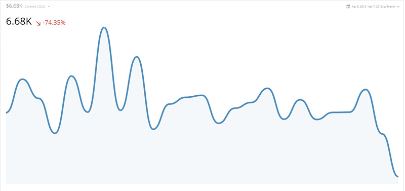
Determines whether the line in your chart is thin (default), medium, or thick. The example at right shows a Spark Line chart in which Thick has been selected.
Line Options > Hide Area Fill
Hides the area fill in the chart. The example at right shows a chart in which this has been done.