> ## Documentation Index
> Fetch the complete documentation index at: https://domoinc-openapi-sync-dataflows.mintlify.site/llms.txt
> Use this file to discover all available pages before exploring further.

# Slicer, Checkbox Selector, and Radio Button Selector Cards

export const InlineImage = ({src, alt = '', height = '1.6em'}) => {
  return <img noZoom src={src} alt={alt} style={{
    display: 'inline',
    verticalAlign: 'start',
    height: height,
    margin: '0'
  }} />;
};

### Intro

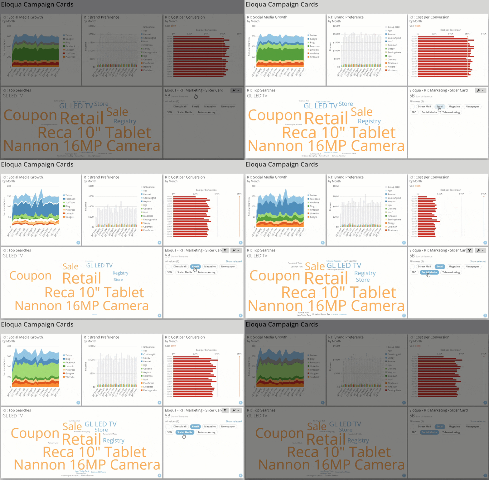
Slicer, Checkbox Selector, and Radio Button Selector cards display values from a selected DataSet column. When you add them to a Domo dashboard, dashboard viewers can select values to filter the other cards on the dashboard. With Radio Button Selector Cards, viewers can only filter on one value at a time; with Slicer and Checkbox Selector cards, they can filter on multiple values at once.

For example, you could build a Slicer Card with names of U.S. states and add it to a dashboard. If you selected `Texas` and `Oklahoma,` all cards on the dashboard filter to only data for those states. Slicer, Checkbox Selector, and Radio Button Selector cards are types of Filter Cards. Filter Cards only work when Interaction Filters are turned on. If Interaction Filters are not turned on, selecting a filter opens the Details view for the card instead of applying the filter. Learn more about [using Slicer, Checkbox Selector, and Radio Button Selector cards on a dashboard](https://domo-support.domo.com/s/article/360042923914?language=en_US#slicer_checkbox_and_radio_button_cards).

<Note>
  **Note:** To use a calculated field as the column in the **Items** field to power your Slicer, Checkbox Selector, or Radio Button Selector cards, you must share the calculated field to the DataSet.

  <Frame>
    <img alt="slicer_edit.gif" src="https://mintcdn.com/domoinc-openapi-sync-dataflows/2K-MJunolF8arvf9/images/kb/ka0Vq00000017yj-00N5w00000Ri7BU-0EM5w000005vP7U.gif?s=89d14b2479c0109d04b4548515f16427" style={{width: 900, height: 591}} width="1228" height="806" data-path="images/kb/ka0Vq00000017yj-00N5w00000Ri7BU-0EM5w000005vP7U.gif" />
  </Frame>
</Note>

You can also use Slicer, Radio Button, and Checkbox filters in a card Details view to filter data to a specific column value before applying a Drill Path.

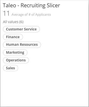
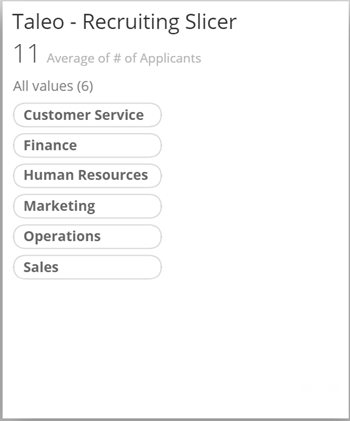
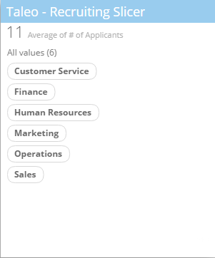
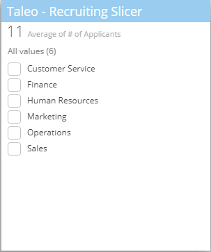
Slicer and Checkbox Selector cards are essentially the same. The only difference is that the filters in Slicer Cards are represented as pills, while filters in Checkbox Selector Cards use checkboxes.

<Columns cols={2}>
  <Frame>
    <img src="https://mintcdn.com/domoinc-openapi-sync-dataflows/2K-MJunolF8arvf9/images/kb/ka0Vq00000017yj-00N5w00000Ri7BU-0EM5w000005vP7i.png?fit=max&auto=format&n=2K-MJunolF8arvf9&q=85&s=ca40810665bcbcf38c8afa245d82de16" width="301" height="362" data-path="images/kb/ka0Vq00000017yj-00N5w00000Ri7BU-0EM5w000005vP7i.png" />
  </Frame>

  <Frame>
    <img alt="filter_card_checkbox.png" src="https://mintcdn.com/domoinc-openapi-sync-dataflows/2K-MJunolF8arvf9/images/kb/ka0Vq00000017p3-00N5w00000Ri7BU-0EM5w000005vP2t.png?fit=max&auto=format&n=2K-MJunolF8arvf9&q=85&s=41f364272f120bf6689213ad400cad19" width="303" height="363" data-path="images/kb/ka0Vq00000017p3-00N5w00000Ri7BU-0EM5w000005vP2t.png" />
  </Frame>
</Columns>

Radio Button Selector Cards are similar to both of the above but use radio buttons instead of pills or checkboxes, meaning viewers can filter on only one value at a time.

***

Learn about the other Filter Card types:

* [Date Selector Card](/s/article/360042924474 "Date Selector Card")
* [Range Selector Card](/s/article/360042924954 "Range Card")

***

### Power Slicer, Checkbox Selector, and Radio Button Selector Cards

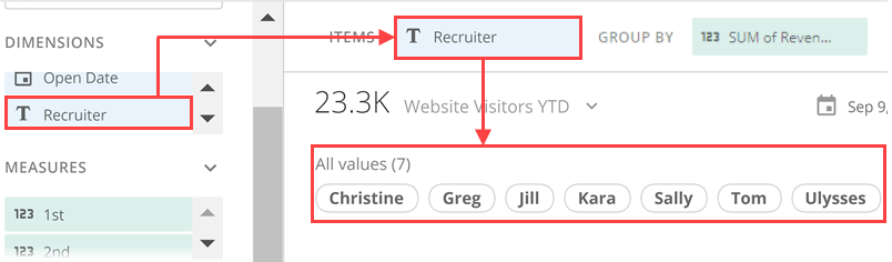
In Analyzer, Slicer, Checkbox Selector, and Radio Button Selector cards each require two columns/rows of data from your DataSet. One column/row contains the category values you want to use as filters. Drag this column/row to the **Items** field.

<Frame>
  <img alt="slicer_items_column.png" src="https://mintcdn.com/domoinc-openapi-sync-dataflows/2K-MJunolF8arvf9/images/kb/ka0Vq00000017yj-00N5w00000Ri7BU-0EM5w000005vP7c.png?fit=max&auto=format&n=2K-MJunolF8arvf9&q=85&s=465d89f43a90afb9e1d159283e08808d" width="804" height="236" data-path="images/kb/ka0Vq00000017yj-00N5w00000Ri7BU-0EM5w000005vP7c.png" />
</Frame>

The other field is called **Optional group by**. Though this field is required to power up the card, in general, it doesn't matter what column/row you drop here. If you need to aggregate the data, you can use this column/row to do so. For example, if the column/row with the filter names is duplicated in your DataSet, you can make the filter names unique by aggregating.

Learn about [choosing data columns](/s/article/360043428713 "Applying DataSet Columns to Your Chart").

Learn more about [formatting charts in Analyzer](https://domo-support.domo.com/s/topic/0TO5w000000ZaoUGAS/analyzer).

### Customize Slicer, Checkbox Selector, and Radio Button Selector Cards

You can customize the layout of filters in a Slicer, Checkbox Selector, or Radio Button Selector card by editing its chart properties. Learn about all available [Chart Properties](/s/article/360042925334 "Chart Properties").

This table details the unique properties of Slicer, Checkbox Selector, and Radio Button Selector cards:

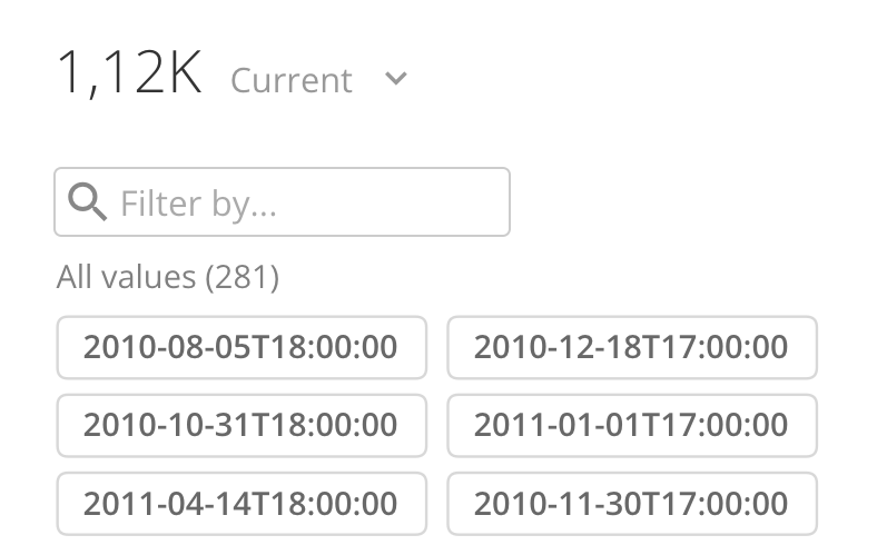
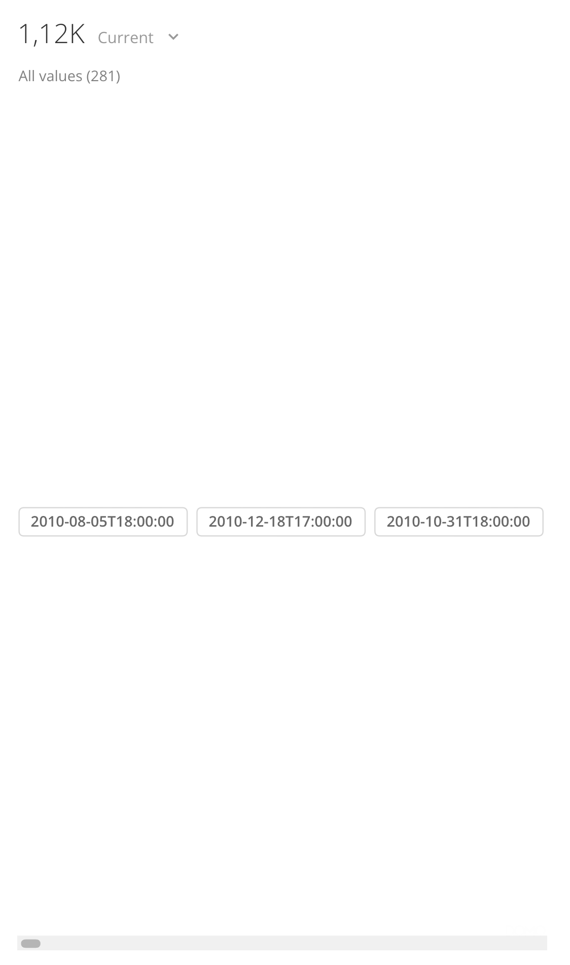
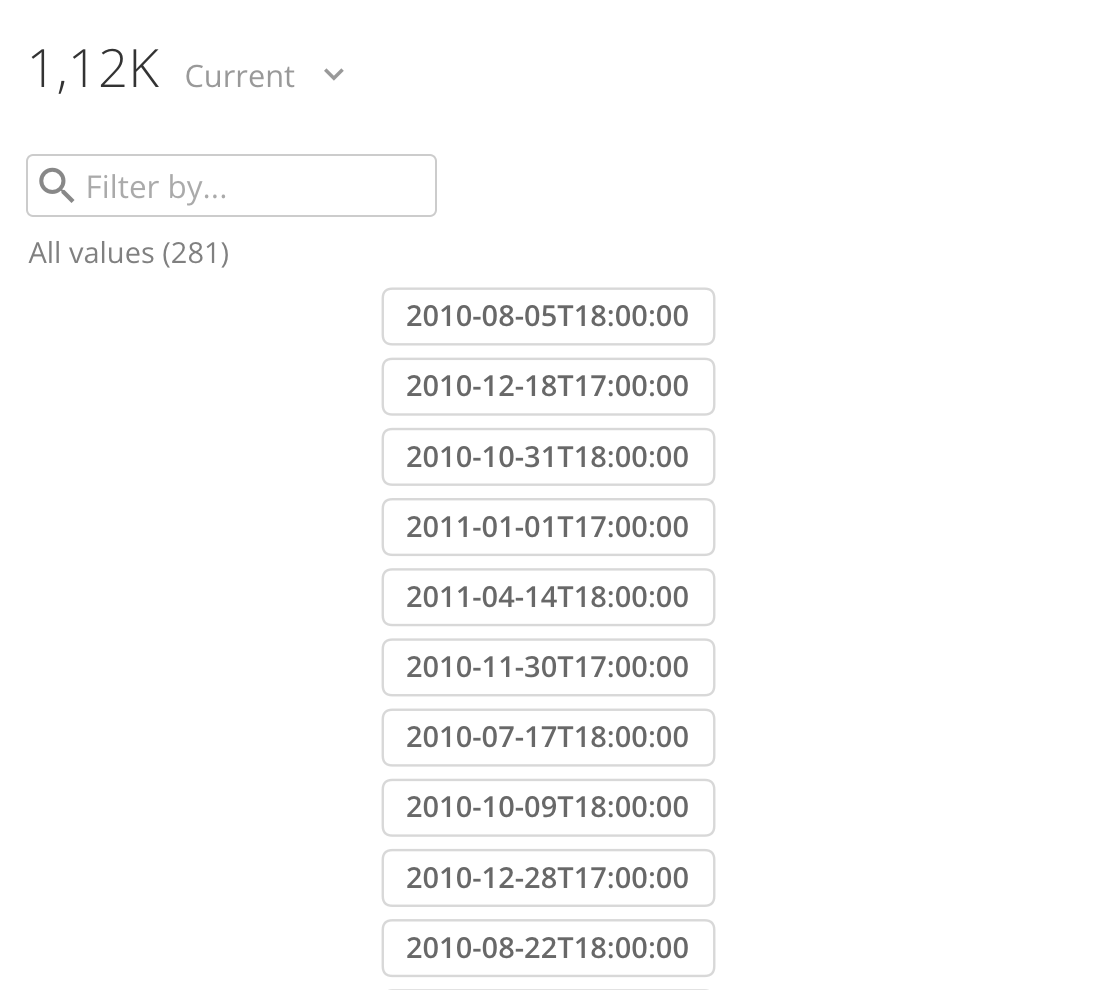
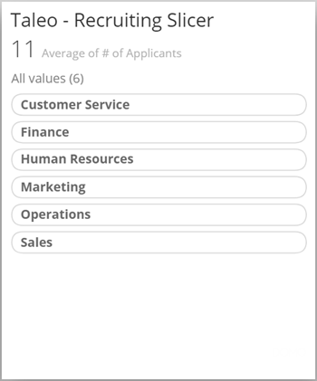
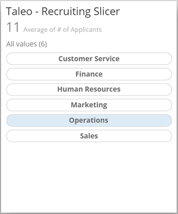
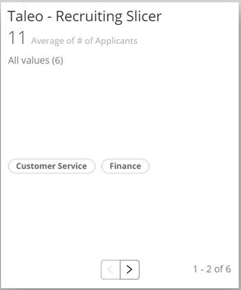
<table border="1" cellpadding="1" cellspacing="1" data-aura-rendered-by="33:209;a"><thead><tr><th colspan="1" rowspan="1"><p> Property </p></th><th colspan="1" rowspan="1"><p> Description </p></th><th colspan="1" rowspan="1"><p> Example </p></th></tr></thead><tbody><tr><td colspan="1" rowspan="1"><b> General </b> > <b> Show search </b></td><td colspan="1" rowspan="1"><p> Determines when a search bar is displayed for Slicer, Checkbox Selector, and Radio Button Selector Cards. When the <b> Default </b> or <b> Auto </b> options are selected, a search bar appears anytime there are more filter items than will fit in the card view. <br /> If you select <b><b> Always </b></b>, the search bar always appears, no matter how many filter items there are. If you select <b><b> Never </b></b>, the search bar never appears. </p></td><td class="mt-align-center" colspan="1" rowspan="1"><img alt="Screenshot 2024-06-27 at 7.02.42 PM.png" src="https://mintcdn.com/domoinc-openapi-sync-dataflows/2K-MJunolF8arvf9/images/kb/ka0Vq00000017yj-00N5w00000Ri7BU-0EMVq000001YDAL.jpg?fit=max&auto=format&n=2K-MJunolF8arvf9&q=85&s=a4af95e7a6a376aca6a69c658a89fbc0" style={{width: 399, height: 248}} width="788" height="490" data-path="images/kb/ka0Vq00000017yj-00N5w00000Ri7BU-0EMVq000001YDAL.jpg" /></td></tr><tr><td colspan="1" rowspan="1"><p><b> General </b> > <b> Number of Columns </b></p><p> (Checkbox and Radio Button Selector cards only) </p></td><td colspan="1" rowspan="1"><p> Lets you specify the number of filter columns in your Checkbox Selector or Radio Button Selector card. </p><p><b> Note: </b> This option requires the <b> Use paging </b> option to be selected. </p></td><td class="mt-align-center" colspan="1" rowspan="1"> — </td></tr><tr><td colspan="1" rowspan="1"><p><b> General </b> > <b> Single column </b></p><p> (Slicer Card only) </p></td><td colspan="1" rowspan="1"><p> Determines whether the filters in your Slicer Card are displayed in a single column. By default, the filters are left-aligned unless you choose to center them using the <b> Center horizontally </b> option. </p><p> The example shows a Slicer Card with all filters in a single column. </p></td><td colspan="1" rowspan="1"><p><img alt="slicer_card_single_column.png" src="https://mintcdn.com/domoinc-openapi-sync-dataflows/9GmyphKXosOtxL2U/images/kb/ka05w00000123xY-00N5w00000Ri7BU-0EM5w000005vWKR.jpg?fit=max&auto=format&n=9GmyphKXosOtxL2U&q=85&s=f1e97f2218f9fa5022a6dc43ae2e2545" style={{width: 350, height: 420}} width="350" height="420" data-path="images/kb/ka05w00000123xY-00N5w00000Ri7BU-0EM5w000005vWKR.jpg" /></p></td></tr><tr><td colspan="1" rowspan="1"><p><b> General </b> > <b> Single row </b></p></td><td colspan="1" rowspan="1"><p> Determines whether the filters in your Slicer, Checkbox Selector, or Radio Button Selector cards display in a row instead of a column. By default, the filters display at the top of the card unless you choose to center them using the <b> Center vertically </b> option. </p><p> The example shows a Slicer Card with all filters in a single row (with a slider bar to view filters that don't fit in the card). </p></td><td colspan="1" rowspan="1"><p><img alt="Screenshot 2024-06-27 at 7.14.36 PM.png" src="https://mintcdn.com/domoinc-openapi-sync-dataflows/2K-MJunolF8arvf9/images/kb/ka0Vq00000017yj-00N5w00000Ri7BU-0EMVq000001YBlG.jpg?fit=max&auto=format&n=2K-MJunolF8arvf9&q=85&s=fb821a388197c5a96a2416cd75a28a2c" style={{width: 340, height: 576}} width="1124" height="1902" data-path="images/kb/ka0Vq00000017yj-00N5w00000Ri7BU-0EMVq000001YBlG.jpg" /></p></td></tr><tr><td colspan="1" rowspan="1"><p><b> General </b> > <b> Center horizontally </b></p><p> (Slicer Card only) </p></td><td colspan="1" rowspan="1"><p> Determines whether the filters in your Slicer Card are centered horizontally on the card. This option is available only when you check the box for <b> Single column </b>. </p><p> The example shows a Slicer Card with all filters in a single column, horizontally centered. </p></td><td colspan="1" rowspan="1"><p><img alt="Screenshot 2024-06-27 at 7.16.53 PM.png" src="https://mintcdn.com/domoinc-openapi-sync-dataflows/2K-MJunolF8arvf9/images/kb/ka0Vq00000017yj-00N5w00000Ri7BU-0EMVq000001YDS5.jpg?fit=max&auto=format&n=2K-MJunolF8arvf9&q=85&s=edc886dbf9f3f900d75742f300176aba" style={{width: 350, height: 315}} width="1100" height="990" data-path="images/kb/ka0Vq00000017yj-00N5w00000Ri7BU-0EMVq000001YDS5.jpg" /></p></td></tr><tr><td colspan="1" rowspan="1"><p><b> General </b> > <b> Equal width items </b></p><p> (Slicer Card only) </p></td><td colspan="1" rowspan="1"><p> Determines whether the filter pills in a Slicer Card are the same width; otherwise, they are fitted to the width of the filters. </p><p> The example shows a Slicer Card with all pills of equal width. </p></td><td colspan="1" rowspan="1"><p><img alt="slicer_card_equal_width.png" src="https://mintcdn.com/domoinc-openapi-sync-dataflows/9GmyphKXosOtxL2U/images/kb/ka05w00000123xY-00N5w00000Ri7BU-0EM5w000005vWKb.jpg?fit=max&auto=format&n=9GmyphKXosOtxL2U&q=85&s=4848ba5268e1b672b13aa85cafbb6a25" width="350" height="421" data-path="images/kb/ka05w00000123xY-00N5w00000Ri7BU-0EM5w000005vWKb.jpg" /></p></td></tr><tr><td colspan="1" rowspan="1"><p><b> General </b> > <b> Fill width </b></p><p> (Slicer Card only) </p></td><td colspan="1" rowspan="1"><p> Determines whether the filter pills in a Slicer Card fill the entire width of the card. This option is available only when you check the box for <b> Single column </b>. </p><p> The example shows a Slicer Card with all pills filling the width. </p></td><td colspan="1" rowspan="1"><p><img alt="slicer_card_fill_width.png" src="https://mintcdn.com/domoinc-openapi-sync-dataflows/9GmyphKXosOtxL2U/images/kb/ka05w00000123xY-00N5w00000Ri7BU-0EM5w000005vWKl.jpg?fit=max&auto=format&n=9GmyphKXosOtxL2U&q=85&s=ccf1537d8a903d5080b8393e1086fe52" width="350" height="421" data-path="images/kb/ka05w00000123xY-00N5w00000Ri7BU-0EM5w000005vWKl.jpg" /></p></td></tr><tr><td colspan="1" rowspan="1"><p><b> General </b> > <b> Center text </b></p><p> (Slicer Card only) </p></td><td colspan="1" rowspan="1"><p> Centers the text within each filter pill in a Slicer Card. </p><p> The example shows a Slicer Card with the pills set to <b> Fill width </b> and text centered. </p></td><td colspan="1" rowspan="1"><p><img alt="slicer_card_center_text.png" src="https://mintcdn.com/domoinc-openapi-sync-dataflows/9GmyphKXosOtxL2U/images/kb/ka05w00000123xY-00N5w00000Ri7BU-0EM5w000005vWIW.jpg?fit=max&auto=format&n=9GmyphKXosOtxL2U&q=85&s=32b577db5207ebfab3207cb98e789e40" width="350" height="421" data-path="images/kb/ka05w00000123xY-00N5w00000Ri7BU-0EM5w000005vWIW.jpg" /></p></td></tr><tr><td colspan="1" rowspan="1"><p><b> General </b> > <b> Center vertically </b></p></td><td colspan="1" rowspan="1"><p> Determines whether the filters in your Slicer, Checkbox Selector, or Radio Button Selector card are centered vertically on the card. This option is available only when you check the box for <b> Single row </b>. </p><p> The example shows a Slicer Card with the filters in a single row and centered vertically. </p></td><td colspan="1" rowspan="1"><p><img alt="slicer_card_center_vertical.png" src="https://mintcdn.com/domoinc-openapi-sync-dataflows/9GmyphKXosOtxL2U/images/kb/ka05w00000123xY-00N5w00000Ri7BU-0EM5w000005vWKv.jpg?fit=max&auto=format&n=9GmyphKXosOtxL2U&q=85&s=d00a0afade5f1e6fdda0208adac692fe" width="350" height="422" data-path="images/kb/ka05w00000123xY-00N5w00000Ri7BU-0EM5w000005vWKv.jpg" /></p></td></tr><tr><td colspan="1" rowspan="1"><p><b> General </b> > <b> Selected color </b></p></td><td colspan="1" rowspan="1"><p> Determines the color of the filter pills in a Slicer, Checkbox Selector, or Radio Button Selector card when someone hovers over them. </p></td><td colspan="1" rowspan="1"><p> — </p></td></tr></tbody></table>