> ## Documentation Index
> Fetch the complete documentation index at: https://domoinc-openapi-sync-dataflows.mintlify.site/llms.txt
> Use this file to discover all available pages before exploring further.

# Latitude-Longitude Map

## Intro

A latitude-longitude map displays data for any region in the world using latitude and longitude coordinates. The region that displays for a DataSet is "zoomed" in or out depending on the given coordinates. For example, if all of the cities in your DataSet were in Germany, the resulting map would show Germany; likewise, if some cities in the DataSet were in Germany and others were in France, the map would be "zoomed out" to show western Europe. Filters you apply to a latitude/longitude map also work this way. For example, if you were in the Details view for a map of the United States and you used Analyzer to show only cities in Washington and California, your map would be updated to show the westmost region of the United States. For more information about applying filters, see [Adding Filters to Your Chart](/s/article/360042924074 "Adding Filters to Your Chart").

This type of map is almost the same as the [latitude-longitude route map](https://domo-support.domo.com/s/article/360042924654 "Latitude-Longitude Route Map"). The difference is that points in a latitude-longitude route map are connected to form routes. These maps are more complex than standard latitude-longitude maps, requiring seven columns or rows of data.

For information about world maps, see [U.S. County Map](/s/article/360042925074 "World Map").

For information about troubleshooting when an area in your map does not show data but there is data, see [Troubleshooting](https://domo-support.domo.com/s/article/360043427473 "Troubleshooting").

**Video - Map Charts**

<iframe allowfullscreen="allowfullscreen" frameborder="0" height="315" src="//www.youtube-nocookie.com/embed/ahzrs6FI3uk" width="560" />

## Understanding latitude-longitude maps

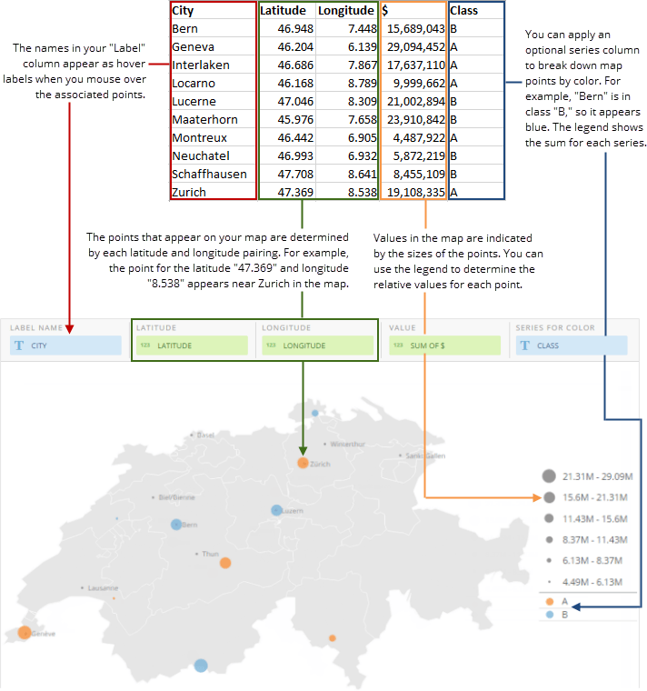
Latitude-longitude maps require four data columns or rows from your DataSet, though you can add an optional fifth column for series data if you want. One column or row contains the latitudes of the points you want to plot, one contains the longitudes, one contains the values that correspond with each latitude-longitude pairing, and one contains text for the hover label that appears for each point. Maps also include permanent data labels for specific cities. These are *not* determined by your DataSet—they are included automatically based on the region. For this reason, it is possible your map may include points that do not have data labels. However, all points have hover text.

Values are represented in your map by varying point sizes, each size of which corresponds to a specific range. Ranges are determined automatically based on the distribution of values in your DataSet and are represented by a legend, which is automatically included beside the map.

If you want, you can add an optional fifth column that contains series data, which is represented in the map by varying colors of map points. For example, if the cities in your DataSet were broken down into two different classes, "A" and "B," the points within class "A" would appear orange by default, and the points within class "B" would appear blue. The sums for each series are shown in the map legend. If a user clicks on a point in a latitude-longitude map with series data, the drill table that appears shows all items for that series in the map. For more information about drilling into a chart, see [Drilling into Data](/s/article/360042923994 "Drilling into Data").

For information about value, category, and series data, see [Understanding Chart Data](/s/article/360043428693 "Understanding Chart Data").

Latitudes and longitudes are recognizable by Domo in any of a number of different formats. For a list of accepted formats, see [Formats for latitudes and longitudes](#Buildingalatitude-longitudemap-formatsforlatitudesandlongitudes "Latitude-Longitude Map").

## Powering latitude-longitude maps

In the Analyzer, you choose the columns containing the data for your map. For more information about choosing data columns, see [Applying DataSet Columns to Your Chart](/s/article/360043428713 "Applying DataSet Columns to Your Chart").

For more information about formatting charts in the Analyzer, see [KPI Card Building Part 2: The Analyzer](/s/article/360043428673 "KPI Card Building Part 2: The Card Builder").

### Example

The following graphic shows you how data from a typical column-based spreadsheet is converted into a latitude-longitude map:

<Frame>
  <img alt="" src="https://mintcdn.com/domoinc-openapi-sync-dataflows/XLeSvlwfBHPJHbmY/images/kb/ka0Vq000000AnXM-00N5w00000Ri7BU-0EM5w000005vP9C.png?fit=max&auto=format&n=XLeSvlwfBHPJHbmY&q=85&s=7c76ff0583e0ddf31c7fcd08e8c153a5" style={{width: 712, height: 760}} width="712" height="760" data-path="images/kb/ka0Vq000000AnXM-00N5w00000Ri7BU-0EM5w000005vP9C.png" />
</Frame>

### Formats for latitudes and longitudes

Domo recognizes latitudes and longitudes written in any of the following formats:

<table border="1" cellpadding="1" cellspacing="1" data-aura-rendered-by="33:209;a"><thead><tr><th colspan="1" rowspan="1"><p> Format Name </p></th><th colspan="1" rowspan="1"><p> Description </p></th><th colspan="1" rowspan="1"><p> Examples </p></th></tr></thead><tbody><tr><td colspan="1" rowspan="1"><p> Signed degrees </p></td><td colspan="1" rowspan="1"><p> Uses the format "DDD.dddd." In this format, South latitudes and West longitudes are preceded by a minus sign. Latitudes range from -90 to 90, and longitudes range from -180 to 80. </p></td><td colspan="1" rowspan="1"><p><code> 41.25, -120.9762 </code></p></td></tr><tr><td colspan="1" rowspan="1"><p> Degrees minutes seconds </p></td><td colspan="1" rowspan="1"><p> Uses the format "DDD MM SS + compass direction (N, S, E, or W)." Latitudes range from 0 to 90 and longitudes range from 0 to 180. The last degree, minute, or second or a latitude or longitude may contain a decimal portion. </p></td><td colspan="1" rowspan="1"><pre><code>41 25 01N, 120 58 57W 41º25'01"N, 120º58'57"W S17 33 08.352, W69 01 29.74</code></pre></td></tr><tr><td colspan="1" rowspan="1"><p> Degrees minutes </p></td><td colspan="1" rowspan="1"><p> Uses the format "DDD MM + compass direction (N, S, E, or W)." Latitudes range from 0 to 90 and longitudes range from 0 to 180. The last degree or minute of a latitude or longitude may contain a decimal portion. </p></td><td colspan="1" rowspan="1"><pre><code>41 25N, 120 58W 41º25'N, 120º58'W N41 25.117, W120 58.292</code></pre></td></tr><tr><td colspan="1" rowspan="1"><p> Degrees only </p></td><td colspan="1" rowspan="1"><p> Uses the format "DDD + compass direction (N, S, E, or W)." Latitudes may range from 0 to 90 and longitudes range from 0 to 180. The last degree of a latitude or longitude may contain a decimal portion. </p></td><td colspan="1" rowspan="1"><pre><code>41N, 120W 41 N, 120 W 41ºN, 120ºW N41.092, W120.8362</code></pre></td></tr></tbody></table>

## Customizing latitude-longitude maps

You can customize the appearance of a latitude-longitude map by editing its **Chart Properties**. Properties for all chart types are listed and described in [Chart Properties](/s/article/360042925154 "Chart Properties"). Unique properties of latitude-longitude maps include the following. You can click a thumbnail image to see a larger image.

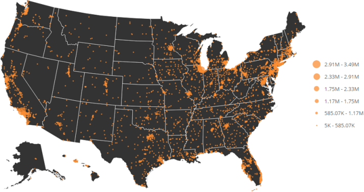
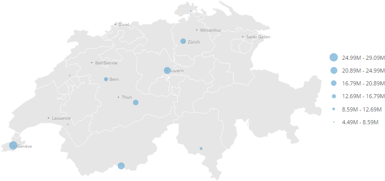
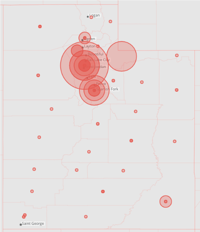
<table border="1" cellpadding="1" cellspacing="1" data-aura-rendered-by="33:209;a"><thead><tr><th colspan="1" rowspan="1"><p> Property </p></th><th colspan="1" rowspan="1"><p> Description </p></th><th colspan="1" rowspan="1"><p> Examples </p></th></tr></thead><tbody><tr><td colspan="1" rowspan="1"><p> Symbols > Symbol Color </p></td><td colspan="1" rowspan="1"><p> Allows you to set the color for map points. The default is orange. If your map contains a series column, colors are determined automatically—setting this property in this case has no effect. </p></td><td colspan="1" rowspan="1"><p> — </p></td></tr><tr><td colspan="1" rowspan="1"><p> Symbols > Symbol Sizes </p></td><td colspan="1" rowspan="1"><p> Determines the relative size for map points. The default is medium. </p></td><td colspan="1" rowspan="1"><p> — </p></td></tr><tr><td colspan="1" rowspan="1"><p> Symbols > Symbol Transparency </p></td><td colspan="1" rowspan="1"><p> Determines the transparency for map points. You can select any value from "none" (totally opaque) to 80% (almost transparent). The default is "none." In the first example at right, the transparency has been set to "none"; in the second example, it has been set to 80%. </p></td><td colspan="1" rowspan="1"><p><a target="_blank" title="/@api/deki/files/700/latlong_transparency_0.png"><img alt="" src="https://mintcdn.com/domoinc-openapi-sync-dataflows/D4XP-ZUu0hZKYNDT/images/kb/ka05w00000123lV-00N5w00000Ri7BU-0EM5w000005vP21.png?fit=max&auto=format&n=D4XP-ZUu0hZKYNDT&q=85&s=e7df35b6e5230158d8c4541b0716303b" width="754" height="354" data-path="images/kb/ka05w00000123lV-00N5w00000Ri7BU-0EM5w000005vP21.png" /></a></p><p><a target="_blank" title="/@api/deki/files/702/latlong_transparency_80.png"><img alt="" src="https://mintcdn.com/domoinc-openapi-sync-dataflows/D4XP-ZUu0hZKYNDT/images/kb/ka05w00000123lV-00N5w00000Ri7BU-0EM5w000005vP1y.png?fit=max&auto=format&n=D4XP-ZUu0hZKYNDT&q=85&s=50cd980be4cb183bed57049c665f2b33" width="754" height="354" data-path="images/kb/ka05w00000123lV-00N5w00000Ri7BU-0EM5w000005vP1y.png" /></a></p></td></tr><tr><td colspan="1" rowspan="1"><p> Scale > Symbol Borders </p></td><td colspan="1" rowspan="1"><p> When set, this option will show borders around the symbols on the map. </p></td><td colspan="1" rowspan="1"><img alt="Bubble_Example.png" src="https://mintcdn.com/domoinc-openapi-sync-dataflows/GZtBW7DeR7whzwbr/images/kb/ka0Vq0000000cJp-00N5w00000Ri7BU-0EM5w000005vOiO.png?fit=max&auto=format&n=GZtBW7DeR7whzwbr&q=85&s=3de4b94f82af7511390c702f879b4288" style={{width: 173, height: 202}} width="774" height="900" data-path="images/kb/ka0Vq0000000cJp-00N5w00000Ri7BU-0EM5w000005vOiO.png" /></td></tr><tr><td colspan="1" rowspan="1"><p> Scale > Manual Minimum Value </p></td><td colspan="1" rowspan="1"><p> Allows you to set the minimum value in your scale. </p></td><td colspan="1" rowspan="1"><p> — </p></td></tr><tr><td colspan="1" rowspan="1"><p> Scale > Manual Maximum Value </p></td><td colspan="1" rowspan="1"><p> Allows you to set the maximum value in your scale. </p></td><td colspan="1" rowspan="1"><p> — </p></td></tr><tr><td colspan="1" rowspan="1"><p> Scale > Use Log Scale </p></td><td colspan="1" rowspan="1"><p> Allows you to convert your map scale to a logarithmic scale. </p></td><td colspan="1" rowspan="1"><p> — <br /></p></td></tr><tr><td colspan="1" rowspan="1"><p> Legend > Show Series Total in Legend As </p></td><td colspan="1" rowspan="1"><p> Lets you choose whether the series totals in the map legend are calculated as totals or averages or do not appear at all. The default is "Total." </p></td><td colspan="1" rowspan="1"><p> — <br /></p></td></tr><tr><td colspan="1" rowspan="1"><p> Background > Color </p></td><td colspan="1" rowspan="1"><p> Lets you choose the lightness of the background. The default is <b> Very Light </b>. The example shows a map in which the background lightness has been set to <b> Very Dark </b>. </p></td><td colspan="1" rowspan="1"><p><a target="_blank" title="latlong_background.png"><img alt="" src="https://mintcdn.com/domoinc-openapi-sync-dataflows/U1MglXZKeJZebGlP/images/kb/ka05w00000123lV-00N5w00000Ri7BU-0EM5w000005vP1m.png?fit=max&auto=format&n=U1MglXZKeJZebGlP&q=85&s=839c945832f21f286f2e1bfc9bfe1d43" width="715" height="377" data-path="images/kb/ka05w00000123lV-00N5w00000Ri7BU-0EM5w000005vP1m.png" /></a></p></td></tr></tbody></table>
## Aggregating rows

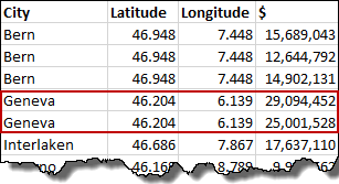
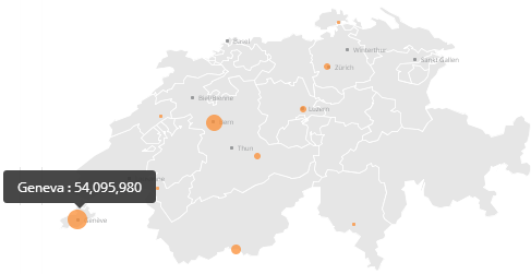
You can aggregate like rows in a latitude-longitude map, and the map points reflect the aggregated values. In the following example, the user uploads a DataSet with two rows for "Geneva."

<Frame>
  <img alt="" src="https://mintcdn.com/domoinc-openapi-sync-dataflows/XLeSvlwfBHPJHbmY/images/kb/ka0Vq000000AnXM-00N5w00000Ri7BU-0EM5w000005vP9H.png?fit=max&auto=format&n=XLeSvlwfBHPJHbmY&q=85&s=a43b2f3da82f49c309e0fad6bb1ae835" style={{width: 307, height: 167}} width="307" height="167" data-path="images/kb/ka0Vq000000AnXM-00N5w00000Ri7BU-0EM5w000005vP9H.png" />
</Frame>

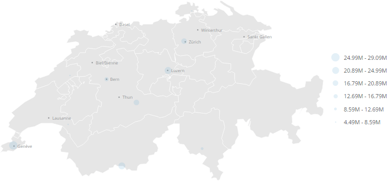
In the map, the individual values for "Geneva" are aggregated, and the corresponding map point is sized larger accordingly.
<Frame>
  <img alt="" src="https://mintcdn.com/domoinc-openapi-sync-dataflows/XLeSvlwfBHPJHbmY/images/kb/ka0Vq000000AnXM-00N5w00000Ri7BU-0EM5w000005vP9E.png?fit=max&auto=format&n=XLeSvlwfBHPJHbmY&q=85&s=edc1e271c03642999af424d4e0879abe" style={{width: 487, height: 251}} width="487" height="251" data-path="images/kb/ka0Vq000000AnXM-00N5w00000Ri7BU-0EM5w000005vP9E.png" />
</Frame>

## Drilling from map to map

With both U.S. state maps and latitude-longitude maps in which U.S. cities are represented, you can create "zoomed" drill layers by drilling down to the same map. For example, if you had a latitude-longitude map showing values per state and you added the same map as a drill layer, clicking any point in the country-level map would bring up a "zoomed in" state or region level that displayed all of the original data points from that state or region.

Results from using this technique vary depending on the map type, your DataSet, and the specific columns you apply.

For more information about adding drill layers to a chart, see [Adding Drill Path to Your Chart](/s/article/360042924094 "Adding Drill Path to Your Chart").