> ## Documentation Index
> Fetch the complete documentation index at: https://domoinc-openapi-sync-dataflows.mintlify.site/llms.txt
> Use this file to discover all available pages before exploring further.

# Best Practices for Choosing Chart Types

The type of chart you select for a KPI card depends on the specific information you want to convey to your audience. For instance, to show financial fluctuations over time, you would want to use a line graph; to compare values, your best choice would be a bar graph; and so on. Choosing the wrong graph type for your data could impair your audience's ability to receive the message, so it is important that you understand when to use the different graph types.

For a list of chart types available in Domo, see Available Chart Types.

## Information Type Table

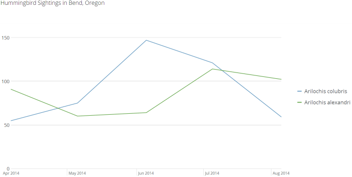
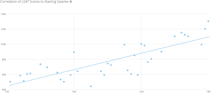
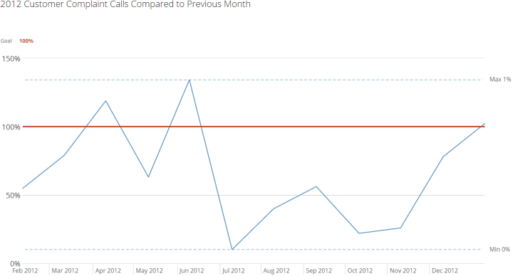
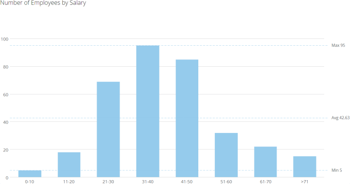
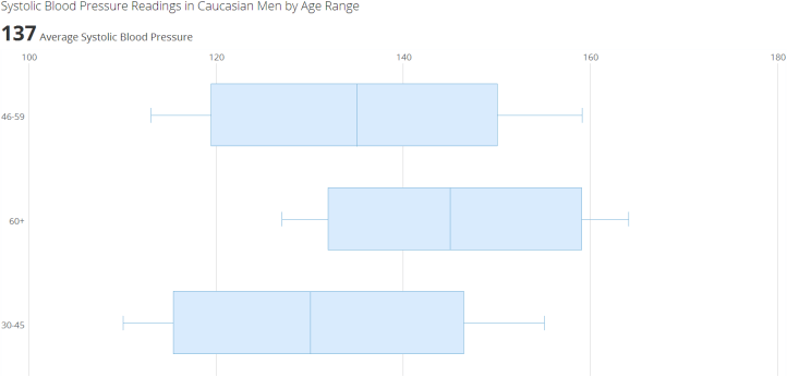
There are different types of information represented in charts. The most common of these, along with the most appropriate chart types to use, are listed in the following table. You can click a thumbnail image to see a larger image.

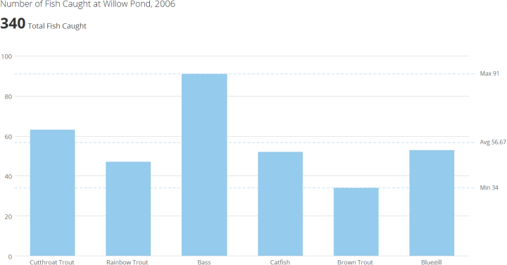
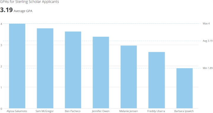
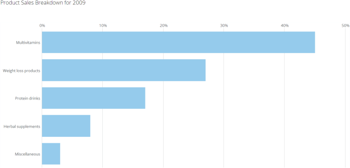
<table border="1" cellpadding="1" cellspacing="1" data-aura-rendered-by="33:208;a"><thead><tr><th colspan="1" rowspan="1"><p> Information Type </p></th><th colspan="1" rowspan="1"><p> Description </p></th><th colspan="1" rowspan="1"><p> Chart Type to Use </p></th><th colspan="1" rowspan="1"><p> Example </p></th></tr></thead><tbody><tr><td colspan="1" rowspan="1"><p> Nominal </p></td><td colspan="1" rowspan="1"><p> Used to compare values that have no specific order. </p></td><td colspan="1" rowspan="1"><p> Vertical or horizontal bar graph. </p></td><td colspan="1" rowspan="1"><p><a target="_blank" title="/@api/deki/files/848/nominal_example.png"><img alt="" src="https://mintcdn.com/domoinc-openapi-sync-dataflows/KCcJNfmszCLwcqSc/images/kb/ka05w00000123fS-00N5w00000Ri7BU-0EM5w000005vOq5.png?fit=max&auto=format&n=KCcJNfmszCLwcqSc&q=85&s=22c188aecfc43ae4702bc977e13c96fa" width="720" height="376" data-path="images/kb/ka05w00000123fS-00N5w00000Ri7BU-0EM5w000005vOq5.png" /></a></p></td></tr><tr><td colspan="1" rowspan="1"><p> Ranking </p></td><td colspan="1" rowspan="1"><p> Used to compare one measure to another, along with its quantitative order relationship. </p></td><td colspan="1" rowspan="1"><p> Vertical or horizontal bar graph sorted in </p><ul><li><p> descending order to emphasize high values, or </p></li><li><p> ascending order to emphasize low values. </p></li></ul></td><td colspan="1" rowspan="1"><p><a target="_blank" title="/@api/deki/files/1001/ranking_example.png"><img alt="" src="https://mintcdn.com/domoinc-openapi-sync-dataflows/KCcJNfmszCLwcqSc/images/kb/ka05w00000123fS-00N5w00000Ri7BU-0EM5w000005vOq9.png?fit=max&auto=format&n=KCcJNfmszCLwcqSc&q=85&s=9cf75e28820a91d7bb948cbfd41fbcdc" width="720" height="381" data-path="images/kb/ka05w00000123fS-00N5w00000Ri7BU-0EM5w000005vOq9.png" /></a></p></td></tr><tr><td colspan="1" rowspan="1"><p> Part-to-Whole </p></td><td colspan="1" rowspan="1"><p> Used to measure a single value against a whole. </p></td><td colspan="1" rowspan="1"><p> Vertical or horizontal Percent of Total graph. Pie graphs may also be used but are generally less effective at presenting data. </p></td><td colspan="1" rowspan="1"><p><a target="_blank" title="/@api/deki/files/912/part-to-whole_example.png"><img alt="" src="https://mintcdn.com/domoinc-openapi-sync-dataflows/KCcJNfmszCLwcqSc/images/kb/ka05w00000123fS-00N5w00000Ri7BU-0EM5w000005vOq8.png?fit=max&auto=format&n=KCcJNfmszCLwcqSc&q=85&s=5e9b67751946b06149552f7ffa09be8c" width="722" height="346" data-path="images/kb/ka05w00000123fS-00N5w00000Ri7BU-0EM5w000005vOq8.png" /></a></p></td></tr><tr><td colspan="1" rowspan="1"><p> Time Series </p></td><td colspan="1" rowspan="1"><p> Used to compare measurements taken over equal time periods. </p></td><td colspan="1" rowspan="1"><p> Use </p><ul><li><p> a vertical bar graph when emphasizing measures and comparisons or </p></li><li><p> a line graph when emphasizing the overall pattern. </p></li></ul></td><td colspan="1" rowspan="1"><p><a target="_blank" title="/@api/deki/files/1309/time_series_example.png"><img alt="" src="https://mintcdn.com/domoinc-openapi-sync-dataflows/KCcJNfmszCLwcqSc/images/kb/ka05w00000123fS-00N5w00000Ri7BU-0EM5w000005vOq6.png?fit=max&auto=format&n=KCcJNfmszCLwcqSc&q=85&s=01ed50c1fdb707f8f008df40d29ddf86" width="722" height="364" data-path="images/kb/ka05w00000123fS-00N5w00000Ri7BU-0EM5w000005vOq6.png" /></a></p></td></tr><tr><td colspan="1" rowspan="1"><p> Correlation </p></td><td colspan="1" rowspan="1"><p> Compares two pared sets of measures to determine how they correlate (for example, if one set increases, does the other increase or decrease, and by how much?). </p></td><td colspan="1" rowspan="1"><p> A Scatter Plot graph that shows points and a linear regression line. </p></td><td colspan="1" rowspan="1"><p><a target="_blank" title="correlation_example.png"><img alt="" src="https://mintcdn.com/domoinc-openapi-sync-dataflows/KCcJNfmszCLwcqSc/images/kb/ka05w00000123fS-00N5w00000Ri7BU-0EM5w000005vOq2.png?fit=max&auto=format&n=KCcJNfmszCLwcqSc&q=85&s=981bade4661612e927abebf8d9c24120" width="712" height="315" data-path="images/kb/ka05w00000123fS-00N5w00000Ri7BU-0EM5w000005vOq2.png" /></a></p></td></tr><tr><td colspan="1" rowspan="1"><p> Deviation </p></td><td colspan="1" rowspan="1"><p> Used to measure the difference between a value and a reference value. </p></td><td colspan="1" rowspan="1"><p> Use </p><ul><li><p> a line graph to emphasize the overall pattern with the time series, or </p></li><li><p> a vertical bar graph to emphasize measures. </p></li></ul><div class="mdx-embed"><Note><p><b> Note: </b> In all graphs that represent deviation, be sure to include a deviation reference line against which to compare the measures. </p></Note></div><p /><p /></td><td colspan="1" rowspan="1"><p><a target="_blank" title="/@api/deki/files/337/deviation_example.png"><img alt="" src="https://mintcdn.com/domoinc-openapi-sync-dataflows/KCcJNfmszCLwcqSc/images/kb/ka05w00000123fS-00N5w00000Ri7BU-0EM5w000005vOqA.png?fit=max&auto=format&n=KCcJNfmszCLwcqSc&q=85&s=ee9509e39f7e91260aec631694a2a21e" width="720" height="388" data-path="images/kb/ka05w00000123fS-00N5w00000Ri7BU-0EM5w000005vOqA.png" /></a></p></td></tr><tr><td colspan="1" rowspan="1"><p> Single Distribution </p></td><td colspan="1" rowspan="1"><p> Used to count items per subdivision on an interval scale. </p></td><td colspan="1" rowspan="1"><p> Use </p><ul><li><p> a vertical bar graph or histogram to emphasize values, or </p></li><li><p> a line graph to emphasize the overall pattern (frequency polygon). </p></li></ul></td><td colspan="1" rowspan="1"><p><a target="_blank" title="/@api/deki/files/1311/single_distribution_example.png"><img alt="" src="https://mintcdn.com/domoinc-openapi-sync-dataflows/KCcJNfmszCLwcqSc/images/kb/ka05w00000123fS-00N5w00000Ri7BU-0EM5w000005vOq4.png?fit=max&auto=format&n=KCcJNfmszCLwcqSc&q=85&s=bbc758ce8a75b88d39a5c98213a4e271" width="720" height="378" data-path="images/kb/ka05w00000123fS-00N5w00000Ri7BU-0EM5w000005vOq4.png" /></a></p></td></tr><tr><td colspan="1" rowspan="1"><p> Multiple Distribution </p></td><td colspan="1" rowspan="1"><p> Used to measure the distribution of values for multiple subdivisions. </p></td><td colspan="1" rowspan="1"><p> Use </p><ul><li><p> a vertical or horizontal Bar or Box Plot graph that shows the high value to the low value or some portion of the range, or </p></li><li><p> a Line or Box Plot graph to encode measures of center such as the mean or median. </p></li></ul></td><td colspan="1" rowspan="1"><p><a target="_blank" title="/@api/deki/files/819/multiple_distribution.png"><img alt="" src="https://mintcdn.com/domoinc-openapi-sync-dataflows/KCcJNfmszCLwcqSc/images/kb/ka05w00000123fS-00N5w00000Ri7BU-0EM5w000005vOq7.png?fit=max&auto=format&n=KCcJNfmszCLwcqSc&q=85&s=b2d646c2b90ffdba21dd998f4eed082a" width="722" height="346" data-path="images/kb/ka05w00000123fS-00N5w00000Ri7BU-0EM5w000005vOq7.png" /></a></p></td></tr></tbody></table>
## Chart Type Diagram

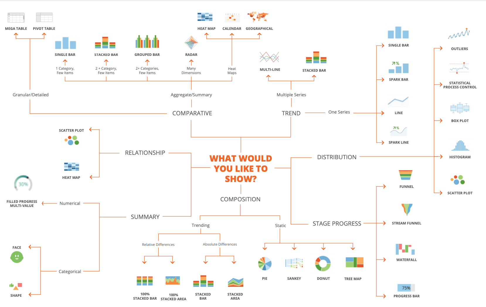
You can also use the following diagram to figure out the best chart type for your information type. To download this PDF to your computer, click [here](https://domosoftware.sharepoint.com/:b:/s/CS-Edu-PublicFiles/Efhk3MIEs85CpEjY0jJ0kFgBo1MJwV_y8aNCjlEgpBw43A?e=T9ipQq).

<Frame>
  <img alt="Choosing_Chart_Types.png" src="https://mintcdn.com/domoinc-openapi-sync-dataflows/KCcJNfmszCLwcqSc/images/kb/ka05w00000123fS-00N5w00000Ri7BU-0EM5w000005vOq3.png?fit=max&auto=format&n=KCcJNfmszCLwcqSc&q=85&s=0c49d9efa1930d1f8d5403cec960aa79" width="1658" height="1049" data-path="images/kb/ka05w00000123fS-00N5w00000Ri7BU-0EM5w000005vOq3.png" />
</Frame>

## Video

**Choosing Chart Types**

<iframe allowfullscreen="" frameborder="0" height="315" src="//www.youtube-nocookie.com/embed/lBHGX9jbHCI" width="560" />

## Other Best Practices Topics

For more Domo best practices, visit the following topics:

* [Projects and Tasks Best Practices](/s/article/360043430493 "Projects and Tasks Best Practices")
* [Best Practices for Managing DataSets](/s/article/360042926154 "Best Practices for Managing DataSets")
* [Best Practices for Creating KPI Cards](/s/article/360043439953 "Best Practices for Creating KPI Cards")
* [Top 10 Dashboard Design Best Practices](/s/article/360043440173 "Top 10 Dashboard Design Best Practices")
* [Best Practices for Standardizing KPIs](/s/article/360043439993 "Best Practices for Standardizing KPIs")
* Best Practices for Designing KPIs

Or, for a handy Domo best practices guide, you can download the following PDF:

* [Best Practices for cards, collections, datasets job aid.revised.pdf](https://hc/en-us/articles/360042923194 "Best Practices for cards, collections, datasets job aid.revised.pdf")