> ## Documentation Index
> Fetch the complete documentation index at: https://domoinc-openapi-sync-dataflows.mintlify.site/llms.txt
> Use this file to discover all available pages before exploring further.

# Properties for Miscellaneous Charts

## Intro

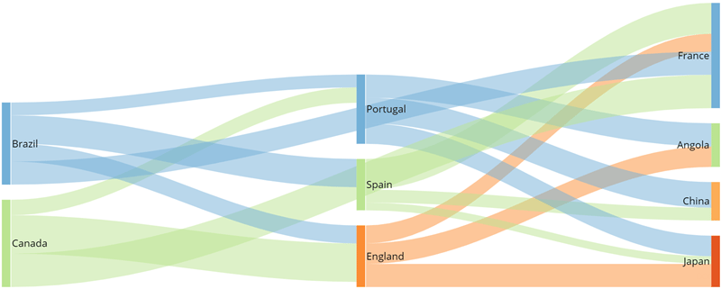
Find out about chart properties available for charts in the "Other" and "Filter" categories in Chart Picker, such as Radar charts, Gantt charts, stock-type charts, slicer Cards, etc.

## "General" properties

The properties in the following table are found in the **General** category in Chart Properties.

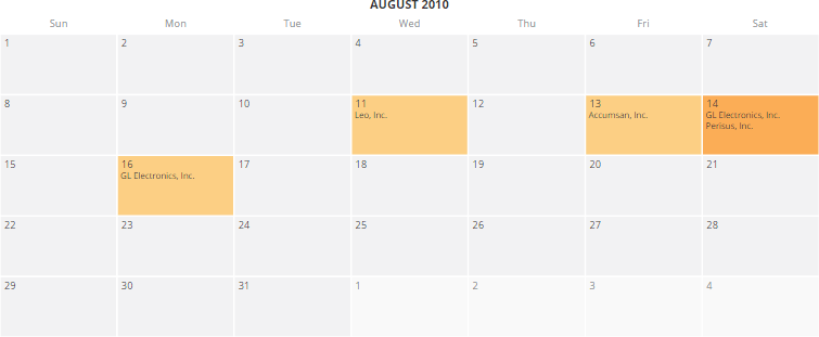
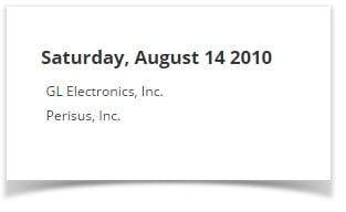
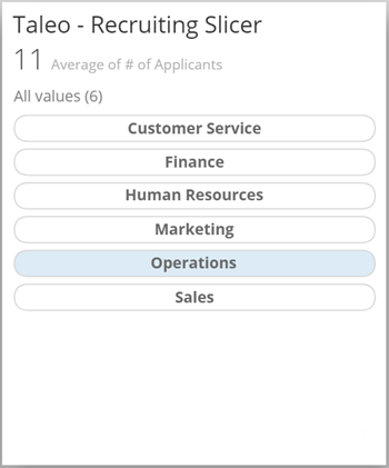
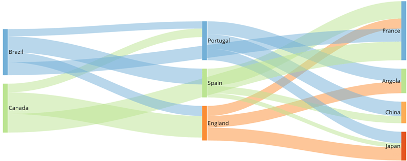
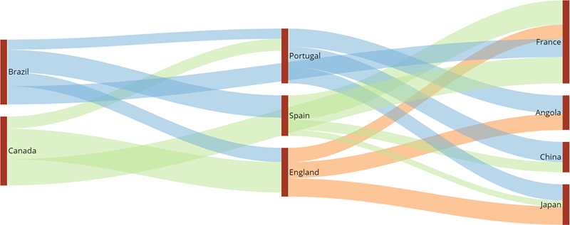
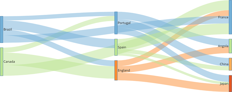
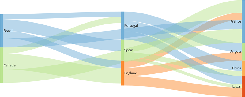
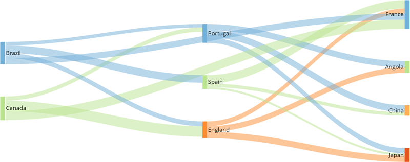
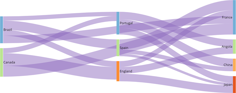
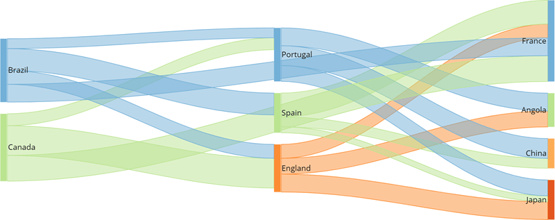
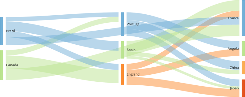
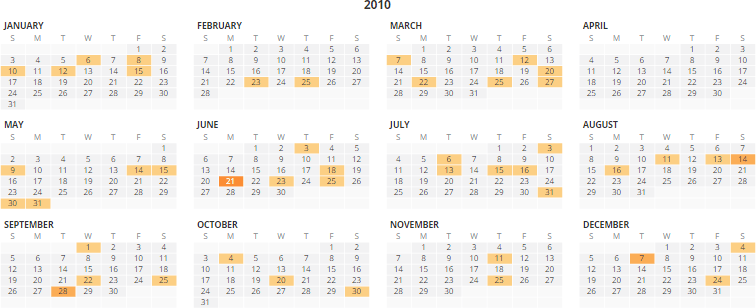
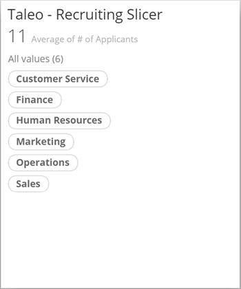
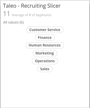
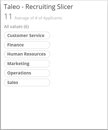
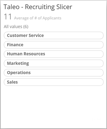
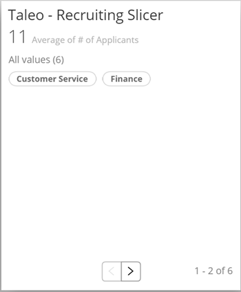
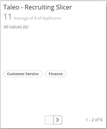
<table class="mt-responsive-table" data-aura-rendered-by="33:209;a"><thead><tr><th colspan="1" rowspan="1"><p> Option </p></th><th class="mt-column-width-40" colspan="1" rowspan="1"><p> Description </p></th><th class="mt-column-width-30" colspan="1" rowspan="1"><p> Examples </p></th></tr></thead><tbody><tr><td colspan="1" rowspan="1"><p> View </p></td><td class="mt-column-width-40" colspan="1" rowspan="1"><p> Determines whether a calendar displays data for an entire year, for a month, or for a single day. Examples of each of these views are shown at right. If you select <b> Auto </b> (which is the default), the calendar determines the view based on the breadth of data in the DataSet. For example, if your DataSet contains data for more than one month, the year view displays automatically so all represented months can be shown. </p></td><td class="mt-column-width-30" colspan="1" rowspan="1"><p><img alt="misccharts1.png" src="https://mintcdn.com/domoinc-openapi-sync-dataflows/7Nd5Hb-h9pITriJg/images/kb/ka05w00000123pw-00N5w00000Ri7BU-0EM5w000005vPJ8.png?fit=max&auto=format&n=7Nd5Hb-h9pITriJg&q=85&s=e339d1715c57f8ace89f3f1f3c700de0" style={{width: 461, height: 188}} width="756" height="308" data-path="images/kb/ka05w00000123pw-00N5w00000Ri7BU-0EM5w000005vPJ8.png" /></p><p><img alt="misccharts2.png" src="https://mintcdn.com/domoinc-openapi-sync-dataflows/7Nd5Hb-h9pITriJg/images/kb/ka05w00000123pw-00N5w00000Ri7BU-0EM5w000005vPJA.png?fit=max&auto=format&n=7Nd5Hb-h9pITriJg&q=85&s=f507fda6c5ac4ac17ae94e3295c881f5" style={{width: 461, height: 188}} width="755" height="311" data-path="images/kb/ka05w00000123pw-00N5w00000Ri7BU-0EM5w000005vPJA.png" /></p><p><img alt="misccharts3.png" src="https://mintcdn.com/domoinc-openapi-sync-dataflows/7Nd5Hb-h9pITriJg/images/kb/ka05w00000123pw-00N5w00000Ri7BU-0EM5w000005vPJC.png?fit=max&auto=format&n=7Nd5Hb-h9pITriJg&q=85&s=2a5906b6699f1adc9101e84f2ea37692" style={{width: 460, height: 282}} width="313" height="192" data-path="images/kb/ka05w00000123pw-00N5w00000Ri7BU-0EM5w000005vPJC.png" /></p></td></tr><tr><td colspan="1" rowspan="1"><p> Dates From </p></td><td class="mt-column-width-40" colspan="1" rowspan="1"><p> Determines whether the dates that appear in a calendar are to be determined automatically based on your DataSet (which is the default) or you plan to specify them manually using the <b> Year </b>, <b> Selected Year </b>, <b> Month </b>, and <b> Day </b> properties. For example, if the series of dates in your DataSet started with "01-06-2014" and you chose the "Day" view, then by default Domo would show the data for "01-06-2014" because it was the first value in the DataSet. If you wanted to show a different date, you could do so by selecting <b> User Specified </b> here and then specifying the date using the <b> Year </b>, <b> Selected Year </b>, <b> Month </b>, and <b> Day </b> properties. </p></td><td class="mt-column-width-30" colspan="1" rowspan="1"><p class="mt-align-center"> — </p></td></tr><tr><td colspan="1" rowspan="1"><p> Year </p></td><td class="mt-column-width-40" colspan="1" rowspan="1"><p> For a calendar, determines the year to be used when <b> User Specified </b> is selected for the <b> Dates From </b> property. Options include <b> Current </b> (which is the default), <b> Previous </b>, <b> Next </b>, and <b> Specified </b>. If you select <b> Specified </b>, you enter the specified year in the <b> Selected Year </b> field. This option is useful if your DataSet contains data for more than one year. </p></td><td class="mt-column-width-30" colspan="1" rowspan="1"><p class="mt-align-center"> — </p></td></tr><tr><td colspan="1" rowspan="1"><p> Selected Year </p></td><td class="mt-column-width-40" colspan="1" rowspan="1"><p> For a calendar, lets you specify the year for your data when you have selected <b> Dates From > User Specified </b> and <b> Year > Specified </b>. This option is useful if your DataSet contains data for more than one year. </p></td><td class="mt-column-width-30" colspan="1" rowspan="1"><p class="mt-align-center"> — </p></td></tr><tr><td colspan="1" rowspan="1"><p> Month </p></td><td class="mt-column-width-40" colspan="1" rowspan="1"><p> For a calendar, lets you specify the month for your data when you have selected <b> Dates From > User Specified </b>. <b> Current </b> is the default. </p></td><td class="mt-column-width-30" colspan="1" rowspan="1"><p class="mt-align-center"> — </p></td></tr><tr><td colspan="1" rowspan="1"><p> Day </p></td><td class="mt-column-width-40" colspan="1" rowspan="1"><p> For a calendar, lets you specify the day of the month for your data when you have selected <b> Dates From > User Specified </b>. <b> Current </b> is the default. </p></td><td class="mt-column-width-30" colspan="1" rowspan="1"><p class="mt-align-center"> — </p></td></tr><tr><td colspan="1" rowspan="1"><p> First Day of Week </p></td><td class="mt-column-width-40" colspan="1" rowspan="1"><p> For a calendar, lets you specify the first day of the week. The default is <b> Sunday </b>. </p></td><td class="mt-column-width-30" colspan="1" rowspan="1"><p class="mt-align-center"> — </p></td></tr><tr><td colspan="1" rowspan="1"><p> Background Fill </p></td><td class="mt-column-width-40" colspan="1" rowspan="1"><p> Specifies the background fill color for a spark line or spark bar chart. If <b><b> Default </b></b> is selected, no background color is used. </p></td><td class="mt-column-width-30" colspan="1" rowspan="1"><p><img alt="misccharts4.png" src="https://mintcdn.com/domoinc-openapi-sync-dataflows/KRKoASQJgRuO8wHw/images/kb/ka05w00000123nA-00N5w00000Ri7BU-0EM5w000005vP7J.png?fit=max&auto=format&n=KRKoASQJgRuO8wHw&q=85&s=da3576746e77b591b4f968af80a90a9a" style={{width: 583, height: 253}} width="800" height="347" data-path="images/kb/ka05w00000123nA-00N5w00000Ri7BU-0EM5w000005vP7J.png" /></p></td></tr><tr><td colspan="1" rowspan="1"><p> Single Column </p></td><td class="mt-column-width-40" colspan="1" rowspan="1"><p> Determines whether the filters in your slicer Card are displayed in a single column. By default the filters are left-aligned unless you choose to center them using the <b> Center Horizontally </b> option. They are also fitted to their individual "bubbles" unless you choose the <b> Equal Width Items </b> option. </p><p> The screenshot at right shows a slicer Card in which this option is being used. </p></td><td class="mt-column-width-30" colspan="1" rowspan="1"><p><img alt="misccharts5.png" src="https://mintcdn.com/domoinc-openapi-sync-dataflows/9GmyphKXosOtxL2U/images/kb/ka05w00000123xY-00N5w00000Ri7BU-0EM5w000005vWKR.jpg?fit=max&auto=format&n=9GmyphKXosOtxL2U&q=85&s=f1e97f2218f9fa5022a6dc43ae2e2545" width="350" height="420" data-path="images/kb/ka05w00000123xY-00N5w00000Ri7BU-0EM5w000005vWKR.jpg" /></p></td></tr><tr><td colspan="1" rowspan="1"><p> Center Horizontally </p></td><td class="mt-column-width-40" colspan="1" rowspan="1"><p> Determines whether the filters in your slicer Card are centered horizontally on the Card. This option is available only when you check the box for <b> Single Column </b>. </p><p> The screenshot at right shows a slicer Card in which this option has been set. </p></td><td class="mt-column-width-30" colspan="1" rowspan="1"><p><img alt="misccharts6.png" src="https://mintcdn.com/domoinc-openapi-sync-dataflows/9GmyphKXosOtxL2U/images/kb/ka05w00000123xY-00N5w00000Ri7BU-0EM5w000005vWKW.jpg?fit=max&auto=format&n=9GmyphKXosOtxL2U&q=85&s=c4a02522639a597ba099a2efee271620" width="350" height="419" data-path="images/kb/ka05w00000123xY-00N5w00000Ri7BU-0EM5w000005vWKW.jpg" /></p></td></tr><tr><td colspan="1" rowspan="1"><p> Equal Width Items </p></td><td class="mt-column-width-40" colspan="1" rowspan="1"><p> Determines whether the "bubbles" for filters in your slicer Card are the same width; otherwise they are fitted to the width of the filters. This option is available only when you check the box for <b> Single Column </b>. </p><p> The screenshot at right shows a slicer Card in which this option has been set. </p></td><td class="mt-column-width-30" colspan="1" rowspan="1"><p><img alt="misccharts7.png" src="https://mintcdn.com/domoinc-openapi-sync-dataflows/9GmyphKXosOtxL2U/images/kb/ka05w00000123xY-00N5w00000Ri7BU-0EM5w000005vWKb.jpg?fit=max&auto=format&n=9GmyphKXosOtxL2U&q=85&s=4848ba5268e1b672b13aa85cafbb6a25" width="350" height="421" data-path="images/kb/ka05w00000123xY-00N5w00000Ri7BU-0EM5w000005vWKb.jpg" /></p></td></tr><tr><td colspan="1" rowspan="1"><p> Fill Width </p></td><td class="mt-column-width-40" colspan="1" rowspan="1"><p> Determines whether the "bubbles" for filters in your slicer Card fill the entire width of the Card. This option is available only when you check the box for <b> Single Column </b>. </p><p> The screenshot at right shows a slicer Card in which this option has been set. </p></td><td class="mt-column-width-30" colspan="1" rowspan="1"><p><img alt="misccharts8.png" src="https://mintcdn.com/domoinc-openapi-sync-dataflows/9GmyphKXosOtxL2U/images/kb/ka05w00000123xY-00N5w00000Ri7BU-0EM5w000005vWKl.jpg?fit=max&auto=format&n=9GmyphKXosOtxL2U&q=85&s=ccf1537d8a903d5080b8393e1086fe52" width="350" height="421" data-path="images/kb/ka05w00000123xY-00N5w00000Ri7BU-0EM5w000005vWKl.jpg" /></p></td></tr><tr><td colspan="1" rowspan="1"><p> Center Text </p></td><td class="mt-column-width-40" colspan="1" rowspan="1"><p> Centers the text within each "bubble" in your slicer Card. This option is available only when you check the box for <b> Single Column </b>. </p><p> The screenshot at right shows a slicer Card in which this option has been set (along with <b> Fill Width </b> ). </p></td><td class="mt-column-width-30" colspan="1" rowspan="1"><p><img alt="misccharts9.png" src="https://mintcdn.com/domoinc-openapi-sync-dataflows/9GmyphKXosOtxL2U/images/kb/ka05w00000123xY-00N5w00000Ri7BU-0EM5w000005vWIW.jpg?fit=max&auto=format&n=9GmyphKXosOtxL2U&q=85&s=32b577db5207ebfab3207cb98e789e40" width="350" height="421" data-path="images/kb/ka05w00000123xY-00N5w00000Ri7BU-0EM5w000005vWIW.jpg" /></p></td></tr><tr><td colspan="1" rowspan="1"><p> Single Row </p></td><td class="mt-column-width-40" colspan="1" rowspan="1"><p> Determines whether the filters in your slicer Card are displayed in a row instead of a column. By default the filters appear at the top of the Card unless you choose to center them using the <b> Center Vertically </b> option. </p><p> The screenshot at right shows a slicer Card in which this option is being used (with a pagination control to view filters that don't fit in the Card). </p></td><td class="mt-column-width-30" colspan="1" rowspan="1"><p><img alt="misccharts10.png" src="https://mintcdn.com/domoinc-openapi-sync-dataflows/9GmyphKXosOtxL2U/images/kb/ka05w00000123xY-00N5w00000Ri7BU-0EM5w000005vWKq.jpg?fit=max&auto=format&n=9GmyphKXosOtxL2U&q=85&s=3a311f891c23fd0545ac4e30e41b5559" width="350" height="423" data-path="images/kb/ka05w00000123xY-00N5w00000Ri7BU-0EM5w000005vWKq.jpg" /></p></td></tr><tr><td colspan="1" rowspan="1"><p> Center Vertically </p></td><td class="mt-column-width-40" colspan="1" rowspan="1"><p> Determines whether the filters in your slicer Card are centered vertically on the Card. This option is available only when you check the box for <b> Single Row </b>. </p><p> The screenshot at right shows a slicer Card in which this option has been set. </p></td><td class="mt-column-width-30" colspan="1" rowspan="1"><p><img alt="misccharts11.png" src="https://mintcdn.com/domoinc-openapi-sync-dataflows/9GmyphKXosOtxL2U/images/kb/ka05w00000123xY-00N5w00000Ri7BU-0EM5w000005vWKv.jpg?fit=max&auto=format&n=9GmyphKXosOtxL2U&q=85&s=d00a0afade5f1e6fdda0208adac692fe" width="350" height="422" data-path="images/kb/ka05w00000123xY-00N5w00000Ri7BU-0EM5w000005vWKv.jpg" /></p></td></tr><tr><td colspan="1" rowspan="1"><p> Selected Color </p></td><td class="mt-column-width-40" colspan="1" rowspan="1"><p> Determines the color of the filter bubbles in your slicer Card when someone mouses over them. </p></td><td class="mt-column-width-30" colspan="1" rowspan="1"><p class="mt-align-center"> — </p></td></tr><tr><td colspan="1" rowspan="1"> Vertical Alignment </td><td class="mt-column-width-40" colspan="1" rowspan="1"><p> Determines the vertical alignment of a Sankey chart. The default is <b><b> Top </b></b>. </p><p> The examples at right show, in order, a Sankey chart with top alignment, middle alignment, and bottom alignment. </p></td><td class="mt-column-width-30" colspan="1" rowspan="1"><p><img alt="misccharts12.png" src="https://mintcdn.com/domoinc-openapi-sync-dataflows/9GmyphKXosOtxL2U/images/kb/ka05w00000123xY-00N5w00000Ri7BU-0EM5w000005vWL0.jpg?fit=max&auto=format&n=9GmyphKXosOtxL2U&q=85&s=5aa8a6da8bbc3aa2d1de596d3e56343d" style={{width: 386, height: 156}} width="800" height="324" data-path="images/kb/ka05w00000123xY-00N5w00000Ri7BU-0EM5w000005vWL0.jpg" /><br /><br /><img alt="misccharts13.png" src="https://mintcdn.com/domoinc-openapi-sync-dataflows/9GmyphKXosOtxL2U/images/kb/ka05w00000123xY-00N5w00000Ri7BU-0EM5w000005vWL5.jpg?fit=max&auto=format&n=9GmyphKXosOtxL2U&q=85&s=52682f0061dbda12695f1fc4799937eb" style={{width: 386, height: 156}} width="800" height="317" data-path="images/kb/ka05w00000123xY-00N5w00000Ri7BU-0EM5w000005vWL5.jpg" /><br /><br /><img alt="misccharts14.png" src="https://mintcdn.com/domoinc-openapi-sync-dataflows/9GmyphKXosOtxL2U/images/kb/ka05w00000123xY-00N5w00000Ri7BU-0EM5w000005vWLA.jpg?fit=max&auto=format&n=9GmyphKXosOtxL2U&q=85&s=cf649231efd23fc12f87f0a4313e35e0" style={{width: 386, height: 156}} width="800" height="321" data-path="images/kb/ka05w00000123xY-00N5w00000Ri7BU-0EM5w000005vWLA.jpg" /></p></td></tr><tr><td colspan="1" rowspan="1"> Outline Sort </td><td class="mt-column-width-40" colspan="1" rowspan="1"> Applies outline (hierarchical) sorting in your Sankey chart if this has been enabled in your DataSet. </td><td class="mt-column-width-30 mt-align-center" colspan="1" rowspan="1"> — </td></tr></tbody></table>
## "Category Scale" properties

The properties in the following table are found in the **Category Scale** category in Chart Properties.

<table class="mt-responsive-table" data-aura-rendered-by="33:209;a"><thead><tr><th class="mt-column-width-15" colspan="1" rowspan="1"><p> Option </p></th><th class="mt-column-width-35" colspan="1" rowspan="1"><p> Description </p></th><th class="mt-column-width-20" colspan="1" rowspan="1"><p> Examples </p></th></tr></thead><tbody><tr><td class="mt-column-width-15" colspan="1" rowspan="1"><p> Wrap Width </p></td><td class="mt-column-width-35" colspan="1" rowspan="1"><p> Allows you to specify the number of pixels at which category labels will wrap in radar charts. </p></td><td class="mt-column-width-20" colspan="1" rowspan="1"><p> — </p></td></tr><tr><td class="mt-column-width-15" colspan="1" rowspan="1"><p> Fixed Area Width </p></td><td class="mt-column-width-35" colspan="1" rowspan="1"><p> Determines a fixed width for the category label area in horizontal bar, horizontal symbol, and category scatter charts. </p></td><td class="mt-column-width-20" colspan="1" rowspan="1"><p> — </p></td></tr><tr><td class="mt-column-width-15" colspan="1" rowspan="1"><p> Fixed Width Margin </p></td><td class="mt-column-width-35" colspan="1" rowspan="1"><p> Determines the margin between category labels and the chart in horizontal bar, horizontal symbol, and category scatter charts. This property does not work unless <b> Fixed Area Width </b> has been set. </p></td><td class="mt-column-width-20" colspan="1" rowspan="1"><p> — </p></td></tr><tr><td class="mt-column-width-15" colspan="1" rowspan="1"><p> Justification (Category Scale) </p></td><td class="mt-column-width-35" colspan="1" rowspan="1"><p> Determines the justification for multi-line category item labels in horizontal bar, horizontal symbol, and category scatter charts—either <b> Left </b> or <b> Right </b>. This works only when the <b> Fixed Area Width </b> property has been set. </p></td><td class="mt-column-width-20" colspan="1" rowspan="1"><p> — </p></td></tr></tbody></table>

## "Radar Settings" properties

The properties in the following table are found in the **Radar Settings** category in Chart Properties.

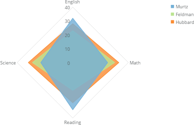
<table class="mt-responsive-table" data-aura-rendered-by="33:209;a"><thead><tr><th class="mt-column-width-15" colspan="1" rowspan="1"><p> Option </p></th><th class="mt-column-width-35" colspan="1" rowspan="1"><p> Description </p></th><th class="mt-column-width-20" colspan="1" rowspan="1"><p> Examples </p></th></tr></thead><tbody><tr><td class="mt-column-width-15" colspan="1" rowspan="1"><p> Series Transparency </p></td><td class="mt-column-width-35" colspan="1" rowspan="1"><p> Determines the transparency for the fill areas in a radar chart. You can specify any value between 0 and 100, where 0 means the fill areas are completely opaque and 100 means they have no fill at all. In the example, the transparency has been set to 20. </p></td><td class="mt-column-width-20" colspan="1" rowspan="1"><p><img alt="misccharts15.png" src="https://mintcdn.com/domoinc-openapi-sync-dataflows/D4XP-ZUu0hZKYNDT/images/kb/ka05w00000123mU-00N5w00000Ri7BU-0EM5w000005vP4j.png?fit=max&auto=format&n=D4XP-ZUu0hZKYNDT&q=85&s=e3b8da7ad7ce9b0c9490cbf270914f5a" style={{width: 343, height: 222}} width="396" height="256" data-path="images/kb/ka05w00000123mU-00N5w00000Ri7BU-0EM5w000005vP4j.png" /></p></td></tr></tbody></table>

## "Theme" properties

The properties in the following table are found in the **Theme** category in Chart Properties.

<table class="mt-responsive-table" data-aura-rendered-by="33:209;a"><thead><tr><th class="mt-column-width-15" colspan="1" rowspan="1"><p> Option </p></th><th class="mt-column-width-35" colspan="1" rowspan="1"><p> Description </p></th><th class="mt-column-width-15" colspan="1" rowspan="1"><p> Examples </p></th></tr></thead><tbody><tr><td class="mt-column-width-15" colspan="1" rowspan="1"><p> Theme </p></td><td class="mt-column-width-35" colspan="1" rowspan="1"><p> Allows you to change the color theme for calendars. For more information about setting colors, see <a href="/s/article/360043428813" target="_self" title="Setting Color Rules for a Chart"> Setting Color Rules for a Chart </a>. </p></td><td class="mt-column-width-15" colspan="1" rowspan="1"><p> — </p></td></tr></tbody></table>

## "Time Scale (X)" properties

The properties in the following table are found in the **Theme** category in Chart Properties.

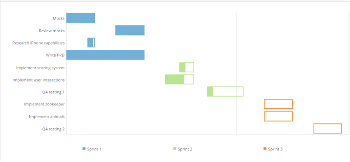
<table class="mt-responsive-table" data-aura-rendered-by="33:209;a"><thead><tr><th colspan="1" rowspan="1"> Option </th><th colspan="1" rowspan="1"> Description </th><th colspan="1" rowspan="1"> Examples </th></tr></thead><tbody><tr><td colspan="1" rowspan="1"><p> Show Label </p></td><td colspan="1" rowspan="1"><p> Hides or shows time scale labels in Gantt charts. Labels are shown by default. </p><p> The example shows a Gantt percent complete chart in which time scales have been removed. </p></td><td colspan="1" rowspan="1"><p><img alt="misccharts16.png" src="https://mintcdn.com/domoinc-openapi-sync-dataflows/KRKoASQJgRuO8wHw/images/kb/ka05w00000123nu-00N5w00000Ri7BU-0EM5w000005vP9c.png?fit=max&auto=format&n=KRKoASQJgRuO8wHw&q=85&s=6b364d84636bb03d21995a78e5afdfb1" style={{width: 440, height: 204}} width="716" height="332" data-path="images/kb/ka05w00000123nu-00N5w00000Ri7BU-0EM5w000005vP9c.png" /></p></td></tr></tbody></table>

## "Value Options" properties

The properties in the following table are found in the **Theme** category in Chart Properties.

<table class="mt-responsive-table" data-aura-rendered-by="33:209;a"><thead><tr><th colspan="1" rowspan="1"><p> Option </p></th><th colspan="1" rowspan="1"><p> Description </p></th></tr></thead><tbody><tr><td colspan="1" rowspan="1"><p> Hide </p></td><td colspan="1" rowspan="1"><p> Hides the summary value in a spark Line or spark Bar chart. (This is the <em><em> first </em></em> number that appears in the chart's built-in gauge.) </p></td></tr><tr><td colspan="1" rowspan="1"><p> Value </p></td><td colspan="1" rowspan="1"><p> Indicates how a spark line or spark bar chart's summary value is derived. You can choose from any of the following options for this property: </p><table><tbody><tr><td colspan="1" rowspan="1"><p> First Value </p></td><td colspan="1" rowspan="1"><p> The summary value is the first value on your line. This is the default option. </p></td></tr><tr><td colspan="1" rowspan="1"><p> Last Value </p></td><td colspan="1" rowspan="1"><p> The summary value is the last value on your line. </p></td></tr><tr><td colspan="1" rowspan="1"><p> Sum </p></td><td colspan="1" rowspan="1"><p> The summary value is the sum of all values on the line. </p></td></tr><tr><td colspan="1" rowspan="1"><p> Average </p></td><td colspan="1" rowspan="1"><p> The summary value is the average of all values on the line. </p></td></tr><tr><td colspan="1" rowspan="1"><p> Minimum </p></td><td colspan="1" rowspan="1"><p> The summary value is the minimum value on the line. </p></td></tr><tr><td colspan="1" rowspan="1"><p> Maximum </p></td><td colspan="1" rowspan="1"><p> The summary value is the maximum value on the line. </p></td></tr><tr><td colspan="1" rowspan="1"><p> Count </p></td><td colspan="1" rowspan="1"><p> The summary value is a count of the number of values on the line. </p></td></tr></tbody></table></td></tr><tr><td colspan="1" rowspan="1"><p> Size </p></td><td colspan="1" rowspan="1"><p> Specifies the size of the summary value in a spark line or spark bar chart. You can choose from <b><b> Medium </b></b> (default) or <b><b> Small </b></b>. </p></td></tr><tr><td colspan="1" rowspan="1"><p> Value Format </p></td><td colspan="1" rowspan="1"><p> Determines the general number format for your spark line/spark bar chart's summary value. Options include <b><b><b><b> Number </b></b></b></b> (which includes no special formatting), <b><b><b><b> Currency </b></b></b></b> (in which a currency symbol is affixed), and <b><b><b><b> Percentage </b></b></b></b> (in which a percent symbol is affixed). </p></td></tr><tr><td colspan="1" rowspan="1"><p> Divide Value By </p></td><td colspan="1" rowspan="1"><p> Refers to the number that the gauge value in a spark line or spark bar is to be divided by, if any. This option is useful when the value is very large and you want to abbreviate it by dividing by a common number. For example, if the gauge value represented millions of dollars, you could choose to divide by millions—the gauge value would then be reduced to more comprehendible single digits. When you choose to divide by <b><b><b><b> Percentage </b></b></b></b>, the gauge value is multiplied by 100. </p></td></tr><tr><td colspan="1" rowspan="1"><p> Decimal Places </p></td><td colspan="1" rowspan="1"><p> Determines the number of decimal places used in the summary value in a spark line or spark bar chart. You can choose from <b><b><b><b> Default </b></b></b></b>, <b><b><b><b> None </b></b></b></b>, and options for numbers of decimal places (from ".0" to ".00000"). By default, Domo automatically determines the optimal number of decimal places for the gauge value. When you select <b><b><b><b> None </b></b></b></b>, the value is rounded to the nearest whole number. </p></td></tr><tr><td colspan="1" rowspan="1"><p> Negative Numbers </p></td><td colspan="1" rowspan="1"><p> Determines the format for negative numbers in a spark line or spark bar chart. </p><p> If you select <b><b><b><b> -100 </b></b></b></b>, negative values have a minus symbol affixed. If you select <b><b><b><b> (100) </b></b></b></b>, negative values are enclosed in parentheses. </p></td></tr></tbody></table>

## "Change Value Options" properties

The properties in the following table are found in the **Change Value Options** category in Chart Properties.

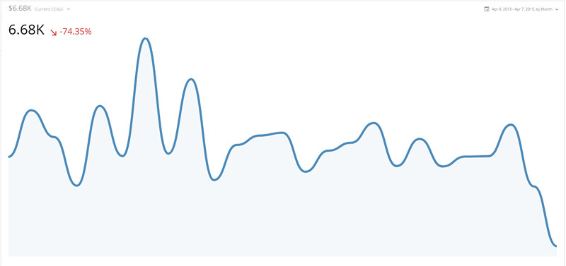
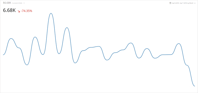
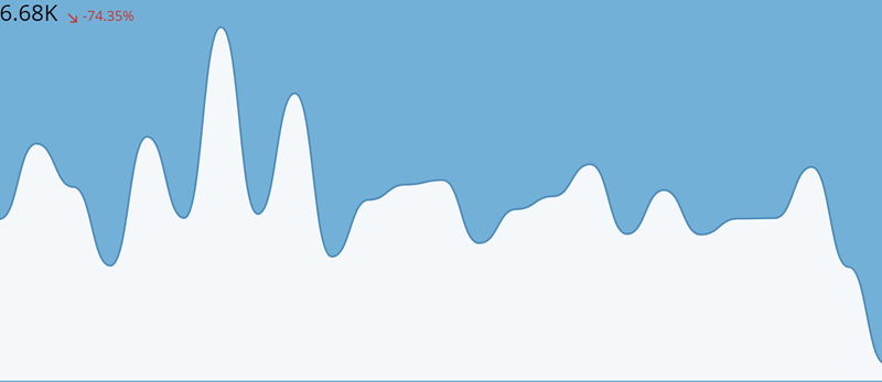
<table class="mt-responsive-table" data-aura-rendered-by="33:209;a"><thead><tr><th colspan="1" rowspan="1"><p> Option </p></th><th colspan="1" rowspan="1"><p> Description </p></th><th colspan="1" rowspan="1"><p /></th></tr></thead><tbody><tr><td colspan="1" rowspan="1"><p> Hide </p></td><td colspan="1" rowspan="1"><p> Hides the change value in a spark line or spark bar chart. (This is the <em> second </em> number that appears in the chart's built-in gauge. For example, in the screenshot of the chart at the top of this article, the value is -74.35%.) </p></td><td colspan="1" rowspan="1"><p> — </p></td></tr><tr><td colspan="1" rowspan="1"><p> Value </p></td><td colspan="1" rowspan="1"><p> Specifies whether the change value in a spark line or spark bar chart is a percent change (default) or a difference in values. </p></td><td colspan="1" rowspan="1"><p> — </p></td></tr><tr><td colspan="1" rowspan="1"><p> Data </p></td><td colspan="1" rowspan="1"><p> Specifies whether the change value in a spark line or spark bar chart is derived from the first and last values in the chart (default) or the last two values in the chart. </p></td><td colspan="1" rowspan="1"><p> — </p></td></tr><tr><td colspan="1" rowspan="1"><p> Size </p></td><td colspan="1" rowspan="1"><p> Specifies the size of the change value in a spark line or spark bar chart. You can choose from <b> Medium </b> (default) or <b> Small </b>. </p></td><td colspan="1" rowspan="1"><p> — </p></td></tr><tr><td colspan="1" rowspan="1"><p> Direction Indicator </p></td><td colspan="1" rowspan="1"><p> Specifies whether the symbol used to represent change in the change value in a spark line or spark bar chart is an arrow (default), a curved arrow, or a triangle. Examples of all three of these are shown at right. </p></td><td colspan="1" rowspan="1"><p><img alt="misccharts17.png" src="https://mintcdn.com/domoinc-openapi-sync-dataflows/KRKoASQJgRuO8wHw/images/kb/ka05w00000123nA-00N5w00000Ri7BU-0EM5w000005vP7A.png?fit=max&auto=format&n=KRKoASQJgRuO8wHw&q=85&s=f0962d92e844ec28199b0d038a5a40ca" width="294" height="38" data-path="images/kb/ka05w00000123nA-00N5w00000Ri7BU-0EM5w000005vP7A.png" /><br /><img alt="misccharts18.png" src="https://mintcdn.com/domoinc-openapi-sync-dataflows/KRKoASQJgRuO8wHw/images/kb/ka05w00000123nA-00N5w00000Ri7BU-0EM5w000005vP7M.png?fit=max&auto=format&n=KRKoASQJgRuO8wHw&q=85&s=b5e107276f11fc1ec4d4be890d8c3451" width="292" height="37" data-path="images/kb/ka05w00000123nA-00N5w00000Ri7BU-0EM5w000005vP7M.png" /><br /><img alt="misccharts19.png" src="https://mintcdn.com/domoinc-openapi-sync-dataflows/KRKoASQJgRuO8wHw/images/kb/ka05w00000123nA-00N5w00000Ri7BU-0EM5w000005vP7K.png?fit=max&auto=format&n=KRKoASQJgRuO8wHw&q=85&s=6f75e5c99b34906462448acf971dacbe" width="292" height="37" data-path="images/kb/ka05w00000123nA-00N5w00000Ri7BU-0EM5w000005vP7K.png" /></p></td></tr><tr><td colspan="1" rowspan="1"><p> Reverse Color Direction </p></td><td colspan="1" rowspan="1"><p> By default, if your change value in a spark line or spark bar chart is positive, the value appears green; if it is negative, the value appears red. By setting the <b> Reverse Color Direction </b> property, you can switch this default behavior. This is useful for gauges in which low values are ideal (such as a gauge that keeps track of workplace accidents). </p></td><td colspan="1" rowspan="1"><p> — </p></td></tr><tr><td colspan="1" rowspan="1"><p> Value Format </p></td><td colspan="1" rowspan="1"><p> Determines the general number format for your spark line or spark bar chart's change value. Options include <b><b> Number </b></b> (which includes no special formatting), <b><b> Currency </b></b> (in which a currency symbol is affixed), and <b><b> Percentage </b></b> (in which a percent symbol is affixed). </p><div class="mdx-embed"><Note><b> Note: </b> The <b> Number </b> and <b> Currency </b> options will <em> not </em> work unless you set <b> Change Value Options > Value </b> to <b> Value Change </b>.</Note></div></td><td colspan="1" rowspan="1"><p> — </p></td></tr><tr><td colspan="1" rowspan="1"><p> Hover Format </p></td><td colspan="1" rowspan="1"><p> Determines the number format for your spark line or spark bar chart's hovers (i.e. the text that appears when you mouse over a data point in the chart). Options include <b><b> Number </b></b> (which includes no special formatting), <b><b> Currency </b></b> (in which a currency symbol is affixed), and <b><b> Percentage </b></b> (in which a percent symbol is affixed). <br /><br /> For more information about hovers, see <a href="/s/article/360043429693" target="_blank" title="Formatting Data Label and Hover Text in Your Chart"> Formatting Data Label and Hover Text in Your Chart </a>. </p></td><td colspan="1" rowspan="1"><p> — </p></td></tr><tr><td colspan="1" rowspan="1"><p> Hover Decimal Places </p></td><td colspan="1" rowspan="1"><p> Determines the number of decimal places that appear in values in your spark line or spark bar chart's hovers (i.e. the text that appears when you mouse over a data point in the chart). <br /><br /> For more information about hovers, see <a href="/s/article/360043429693" target="_blank" title="Formatting Data Label and Hover Text in Your Chart"> Formatting Data Label and Hover Text in Your Chart </a>. </p></td><td colspan="1" rowspan="1"><p> — </p></td></tr><tr><td colspan="1" rowspan="1"><p> Positive Color </p></td><td colspan="1" rowspan="1"><p> Specifies the color used in a spark line or spark bar chart when the degree of change in your chart is positive. </p></td><td colspan="1" rowspan="1"><p> — </p></td></tr><tr><td colspan="1" rowspan="1"><p> Negative Color </p></td><td colspan="1" rowspan="1"><p> Specifies the color used in a spark line or spark bar chart when the degree of change in your chart is negative. </p></td><td colspan="1" rowspan="1"><p> — </p></td></tr></tbody></table>

## "Line Options" properties

The properties in the following table are found in the **Line Options** category in Chart Properties.

<table class="mt-responsive-table" data-aura-rendered-by="33:209;a"><thead><tr><th colspan="1" rowspan="1"><p> Option </p></th><th colspan="1" rowspan="1"><p> Description </p></th><th colspan="1" rowspan="1"><p /></th></tr></thead><tbody><tr><td colspan="1" rowspan="1"><p> Style </p></td><td colspan="1" rowspan="1"><p> Determines whether the line in your spark line chart is angular (<b> Plain </b> ) or curved. <b> Plain </b> is the default. </p></td><td colspan="1" rowspan="1"><p> — </p></td></tr><tr><td colspan="1" rowspan="1"><p> Thickness </p></td><td colspan="1" rowspan="1"><p> Determines whether the line in your spark line chart is thin (default), medium, or thick. The example at right shows a spark line chart in which <b> Thick </b> has been selected. </p></td><td colspan="1" rowspan="1"><p><img alt="misccharts20.png" src="https://mintcdn.com/domoinc-openapi-sync-dataflows/KRKoASQJgRuO8wHw/images/kb/ka05w00000123nA-00N5w00000Ri7BU-0EM5w000005vP7N.png?fit=max&auto=format&n=KRKoASQJgRuO8wHw&q=85&s=39e3c87063c0e0d526f52829a3c1f075" style={{width: 533, height: 251}} width="800" height="377" data-path="images/kb/ka05w00000123nA-00N5w00000Ri7BU-0EM5w000005vP7N.png" /></p></td></tr><tr><td colspan="1" rowspan="1"><p> Hide Area Fill </p></td><td colspan="1" rowspan="1"><p> Hides the area fill in your spark line chart. The example at right shows a chart in which this has been done. </p></td><td colspan="1" rowspan="1"><p><img alt="misccharts21.png" src="https://mintcdn.com/domoinc-openapi-sync-dataflows/KRKoASQJgRuO8wHw/images/kb/ka05w00000123nA-00N5w00000Ri7BU-0EM5w000005vP7B.png?fit=max&auto=format&n=KRKoASQJgRuO8wHw&q=85&s=0859f1634daff6105f9917069348b41e" style={{width: 533, height: 251}} width="800" height="377" data-path="images/kb/ka05w00000123nA-00N5w00000Ri7BU-0EM5w000005vP7B.png" /></p></td></tr></tbody></table>

## "Node Options" properties

The properties in the following table are found in the **Node Options** category in Chart Properties.

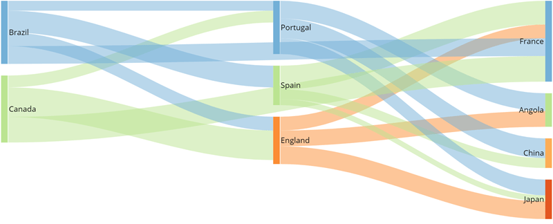
<table class="mt-responsive-table" data-aura-rendered-by="33:209;a"><thead><tr><th colspan="1" rowspan="1"><p> Option </p></th><th colspan="1" rowspan="1"><p> Description </p></th><th colspan="1" rowspan="1"><p /></th></tr></thead><tbody><tr><td colspan="1" rowspan="1"> Fill Color </td><td colspan="1" rowspan="1"><p> Determines the color of the nodes in a Sankey chart (i.e. the vertical lines separating each item on both the left and right sides). By default these are the same color as the output lines. If you choose a color here, all nodes will be the same color. </p><p> In the example at right, all nodes are colored dark red. </p></td><td colspan="1" rowspan="1"><img alt="misccharts22.png" src="https://mintcdn.com/domoinc-openapi-sync-dataflows/9GmyphKXosOtxL2U/images/kb/ka05w00000123xY-00N5w00000Ri7BU-0EM5w000005vWMk.jpg?fit=max&auto=format&n=9GmyphKXosOtxL2U&q=85&s=806df06cd7e90e35c62ec6da7bf52dbd" style={{width: 433, height: 172}} width="800" height="317" data-path="images/kb/ka05w00000123xY-00N5w00000Ri7BU-0EM5w000005vWMk.jpg" /></td></tr><tr><td colspan="1" rowspan="1"> Border Color </td><td colspan="1" rowspan="1"><p> Determines the border color for the nodes in a Sankey chart (i.e. the vertical lines separating each item on both the left and right sides). By default, no borders are shown. </p><p> In the example at right, all nodes have dark blue borders. </p></td><td colspan="1" rowspan="1"><img alt="misccharts23.png" src="https://mintcdn.com/domoinc-openapi-sync-dataflows/9GmyphKXosOtxL2U/images/kb/ka05w00000123xY-00N5w00000Ri7BU-0EM5w000005vWMp.jpg?fit=max&auto=format&n=9GmyphKXosOtxL2U&q=85&s=5a891844efabb1d1850348d899473f2b" style={{width: 433, height: 172}} width="800" height="317" data-path="images/kb/ka05w00000123xY-00N5w00000Ri7BU-0EM5w000005vWMp.jpg" /></td></tr><tr><td colspan="1" rowspan="1"> Percent Space Between Nodes </td><td colspan="1" rowspan="1"><p> Determines the amount of space between nodes in a Sankey chart. You can enter any value between 0 (meaning no white space appears between nodes) and 80. The default is about 15. </p><p> The first example at right shows a Sankey chart with a percent space of 0. The second example shows the same chart with a percent space of 60. </p></td><td colspan="1" rowspan="1"><p><img alt="misccharts24.png" src="https://mintcdn.com/domoinc-openapi-sync-dataflows/9GmyphKXosOtxL2U/images/kb/ka05w00000123xY-00N5w00000Ri7BU-0EM5w000005vWMu.jpg?fit=max&auto=format&n=9GmyphKXosOtxL2U&q=85&s=4c6ae0c50da414cda53efe6c6cfd8f49" style={{width: 554, height: 220}} width="800" height="317" data-path="images/kb/ka05w00000123xY-00N5w00000Ri7BU-0EM5w000005vWMu.jpg" /><br /><img alt="misccharts25.png" src="https://mintcdn.com/domoinc-openapi-sync-dataflows/9GmyphKXosOtxL2U/images/kb/ka05w00000123xY-00N5w00000Ri7BU-0EM5w000005vWMz.jpg?fit=max&auto=format&n=9GmyphKXosOtxL2U&q=85&s=7e9d95f59a4379b716074e91ada3cbba" style={{width: 554, height: 220}} width="800" height="317" data-path="images/kb/ka05w00000123xY-00N5w00000Ri7BU-0EM5w000005vWMz.jpg" /></p></td></tr><tr><td colspan="1" rowspan="1"> Hover Text </td><td colspan="1" rowspan="1"> Lets you specify the hover text that appears when you mouse over a node in a Sankey chart. (By default, the hover text shows you the name and total value for the item.) A variety of replacement macros is available for dynamic text. For more information, see <a href="/s/article/360043429693" target="_blank" title="Formatting Data Label and Hover Text in Your Chart"> Formatting Data Label and Hover Text in Your Chart </a>. </td><td colspan="1" rowspan="1"> — </td></tr></tbody></table>

## "Flow Options" properties

The properties in the following table are found in the **Flow Options** category in Chart Properties.

<table class="mt-responsive-table" data-aura-rendered-by="33:209;a"><thead><tr><th colspan="1" rowspan="1"><p> Option </p></th><th colspan="1" rowspan="1"><p> Description </p></th><th colspan="1" rowspan="1"><p /></th></tr></thead><tbody><tr><td colspan="1" rowspan="1"> Fill Color </td><td colspan="1" rowspan="1"><p> Determines the color of the connector lines in a Sankey chart. By default these are all different colors to aid visibility. If you choose a color here, all connector lines will be the same color (however, shading will be added in spots where lines cross other lines so visibility is improved). </p><p> In the example at right, all connector lines are colored purple. </p></td><td colspan="1" rowspan="1"><img alt="misccharts26.png" src="https://mintcdn.com/domoinc-openapi-sync-dataflows/9GmyphKXosOtxL2U/images/kb/ka05w00000123xY-00N5w00000Ri7BU-0EM5w000005vWN4.jpg?fit=max&auto=format&n=9GmyphKXosOtxL2U&q=85&s=5311139a833cccd258942ac1515fa933" style={{width: 526, height: 208}} width="800" height="317" data-path="images/kb/ka05w00000123xY-00N5w00000Ri7BU-0EM5w000005vWN4.jpg" /></td></tr><tr><td colspan="1" rowspan="1"> Show Borders </td><td colspan="1" rowspan="1"> When checked, all connector lines in a Sankey chart will have borders (as shown in the example at right). </td><td colspan="1" rowspan="1"><img alt="misccharts27.png" src="https://mintcdn.com/domoinc-openapi-sync-dataflows/9GmyphKXosOtxL2U/images/kb/ka05w00000123xY-00N5w00000Ri7BU-0EM5w000005vWN9.jpg?fit=max&auto=format&n=9GmyphKXosOtxL2U&q=85&s=5eacc4ba697a8a3bc89f5cbab6d3f62a" style={{width: 526, height: 208}} width="800" height="317" data-path="images/kb/ka05w00000123xY-00N5w00000Ri7BU-0EM5w000005vWN9.jpg" /></td></tr><tr><td colspan="1" rowspan="1"> Node Margin </td><td colspan="1" rowspan="1"><p> Determines the amount of space between the nodes and their connector lines in a Sankey chart. You can enter any value between 0 (the default—no space separates the nodes and lines) and 20. </p><p> In the example, a margin space of 10 has been set. </p></td><td colspan="1" rowspan="1"><img alt="misccharts28.png" src="https://mintcdn.com/domoinc-openapi-sync-dataflows/9GmyphKXosOtxL2U/images/kb/ka05w00000123xY-00N5w00000Ri7BU-0EM5w000005vWNE.jpg?fit=max&auto=format&n=9GmyphKXosOtxL2U&q=85&s=ba2c094f96692134f60b3504d90bb3f7" style={{width: 526, height: 208}} width="800" height="317" data-path="images/kb/ka05w00000123xY-00N5w00000Ri7BU-0EM5w000005vWNE.jpg" /></td></tr><tr><td colspan="1" rowspan="1"> Hover Text </td><td colspan="1" rowspan="1"> Lets you specify the hover text that appears when you mouse over a connector line in a Sankey chart. (By default, the hover text shows the "From" and "To" items followed by the value of the pairing.) A variety of replacement macros is available for dynamic text. For more information, see <a href="/s/article/360043429693" target="_blank" title="Formatting Data Label and Hover Text in Your Chart"> Formatting Data Label and Hover Text in Your Chart </a>. </td><td colspan="1" rowspan="1"> — </td></tr></tbody></table>

## "Entry Indicator" and "Exit Indicator" properties

The properties in the following table are found in the **Entry Indicator** and **Exit Indicator** categories in Chart Properties.

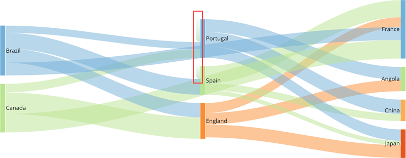
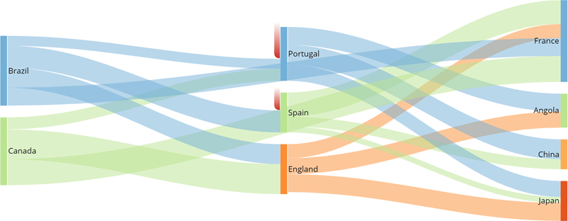
<table class="mt-responsive-table" data-aura-rendered-by="33:209;a"><thead><tr><th colspan="1" rowspan="1"><p> Option </p></th><th colspan="1" rowspan="1"><p> Description </p></th><th colspan="1" rowspan="1"><p /></th></tr></thead><tbody><tr><td colspan="1" rowspan="1"> Show </td><td colspan="1" rowspan="1"><p> Lets you turn on entry/exit indicators for your Sankey chart. Entry indicators appear for nodes in which the value exiting the node is greater than the value entering the node. Exit indicators appear for nodes in which the value entering the node is greater than the value exiting the node. If you mouse over a node, hover text appears showing you the difference in values. </p><p> The screenshot shows an example of a Sankey chart with two entry indicators, for Portugal and Spain. </p></td><td colspan="1" rowspan="1"><img alt="misccharts29.png" src="https://mintcdn.com/domoinc-openapi-sync-dataflows/9GmyphKXosOtxL2U/images/kb/ka05w00000123xY-00N5w00000Ri7BU-0EM5w000005vWNY.jpg?fit=max&auto=format&n=9GmyphKXosOtxL2U&q=85&s=1f447785e8453ac98a9548ed2ba3bced" style={{width: 494, height: 193}} width="800" height="312" data-path="images/kb/ka05w00000123xY-00N5w00000Ri7BU-0EM5w000005vWNY.jpg" /></td></tr><tr><td colspan="1" rowspan="1"> Color </td><td colspan="1" rowspan="1"><p> Lets you change the color of entry/exit indicators in your Sankey chart. </p><p> In the screenshot, the color of the entry indicators has been changed to dark red. </p></td><td colspan="1" rowspan="1"><img alt="misccharts30.png" src="https://mintcdn.com/domoinc-openapi-sync-dataflows/9GmyphKXosOtxL2U/images/kb/ka05w00000123xY-00N5w00000Ri7BU-0EM5w000005vWNd.jpg?fit=max&auto=format&n=9GmyphKXosOtxL2U&q=85&s=2268a171f76ab6d8e6eaf4e46f5abda0" style={{width: 494, height: 193}} width="800" height="312" data-path="images/kb/ka05w00000123xY-00N5w00000Ri7BU-0EM5w000005vWNd.jpg" /></td></tr><tr><td colspan="1" rowspan="1"> Hover Text </td><td colspan="1" rowspan="1"> Lets you specify the hover text that appears when you mouse over an entry/exit indicator in a Sankey chart. (By default, the hover text shows the difference in values between the input and output nodes.) A variety of replacement macros is available for dynamic text. For more information, see <a href="/s/article/360043429693" target="_blank" title="Formatting Data Label and Hover Text in Your Chart"> Formatting Data Label and Hover Text in Your Chart </a>. </td><td class="mt-align-center" colspan="1" rowspan="1"> — </td></tr></tbody></table>