> ## Documentation Index
> Fetch the complete documentation index at: https://domoinc-openapi-sync-dataflows.mintlify.site/llms.txt
> Use this file to discover all available pages before exploring further.

# Properties for Tables

### Intro

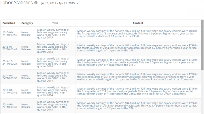
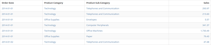
This article describes chart properties available for tables, including specific properties of Flex Tables, Heat Map Tables, Mega Tables, and textboxes.

Learn about [properties available for most chart types](/s/article/360043429793).

***

### General Properties

The properties in the following table are found in the **General** category in Chart Properties.

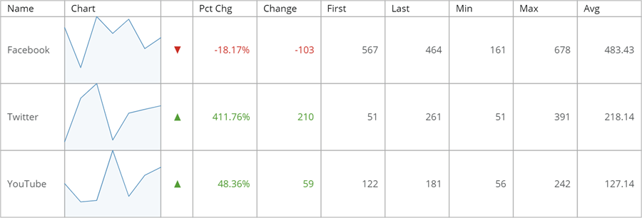
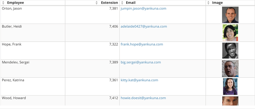
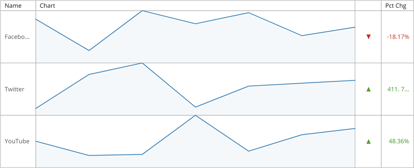
<table class="mt-responsive-table" data-aura-rendered-by="33:209;a"><thead><tr><th colspan="1" rowspan="1"><p> Option </p></th><th colspan="1" rowspan="1"><p> Description </p></th><th colspan="1" rowspan="1"><p> Examples </p></th></tr></thead><tbody><tr><td colspan="1" rowspan="1"><p> Font color </p></td><td colspan="1" rowspan="1"> Choose the font color used for all text in the table. </td><td colspan="1" rowspan="1"><p class="wysiwyg-text-align-center"> — </p></td></tr><tr><td colspan="1" rowspan="1"><p> Allow text to wrap </p></td><td colspan="1" rowspan="1"><p> When checked, text in table columns wraps instead of disappearing off the right side of the column. </p></td><td colspan="1" rowspan="1"><p class="wysiwyg-text-align-center"><a href="/s/article/360043429073" target="_blank" title="/@api/deki/files/1330/table_text_wrap.png"><img alt="" src="https://mintcdn.com/domoinc-openapi-sync-dataflows/zKZ3HwsBqhLsvFuw/images/kb/ka0Vq0000003jAH-00N5w00000Ri7BU-0EM5w000005vZ68.png?fit=max&auto=format&n=zKZ3HwsBqhLsvFuw&q=85&s=e14cfde95a5a99d15ea9cee4339fb8c0" width="708" height="397" data-path="images/kb/ka0Vq0000003jAH-00N5w00000Ri7BU-0EM5w000005vZ68.png" /></a></p></td></tr><tr><td colspan="1" rowspan="1"><p> Financial style negatives (100) </p></td><td colspan="1" rowspan="1"><p> When this box is checked, negative numbers are enclosed in parentheses; otherwise, a minus sign is used. </p></td><td class="wysiwyg-text-align-center" colspan="1" rowspan="1"><p> — </p></td></tr><tr><td colspan="1" rowspan="1"><p> Show negative numbers in red </p></td><td colspan="1" rowspan="1"><p> When this box is checked, negative numbers appear in red. </p></td><td class="wysiwyg-text-align-center" colspan="1" rowspan="1"><p> — </p></td></tr><tr><td colspan="1" rowspan="1"><p> Set column widths </p></td><td colspan="1" rowspan="1"><p> Allows you to set the widths, in pixels, for all table columns as percentages. Do this by entering the widths as a comma-separated list. <br /><br /> In the example below, the column widths are 20, 20, 40, 20. </p></td><td colspan="1" rowspan="1"><p class="mt-align-center"><a target="_blank" title="/@api/deki/files/4187/table_set_column_width.png"><img alt="" src="https://mintcdn.com/domoinc-openapi-sync-dataflows/g5Ek3SRXv8ussuBG/images/kb/ka0Vq0000003jAH-00N5w00000Ri7BU-0EM5w000005vP3d.png?fit=max&auto=format&n=g5Ek3SRXv8ussuBG&q=85&s=910e398825be233fca7a23750ae2ea1f" style={{width: 756, height: 163}} width="700" height="151" data-path="images/kb/ka0Vq0000003jAH-00N5w00000Ri7BU-0EM5w000005vP3d.png" /></a></p></td></tr><tr><td colspan="1" rowspan="1"><p> Hide columns </p></td><td colspan="1" rowspan="1"><p> Allows you to hide columns in a table by entering the column numbers in a comma-separated list. The column numbers are based on the order of the columns in the table, from left to right. </p><p> For example, the third column from the left would be column 3. </p></td><td colspan="1" rowspan="1"><p class="mt-align-center" /></td></tr><tr><td colspan="1" rowspan="1"><p> No data message </p></td><td colspan="1" rowspan="1"><p> The text of the message that displays if there is no data. This can occur if the data has been filtered out. </p></td><td colspan="1" rowspan="1"><p class="mt-align-center" /></td></tr><tr><td colspan="1" rowspan="1"><p> Text </p></td><td colspan="1" rowspan="1"><p> Lets you set custom text for a Textbox. Any text you enter here replaces the text from your DataSet. You can use the macro <code> %\_VALUE </code> here to insert the value from the column you applied in the <b> Optional Value </b> field. For example, if you wanted the text in your textbox to read "Today's quota is \[some value]," you would enter <code> Today's quota is %\_VALUE </code> in this field. </p></td><td class="wysiwyg-text-align-center" colspan="1" rowspan="1"><p class="mt-align-center"> — </p></td></tr><tr><td colspan="1" rowspan="1"><p> Horizontal Text Alignment </p></td><td colspan="1" rowspan="1"><p> Lets you select the horizontal alignment for text in a Textbox. The examples at right show the same string of text left-aligned, center-aligned, and right-aligned, in that order. </p></td><td colspan="1" rowspan="1"><p class="wysiwyg-text-align-center"><a href="/s/article/360043429073" target="_blank" title="/@api/deki/files/1329/textbox_left_aligned.png"><img alt="" src="https://mintcdn.com/domoinc-openapi-sync-dataflows/zKZ3HwsBqhLsvFuw/images/kb/ka0Vq0000003jAH-00N5w00000Ri7BU-0EM5w000005vZ5p.png?fit=max&auto=format&n=zKZ3HwsBqhLsvFuw&q=85&s=79fae227caa6fb1e695b8d525d70f397" width="585" height="160" data-path="images/kb/ka0Vq0000003jAH-00N5w00000Ri7BU-0EM5w000005vZ5p.png" /></a></p><p class="wysiwyg-text-align-center"><a href="/s/article/360043429073" target="_blank" title="/@api/deki/files/1328/textbox_center_aligned.png"><img alt="" src="https://mintcdn.com/domoinc-openapi-sync-dataflows/zKZ3HwsBqhLsvFuw/images/kb/ka0Vq0000003jAH-00N5w00000Ri7BU-0EM5w000005vZ5q.png?fit=max&auto=format&n=zKZ3HwsBqhLsvFuw&q=85&s=61e679483ab7be112a6b08104e59a67f" width="585" height="160" data-path="images/kb/ka0Vq0000003jAH-00N5w00000Ri7BU-0EM5w000005vZ5q.png" /></a></p><p class="wysiwyg-text-align-center"><a href="/s/article/360043429073" target="_blank" title="/@api/deki/files/1327/textbox_right_aligned.png"><img alt="" src="https://mintcdn.com/domoinc-openapi-sync-dataflows/zKZ3HwsBqhLsvFuw/images/kb/ka0Vq0000003jAH-00N5w00000Ri7BU-0EM5w000005vZ5i.png?fit=max&auto=format&n=zKZ3HwsBqhLsvFuw&q=85&s=7e702f6559244b9e5833c22ccb83bc05" width="585" height="160" data-path="images/kb/ka0Vq0000003jAH-00N5w00000Ri7BU-0EM5w000005vZ5i.png" /></a></p></td></tr><tr><td colspan="1" rowspan="1"><p> Vertical Text Alignment </p></td><td colspan="1" rowspan="1"><p> Determines whether text in a Textbox appears at the top, in the center, or at the bottom. </p></td><td class="wysiwyg-text-align-center" colspan="1" rowspan="1"><p class="mt-align-center"> — </p></td></tr><tr><td colspan="1" rowspan="1"><p> Top Margin </p></td><td colspan="1" rowspan="1"><p> Determines the amount of space in pixels above the text in a Textbox. </p></td><td class="wysiwyg-text-align-center" colspan="1" rowspan="1"><p class="mt-align-center"> — </p></td></tr><tr><td colspan="1" rowspan="1"><p> Bottom Margin </p></td><td colspan="1" rowspan="1"><p> Determines the amount of space in pixels below the text in a Textbox. </p></td><td class="wysiwyg-text-align-center" colspan="1" rowspan="1"><p class="mt-align-center"> — </p></td></tr><tr><td colspan="1" rowspan="1"><p> Left Margin </p></td><td colspan="1" rowspan="1"><p> Determines the amount of space in pixels to the left of the text in a Textbox. </p></td><td class="wysiwyg-text-align-center" colspan="1" rowspan="1"><p class="mt-align-center"> — </p></td></tr><tr><td colspan="1" rowspan="1"><p> Right Margin </p></td><td colspan="1" rowspan="1"><p> Determines the amount of space in pixels to the right of the text in a Textbox. </p></td><td class="wysiwyg-text-align-center" colspan="1" rowspan="1"><p class="mt-align-center"> — </p></td></tr><tr><td colspan="1" rowspan="1"><p> Row Height </p></td><td colspan="1" rowspan="1"><p> Specify the size of the padding in the cells of your Mega Table. </p></td><td class="wysiwyg-text-align-center" colspan="1" rowspan="1"><p class="mt-align-center"> — </p></td></tr><tr><td colspan="1" rowspan="1"><p> Fixed Row Height </p></td><td colspan="1" rowspan="1"><p> Sets the height for all rows in a Flex table. A minimum value of 28 is required, but no there are no restrictions on the maximum value. </p></td><td class="wysiwyg-text-align-center" colspan="1" rowspan="1"><p class="mt-align-center"> — </p></td></tr><tr><td colspan="1" rowspan="1"><p> Column 1-Column 10 </p></td><td colspan="1" rowspan="1"><p> Lets you choose the aspect of the series that is portrayed in a given column in a Flex table. Four columns are included in a table by default, but you can add additional columns by choosing options for columns 5 through 10. For example, if you selected <b> Penultimate Value </b> for <b> Column 5 </b>, a fifth column would be added to the table, portraying the penultimate value in the data for each series. </p><p> The screenshot shows a Flex table in which nearly all aspects are shown (except for <b> Penultimate Value </b> ). </p><p> The options in this menu are as follows: </p><table class="mt-responsive-table"><tbody><tr><td class="mt-noheading" colspan="1" rowspan="1"><p> Default </p></td><td class="mt-noheading" colspan="1" rowspan="1"><p> The default aspect of the series represented in each column. For column 1, this is the name of the series; for column 2, the graph; for column 3, a positive or negative indicator, and for column 4, the percent of change. All remaining columns default to <b> Empty </b>. </p></td></tr><tr><td class="mt-noheading" colspan="1" rowspan="1"><p> Empty </p></td><td class="mt-noheading" colspan="1" rowspan="1"><p> If you choose this option, this column does not appear in the table. This is the default setting for columns 5-10. </p></td></tr><tr><td class="mt-noheading" colspan="1" rowspan="1"><p> Name </p></td><td class="mt-noheading" colspan="1" rowspan="1"><p> The name of the series. This is the default setting for column 1. </p></td></tr><tr><td class="mt-noheading" colspan="1" rowspan="1"><p> Graph </p></td><td class="mt-noheading" colspan="1" rowspan="1"><p> The line or bar graph for this series. This is the default setting for column 2. You can change the graph type under <b> Graph Settings > Type </b>. </p></td></tr><tr><td class="mt-noheading" colspan="1" rowspan="1"><p> Change Indicator </p></td><td class="mt-noheading" colspan="1" rowspan="1"><p> An icon that shows whether overall change for the series is positive (green) or negative (red). This is the default setting for column 3. </p></td></tr><tr><td class="mt-noheading" colspan="1" rowspan="1"><p> Change Percent </p></td><td class="mt-noheading" colspan="1" rowspan="1"><p> The percent of overall change for the series. This is the default setting for column 4. </p></td></tr><tr><td class="mt-noheading" colspan="1" rowspan="1"><p> Change Value </p></td><td class="mt-noheading" colspan="1" rowspan="1"><p> The specific amount of change for the series. </p></td></tr><tr><td class="mt-noheading" colspan="1" rowspan="1"><p> First Value </p></td><td class="mt-noheading" colspan="1" rowspan="1"><p> The first data value in the series. </p></td></tr><tr><td class="mt-noheading" colspan="1" rowspan="1"><p> Penultimate Value </p></td><td class="mt-noheading" colspan="1" rowspan="1"><p> The second-to-last data value in the series. </p></td></tr><tr><td class="mt-noheading" colspan="1" rowspan="1"><p> Last Value </p></td><td class="mt-noheading" colspan="1" rowspan="1"><p> The last data value in the series. </p></td></tr><tr><td class="mt-noheading" colspan="1" rowspan="1"><p> Minimum Value </p></td><td class="mt-noheading" colspan="1" rowspan="1"><p> The minimum (lowest) data value in the series. </p></td></tr><tr><td class="mt-noheading" colspan="1" rowspan="1"><p> Maximum Value </p></td><td class="mt-noheading" colspan="1" rowspan="1"><p> The maximum (highest) data value in the series. </p></td></tr><tr><td class="mt-noheading" colspan="1" rowspan="1"><p> Average Value </p></td><td class="mt-noheading" colspan="1" rowspan="1"><p> The average data value in the series. </p></td></tr></tbody></table><p /></td><td colspan="1" rowspan="1"><p class="wysiwyg-text-align-center"><a href="/s/article/360043429073" target="_blank" title="Flex Table"><img alt="flex_table_full.png" src="https://mintcdn.com/domoinc-openapi-sync-dataflows/KRKoASQJgRuO8wHw/images/kb/ka05w00000123o8-00N5w00000Ri7BU-0EM5w000005vPAD.png?fit=max&auto=format&n=KRKoASQJgRuO8wHw&q=85&s=0f958ff93470a17aea978dc0519cb77a" width="900" height="306" data-path="images/kb/ka05w00000123o8-00N5w00000Ri7BU-0EM5w000005vPAD.png" /></a></p></td></tr><tr><td colspan="1" rowspan="1"><p> Column 1-10 Title </p></td><td colspan="1" rowspan="1"><p> The name of a Flex table column, as it appears in the topmost row of the table. </p></td><td class="wysiwyg-text-align-center" colspan="1" rowspan="1"><p class="mt-align-center"> — </p></td></tr><tr><td colspan="1" rowspan="1"><p> Column 1-10 Width </p></td><td colspan="1" rowspan="1"><p> Lets you set the width of a Flex table column as a percentage of the entire table (1-100). </p></td><td class="wysiwyg-text-align-center" colspan="1" rowspan="1"><p class="mt-align-center"> — </p></td></tr><tr><td colspan="1" rowspan="1"><p> Hide Alternating Row Colors </p></td><td colspan="1" rowspan="1"><p> Lets you turn off the default alternating row colors in the table, meaning all rows will appear with a white background (except for when you mouse over a column, in which case all cells in that column and the current row appear blue). </p></td><td class="wysiwyg-text-align-center" colspan="1" rowspan="1"><p class="mt-align-center"> — </p></td></tr><tr><td colspan="1" rowspan="1"><p> Apply Color Rules to Totals and Subtotals </p></td><td colspan="1" rowspan="1"><p> Lets you apply any <a href="/s/article/360043428813" target="_self"> color rules </a> you have set using the <b> Colors </b> property to total and subtotal rows in your mega table. </p></td><td class="wysiwyg-text-align-center" colspan="1" rowspan="1"><p class="mt-align-center"> — </p></td></tr><tr><td colspan="1" rowspan="1"><p> Apply Color Rules to Headers </p></td><td colspan="1" rowspan="1"><p> Lets you apply any <a href="/s/article/360043428813" target="_self"> color rules </a> you have set using the <b> Colors </b> property to header rows in your mega table. </p><p> If your color rules are not displaying as expected, go to <b> General </b> and make sure the <b> Apply Color Rules to Headers </b> box is checked. </p></td><td class="wysiwyg-text-align-center" colspan="1" rowspan="1"><p class="mt-align-center"> — </p></td></tr><tr><td colspan="1" rowspan="1"><p> Allow HTML Links and Images </p></td><td colspan="1" rowspan="1"><p> Lets you permit HTML-encoded links and images to show up in your mega table. </p><p> URLs should be enclosed in <span class="mt-font-courier-new"> \<a> </span> tags. For example, the following code would be converted into a functional email address for a user named "Sam MacGregor": </p><p><span class="nowiki"><span class="mt-font-courier-new"> \<a href="mailto: <a href="mailto:sam.macgregor@yankuna.com"> [sam.macgregor@yankuna.com](mailto:sam.macgregor@yankuna.com) </a> "> <a href="mailto:sam.macgregor@yankuna.com"> [sam.macgregor@yankuna.com](mailto:sam.macgregor@yankuna.com) </a> \</a> </span></span></p><p> Images should be enclosed in <span class="mt-font-courier-new"> \<div> </span> tags. For example, the following code would be converted into an image called "bruce.png" that is stored on <a href="http://knowledge.domo.com" rel="noopener" target="_blank"> knowledge.domo.com </a>: </p><p><span class="nowiki"><span class="mt-font-courier-new"> \<div style="text-align:center">\<img height="80px" src=" <a href="https://knowledge.domo.com/@api/deki/files/7627/bruce.png?origin=mt-web&#x22;></div>" rel="noopener" target="_blank"> [https://knowledge.domo.com/@api/deki/files/7627/bruce.png?origin=mt-web"\&gt;\&lt;/div](https://knowledge.domo.com/@api/deki/files/7627/bruce.png?origin=mt-web"\&gt;\&lt;/div)> </a>; </span></span></p><p> The example shows a table in which both URLs and images have been enabled. </p></td><td colspan="1" rowspan="1"><p class="wysiwyg-text-align-center"><a href="/s/article/360043429073" target="_blank" title="/@api/deki/files/7631/megatable_images_and_links.png"><img alt="megatable_images_and_links.png" src="https://mintcdn.com/domoinc-openapi-sync-dataflows/zKZ3HwsBqhLsvFuw/images/kb/ka0Vq0000003jAH-00N5w00000Ri7BU-0EM5w000005vZ5u.png?fit=max&auto=format&n=zKZ3HwsBqhLsvFuw&q=85&s=a3912b3e63d6fb47af069ee194b1f78a" width="850" height="366" data-path="images/kb/ka0Vq0000003jAH-00N5w00000Ri7BU-0EM5w000005vZ5u.png" /></a></p></td></tr><tr><td colspan="1" rowspan="1"><p> HTML Image Size </p></td><td colspan="1" rowspan="1"><p> Lets you set a size constraint for HTML images in your mega table. You can set any size between 10 and 500 pixels. The default is 64. </p></td><td colspan="1" rowspan="1"><p class="mt-align-center wysiwyg-text-align-center"> — </p></td></tr><tr><td colspan="1" rowspan="1"> Apply Heat Map to Columns </td><td colspan="1" rowspan="1"> Lets you specify which numeric columns in your heat map table have shading applied. You indicate the columns by their number in the table from left to right. You can use commas to indicate different columns or hyphens to indicate ranges of columns. For example, if you entered <span class="mt-font-courier-new"> 2,4-6 </span> in this field, columns 2, 4, 5, and 6 would have heat map coloring. <a id="header_row_properties" target="_blank" /></td><td class="wysiwyg-text-align-center" colspan="1" rowspan="1"> — </td></tr><tr><td colspan="1" rowspan="1"><p> Hide Columns </p></td><td colspan="1" rowspan="1"><p> Lets you hide columns in a table by entering the numbers of those columns in a comma-separated list. Column numbers are based on the table column order going from left to right. For example, the third column from the left would be column 3. </p></td><td colspan="1" rowspan="1"><p class="wysiwyg-text-align-center"> — </p></td></tr></tbody></table>

### Header Row Properties

The properties in the following table are found in the **Header Row** category in Chart Properties.

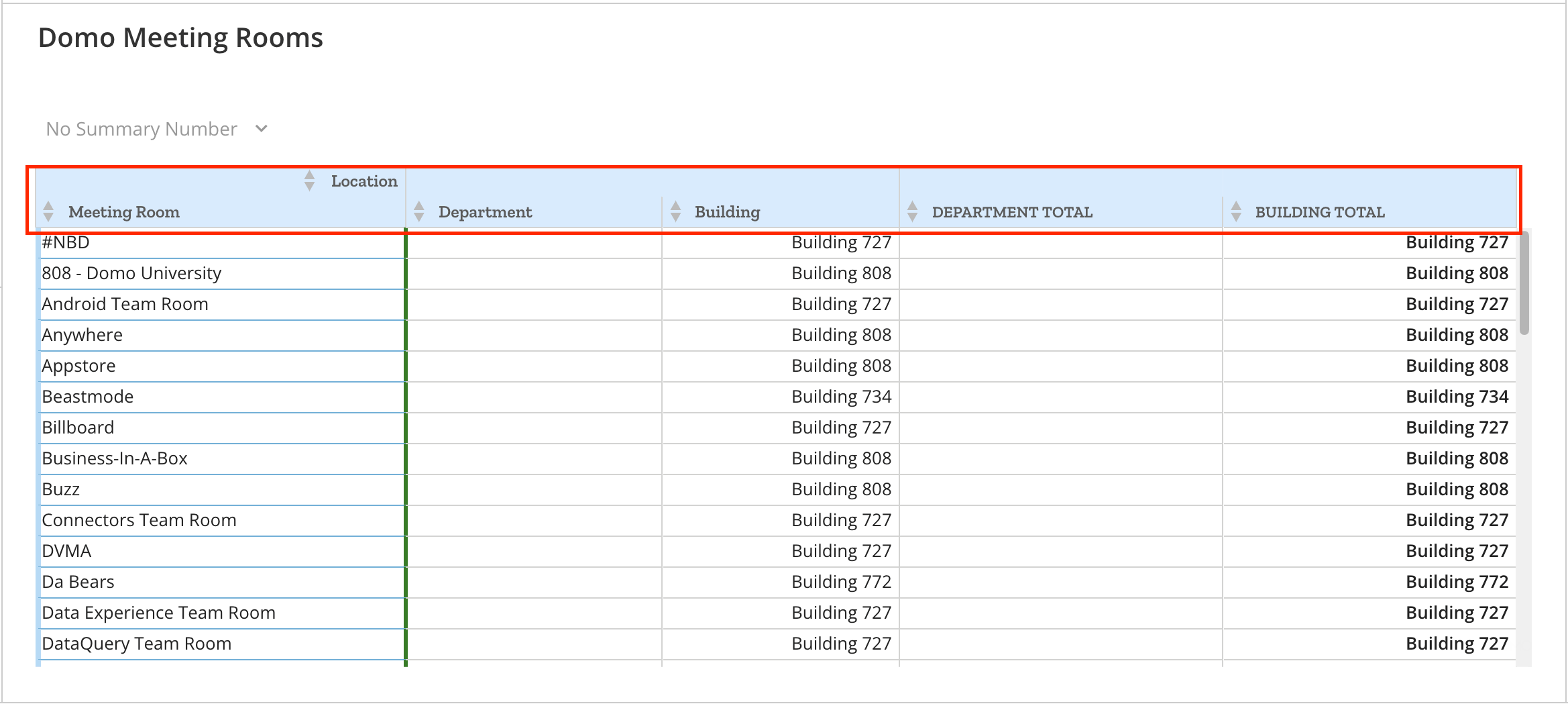
<table class="mt-responsive-table" data-aura-rendered-by="33:209;a"><thead><tr><th class="mt-column-width-15" colspan="1" rowspan="1"><p> Option </p></th><th class="mt-column-width-35" colspan="1" rowspan="1"><p> Description </p></th><th class="mt-column-width-15" colspan="1" rowspan="1"><p> Examples </p></th></tr><tr><td colspan="1" rowspan="1"><p> Header row font family </p></td><td colspan="1" rowspan="1"><p> Allows you to select a font family for the header row text of your table. Options include default, Sans, Serif, Slab, Condensed, and Monospace. </p></td><td colspan="1" rowspan="1"><p class="wysiwyg-text-align-center"><img alt="Screenshot 2024-05-21 at 2.25.39 PM.png" src="https://mintcdn.com/domoinc-openapi-sync-dataflows/zKZ3HwsBqhLsvFuw/images/kb/ka0Vq0000003jAH-00N5w00000Ri7BU-0EMVq0000011uCT.jpg?fit=max&auto=format&n=zKZ3HwsBqhLsvFuw&q=85&s=88771b663c741b14e8cc894ea66033e2" style={{width: 500, height: 225}} width="2338" height="1052" data-path="images/kb/ka0Vq0000003jAH-00N5w00000Ri7BU-0EMVq0000011uCT.jpg" /></p></td></tr><tr><td colspan="1" rowspan="1"><p> Header row font size </p></td><td colspan="1" rowspan="1"><p /></td><td colspan="1" rowspan="1"><p class="wysiwyg-text-align-center" /></td></tr><tr><td class="mt-column-width-15" colspan="1" rowspan="1"><p> Header fill color </p></td><td class="mt-column-width-35" colspan="1" rowspan="1"><p> Lets you select a background color for the header row in a table. If you select <b> Default </b>, no color is used. </p><p> If you select both a Header Row fill color and a Header Column fill color, the Header Row takes precedence. </p></td><td class="mt-column-width-15" colspan="1" rowspan="1"><p class="wysiwyg-text-align-center"><a href="/s/article/360043429073" target="_blank" title="/@api/deki/files/4186/table_header_row_fill_color.png"><img alt="" src="https://mintcdn.com/domoinc-openapi-sync-dataflows/zKZ3HwsBqhLsvFuw/images/kb/ka0Vq0000003jAH-00N5w00000Ri7BU-0EM5w000005vZ5x.png?fit=max&auto=format&n=zKZ3HwsBqhLsvFuw&q=85&s=1e57fabb2471534d94abcf282eacbb21" width="700" height="114" data-path="images/kb/ka0Vq0000003jAH-00N5w00000Ri7BU-0EM5w000005vZ5x.png" /></a></p></td></tr><tr><td class="mt-column-width-15" colspan="1" rowspan="1"><p> Header font color </p></td><td class="mt-column-width-35" colspan="1" rowspan="1"><p> Lets you select the text color for the column names in your table header row. This color takes precedence over the table font color applied in <b> General > Font Color </b>, so if you set the general font color to blue and the header row font color to red, the header row font color would appear red instead of blue. If you then chose <b> Default </b>, the header row color would revert to blue. </p></td><td class="mt-column-width-15" colspan="1" rowspan="1"><p class="wysiwyg-text-align-center"><a href="/s/article/360043429073" target="_blank" title="/@api/deki/files/4184/table_header_row_font_color.png"><img alt="" src="https://mintcdn.com/domoinc-openapi-sync-dataflows/zKZ3HwsBqhLsvFuw/images/kb/ka0Vq0000003jAH-00N5w00000Ri7BU-0EM5w000005vZ5k.png?fit=max&auto=format&n=zKZ3HwsBqhLsvFuw&q=85&s=5e1572eeaa7352eceddad3b6b52ca854" width="700" height="115" data-path="images/kb/ka0Vq0000003jAH-00N5w00000Ri7BU-0EM5w000005vZ5k.png" /></a></p></td></tr><tr><td class="mt-column-width-15" colspan="1" rowspan="1"><p> Header alignment </p></td><td class="mt-column-width-35" colspan="1" rowspan="1"><p> Lets you select the alignment for the column names in a table header row. The default setting is <b> Left </b>. </p><p> In the example, the column names are centered. </p><p> If you specify both a <b> Header Row </b> alignment and a <b> Header Column </b> alignment, the <b> Header Row </b> alignment takes precedence. </p><p> In the example below, the column names are centered. </p></td><td class="mt-column-width-15" colspan="1" rowspan="1"><p class="wysiwyg-text-align-center"><a href="/s/article/360043429073" target="_blank" title="/@api/deki/files/4185/table_header_row_alignment.png"><img alt="" src="https://mintcdn.com/domoinc-openapi-sync-dataflows/zKZ3HwsBqhLsvFuw/images/kb/ka0Vq0000003jAH-00N5w00000Ri7BU-0EM5w000005vZ60.png?fit=max&auto=format&n=zKZ3HwsBqhLsvFuw&q=85&s=330393cc144fb4092597d7e8dfdd8855" width="700" height="115" data-path="images/kb/ka0Vq0000003jAH-00N5w00000Ri7BU-0EM5w000005vZ60.png" /></a></p></td></tr><tr><td class="mt-column-width-15" colspan="1" rowspan="1"><p> Header font style </p></td><td class="mt-column-width-35" colspan="1" rowspan="1"><p> Lets you select the font style for the column names in a table header row, either bold, italic, bold-italic, or underline. The default setting is <b> Bold </b>. </p><p> In the example, <b> Bold-Italic </b> is set as the font style. <a id="header_row_border_properties" target="_blank" /></p></td><td class="mt-column-width-15" colspan="1" rowspan="1"><p class="wysiwyg-text-align-center"><a href="/s/article/360043429073" target="_blank" title="/@api/deki/files/4183/table_header_row_font_style.png"><img alt="" src="https://mintcdn.com/domoinc-openapi-sync-dataflows/zKZ3HwsBqhLsvFuw/images/kb/ka0Vq0000003jAH-00N5w00000Ri7BU-0EM5w000005vZ64.png?fit=max&auto=format&n=zKZ3HwsBqhLsvFuw&q=85&s=c2c933e6c10f17d575f31542f9c292d0" width="700" height="113" data-path="images/kb/ka0Vq0000003jAH-00N5w00000Ri7BU-0EM5w000005vZ64.png" /></a></p></td></tr><tr><td class="mt-column-width-15" colspan="1" rowspan="1"> Header Row Height </td><td class="mt-column-width-35" colspan="1" rowspan="1"><p> Lets you set the height for the header row in a Flex Table (the row containing the column names). A minimum value of 28 is required. There is no maximum limit. </p></td><td class="mt-column-width-15" colspan="1" rowspan="1"><p> — </p></td></tr></thead></table>

# Header Row Border Properties

These properties are available only for Mega and Pivot Tables. See [Pivot Table](/s/article/360043429473).

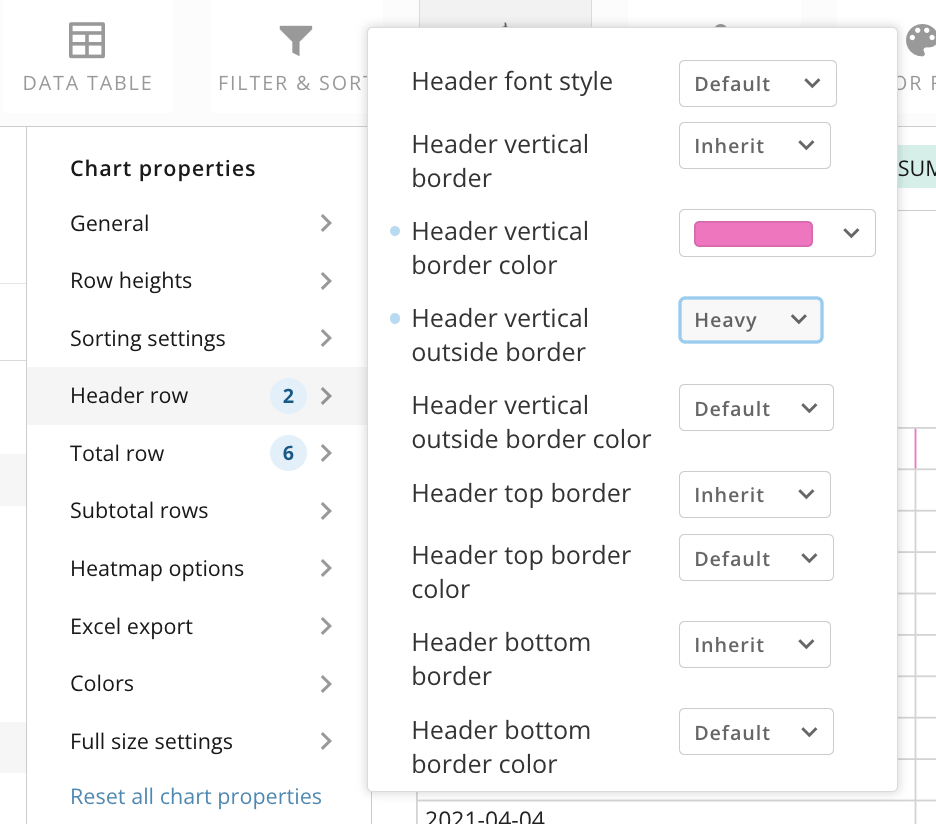
Using these border properties, you can choose the width and color for the header row vertical and horizontal borders.

* **Header vertical border —** Select **Inherit** so the vertical header borders mirror the configured width for the **General** > **Vertical border** property, or choose a different width (Default, Off, Thin, Thick, Heavy, and Extra Heavy)
* **Header vertical border color —** Use a color picker to choose the color for the header vertical borders.
* **Header vertical outside border —** Select **Inherit** so the vertical header outside border mirrors the configured width for **General** > **Vertical border** or choose a different width (Off, Thin, Thick, Heavy, and Extra Heavy)
* **Header vertical outside border color —** Use a color picker to choose the color for the header vertical outside border.
* **Header top border —** Select **Inherit** so the header top border mirrors the configured width for the **General** > **Vertical border** property, or choose a different width (Default, Off, Thin, Thick, Heavy, and Extra Heavy)
* **Header top border color —** Use a color picker to choose the color for the header top border.
* **Header bottom border —** Select **Inherit** so the header bottom border mirrors the configured width for the **General** > **Vertical border** property, or choose a different width (Default, Off, Thin, Thick, Heavy, and Extra Heavy)
* **Header bottom border color —** Use a color picker to choose the color for the header bottom border.

<Frame>
  <img alt="Screenshot 2024-02-26 at 3.59.51 PM.png" src="https://mintcdn.com/domoinc-openapi-sync-dataflows/zKZ3HwsBqhLsvFuw/images/kb/ka0Vq0000003jAH-00N5w00000Ri7BU-0EMVq000000PsDJ.jpg?fit=max&auto=format&n=zKZ3HwsBqhLsvFuw&q=85&s=d1c66ef147abdb9c3b5c9c642bb9c59b" style={{width: 471, height: 415}} width="936" height="824" data-path="images/kb/ka0Vq0000003jAH-00N5w00000Ri7BU-0EMVq000000PsDJ.jpg" />
</Frame>

### Total Row (Totals) Properties

The properties in the following table are found in the **Total row** category in Chart Properties. This is called **Totals** for Pivot Tables.

<Warning>
  **Important:** Analytics functions (windows functions) are not supported in total or subtotal rows.
</Warning>

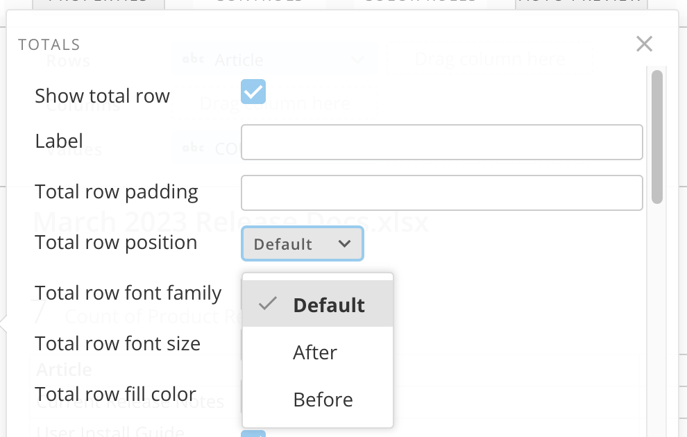
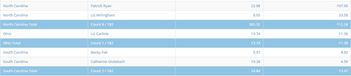
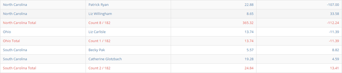
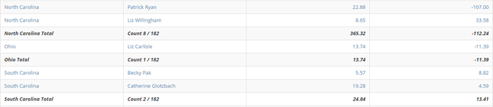
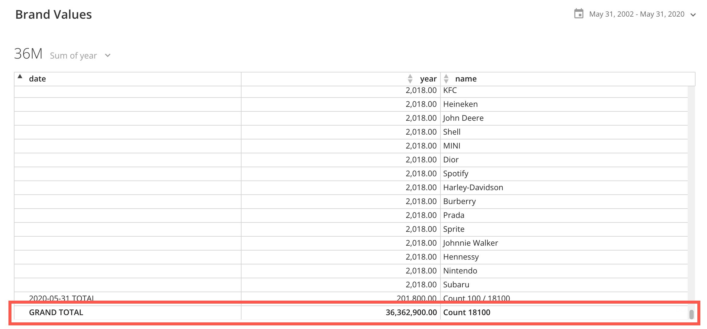
<table class="mt-responsive-table" data-aura-rendered-by="33:209;a"><thead><tr><th class="mt-column-width-15" colspan="1" rowspan="1"><p> Option </p></th><th class="mt-column-width-35" colspan="1" rowspan="1"><p> Description </p></th><th class="mt-column-width-15" colspan="1" rowspan="1"><p> Examples </p></th></tr><tr><td class="mt-column-width-15" colspan="1" rowspan="1"><p> Show total row </p></td><td class="mt-column-width-35" colspan="1" rowspan="1"><p> You must check this box to enable additional total row properties. </p><p> Show Total Row lets you add a <b> Grand Total </b> row to the bottom of a table. In this row, all value columns are summed and all string and date/time columns are counted. </p><p> Note that the label appears at the bottom of the first column, replacing any total information that would otherwise appear there, so we don't recommend making the column you want to total the first column. </p></td><td class="mt-column-width-15" colspan="1" rowspan="1"><img alt="grant total.jpg" src="https://mintcdn.com/domoinc-openapi-sync-dataflows/zKZ3HwsBqhLsvFuw/images/kb/ka0Vq0000003jAH-00N5w00000Ri7BU-0EMVq000000PrcD.jpg?fit=max&auto=format&n=zKZ3HwsBqhLsvFuw&q=85&s=e7f9e0ce5969bc4de4ddf9c3f0349410" style={{width: 649, height: 302}} width="2342" height="1090" data-path="images/kb/ka0Vq0000003jAH-00N5w00000Ri7BU-0EMVq000000PrcD.jpg" /></td></tr><tr><td colspan="1" rowspan="1"><p> Hide counts </p></td><td colspan="1" rowspan="1"><p> Hides row counts for non-numeric columns. The default is to display counts. </p></td><td colspan="1" rowspan="1"><p /></td></tr><tr><td class="mt-column-width-15" colspan="1" rowspan="1"><p> Label </p></td><td class="mt-column-width-35" colspan="1" rowspan="1"><p> Lets you replace the "Grand Total" text in your table's total row with custom text. </p></td><td class="mt-column-width-15" colspan="1" rowspan="1"><p> — </p></td></tr><tr><td class="mt-column-width-15" colspan="1" rowspan="1"><p> Total row fill color </p></td><td class="mt-column-width-35" colspan="1" rowspan="1"><p> Lets you select a background color for the total row in your table. If you select <b> Default </b>, no color is used. </p></td><td class="mt-column-width-15" colspan="1" rowspan="1"><p><img alt="total row fill color.jpg" src="https://mintcdn.com/domoinc-openapi-sync-dataflows/zKZ3HwsBqhLsvFuw/images/kb/ka0Vq0000003jAH-00N5w00000Ri7BU-0EMVq000000Prh3.jpg?fit=max&auto=format&n=zKZ3HwsBqhLsvFuw&q=85&s=a7dd0c5edd6c95492f84e4893597c5bc" style={{width: 650, height: 102}} width="2348" height="368" data-path="images/kb/ka0Vq0000003jAH-00N5w00000Ri7BU-0EMVq000000Prh3.jpg" /></p></td></tr><tr><td class="mt-column-width-15" colspan="1" rowspan="1"><p> Total row font color </p></td><td class="mt-column-width-35" colspan="1" rowspan="1"><p> Lets you select the text color for the content in your table's total row. This color takes precedence over the table font color applied in <b> General > Font Color </b>, so if you set the general font color to blue and the total row font color to red, the total row font color would appear red instead of blue. If you then chose <b> Default </b>, the total row color would revert to blue. Otherwise, the default is black. </p></td><td class="mt-column-width-15" colspan="1" rowspan="1"><img alt="total row font color.jpg" src="https://mintcdn.com/domoinc-openapi-sync-dataflows/zKZ3HwsBqhLsvFuw/images/kb/ka0Vq0000003jAH-00N5w00000Ri7BU-0EMVq000000PrcE.jpg?fit=max&auto=format&n=zKZ3HwsBqhLsvFuw&q=85&s=c129fc5088f142b824aaceb59e78c055" style={{width: 653, height: 97}} width="2328" height="346" data-path="images/kb/ka0Vq0000003jAH-00N5w00000Ri7BU-0EMVq000000PrcE.jpg" /></td></tr><tr><td colspan="1" rowspan="1"><p> Total row font family </p></td><td colspan="1" rowspan="1"><p> Allows you to select the font family for the total row (Default, Sans, Serif, Slab, Condensed, Monospace). </p></td><td colspan="1" rowspan="1"><p class="wysiwyg-text-align-center" /></td></tr><tr><td colspan="1" rowspan="1"><p> Total row font size </p></td><td colspan="1" rowspan="1"><p> Allows you to select the font size for the total row (Default, Normal, Smallest, Smaller, Larger, Largest). </p></td><td colspan="1" rowspan="1"><p class="wysiwyg-text-align-center" /></td></tr><tr><td class="mt-column-width-15" colspan="1" rowspan="1"><p> Total row font style </p></td><td class="mt-column-width-35" colspan="1" rowspan="1"><p> Lets you select the font style for the column names in a table total row, either bold, italic, bold-italic, or underline. The default setting is <b> Bold </b>. This option is only available when the <b> Total Row > Show Total Row </b> box is checked. </p><p> In the example, <b> Bold-Italic </b> is set as the font style. </p></td><td class="mt-column-width-15" colspan="1" rowspan="1"><img alt="font style total.jpg" src="https://mintcdn.com/domoinc-openapi-sync-dataflows/zKZ3HwsBqhLsvFuw/images/kb/ka0Vq0000003jAH-00N5w00000Ri7BU-0EMVq000000Ps0P.jpg?fit=max&auto=format&n=zKZ3HwsBqhLsvFuw&q=85&s=eab446f3705e2a989e0981d1215a9879" style={{width: 649, height: 99}} width="2320" height="354" data-path="images/kb/ka0Vq0000003jAH-00N5w00000Ri7BU-0EMVq000000Ps0P.jpg" /></td></tr><tr><td class="mt-column-width-15" colspan="1" rowspan="1"><p> Total row position </p></td><td class="mt-column-width-35" colspan="1" rowspan="1"><p> Lets you specify whether your total row appears at the end of your table (default) or at the beginning. </p></td><td class="mt-column-width-15" colspan="1" rowspan="1"><p><img alt="Screenshot 2024-08-26 at 3.58.13 PM.png" src="https://mintcdn.com/domoinc-openapi-sync-dataflows/zKZ3HwsBqhLsvFuw/images/kb/ka0Vq0000003jAH-00N5w00000Ri7BU-0EMVq000002P0yA.jpg?fit=max&auto=format&n=zKZ3HwsBqhLsvFuw&q=85&s=af4295adb592f5542d453f83f6935ea2" style={{width: 601, height: 382}} width="990" height="630" data-path="images/kb/ka0Vq0000003jAH-00N5w00000Ri7BU-0EMVq000002P0yA.jpg" /></p></td></tr><tr><td class="mt-column-width-15" colspan="1" rowspan="1"><p> Total row padding </p></td><td class="mt-column-width-35" colspan="1" rowspan="1"><p> Lets you add padding, in pixels, between the content in the total row of your mega table and the upper border. <a id="total_row_border_properties" target="_blank" /></p><p> In the example, this value has been set to 25. </p></td><td class="mt-column-width-15" colspan="1" rowspan="1"><img alt="Screenshot 2024-02-26 at 3.54.21 PM.png" src="https://mintcdn.com/domoinc-openapi-sync-dataflows/zKZ3HwsBqhLsvFuw/images/kb/ka0Vq0000003jAH-00N5w00000Ri7BU-0EMVq000000Ps6r.jpg?fit=max&auto=format&n=zKZ3HwsBqhLsvFuw&q=85&s=e9ede326f1afd92d107b15f5e764b2db" style={{width: 653, height: 114}} width="2292" height="400" data-path="images/kb/ka0Vq0000003jAH-00N5w00000Ri7BU-0EMVq000000Ps6r.jpg" /></td></tr></thead></table>

# Total Row Border Properties

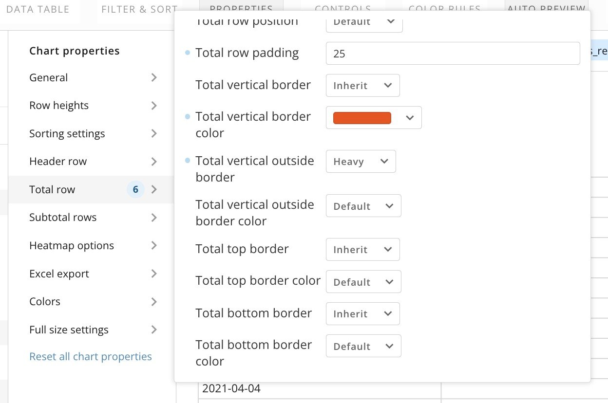
* **Total vertical border —** Select **Inherit** so the total row vertical border mirrors the configured width for the **General** > **Vertical border** property, or choose a different width (Off, Thin, Thick, Heavy, and Extra Heavy)
* **Total vertical border color —** Use a color picker to choose the color for the total row vertical borders.
* **Total vertical outside border —** Select **Inherit** so the total row vertical outside border mirrors the configured width for **General** > **Vertical border** or choose a different width (Off, Thin, Thick, Heavy, and Extra Heavy)
* **Total vertical outside border color —** Use a color picker to choose the color for the outside vertical table border.
* **Total top border —** Select **Inherit** so the total row top border mirrors the configured width for **General** > **Vertical border** or choose a different width (Off, Thin, Thick, Heavy, and Extra Heavy)
* **Total top border color —** Use a color picker to choose the color for the total row top border.
* **Total bottom border —** Select **Inherit** so the total row bottom border mirrors the configured width for **General** > **Vertical border** or choose a different width (Off, Thin, Thick, Heavy, and Extra Heavy)
* **Total bottom border color —** Use a color picker to choose the color for the total row bottom border.

  <Frame>
    <img alt="total row borders.jpg" src="https://mintcdn.com/domoinc-openapi-sync-dataflows/zKZ3HwsBqhLsvFuw/images/kb/ka0Vq0000003jAH-00N5w00000Ri7BU-0EMVq000000PsA5.jpg?fit=max&auto=format&n=zKZ3HwsBqhLsvFuw&q=85&s=5eb6a6d95c741bb50aa1539c79555384" style={{width: 556, height: 368}} width="1248" height="828" data-path="images/kb/ka0Vq0000003jAH-00N5w00000Ri7BU-0EMVq000000PsA5.jpg" />
  </Frame>

### Subtotal Rows Properties

The properties in the following table are found in the **Subtotal Row** category in Chart Properties.
<Warning>
  **Important:** Analytics functions (windows functions) are not supported in total or subtotal rows.
</Warning>

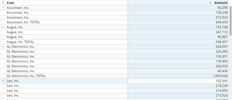
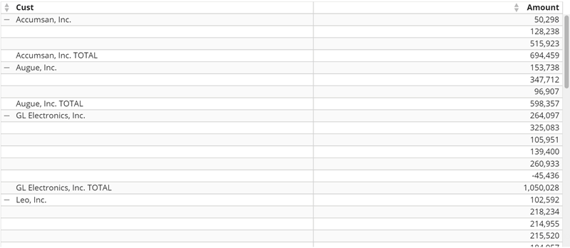
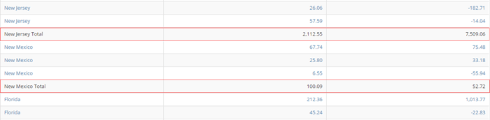
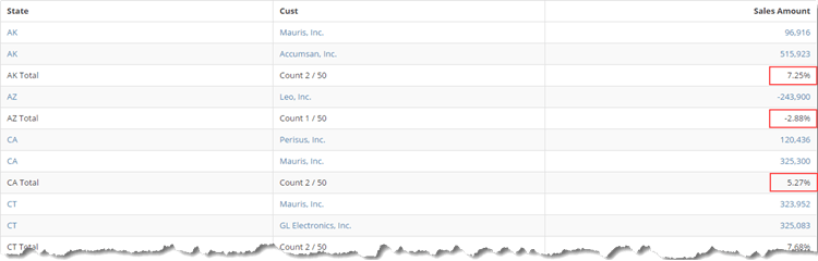
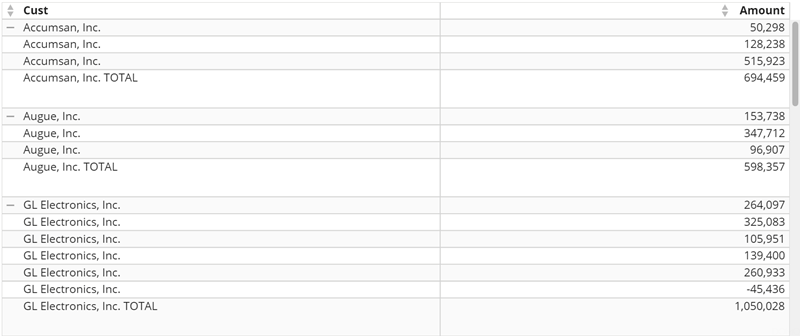
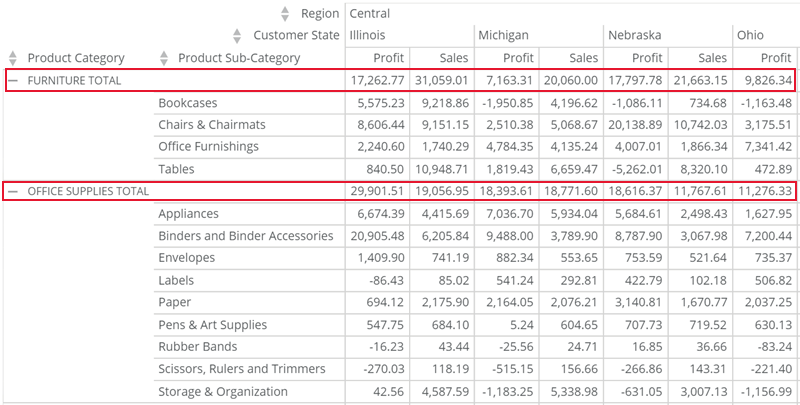
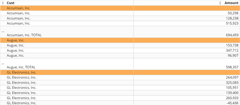
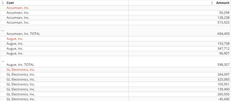
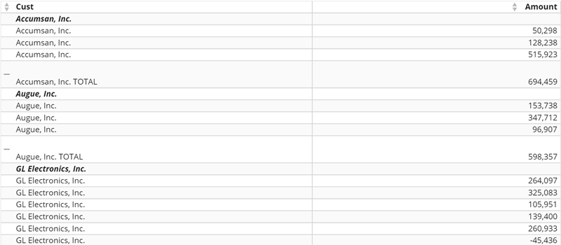
<table class="mt-responsive-table" data-aura-rendered-by="33:209;a"><thead><tr><th class="mt-column-width-15" colspan="1" rowspan="1"><p> Option </p></th><th class="mt-column-width-35" colspan="1" rowspan="1"><p> Description </p></th><th class="mt-column-width-15" colspan="1" rowspan="1"><p> Examples </p></th></tr><tr><td class="mt-column-width-15" colspan="1" rowspan="1"><p> Show subtotal rows </p></td><td class="mt-column-width-35" colspan="1" rowspan="1"><p> You must check this box to enable additional subtotal rows properties. </p><p> Lets you add subtotal rows after each group of like values in your table's first column. In this row, all value columns are summed and all string and date/time columns you added to the <b> Values </b> field are counted. </p><p> One subtotal row displays for each of the primary <b> Rows </b> groupings in your table. </p><p> In the example, the first column includes state names, which are sorted alphabetically. There are three rows for New Mexico. Therefore, a subtotal column appears after the New Mexico rows, providing subtotals just for the New Mexico data. </p></td><td class="mt-column-width-15" colspan="1" rowspan="1"><p class="wysiwyg-text-align-center"><a href="/s/article/360043429073" target="_blank" title="/@api/deki/files/4178/table_subtotal_row.png"><img alt="" src="https://mintcdn.com/domoinc-openapi-sync-dataflows/zKZ3HwsBqhLsvFuw/images/kb/ka0Vq0000003jAH-00N5w00000Ri7BU-0EM5w000005vZ5v.png?fit=max&auto=format&n=zKZ3HwsBqhLsvFuw&q=85&s=664eb7a2ee10fb2d60caca4d5b177ef3" width="700" height="172" data-path="images/kb/ka0Vq0000003jAH-00N5w00000Ri7BU-0EM5w000005vZ5v.png" /></a></p></td></tr><tr><td class="mt-column-width-15" colspan="1" rowspan="1"><p> Show as percent of total </p></td><td class="mt-column-width-35" colspan="1" rowspan="1"><p> When this box is checked, subtotals in a table will appear as percent of total values for the entire column instead of the usual subtotals. </p></td><td class="mt-column-width-15" colspan="1" rowspan="1"><p class="wysiwyg-text-align-center"><a href="/s/article/360043429073" target="_blank" title="/@api/deki/files/4224/table_subtotal_row_percentages.png"><img alt="" src="https://mintcdn.com/domoinc-openapi-sync-dataflows/zKZ3HwsBqhLsvFuw/images/kb/ka0Vq0000003jAH-00N5w00000Ri7BU-0EM5w000005vZ5y.png?fit=max&auto=format&n=zKZ3HwsBqhLsvFuw&q=85&s=4f6bd3c32e6acf728555b266168ed90f" width="750" height="240" data-path="images/kb/ka0Vq0000003jAH-00N5w00000Ri7BU-0EM5w000005vZ5y.png" /></a></p></td></tr><tr><td class="mt-column-width-15" colspan="1" rowspan="1"><p> Subtotal label </p></td><td class="mt-column-width-35" colspan="1" rowspan="1"><p> Lets you customize the label text for your table's subtotal rows. Note that your custom text replaces only the word "Total," not the name of the group of like values the subtotal is based on. </p><p> For example, if the group of like values was "Minnesota" and you added "Summary" as the label text, the label would read "Minnesota Summary." </p><p> You can specify whether your custom label comes before or after the group name using the <b> Subtotal Row > Label Position </b> option. </p></td><td class="mt-column-width-15" colspan="1" rowspan="1"><p> — </p></td></tr><tr><td class="mt-column-width-15" colspan="1" rowspan="1"><p> Subtotal label position </p></td><td class="mt-column-width-35" colspan="1" rowspan="1"><p> Lets you specify whether the word "Total" (or your custom label if you specified one in the <b> Subtotal Row> Label </b> property) comes before or after the name of the group of like values the subtotal row is based on in a table. The default is <b> After </b>. </p><p> For example, if the group name was "Minnesota," by default the label would read "Minnesota Total." If you changed this setting to <b> Before </b>, the label would read "Total Minnesota." </p></td><td class="mt-column-width-15" colspan="1" rowspan="1"><p> — </p></td></tr><tr><td class="mt-column-width-15" colspan="1" rowspan="1"><p> Subtotal row fill color </p></td><td class="mt-column-width-35" colspan="1" rowspan="1"><p> Lets you select a background color for the subtotal rows in your table. If you select <b> Default </b>, no color is used. </p></td><td class="mt-column-width-15" colspan="1" rowspan="1"><p class="wysiwyg-text-align-center"><a href="/s/article/360043429073" target="_blank" title="/@api/deki/files/4176/table_subtotal_row_fill_color.png"><img alt="" src="https://mintcdn.com/domoinc-openapi-sync-dataflows/1pUbNiMC_kZqIvej/images/kb/ka05w00000129vL-00N5w00000Ri7BU-0EM5w000005vOmF.png?fit=max&auto=format&n=1pUbNiMC_kZqIvej&q=85&s=29772ac6afa5d0b9af081984ce642b56" width="700" height="153" data-path="images/kb/ka05w00000129vL-00N5w00000Ri7BU-0EM5w000005vOmF.png" /></a></p></td></tr><tr><td class="mt-column-width-15" colspan="1" rowspan="1"><p> Subtotal row font color </p></td><td class="mt-column-width-35" colspan="1" rowspan="1"><p> Lets you select the text color for the content in your table's subtotal rows. This color overrides the table font color applied in <b> General </b> > <b> Font Color </b>, so if you set the general font color to blue and the subtotal row font color to red, the subtotal row font color would appear red instead of blue. If you then chose <b> Default </b>, the subtotal row color would revert to blue. </p></td><td class="mt-column-width-15" colspan="1" rowspan="1"><p class="wysiwyg-text-align-center"><a href="/s/article/360043429073" target="_blank" title="/@api/deki/files/4177/table_subtotal_row_font_color.png"><img alt="" src="https://mintcdn.com/domoinc-openapi-sync-dataflows/g5Ek3SRXv8ussuBG/images/kb/ka0Vq0000003jAH-00N5w00000Ri7BU-0EM5w000005vZ5f.png?fit=max&auto=format&n=g5Ek3SRXv8ussuBG&q=85&s=f19d9b36a96f7a5360a4e8dacf09c50a" width="700" height="151" data-path="images/kb/ka0Vq0000003jAH-00N5w00000Ri7BU-0EM5w000005vZ5f.png" /></a></p></td></tr><tr><td colspan="1" rowspan="1"><p> Subtotal row font family </p></td><td colspan="1" rowspan="1"><p> — </p></td><td colspan="1" rowspan="1"><p class="wysiwyg-text-align-center"> — </p></td></tr><tr><td colspan="1" rowspan="1"><p> Subtotal row font size </p></td><td colspan="1" rowspan="1"><p> — </p></td><td colspan="1" rowspan="1"><p class="wysiwyg-text-align-center"> — </p></td></tr><tr><td class="mt-column-width-15" colspan="1" rowspan="1"><p> Subtotal row font style </p></td><td class="mt-column-width-35" colspan="1" rowspan="1"><p> Lets you select the font style for the text in your table's subtotal rows (bold, italic, bold-italic, or underline). The default setting is <b> Bold </b>. </p><p> In the example, <b> Bold-Italic </b> is set as the font style. </p></td><td class="mt-column-width-15" colspan="1" rowspan="1"><p class="wysiwyg-text-align-center"><a href="/s/article/360043429073" target="_blank" title="/@api/deki/files/4175/table_subtotal_row_font_style.png"><img alt="" src="https://mintcdn.com/domoinc-openapi-sync-dataflows/zKZ3HwsBqhLsvFuw/images/kb/ka0Vq0000003jAH-00N5w00000Ri7BU-0EM5w000005vZ5m.png?fit=max&auto=format&n=zKZ3HwsBqhLsvFuw&q=85&s=acb04ba3e7184bf701c62d59ef33068d" width="700" height="153" data-path="images/kb/ka0Vq0000003jAH-00N5w00000Ri7BU-0EM5w000005vZ5m.png" /></a></p></td></tr><tr><td class="mt-column-width-15" colspan="1" rowspan="1"><p> Show all group names </p></td><td class="mt-column-width-35" colspan="1" rowspan="1"><p> When checked, for unaggregated data in Mega and Pivot tables, names are shown for all individual items within a category. When unchecked, the category name is only used once (aside from the subtotal row), and blank cells appear under that name for all remaining values in the category. </p><p> The first example shows a table in which the customer name appears every time a value is listed for that customer. </p><p> The second example shows the same table with customer names only being listed once; all subsequent values for the customer have a blank customer name. </p></td><td class="mt-column-width-15" colspan="1" rowspan="1"><p class="wysiwyg-text-align-center"><a href="/s/article/360043429073" target="_blank" title="/@api/deki/files/7633/megatable_groups_shown.png"><img alt="megatable_groups_shown.png" src="https://mintcdn.com/domoinc-openapi-sync-dataflows/g5Ek3SRXv8ussuBG/images/kb/ka0Vq0000003jAH-00N5w00000Ri7BU-0EM5w000005vZ5h.png?fit=max&auto=format&n=g5Ek3SRXv8ussuBG&q=85&s=e5c4546f3b2b671b3860a36dc8996fe8" width="800" height="346" data-path="images/kb/ka0Vq0000003jAH-00N5w00000Ri7BU-0EM5w000005vZ5h.png" /></a></p><p class="wysiwyg-text-align-center"><a href="/s/article/360043429073" target="_blank" title="/@api/deki/files/7632/megatable_groups_hidden.png"><img alt="megatable_groups_hidden.png" src="https://mintcdn.com/domoinc-openapi-sync-dataflows/zKZ3HwsBqhLsvFuw/images/kb/ka0Vq0000003jAH-00N5w00000Ri7BU-0EM5w000005vZ5s.png?fit=max&auto=format&n=zKZ3HwsBqhLsvFuw&q=85&s=bfa3ce5f41e16ba3435c50b042646d8b" width="800" height="348" data-path="images/kb/ka0Vq0000003jAH-00N5w00000Ri7BU-0EM5w000005vZ5s.png" /></a></p></td></tr><tr><td colspan="1" rowspan="1"><p> Show group name once </p></td><td colspan="1" rowspan="1"><p /></td><td colspan="1" rowspan="1"><p class="wysiwyg-text-align-center" /></td></tr><tr><td class="mt-column-width-15" colspan="1" rowspan="1"><p> Subtotal row padding </p></td><td class="mt-column-width-35" colspan="1" rowspan="1"><p> Lets you add padding, in pixels, between the content in the subtotal rows and the lower table border. In the example, this value has been set to 25. </p></td><td class="mt-column-width-15" colspan="1" rowspan="1"><p class="wysiwyg-text-align-center"><a href="/s/article/360043429073" target="_blank" title="/@api/deki/files/7634/megatable_subtotals_padding.png"><img alt="megatable_subtotals_padding.png" src="https://mintcdn.com/domoinc-openapi-sync-dataflows/zKZ3HwsBqhLsvFuw/images/kb/ka0Vq0000003jAH-00N5w00000Ri7BU-0EM5w000005vZ5j.png?fit=max&auto=format&n=zKZ3HwsBqhLsvFuw&q=85&s=36ef703a053a10b449c0bd1009b8a8d6" width="800" height="336" data-path="images/kb/ka0Vq0000003jAH-00N5w00000Ri7BU-0EM5w000005vZ5j.png" /></a></p></td></tr><tr><td class="mt-column-width-15" colspan="1" rowspan="1"><p> Hide counts </p></td><td class="mt-column-width-35" colspan="1" rowspan="1"><p> Lets you hide "Count" summations for non-value columns in subtotal rows. </p></td><td class="mt-column-width-15" colspan="1" rowspan="1"><p> — </p></td></tr><tr><td class="mt-column-width-15" colspan="1" rowspan="1"><p> Subtotal row position </p></td><td class="mt-column-width-35" colspan="1" rowspan="1"><p> Lets you specify whether subtotal rows in your table appear after the rows they apply to (default) or before, at the top of each grouping. </p></td><td class="mt-column-width-15" colspan="1" rowspan="1"><p><a target="_blank" title="/@api/deki/files/7284/pivot_table_subtotal_rows_position.png"><img alt="pivot_table_subtotal_rows_position.png" src="https://mintcdn.com/domoinc-openapi-sync-dataflows/g5Ek3SRXv8ussuBG/images/kb/ka0Vq0000003jAH-00N5w00000Ri7BU-0EM5w000005vP5M.png?fit=max&auto=format&n=g5Ek3SRXv8ussuBG&q=85&s=785fd294e47aa47f00d82251a1f183d1" style={{width: 602, height: 305}} width="800" height="405" data-path="images/kb/ka0Vq0000003jAH-00N5w00000Ri7BU-0EM5w000005vP5M.png" /></a></p></td></tr><tr><td class="mt-column-width-15" colspan="1" rowspan="1"><p> Show subheader rows </p></td><td class="mt-column-width-35" colspan="1" rowspan="1"><p> Lets you add subheader rows above the groupings in your unaggregated data rows in your mega table. If you want to incorporate subheader rows in your table, we recommend that you set them apart using the <b> Subheader fill color </b>, <b> Subheader </b><b> font color </b>, and/or <b> Subheader f </b><b> ont style </b> properties so users can see them easily. </p></td><td class="mt-column-width-15" colspan="1" rowspan="1"><p> — </p></td></tr><tr><td class="mt-column-width-15" colspan="1" rowspan="1"><p> Subheader fill color </p></td><td class="mt-column-width-35" colspan="1" rowspan="1"><p> Lets you add a selected background color to the subheader rows in your mega table. (Subheader rows must be turned on using the <b> Subtotal Row > Show Subheader Rows </b> checkbox for this to be available.) By default, no background color is used. </p><p> In the example, the subheader rows are shown with an orange background. </p></td><td class="mt-column-width-15" colspan="1" rowspan="1"><p class="wysiwyg-text-align-center"><a href="/s/article/360043429073" target="_blank" title="/@api/deki/files/7637/megatable_subheaders_fill_color.png"><img alt="megatable_subheaders_fill_color.png" src="https://mintcdn.com/domoinc-openapi-sync-dataflows/g5Ek3SRXv8ussuBG/images/kb/ka0Vq0000003jAH-00N5w00000Ri7BU-0EM5w000005vZ5e.png?fit=max&auto=format&n=g5Ek3SRXv8ussuBG&q=85&s=762a0c3cf74be97b59c82a7fb46c9464" width="800" height="350" data-path="images/kb/ka0Vq0000003jAH-00N5w00000Ri7BU-0EM5w000005vZ5e.png" /></a></p></td></tr><tr><td class="mt-column-width-15" colspan="1" rowspan="1"><p> Subheader font color </p></td><td class="mt-column-width-35" colspan="1" rowspan="1"><p> Lets you select a color for the text in the subheader rows in your mega table. (Subheader rows must be turned on using the <b> Subtotal row > Show subheader rows </b> checkbox for this to be available.) By default, the color is black. </p><p> In the example, the subheader rows display in red text. </p></td><td class="mt-column-width-15" colspan="1" rowspan="1"><p class="wysiwyg-text-align-center"><a href="/s/article/360043429073" target="_blank" title="/@api/deki/files/7636/megatable_subheaders_font_color.png"><img alt="megatable_subheaders_font_color.png" src="https://mintcdn.com/domoinc-openapi-sync-dataflows/zKZ3HwsBqhLsvFuw/images/kb/ka0Vq0000003jAH-00N5w00000Ri7BU-0EM5w000005vZ5r.png?fit=max&auto=format&n=zKZ3HwsBqhLsvFuw&q=85&s=5b4b79597c71a2338d94058c73105c6e" width="800" height="350" data-path="images/kb/ka0Vq0000003jAH-00N5w00000Ri7BU-0EM5w000005vZ5r.png" /></a></p></td></tr><tr><td class="mt-column-width-15" colspan="1" rowspan="1"><p> Subheader font style </p></td><td class="mt-column-width-35" colspan="1" rowspan="1"><p> Lets you select a style (bold, italic, or both) to the text in the subheader rows. (Subheader rows must be turned on using the <b> Subtotal Row > Show Subheader Rows </b> checkbox for this to be available.) By default, no style is applied. </p><p> In the example, the subheader rows are shown in bold and italic styling. <a id="subtotal_rows_border_properties" target="_blank" /></p></td><td class="mt-column-width-15" colspan="1" rowspan="1"><p class="wysiwyg-text-align-center"><a href="/s/article/360043429073" target="_blank" title="/@api/deki/files/7635/megatable_subheaders_font_style.png"><img alt="megatable_subheaders_font_style.png" src="https://mintcdn.com/domoinc-openapi-sync-dataflows/zKZ3HwsBqhLsvFuw/images/kb/ka0Vq0000003jAH-00N5w00000Ri7BU-0EM5w000005vZ5n.png?fit=max&auto=format&n=zKZ3HwsBqhLsvFuw&q=85&s=1c843f0e2c7518bf5d022a0ef193b0bc" width="800" height="350" data-path="images/kb/ka0Vq0000003jAH-00N5w00000Ri7BU-0EM5w000005vZ5n.png" /></a></p></td></tr><tr><td class="mt-column-width-15" colspan="1" rowspan="1"><p> Suppress single items subtotals </p></td><td class="mt-column-width-35" colspan="1" rowspan="1"><p> Lets you determine whether to suppress (hide) subtotals if there is only one item in a group in your table. </p></td><td class="mt-column-width-15" colspan="1" rowspan="1"><p> — </p></td></tr></thead></table>

# Subtotal Rows Border Properties

The following properties only display if the **Subtotal rows** > **Show subheader rows** checkbox is selected.

* **Subheader vertical border —** Select **Inherit** so the subheader vertical border mirrors the configured width for the **General** > **Vertical border** property, or choose a different width (Off, Thin, Thick, Heavy, and Extra Heavy)
* **Subheader vertical border color —** Use a color picker to choose the color for the subheader vertical border.
* **Subheader vertical outside border —** Select **Inherit** so the subheader vertical outside border mirrors the configured width for **General** > **Vertical border** or choose a different width (Off, Thin, Thick, Heavy, and Extra Heavy)
* **Subheader vertical outside border color —** Use a color picker to choose the color for the subheader vertical outside border.
* **Subheader top border —** Select **Inherit** so the subheader top border mirrors the configured width for **General** > **Vertical border** or choose a different width (Off, Thin, Thick, Heavy, and Extra Heavy)
* **Subheader top border color —** Use a color picker to choose the color for the subheader top border color.
* **Subheader bottom border —** Select **Inherit** so the subheader bottom border mirrors the configured width for **General** > **Vertical border** or choose a different width (Off, Thin, Thick, Heavy, and Extra Heavy)
* **Subheader bottom border color —** Use a color picker to choose the color for the subheader bottom border.
* **Subtotal vertical border —** Select **Inherit** so the subtotal vertical border mirrors the configured width for the **General** > **Vertical border** property, or choose a different width (Off, Thin, Thick, Heavy, and Extra Heavy)
* **Subtotal vertical border color —** Use a color picker to choose the color for the subtotal vertical border.
* **Subtotal vertical outside border —** Select **Inherit** so the subtotal vertical outside border mirrors the configured width for the **General** > **Vertical border** property, or choose a different width (Off, Thin, Thick, Heavy, and Extra Heavy)
* **Subtotal vertical outside border color —** Use a color picker to choose the color for the subtotal vertical outside border.
* **Subtotal top border —** Select **Inherit** so the subtotal top border mirrors the configured width for the **General** > **Vertical border** property, or choose a different width (Off, Thin, Thick, Heavy, and Extra Heavy)
* **Subtotal top border color —** Use a color picker to choose the color for the subtotal top border.
* **Subtotal bottom border —** Select **Inherit** so the subtotal bottom border mirrors the configured width for the **General** > **Vertical border** property, or choose a different width (Off, Thin, Thick, Heavy, and Extra Heavy)
* **Subtotal bottom border color —** Use a color picker to choose the color for the subtotal bottom border.

### Theme Property

The Theme property in the following table applies only to Heatmap Tables. Find it under **Theme** in Chart Properties.

<table class="mt-responsive-table" data-aura-rendered-by="33:209;a"><thead><tr><th colspan="1" rowspan="1"><p> Option </p></th><th colspan="1" rowspan="1"><p> Description </p></th><th colspan="1" rowspan="1"><p> Examples <a id="scale_properties" target="_blank" /></p></th></tr></thead><tbody><tr><td colspan="1" rowspan="1"><p> Theme </p></td><td colspan="1" rowspan="1"><p> Allows you to change the color theme for the values column in a heat map table. For more information about setting colors, see <a href="/s/article/360043429653" target="_blank" title="Changing the Default Colors in Your Chart"> Changing the Default Colors in Your Chart </a>. </p></td><td colspan="1" rowspan="1"><p> — </p></td></tr></tbody></table>

### Scale Properties

These properties apply only to Heatmap Tables. Find them under **Scale** in Chart Properties.

<table class="mt-responsive-table" data-aura-rendered-by="33:209;a"><thead><tr><th colspan="1" rowspan="1"><p> Option </p></th><th colspan="1" rowspan="1"><p> Description </p></th><th colspan="1" rowspan="1"><p> Examples </p></th></tr></thead><tbody><tr><td colspan="1" rowspan="1"><p> Use Log Scale </p></td><td colspan="1" rowspan="1"><p> Uses a logarithmic scale for the ranges in a heat map table. </p></td><td colspan="1" rowspan="1"><p> — </p></td></tr><tr><td colspan="1" rowspan="1"><p> Independent Column Ranges </p></td><td colspan="1" rowspan="1"><p> Causes ranges to be applied separately to each column in a heat map table. <a id="graph_settings" target="_blank" /></p></td><td class="mt-align-center" colspan="1" rowspan="1"><p class="wysiwyg-text-align-center"> — </p></td></tr></tbody></table>

### Graph Settings

The properties in the following table are found in the **Graph Settings** category in Chart Properties. These properties apply to Flex Tables only.
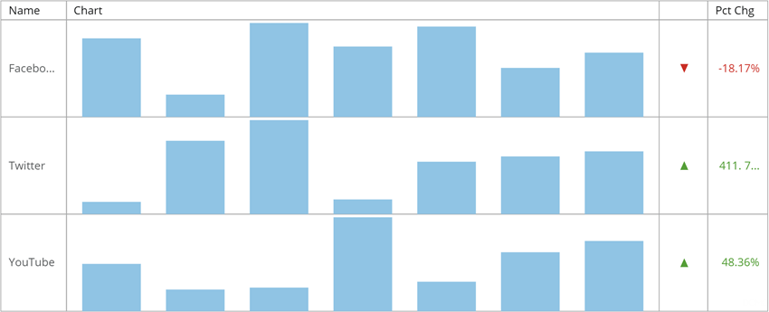
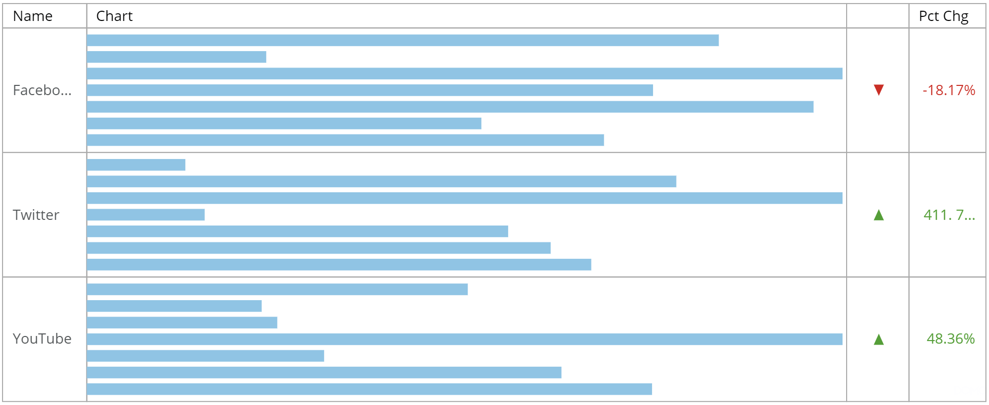
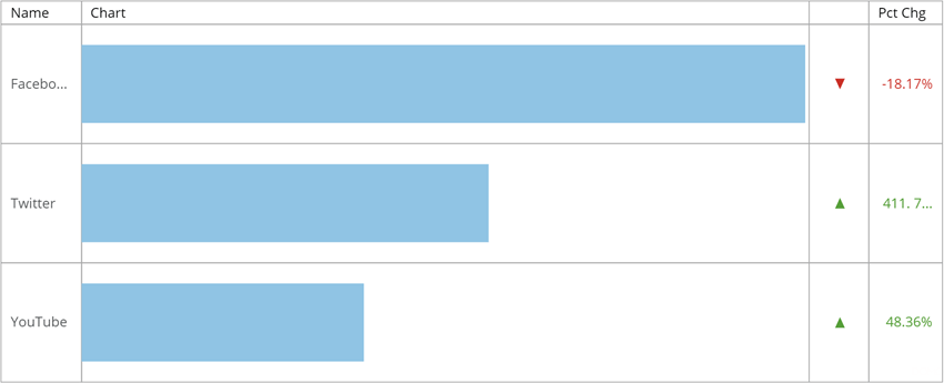
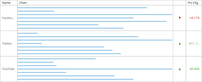
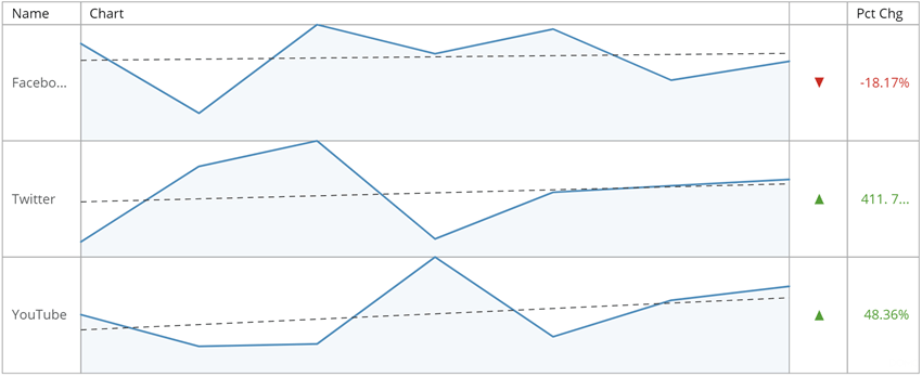
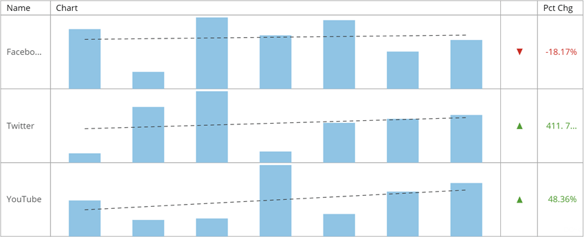
<table class="mt-responsive-table" data-aura-rendered-by="33:209;a"><thead><tr><th class="mt-column-width-15" colspan="1" rowspan="1"><p> Option </p></th><th class="mt-column-width-35" colspan="1" rowspan="1"><p> Description </p></th><th class="mt-column-width-15" colspan="1" rowspan="1"><p> Examples </p></th></tr><tr><td class="mt-column-width-15" colspan="1" rowspan="1"><p> Graph Settings > Type </p></td><td class="mt-column-width-35" colspan="1" rowspan="1"><p> Lets you choose the graph type in the column containing your series graphs in your Flex table. Note that these will all be the same graph type for each series; you cannot include more than one type of graph in the same Flex table. </p><p> The following graph types are available: </p><table class="mt-responsive-table"><tbody><tr><td class="mt-noheading" colspan="1" rowspan="1"><p> Line </p></td><td class="mt-noheading" colspan="1" rowspan="1"><p> Creates a <a href="/s/article/360043429353" target="_blank" title="Spark Line Graph"> Spark Line </a> graph for each series. This is the default option. The first screenshot at right shows an example of this graph type. </p></td></tr><tr><td class="mt-noheading" colspan="1" rowspan="1"><p> Bar </p></td><td class="mt-noheading" colspan="1" rowspan="1"><p> Creates a vertical <a href="/s/article/360043429333" target="_blank" title="Spark Bar Graph"> Spark Bar </a> graph for each series. The second screenshot at right shows an example of this graph type. </p></td></tr><tr><td class="mt-noheading" colspan="1" rowspan="1"><p> Horizontal Bar </p></td><td class="mt-noheading" colspan="1" rowspan="1"><p> Creates a horizontal Spark Bar graph for each series. The third screenshot at right shows an example of this graph type. </p></td></tr><tr><td class="mt-noheading" colspan="1" rowspan="1"><p> Horizontal Single Bar </p></td><td class="mt-noheading" colspan="1" rowspan="1"><p> Creates a horizontal bar graph in which all bars for each series are aggregated to yield a single bar. The fourth screenshot at right shows an example of this graph type. </p></td></tr></tbody></table><p /></td><td class="mt-column-width-15" colspan="1" rowspan="1"><p class="wysiwyg-text-align-center"><a href="/s/article/360043429073" target="_blank" title="Flex Table"><img alt="flex_table_line.png" src="https://mintcdn.com/domoinc-openapi-sync-dataflows/KRKoASQJgRuO8wHw/images/kb/ka05w00000123o8-00N5w00000Ri7BU-0EM5w000005vP9u.png?fit=max&auto=format&n=KRKoASQJgRuO8wHw&q=85&s=76fd429aaf80805df1030be0212dcf1c" width="850" height="345" data-path="images/kb/ka05w00000123o8-00N5w00000Ri7BU-0EM5w000005vP9u.png" /></a></p><p /><p class="wysiwyg-text-align-center"><a href="/s/article/360043429073" target="_blank" title="Flex Table"><img alt="flex_table_bar.png" src="https://mintcdn.com/domoinc-openapi-sync-dataflows/KRKoASQJgRuO8wHw/images/kb/ka05w00000123o8-00N5w00000Ri7BU-0EM5w000005vPAB.png?fit=max&auto=format&n=KRKoASQJgRuO8wHw&q=85&s=3af972da2112e09cd459de14f87d90c9" width="850" height="345" data-path="images/kb/ka05w00000123o8-00N5w00000Ri7BU-0EM5w000005vPAB.png" /></a></p><p /><p class="wysiwyg-text-align-center"><a href="/s/article/360043429073" target="_blank" title="Flex Table"><img alt="flex_table_horizontal_bar.png" src="https://mintcdn.com/domoinc-openapi-sync-dataflows/KRKoASQJgRuO8wHw/images/kb/ka05w00000123o8-00N5w00000Ri7BU-0EM5w000005vPA0.png?fit=max&auto=format&n=KRKoASQJgRuO8wHw&q=85&s=54b8ab02604515fc219c3c52f7d7bafd" width="1931" height="792" data-path="images/kb/ka05w00000123o8-00N5w00000Ri7BU-0EM5w000005vPA0.png" /></a></p><p /><p class="wysiwyg-text-align-center"><a href="/s/article/360043429073" target="_blank" title="Flex Table"><img alt="flex_table_horizontal_single_bar.png" src="https://mintcdn.com/domoinc-openapi-sync-dataflows/KRKoASQJgRuO8wHw/images/kb/ka05w00000123o8-00N5w00000Ri7BU-0EM5w000005vP9t.png?fit=max&auto=format&n=KRKoASQJgRuO8wHw&q=85&s=e378f3149f9f5149a6a7a990a50a47de" width="850" height="345" data-path="images/kb/ka05w00000123o8-00N5w00000Ri7BU-0EM5w000005vP9t.png" /></a></p></td></tr><tr><td class="mt-column-width-15" colspan="1" rowspan="1"><p> Graph Settings > Bar Width Percentage </p></td><td class="mt-column-width-35" colspan="1" rowspan="1"><p> Lets you specify the width of the bars in your Flex table as a percentage of the cell space. Not available when you select <b> Line </b> as your graph type. <a id="graph_data_label_settings" target="_blank" /></p><p> The screenshot shows an example of a horizontal bar graph in which this setting has been set to <span class="mt-font-courier-new"> 25 </span>. (In contrast, the preceding example is set to the default value of <span class="mt-font-courier-new"> 50 </span>.) </p></td><td class="mt-column-width-15" colspan="1" rowspan="1"><p class="wysiwyg-text-align-center"><img alt="flex_table_bar_width_25.png" src="https://mintcdn.com/domoinc-openapi-sync-dataflows/KRKoASQJgRuO8wHw/images/kb/ka05w00000123o8-00N5w00000Ri7BU-0EM5w000005vP9x.png?fit=max&auto=format&n=KRKoASQJgRuO8wHw&q=85&s=0eed3e6da62e767e9428484558aad1ab" width="850" height="345" data-path="images/kb/ka05w00000123o8-00N5w00000Ri7BU-0EM5w000005vP9x.png" /></p></td></tr></thead></table>

### Graph Data Label Settings

The properties in the following table are found in the **Graph Data Label Settings** category in Chart Properties. These properties apply to Flex Tables only.
Coming soon...

### Change Value Options

Coming soon...

### Regression Line Properties

The properties in the following table are found in the **Regression Line** category in Chart Properties. These properties apply to Flex Tables only.
<table class="mt-responsive-table" data-aura-rendered-by="33:209;a"><thead><tr><th colspan="1" rowspan="1"><p> Option </p></th><th colspan="1" rowspan="1"><p> Description </p></th><th colspan="1" rowspan="1"><p> Examples </p></th></tr></thead><tbody><tr><td colspan="1" rowspan="1"><p> Regression Line > Show Linear Regression Line </p></td><td colspan="1" rowspan="1"><p> Adds a linear regression line to all series graphs in the Flex table. Not available when you select <b> Horizontal Bar </b> or <b> Horizontal Single Bar </b> as your graph type. </p><p> The first screenshot at right shows an example of this when used with a Line graph. The second example shows the same thing with a Bar graph. </p></td><td colspan="1" rowspan="1"><p class="wysiwyg-text-align-center"><img alt="flex_table_line_regression.png" src="https://mintcdn.com/domoinc-openapi-sync-dataflows/KRKoASQJgRuO8wHw/images/kb/ka05w00000123o8-00N5w00000Ri7BU-0EM5w000005vPA9.png?fit=max&auto=format&n=KRKoASQJgRuO8wHw&q=85&s=deec1c098fe266a75bbda99b46adac90" width="850" height="348" data-path="images/kb/ka05w00000123o8-00N5w00000Ri7BU-0EM5w000005vPA9.png" /></p><p /><p class="wysiwyg-text-align-center"><img alt="flex_table_bar_regression.png" src="https://mintcdn.com/domoinc-openapi-sync-dataflows/KRKoASQJgRuO8wHw/images/kb/ka05w00000123o8-00N5w00000Ri7BU-0EM5w000005vPA7.png?fit=max&auto=format&n=KRKoASQJgRuO8wHw&q=85&s=5ce1611907b1731c879e9c45a0aefab1" width="850" height="345" data-path="images/kb/ka05w00000123o8-00N5w00000Ri7BU-0EM5w000005vPA7.png" /></p></td></tr><tr><td colspan="1" rowspan="1"><p> Regression Line > Include Last Data Point </p></td><td colspan="1" rowspan="1"><p> Lets you determine whether the last data point in a series is used to calculate the regression line. </p></td><td class="wysiwyg-text-align-center" colspan="1" rowspan="1"><p> — </p></td></tr><tr><td colspan="1" rowspan="1"><p> Regression Line > Line Style </p></td><td colspan="1" rowspan="1"><p> Lets you determine whether regression lines appear dashed (default) or solid. <a id="colors_properties" target="_blank" /></p></td><td class="wysiwyg-text-align-center" colspan="1" rowspan="1"><p> — </p></td></tr><tr><td colspan="1" rowspan="1"><p> Regression Line > Line Color </p></td><td colspan="1" rowspan="1"><p> Lets you determine the color for regression lines. </p></td><td class="wysiwyg-text-align-center" colspan="1" rowspan="1"><p> — </p></td></tr></tbody></table>

### Colors Properties

Coming soon...

### Full Size Settings

The properties in the following table are found in the **Full Size Settings** category in Chart Properties.
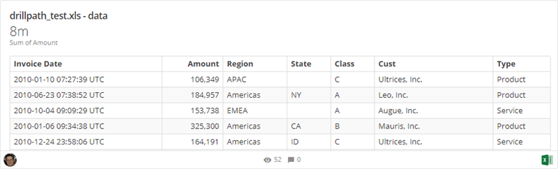
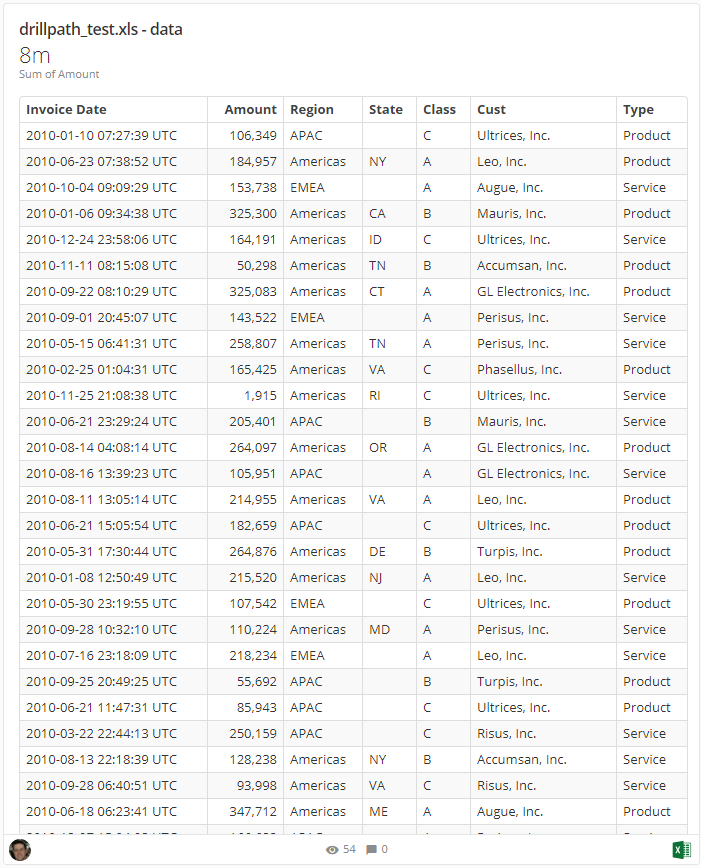
<table class="mt-responsive-table" data-aura-rendered-by="33:209;a"><thead><tr><th colspan="1" rowspan="1"><p> Option </p></th><th colspan="1" rowspan="1"><p> Description </p></th><th colspan="1" rowspan="1"><p> Examples </p></th></tr></thead><tbody><tr><td colspan="1" rowspan="1"><p> Full Size Settings </p></td><td colspan="1" rowspan="1"><p> Allows you to set custom sizing on tables in the card view when the "Full Size" option is selected—anywhere from 1 to 6 card sizes in both width and height. For more information about card sizing, see <a href="/s/article/360042923594" target="_blank" title="Changing the Size of Cards in a Page"> Changing the Size of Cards in a Page </a>. </p><p> The first table in the example at right shows a table in the card view that has been set to a 4-card width by a 1-card height. The second table has been set to a 3-card width by a 3-card height. <a id="deprecated" target="_blank" /></p></td><td colspan="1" rowspan="1"><p class="wysiwyg-text-align-center"><a href="/s/article/360043429073" target="_blank" title="/@api/deki/files/4720/table_4x1.png"><img alt="" src="https://mintcdn.com/domoinc-openapi-sync-dataflows/g5Ek3SRXv8ussuBG/images/kb/ka0Vq0000003jAH-00N5w00000Ri7BU-0EM5w000005vZ5d.png?fit=max&auto=format&n=g5Ek3SRXv8ussuBG&q=85&s=ba723b5841d2c3e415a31b2de58c0526" width="800" height="242" data-path="images/kb/ka0Vq0000003jAH-00N5w00000Ri7BU-0EM5w000005vZ5d.png" /></a></p><p class="wysiwyg-text-align-center"><a href="/s/article/360043429073" target="_blank" title="/@api/deki/files/4719/table_3x3.png"><img alt="" src="https://mintcdn.com/domoinc-openapi-sync-dataflows/g5Ek3SRXv8ussuBG/images/kb/ka0Vq0000003jAH-00N5w00000Ri7BU-0EM5w000005vZ5g.png?fit=max&auto=format&n=g5Ek3SRXv8ussuBG&q=85&s=04d7da0b13f481a2b1ab77ea99e973e9" width="701" height="868" data-path="images/kb/ka0Vq0000003jAH-00N5w00000Ri7BU-0EM5w000005vZ5g.png" /></a></p></td></tr></tbody></table>

### Alignment Properties - DEPRECATED

The properties in the following table were formerly found in the **Alignment** category in Chart Properties.
<table class="mt-responsive-table" data-aura-rendered-by="33:209;a"><thead><tr><th class="mt-column-width-15" colspan="1" rowspan="1"><p> Option </p></th><th class="mt-column-width-35" colspan="1" rowspan="1"><p> Description </p></th><th class="mt-column-width-15" colspan="1" rowspan="1"><p> Examples </p></th></tr><tr><td class="mt-column-width-15" colspan="1" rowspan="1"> Column 1-16 </td><td class="mt-column-width-35" colspan="1" rowspan="1"><p> Lets you set the text alignment (left, center, or right) for all desired columns in your table. Column numbers are based on the table column order going from left to right. For example, the third column from the left would be column 3. </p><p> In the example, all columns are set to <b> Center </b>. </p></td><td class="mt-column-width-15 wysiwyg-text-align-center" colspan="1" rowspan="1"><a href="/s/article/360043429073" target="_blank" title="/@api/deki/files/4174/table_column_alignment.png"><img alt="" src="https://mintcdn.com/domoinc-openapi-sync-dataflows/zKZ3HwsBqhLsvFuw/images/kb/ka0Vq0000003jAH-00N5w00000Ri7BU-0EM5w000005vZ63.png?fit=max&auto=format&n=zKZ3HwsBqhLsvFuw&q=85&s=9d247dfc0be2343220d881e01ee0a4f5" width="700" height="112" data-path="images/kb/ka0Vq0000003jAH-00N5w00000Ri7BU-0EM5w000005vZ63.png" /></a></td></tr></thead></table>

### Attribute Properties - DEPRECATED

The properties in the following table were formerly found in the **Attribute** category in Chart Properties.
<table class="mt-responsive-table" data-aura-rendered-by="33:209;a"><thead><tr><th class="mt-column-width-15" colspan="1" rowspan="1"><p> Option </p></th><th class="mt-column-width-35" colspan="1" rowspan="1"><p> Description </p></th><th class="mt-column-width-15" colspan="1" rowspan="1"><p> Examples </p></th></tr><tr><td class="mt-column-width-15" colspan="1" rowspan="1"> Column 1-16 </td><td class="mt-column-width-35" colspan="1" rowspan="1"><p> Lets you set the font style (bold, italic, bold-italic, or underline) for all desired columns in your table. Note this does not affect text in header rows. Column numbers are based on the table column order going from left to right. For example, the third column from the left would be column 3. </p><p> In the example, the two value columns are set to <b> Italic </b>. </p></td><td class="mt-column-width-15" colspan="1" rowspan="1"> — </td></tr></thead></table>