> ## Documentation Index
> Fetch the complete documentation index at: https://domoinc-openapi-sync-dataflows.mintlify.site/llms.txt
> Use this file to discover all available pages before exploring further.

# Properties for Gauges

## Intro

Refer to this topic to find information about chart properties available for Gauges, such as those for configuring ranges, target values, fill colors, value formats, and so on.

For step-by-step instructions on applying these properties to gauges, see [Setting Options for Gauges](/s/article/360042925254 "Setting Options for Gauges").

## "General" Properties

The properties in the following table are found in the **General** category in Chart Properties.

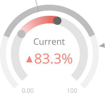
<table class="mt-responsive-table" data-aura-rendered-by="33:209;a"><thead><tr><th colspan="1" rowspan="1"><p> Option </p></th><th colspan="1" rowspan="1"><p> Description </p></th><th colspan="1" rowspan="1"><p> Examples </p></th></tr></thead><tbody><tr><td colspan="1" rowspan="1"><p> Fill Color </p></td><td colspan="1" rowspan="1"><p> Determines the fill color for a Filled gauge. For more information, see <a href="/s/article/360042925254" target="_self" title="Setting Properties for Gauges"> Setting Properties for Gauges </a>. </p></td><td colspan="1" rowspan="1"><p class="mt-align-center"> — <br /></p></td></tr><tr><td colspan="1" rowspan="1"><p> Minimum Value </p></td><td colspan="1" rowspan="1"><p> Determines the minimum value for a Filled gauge. For more information, see <a href="/s/article/360042925254" target="_self" title="Setting Properties for Gauges"> Setting Properties for Gauges </a>. </p></td><td colspan="1" rowspan="1"><p class="mt-align-center"> — <br /><br /></p></td></tr><tr><td colspan="1" rowspan="1"><p> Maximum Value </p></td><td colspan="1" rowspan="1"><p> Determines the maximum value for a Filled gauge. For more information, see <a href="/s/article/360042925254" target="_self" title="Setting Properties for Gauges"> Setting Properties for Gauges </a>. </p></td><td colspan="1" rowspan="1"><p class="mt-align-center"> — <br /></p></td></tr><tr><td colspan="1" rowspan="1"><p> Target Value </p></td><td colspan="1" rowspan="1"><p> Determines the target value for a Filled gauge. When a value has been entered in this field, that value appears in the gauge, and a line appears at the corresponding point in the gauge to indicate the target. This property sets a non-changing, static target value in the gauge. If you want dynamic target values in your gauge (that is, you want your target to change according to changes in your DataSet), you should add them by applying the optional third column to the gauge rather than using <b> Chart Properties </b>. For more information about gauge properties, see <a href="/s/article/360042924554" target="_blank" title="Setting Properties for Gauges"> Filled Gauge </a>. </p></td><td colspan="1" rowspan="1"><p class="mt-align-center"> — </p></td></tr><tr><td colspan="1" rowspan="1"><p> Target Label </p></td><td colspan="1" rowspan="1"><p> Determines the text that accompanies the target value in a Filled gauge. For more information, see <a href="/s/article/360042925254" target="_self" title="Setting Properties for Gauges"> Setting Properties for Gauges </a>. </p></td><td colspan="1" rowspan="1"><p class="mt-align-center"> — </p></td></tr><tr><td colspan="1" rowspan="1"><p> Value Label </p></td><td colspan="1" rowspan="1"><p> Determines the text that accompanies the current value in a Filled gauge. For more information, see <a href="/s/article/360042925254" target="_self" title="Setting Properties for Gauges"> Setting Properties for Gauges </a>. </p></td><td colspan="1" rowspan="1"><p class="mt-align-center"> — </p></td></tr><tr><td colspan="1" rowspan="1"><p> Maximum Label </p></td><td colspan="1" rowspan="1"><p> Determines the text that accompanies the maximum value in a Filled gauge. For more information, see <a href="/s/article/360042925254" target="_self" title="Setting Properties for Gauges"> Setting Properties for Gauges </a>. </p></td><td colspan="1" rowspan="1"><p class="mt-align-center"> — </p></td></tr><tr><td colspan="1" rowspan="1"><p> Value </p></td><td colspan="1" rowspan="1"><p> Determines how the values in your values column are to be aggregated for Single Value, Filled, and Radial gauges. Options include the usual aggregations such as <b> Sum </b>, <b> Average </b>, etc., as well as <b> First Row </b> and <b> Last Row </b>, which take the value in the first or last row as the gauge value. The default option is <b> Sum </b>. The aggregation you select here is added to the aggregation you select in the value aggregation menu (so, for example, if you selected <b> Average </b> in the value aggregation menu and <b> Sum </b> in <b> Chart Properties </b>, your gauge value would be the summed averages for each category). Because having two aggregations in a chart is usually undesirable, select <b> No Aggregation </b> in the value aggregation menu, then in <b> Chart Properties </b> select your desired aggregation in the <b> General > Value </b> menu. </p></td><td colspan="1" rowspan="1"><p class="mt-align-center"> — </p></td></tr><tr><td colspan="1" rowspan="1"><p> Color Source </p></td><td colspan="1" rowspan="1"><p> Determines how the color of a Filled gauge is determined. Options include <b> Fill Color </b> (the default option), which uses the color you specify for the <b> Fill Color </b> property; <b> Green Above Target </b>, which causes the gauge to appear green if the current value is higher than the target value and red if it is below; and <b> Green Below Target </b>, which causes the gauge to appear red if the current value is higher than the target value and green if it is below. For the <b> Green Above Target </b> and <b> Green Below Target </b> options to work, <b> Fill Color </b><em> must </em> be set to <b> Default </b>; otherwise the color you select for <b> Fill Color </b> overrides this property. </p></td><td colspan="1" rowspan="1"><p class="mt-align-center"> — </p></td></tr><tr><td colspan="1" rowspan="1"><p> Fill Color </p></td><td colspan="1" rowspan="1"><p> Determines the fill color for a Filled gauge. Any color you select for this property overrides the <b> Green Above Target </b> and <b> Green Below Target </b> settings in the <b> Color Source </b> properties; therefore, if you plan to use either of these settings, you should set <b> Fill Color </b> to <b> Default </b> so the settings are not overridden. </p></td><td colspan="1" rowspan="1"><p class="mt-align-center"> — </p></td></tr><tr><td colspan="1" rowspan="1"><p> Value Format </p></td><td colspan="1" rowspan="1"><p> Determines the general number format for a Single Value gauge. Options include <b> Number </b> (which includes no special formatting), <b> Currency </b> (in which a currency symbol is affixed), and <b> Percentage </b> (in which a percent symbol is affixed). </p></td><td colspan="1" rowspan="1"><p class="mt-align-center"> — </p></td></tr><tr><td colspan="1" rowspan="1"><p> Divide Value By </p></td><td colspan="1" rowspan="1"><p> Refers to the number that the value in a Single Value gauge is to be divided by, if any. This option is useful when the value is very large and you want to abbreviate it by dividing by a common number. For example, if the gauge value represented millions of dollars, you could choose to divide by millions—the gauge value would then be reduced to more comprehendible single digits. When you choose to divide by <b> Percentage </b>, the gauge value is multiplied by 100. </p></td><td colspan="1" rowspan="1"><p class="mt-align-center"> — </p></td></tr><tr><td colspan="1" rowspan="1"><p> Decimal Places </p></td><td colspan="1" rowspan="1"><p> Determines the number of decimal places used in the value in a Single Value gauge. You can choose from <b> Default </b>, <b> None </b>, and options for numbers of decimal places (from ".0" to ".00000"). By default, Domo automatically determines the optimal number of decimal places for the gauge value. When you select <b> None </b>, the value is rounded to the nearest whole number. </p></td><td colspan="1" rowspan="1"><p class="mt-align-center"> — </p></td></tr><tr><td colspan="1" rowspan="1"><p> Negative Numbers </p></td><td colspan="1" rowspan="1"><p> Determines the format for negative numbers in a Single Value gauge. If you select <b> -100 </b>, negative values have a minus symbol affixed. If you select <b> (100) </b>, negative values are enclosed in parentheses. </p></td><td colspan="1" rowspan="1"><p class="mt-align-center"> — </p></td></tr><tr><td colspan="1" rowspan="1"><p> Color Direction </p></td><td colspan="1" rowspan="1"><p> Determines whether green fill in a Comparative Fill Gauge indicates positive (default) or negative change in the gauge. </p><p> When positive change is denoted by green, negative change is denoted by red. Alternatively, if you specify that negative change is denoted by green, then positive change is denoted by red. </p><p> In the example at right, the user has selected <b> Negative is Green </b> for this property. Thus, because the percent change is positive, the color fill is red. </p></td><td colspan="1" rowspan="1"><p><a target="_blank" title="/@api/deki/files/237/comparative_fill_gauge_positive_red.png"><img alt="" src="https://mintcdn.com/domoinc-openapi-sync-dataflows/DfXQTn5UA-Ig8rT5/images/kb/ka05w000001242k-00N5w00000Ri7BU-0EM5w000005vZ6X.png?fit=max&auto=format&n=DfXQTn5UA-Ig8rT5&q=85&s=54f410ed810bab4de97e7188a530f000" width="357" height="318" data-path="images/kb/ka05w000001242k-00N5w00000Ri7BU-0EM5w000005vZ6X.png" /></a></p></td></tr></tbody></table>
## "Range 1-6" Properties

The properties in the following table are found in the **Range 1** to **Range 6** categories in Chart Properties.

<table class="mt-responsive-table"><thead><tr><th class="mt-column-width-15" colspan="1" rowspan="1"><p> Option </p></th><th class="mt-column-width-40" colspan="1" rowspan="1"><p> Description </p></th><th class="mt-column-width-15" colspan="1" rowspan="1"><p> Examples </p></th></tr></thead><tbody><tr><td class="mt-column-width-15" colspan="1" rowspan="1"><p> Minimum Value </p></td><td class="mt-column-width-40" colspan="1" rowspan="1"><p> Lets you specify the minimum value for the selected range in a Radial gauge. </p></td><td class="mt-column-width-15" colspan="1" rowspan="1"><p> — </p></td></tr><tr><td class="mt-column-width-15" colspan="1" rowspan="1"><p> Maximum Value </p></td><td class="mt-column-width-40" colspan="1" rowspan="1"><p> Lets you specify the maximum value for the selected range in a Radial gauge. </p></td><td class="mt-column-width-15" colspan="1" rowspan="1"><p> — </p></td></tr><tr><td class="mt-column-width-15" colspan="1" rowspan="1"><p> Color </p></td><td class="mt-column-width-40" colspan="1" rowspan="1"><p> Lets you select the color for the selected range in a Radial gauge. In the example, the <b> Minimum Value </b> for <b> Range 3 </b> has been set to "67," the <b> Maximum Value </b> has been set to "100," and the <b> Color </b> has been set to green. </p></td><td class="mt-column-width-15" colspan="1" rowspan="1"><p><a target="_blank" title="/@api/deki/files/999/ranges_example.png"><img alt="" src="https://mintcdn.com/domoinc-openapi-sync-dataflows/DfXQTn5UA-Ig8rT5/images/kb/ka05w000001242k-00N5w00000Ri7BU-0EM5w000005vZ6H.png?fit=max&auto=format&n=DfXQTn5UA-Ig8rT5&q=85&s=a5352606c391679e172cad799a27a06e" width="400" height="290" data-path="images/kb/ka05w000001242k-00N5w00000Ri7BU-0EM5w000005vZ6H.png" /></a></p></td></tr></tbody></table>

## "Green Range/Yellow Range/Red Range" Properties

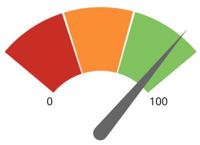
The properties in the following table are found in the **Green Range**, **Yellow Range**, and **Red Range** categories in Chart Properties.

<table class="mt-responsive-table" data-aura-rendered-by="33:209;a"><thead><tr><th class="mt-column-width-15" colspan="1" rowspan="1"><p> Option </p></th><th class="mt-column-width-40" colspan="1" rowspan="1"><p> Description </p></th><th class="mt-column-width-15" colspan="1" rowspan="1"><p> Examples </p></th></tr></thead><tbody><tr><td class="mt-column-width-15" colspan="1" rowspan="1"><p> Minimum Value </p></td><td class="mt-column-width-40" colspan="1" rowspan="1"><p> Lets you specify the minimum value for the selected color range in a Face gauge. </p></td><td class="mt-column-width-15" colspan="1" rowspan="1"><p> — </p></td></tr><tr><td class="mt-column-width-15" colspan="1" rowspan="1"><p> Maximum Value </p></td><td class="mt-column-width-40" colspan="1" rowspan="1"><p> Lets you specify the maximum value for the selected color range in a Face gauge. </p></td><td class="mt-column-width-15" colspan="1" rowspan="1"><p> — </p></td></tr></tbody></table>

## Number Format Properties

<table border="1" cellpadding="1" cellspacing="1" data-aura-rendered-by="33:209;a"><thead><tr><th colspan="1" rowspan="1"><p> Property </p></th><th colspan="1" rowspan="1"><p> Description </p></th></tr></thead><tbody><tr><td colspan="1" rowspan="1"><p> Currency Symbol </p></td><td colspan="1" rowspan="1"><p> The symbol or group of symbols used to denote currency in values in your chart. The default currency symbol is "\$." </p><div class="mdx-embed"><Note><b> Note </b><b>: </b> If you use a close parenthesis as part of your currency symbol, you <em> must </em> pair it with an open parenthesis.</Note></div></td></tr><tr><td colspan="1" rowspan="1"><p> Currency Symbol Position </p></td><td colspan="1" rowspan="1"><p> Determines whether currency symbols appear before or after their values. </p></td></tr><tr><td colspan="1" rowspan="1"><p> Decimal Separator </p></td><td colspan="1" rowspan="1"><p> Determines the symbol for separate decimal values. The default decimal separator is a period. </p></td></tr><tr><td colspan="1" rowspan="1"><p> Thousands Separator </p></td><td colspan="1" rowspan="1"><p> Determines the symbol used to separate thousands in large numbers. The default thousands separator is a comma. </p></td></tr></tbody></table>

## "Header/Footer" Properties

The properties in the following table are found in the **Header/Footer** categories in Chart Properties.

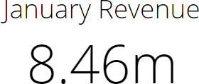
<table class="mt-responsive-table" data-aura-rendered-by="33:209;a"><thead><tr><th class="mt-column-width-15" colspan="1" rowspan="1"><p> Option </p></th><th class="mt-column-width-35" colspan="1" rowspan="1"><p> Description </p></th><th class="mt-column-width-20" colspan="1" rowspan="1"><p> Examples </p></th></tr></thead><tbody><tr><td class="mt-column-width-15" colspan="1" rowspan="1"><p> Header/Footer > Header </p></td><td class="mt-column-width-35" colspan="1" rowspan="1"><p> Specifies text to appear before the value in a Single Value gauge. </p></td><td class="mt-column-width-20" colspan="1" rowspan="1"><p><a target="_blank" title="/@api/deki/files/533/gauge_header.png"><img alt="" src="https://mintcdn.com/domoinc-openapi-sync-dataflows/DfXQTn5UA-Ig8rT5/images/kb/ka05w000001242k-00N5w00000Ri7BU-0EM5w000005vZ6U.png?fit=max&auto=format&n=DfXQTn5UA-Ig8rT5&q=85&s=adeee5a30b797f33bfe49b52784bf0db" width="280" height="119" data-path="images/kb/ka05w000001242k-00N5w00000Ri7BU-0EM5w000005vZ6U.png" /></a></p></td></tr><tr><td class="mt-column-width-15" colspan="1" rowspan="1"><p> Header/Footer > Footer </p></td><td class="mt-column-width-35" colspan="1" rowspan="1"><p> Specifies text to appear after the value in a Single Value gauge. </p></td><td class="mt-column-width-20" colspan="1" rowspan="1"><p><a target="_blank" title="/@api/deki/files/530/gauge_footer.png"><img alt="" src="https://mintcdn.com/domoinc-openapi-sync-dataflows/DfXQTn5UA-Ig8rT5/images/kb/ka05w000001242k-00N5w00000Ri7BU-0EM5w000005vZ6R.png?fit=max&auto=format&n=DfXQTn5UA-Ig8rT5&q=85&s=93815f614957bef2d4248add282897f1" width="369" height="129" data-path="images/kb/ka05w000001242k-00N5w00000Ri7BU-0EM5w000005vZ6R.png" /></a></p></td></tr></tbody></table>