> ## Documentation Index
> Fetch the complete documentation index at: https://domoinc-openapi-sync-dataflows.mintlify.site/llms.txt
> Use this file to discover all available pages before exploring further.

# Properties for Data Science Charts

## Intro

## "General" Properties

The properties in the following table are found in the **General** category in Chart Properties.

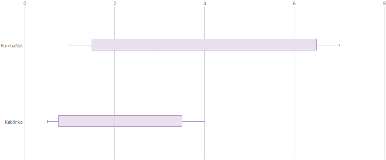
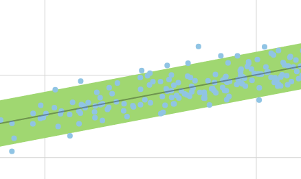
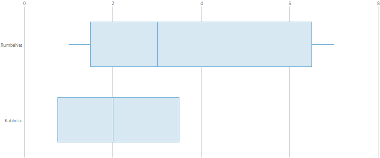
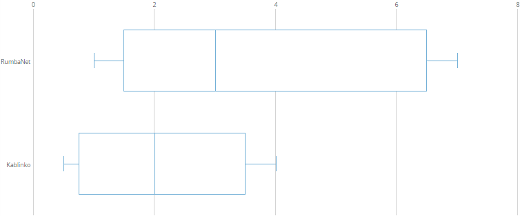
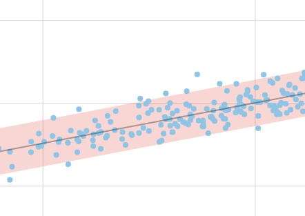
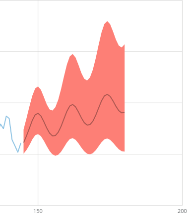
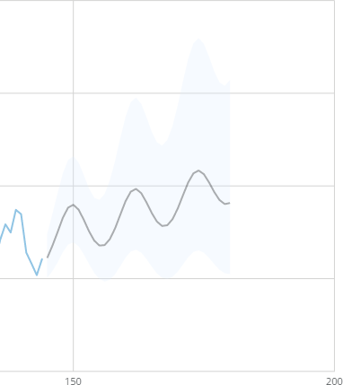
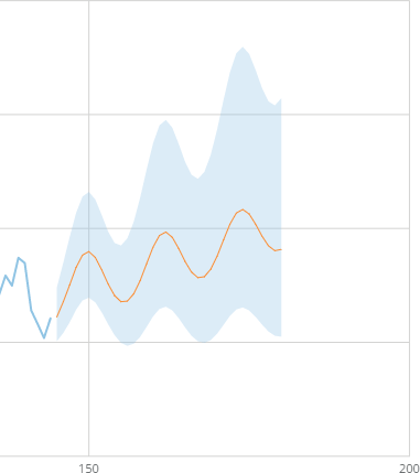
<table class="mt-responsive-table" data-aura-rendered-by="33:209;a"><thead><tr><th colspan="1" rowspan="1"><p> Option </p></th><th class="mt-column-width-40" colspan="1" rowspan="1"><p> Description </p></th><th class="mt-column-width-30" colspan="1" rowspan="1"><p> Examples </p></th></tr></thead><tbody><tr><td colspan="1" rowspan="1"><p> Line Color </p></td><td class="mt-column-width-40" colspan="1" rowspan="1"><p> Determines the color of lines in a Box Plot graph. If the <b> Disable Fill </b> property is unchecked, the fill color of the boxes matches the line color; otherwise only the lines are colored. The default color is blue. </p></td><td class="mt-column-width-30" colspan="1" rowspan="1"><p class="mt-align-center"> — </p></td></tr><tr><td colspan="1" rowspan="1"><p> Percent Width </p></td><td class="mt-column-width-40" colspan="1" rowspan="1"><p> Determines the width of Box Plot diagrams in the graph. You can enter any value between 10 and 100. The lower the value, the thinner the boxes. In the example, the <b> Percent Width </b> has been set to <code> 15 </code>. </p></td><td class="mt-column-width-30" colspan="1" rowspan="1"><p><a target="_blank" title="/@api/deki/files/138/boxplot_percent_width.png"><img alt="" src="https://mintcdn.com/domoinc-openapi-sync-dataflows/KRKoASQJgRuO8wHw/images/kb/ka05w00000123pO-00N5w00000Ri7BU-0EM5w000005vPHb.png?fit=max&auto=format&n=KRKoASQJgRuO8wHw&q=85&s=fad9d4fb052e5e45b97a5c087f0a1dce" width="754" height="314" data-path="images/kb/ka05w00000123pO-00N5w00000Ri7BU-0EM5w000005vPHb.png" /></a></p></td></tr><tr><td colspan="1" rowspan="1"><p> Hide Whisker Caps </p></td><td class="mt-column-width-40" colspan="1" rowspan="1"><p> When enabled, hides the "whisker caps" in a Box Plot graph, the lines for high and low values that appear at the ends of the "whisker lines" by default. In the example, whisker caps have been hidden. </p></td><td class="mt-column-width-30" colspan="1" rowspan="1"><p><a target="_blank" title="/@api/deki/files/1326/whisker_caps_off.png"><img alt="" src="https://mintcdn.com/domoinc-openapi-sync-dataflows/KRKoASQJgRuO8wHw/images/kb/ka05w00000123pO-00N5w00000Ri7BU-0EM5w000005vPHa.png?fit=max&auto=format&n=KRKoASQJgRuO8wHw&q=85&s=8f433b4c0702c12ad437d725581c71ed" width="754" height="314" data-path="images/kb/ka05w00000123pO-00N5w00000Ri7BU-0EM5w000005vPHa.png" /></a></p></td></tr><tr><td colspan="1" rowspan="1"><p> Disable Fill </p></td><td class="mt-column-width-40" colspan="1" rowspan="1"><p> Removes the colored fill in boxes in a Box Plot graph, causing them to appear transparent. </p></td><td class="mt-column-width-30" colspan="1" rowspan="1"><p><a target="_blank" title="/@api/deki/files/130/boxplot_fill_disabled.png"><img alt="" src="https://mintcdn.com/domoinc-openapi-sync-dataflows/KRKoASQJgRuO8wHw/images/kb/ka05w00000123pO-00N5w00000Ri7BU-0EM5w000005vPHf.png?fit=max&auto=format&n=KRKoASQJgRuO8wHw&q=85&s=e7f370402afc4ba9ddd9d9e5286ffd8b" width="754" height="314" data-path="images/kb/ka05w00000123pO-00N5w00000Ri7BU-0EM5w000005vPHf.png" /></a></p></td></tr><tr><td colspan="1" rowspan="1"> General > Bounds Fill Color </td><td class="mt-column-width-40" colspan="1" rowspan="1"> Determines the color of the region between the lower and upper bounds of the first provided forecasting line. If either of these bounds is not set, no fill is applied. </td><td class="mt-column-width-30" colspan="1" rowspan="1"><a target="_blank" title="/@api/deki/files/4160/pmodeling_bounds_fill.png"><img alt="" src="https://mintcdn.com/domoinc-openapi-sync-dataflows/D4XP-ZUu0hZKYNDT/images/kb/ka05w00000123mW-00N5w00000Ri7BU-0EM5w000005vP4n.png?fit=max&auto=format&n=D4XP-ZUu0hZKYNDT&q=85&s=5e1e4d6029bf84559a3c963121021986" width="438" height="261" data-path="images/kb/ka05w00000123mW-00N5w00000Ri7BU-0EM5w000005vP4n.png" /></a></td></tr><tr><td colspan="1" rowspan="1"> General > Fill Transparency Percent </td><td class="mt-column-width-40" colspan="1" rowspan="1"><p> Determines the percent of transparency of the fill between the lower and upper bounds of the first provided forecasting line. You can select any number between 0 and 100, in which 0 is completely opaque and 100 is completely transparent. If no color is selected in <b> Bounds Fill Color </b>, this property is unavailable. </p><p> In the example, the transparency has been set to 75. </p></td><td class="mt-column-width-30" colspan="1" rowspan="1"><a target="_blank" title="/@api/deki/files/4159/pmodeling_transparency.png"><img alt="" src="https://mintcdn.com/domoinc-openapi-sync-dataflows/D4XP-ZUu0hZKYNDT/images/kb/ka05w00000123mW-00N5w00000Ri7BU-0EM5w000005vP4k.png?fit=max&auto=format&n=D4XP-ZUu0hZKYNDT&q=85&s=049a0c41b5dc79f30bcd77fb89427c1e" width="442" height="313" data-path="images/kb/ka05w00000123mW-00N5w00000Ri7BU-0EM5w000005vP4k.png" /></a></td></tr><tr><td colspan="1" rowspan="1"><p> General > Bounds Fill Color </p></td><td class="mt-column-width-40" colspan="1" rowspan="1"><p> Determines the color of the region between the lower and upper bounds of the first provided forecasting line. If either of these bounds is not set, no fill is applied. </p></td><td class="mt-column-width-30" colspan="1" rowspan="1"><p><a target="_blank" title="/@api/deki/files/4153/forecasting_bound_fill_color.png"><img alt="forecasting_bound_fill_color.png" src="https://mintcdn.com/domoinc-openapi-sync-dataflows/KRKoASQJgRuO8wHw/images/kb/ka05w00000123o7-00N5w00000Ri7BU-0EM5w000005vPA3.png?fit=max&auto=format&n=KRKoASQJgRuO8wHw&q=85&s=e445efa0bfd53a5150eb9889ffefdef5" width="377" height="429" data-path="images/kb/ka05w00000123o7-00N5w00000Ri7BU-0EM5w000005vPA3.png" /></a></p></td></tr><tr><td colspan="1" rowspan="1"><p> General > Fill Transparency Percent </p></td><td class="mt-column-width-40" colspan="1" rowspan="1"><p> Determines the percent of transparency of the fill between the lower and upper bounds of the first provided forecasting line. You can select any number between 0 and 100, in which 0 is completely opaque and 100 is completely transparent. If no color is selected in <b> Bounds Fill Color </b>, this property is unavailable. </p><p> In the example, the transparency has been set to 75. </p></td><td class="mt-column-width-30" colspan="1" rowspan="1"><p><a target="_blank" title="/@api/deki/files/4151/forecasting_line_color.png"><img alt="" src="https://mintcdn.com/domoinc-openapi-sync-dataflows/KRKoASQJgRuO8wHw/images/kb/ka05w00000123o7-00N5w00000Ri7BU-0EM5w000005vPA1.png?fit=max&auto=format&n=KRKoASQJgRuO8wHw&q=85&s=a06ed93b5d840f1758539c334a9978ff" width="382" height="429" data-path="images/kb/ka05w00000123o7-00N5w00000Ri7BU-0EM5w000005vPA1.png" /></a></p></td></tr><tr><td colspan="1" rowspan="1"><p> General > Forecast Line Color </p></td><td class="mt-column-width-40" colspan="1" rowspan="1"><p> Determines the color of the first provided forecast line. </p><p /></td><td class="mt-column-width-30" colspan="1" rowspan="1"><p><a target="_blank" title="/@api/deki/files/4152/forecasting_bound_fill_transparency.png"><img alt="" src="https://mintcdn.com/domoinc-openapi-sync-dataflows/KRKoASQJgRuO8wHw/images/kb/ka05w00000123o7-00N5w00000Ri7BU-0EM5w000005vPAA.png?fit=max&auto=format&n=KRKoASQJgRuO8wHw&q=85&s=e5637399b75fc4f1bdfb851d9bb85896" width="381" height="429" data-path="images/kb/ka05w00000123o7-00N5w00000Ri7BU-0EM5w000005vPAA.png" /></a></p></td></tr><tr><td colspan="1" rowspan="1"><p> General > Bounds 2 Fill Color </p></td><td class="mt-column-width-40" colspan="1" rowspan="1"><p> Determines the color of the region between the lower and upper bounds of the second provided forecasting line. If either of these bounds is not set, no fill is applied. </p></td><td class="mt-column-width-30" colspan="1" rowspan="1"><p class="mt-align-center"> N/A </p></td></tr><tr><td colspan="1" rowspan="1"><p> General > Fill 2 Transparency Percent </p></td><td class="mt-column-width-40" colspan="1" rowspan="1"><p> Determines the percent of transparency of the fill between the lower and upper bounds of the second provided forecasting line. You can select any number between 0 and 100, in which 0 is completely opaque and 100 is completely transparent. If no color is selected in <b> Bounds 2 Fill Color </b>, this property is unavailable. </p></td><td class="mt-column-width-30" colspan="1" rowspan="1"><p class="mt-align-center"> N/A </p></td></tr><tr><td colspan="1" rowspan="1"><p> General > Forecast 2 Line Color </p></td><td class="mt-column-width-40" colspan="1" rowspan="1"><p> Determines the color of the second provided forecast line. </p></td><td class="mt-column-width-30" colspan="1" rowspan="1"><p class="mt-align-center"> N/A </p></td></tr></tbody></table>
## "Grid Lines" Properties

The properties in the following table are found in the **Grid Lines** category in Chart Properties.

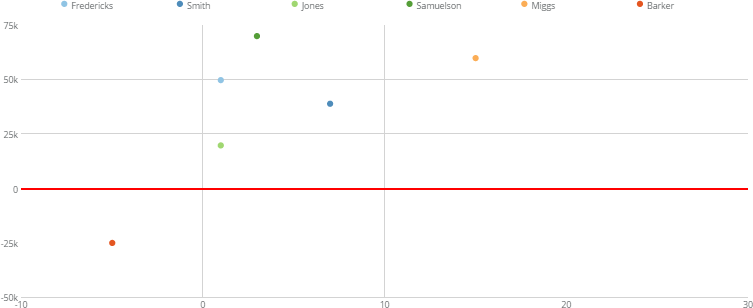
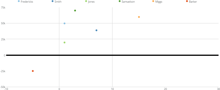
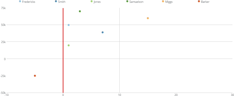
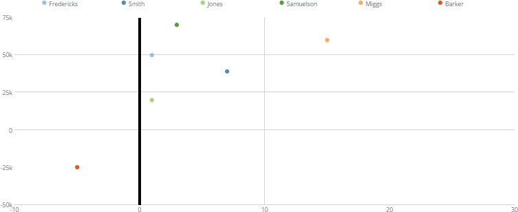
<table class="mt-responsive-table" data-aura-rendered-by="33:209;a"><thead><tr><th class="mt-column-width-15" colspan="1" rowspan="1"><p> Option </p></th><th class="mt-column-width-35" colspan="1" rowspan="1"><p> Description </p></th><th class="mt-column-width-20" colspan="1" rowspan="1"><p> Examples </p></th></tr></thead><tbody><tr><td class="mt-column-width-15" colspan="1" rowspan="1"><p> Hide All Grids </p></td><td class="mt-column-width-35" colspan="1" rowspan="1"><p> Turns off grid lines in Bubble graphs. This is useful when you want to create a "quadrant chart" (that is, a chart divided into four sections using two coordinate lines). For more properties related to quadrant charts, see <a class="confluence-link" href="/s/article/360042925334" target="_self" title="Properties for Data Science Charts"> Quadrant Lines </a>. </p></td><td class="mt-column-width-20" colspan="1" rowspan="1"><p /></td></tr><tr><td class="mt-column-width-15" colspan="1" rowspan="1"><p> Y Zero Line Color </p></td><td class="mt-column-width-35" colspan="1" rowspan="1"><p> Determines the color of the horizontal "zero line" in Bubble and Scatter Plot graphs. This attribute does not work if the zero line is also the baseline in the graph (that is, the chart must contain negative values). In the example, this property has been set to <code> red </code>. </p></td><td class="mt-column-width-20" colspan="1" rowspan="1"><p><a target="_blank" title="/@api/deki/files/1336/y_zero_line_color.png"><img alt="" src="https://mintcdn.com/domoinc-openapi-sync-dataflows/KRKoASQJgRuO8wHw/images/kb/ka05w00000123nS-00N5w00000Ri7BU-0EM5w000005vP7p.png?fit=max&auto=format&n=KRKoASQJgRuO8wHw&q=85&s=0c32bd33749e593e9b57790ebe2719e8" width="753" height="308" data-path="images/kb/ka05w00000123nS-00N5w00000Ri7BU-0EM5w000005vP7p.png" /></a></p></td></tr><tr><td class="mt-column-width-15" colspan="1" rowspan="1"><p> Y Zero Line Width </p></td><td class="mt-column-width-35" colspan="1" rowspan="1"><p> Determines the width of the horizontal "zero line" in Bubble and Scatter Plot graphs. This attribute does not work if the zero line is also the baseline in the graph (that is, the chart must contain negative values). In the example, this property has been set to <code> 5 </code>. </p></td><td class="mt-column-width-20" colspan="1" rowspan="1"><p><a target="_blank" title="/@api/deki/files/1335/y_zero_line_width.png"><img alt="" src="https://mintcdn.com/domoinc-openapi-sync-dataflows/DfXQTn5UA-Ig8rT5/images/kb/ka05w000001242l-00N5w00000Ri7BU-0EM5w000005vZ6L.png?fit=max&auto=format&n=DfXQTn5UA-Ig8rT5&q=85&s=15e76b0a5da9c9ba7787985d7936e070" width="753" height="308" data-path="images/kb/ka05w000001242l-00N5w00000Ri7BU-0EM5w000005vZ6L.png" /></a></p></td></tr><tr><td class="mt-column-width-15" colspan="1" rowspan="1"><p> X Zero Line Color </p></td><td class="mt-column-width-35" colspan="1" rowspan="1"><p> Determines the color for the vertical "zero line" in Bubble and Scatter Plot graphs. This attribute does not work if the vertical zero line is the leftmost line in the graph (that is, the chart must contain negative values). In the example, this property has been set to <code> red </code>. </p></td><td class="mt-column-width-20" colspan="1" rowspan="1"><p><a target="_blank" title="/@api/deki/files/1337/x_zero_line_color.png"><img alt="" src="https://mintcdn.com/domoinc-openapi-sync-dataflows/DfXQTn5UA-Ig8rT5/images/kb/ka05w000001242l-00N5w00000Ri7BU-0EM5w000005vZ6N.png?fit=max&auto=format&n=DfXQTn5UA-Ig8rT5&q=85&s=99a29c904bed60f85a2b84dc49009e76" width="753" height="308" data-path="images/kb/ka05w000001242l-00N5w00000Ri7BU-0EM5w000005vZ6N.png" /></a></p></td></tr><tr><td class="mt-column-width-15" colspan="1" rowspan="1"><p> X Zero Line Width </p></td><td class="mt-column-width-35" colspan="1" rowspan="1"><p> Determines the width of the vertical "zero line" in Bubble and Scatter Plot graphs. This attribute does not work if the zero line is the leftmost line in the graph (that is, the chart must contain negative values). In the example, this property has been set to <code> 5 </code>. </p></td><td class="mt-column-width-20" colspan="1" rowspan="1"><p><a target="_blank" title="/@api/deki/files/1334/x_zero_line_width.png"><img alt="" src="https://mintcdn.com/domoinc-openapi-sync-dataflows/KRKoASQJgRuO8wHw/images/kb/ka05w00000123nS-00N5w00000Ri7BU-0EM5w000005vP7r.png?fit=max&auto=format&n=KRKoASQJgRuO8wHw&q=85&s=167153ce1528755033051298afe32d95" width="753" height="308" data-path="images/kb/ka05w00000123nS-00N5w00000Ri7BU-0EM5w000005vP7r.png" /></a></p></td></tr></tbody></table>

## "Quadrant Lines" Properties

The properties in the following table are found in the **Quadrant Lines** category in Chart Properties.

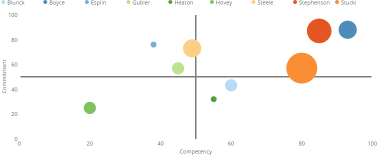
<table class="mt-responsive-table" data-aura-rendered-by="33:209;a"><thead><tr><th class="mt-column-width-15" colspan="1" rowspan="1"><p> Option </p></th><th class="mt-column-width-35" colspan="1" rowspan="1"><p> Description </p></th><th class="mt-column-width-20" colspan="1" rowspan="1"><p> Examples </p></th></tr></thead><tbody><tr><td class="mt-column-width-15" colspan="1" rowspan="1"><p> X Scale Value </p></td><td class="mt-column-width-35" colspan="1" rowspan="1"><p> Allows you to set the value for the vertical quadrant line in a Bubble graph. If you do not specify a value for this property, no vertical quadrant line appears. The example shows a Bubble graph in which both the X and Y scale quadrant lines have been set to the midpoint value of 50. This dissects the graph into four quadrants of equal area. (Grid lines have also been turned off using the <b> Grid Lines > Hide All Grids </b> property. </p></td><td class="mt-column-width-20" colspan="1" rowspan="1"><p><a target="_blank" title="/@api/deki/files/990/quadrant_lines.png"><img alt="" src="https://mintcdn.com/domoinc-openapi-sync-dataflows/KRKoASQJgRuO8wHw/images/kb/ka05w00000123pN-00N5w00000Ri7BU-0EM5w000005vPHg.png?fit=max&auto=format&n=KRKoASQJgRuO8wHw&q=85&s=d27760d2a9fa576b58364dbb7c3d1bc2" width="754" height="310" data-path="images/kb/ka05w00000123pN-00N5w00000Ri7BU-0EM5w000005vPHg.png" /></a></p></td></tr><tr><td class="mt-column-width-15" colspan="1" rowspan="1"><p> Y Scale Value </p></td><td class="mt-column-width-35" colspan="1" rowspan="1"><p> Allows you to set the value for the horizontal quadrant line in a Bubble graph. If you do not specify a value for this property, no horizontal quadrant line appears. For an example chart that uses quadrant lines, see the previous entry. </p></td><td class="mt-column-width-20" colspan="1" rowspan="1"><p> — </p></td></tr></tbody></table>

## "Regression Lines" Properties

The properties in the following table are found in the **Regression Lines** category in Chart Properties.

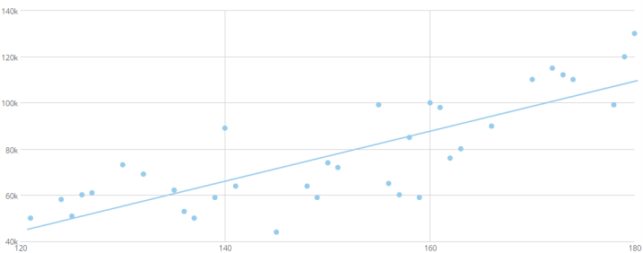
<table class="mt-responsive-table" data-aura-rendered-by="33:209;a"><thead><tr><th class="mt-column-width-15" colspan="1" rowspan="1"><p> Option </p></th><th class="mt-column-width-35" colspan="1" rowspan="1"><p> Description </p></th><th class="mt-column-width-20" colspan="1" rowspan="1"><p> Examples </p></th></tr></thead><tbody><tr><td class="mt-column-width-15" colspan="1" rowspan="1"><p> Show Linear Regression Lines </p></td><td class="mt-column-width-35" colspan="1" rowspan="1"><p> Allows you to add a regression line for each series in a Scatter Plot or Bubble chart. </p></td><td class="mt-column-width-20" colspan="1" rowspan="1"><p><a target="_blank" title="/@api/deki/files/1352/scatter_with_regression_line.png"><img alt="" src="https://mintcdn.com/domoinc-openapi-sync-dataflows/KRKoASQJgRuO8wHw/images/kb/ka05w00000123nS-00N5w00000Ri7BU-0EM5w000005vP7v.png?fit=max&auto=format&n=KRKoASQJgRuO8wHw&q=85&s=93791bb262782a80d72ef65fe68a3563" width="717" height="282" data-path="images/kb/ka05w00000123nS-00N5w00000Ri7BU-0EM5w000005vP7v.png" /></a></p></td></tr></tbody></table>