> ## Documentation Index
> Fetch the complete documentation index at: https://domoinc-openapi-sync-dataflows.mintlify.site/llms.txt
> Use this file to discover all available pages before exploring further.

# Setting Options for Gauges

## Intro

You can set properties for filled, comparative fill, radial, and face gauges in Domo. Properties are different for each gauge type. Filled and comparative fill gauges provide options for formatting the visual aspects, radial and face gauges allow you to set and edit ranges, and comparative gauges include options for formatting the color and type of displayed values.

Because single value gauges consist of a single number with no visual aspects or ranges, they do not have visual or range properties you can set. However, you can apply value formatting to the number and change the aggregation. For more information, see [Customizing Single Value gauges](http://wiki.domo.com/confluence/display/DHCS/Building+a+Single+Value+gauge#BuildingaSingleValuegauge-CustomizingSingleValuegauges "Single Value Gauge").

Progress bar gauges are not currently customizable.

## Formatting the appearance of filled and comparative fill gauges

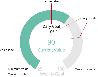
With filled gauges, you can set several visual properties, including the fill color and the minimum, maximum, and target values on the gauge. You can also add labels to describe the target, current, and maximum values. The following example shows a filled gauge and its editable properties:

<Frame>
  <img alt="" src="https://mintcdn.com/domoinc-openapi-sync-dataflows/DfXQTn5UA-Ig8rT5/images/kb/ka05w000001242z-00N5w00000Ri7BU-0EM5w000005vZ7K.png?fit=max&auto=format&n=DfXQTn5UA-Ig8rT5&q=85&s=185bef3d4ba82eecedc9b2f3efc79d5d" style={{width: 410, height: 321}} width="410" height="321" data-path="images/kb/ka05w000001242z-00N5w00000Ri7BU-0EM5w000005vZ7K.png" />
</Frame>

The following table describes each of these properties:

<table border="1" cellpadding="1" cellspacing="1" data-aura-rendered-by="33:209;a"><thead><tr><th colspan="1" rowspan="1"><p> Property </p></th><th colspan="1" rowspan="1"><p> Description </p></th></tr></thead><tbody><tr><td colspan="1" rowspan="1"><p> Fill Color </p></td><td colspan="1" rowspan="1"><p> The color that fills the gauge up to the current value. Gray is used to indicate the "unfilled" portion of the gauge. </p></td></tr><tr><td colspan="1" rowspan="1"><p> Minimum Value </p></td><td colspan="1" rowspan="1"><p> The starting point on the gauge. </p></td></tr><tr><td colspan="1" rowspan="1"><p> Maximum Value </p></td><td colspan="1" rowspan="1"><p> The highest possible value on the gauge. </p></td></tr><tr><td colspan="1" rowspan="1"><p> Target Value </p></td><td colspan="1" rowspan="1"><p> The value you want to reach or avoid, depending on the gauge. Entering a target value adds to the gauge a numerical label and a line to indicate the target. A target added in this way is <em> static </em>. If you want a dynamic target value that changes with your DataSet, you should add a target value by applying an optional third column to the gauge. For more information, see <a href="/s/article/360042924554" target="_blank" title="Filled Gauge"> Filled Gauge </a>. </p></td></tr><tr><td colspan="1" rowspan="1"><p> Target Label </p></td><td colspan="1" rowspan="1"><p> Text that describes the target value. </p></td></tr><tr><td colspan="1" rowspan="1"><p> Value Label </p></td><td colspan="1" rowspan="1"><p> Text that describes the current value of the gauge. </p></td></tr><tr><td colspan="1" rowspan="1"><p> Maximum Label </p></td><td colspan="1" rowspan="1"><p> Text that describes the maximum value of the gauge. </p></td></tr></tbody></table>

**To set properties for a filled gauge,**

1. Open the Analyzer for the gauge.
2. In **Chart Properties**, click **General**.
3. Set each property as desired.

Comparative fill gauges have only one visual property you can set— **Color Direction**. This lets you specify whether green fill color denotes positive or negative change. If you correlate green fill color with positive change, red denotes negative change, and vice versa. This is useful for gauges in which low values are ideal (such as a gauge that keeps track of workplace accidents).

**To set color direction in a comparative fill gauge,**

1. Open the Analyzer for the gauge.
2. In **Chart Properties**, click **General**.
3. Select the desired color direction in the **Color Direction** menu.

## Setting ranges in radial and face gauges

In radial and face gauges, you can specify ranges for values. This allows viewers to classify gauge values as belonging to a specific range. For example, a radial gauge might have three ranges, each of which corresponds to a different level of departmental proficiency, such as "Poor," "Fair," and "Excellent." A viewer could determine the department's proficiency by seeing which range the value falls into.

You can set range values for radial and face gauges in **Chart Properties** in the Analyzer. For more information, see [Applying and Resetting Chart Properties](/s/article/360042925154 "Chart Properties").

For more information about creating radial and face gauges, see [Face Gauge](/s/article/360042924534 "Radial Gauge"), respectively.

### Setting ranges in a radial gauge

Ranges for radial gauges are optional. You can create a radial gauge without ranges; however, ranges are highly recommended in radial gauges as they make the gauges much more useful and interesting to look at. Also, your lowest and highest range values determine the minimum and maximum values in your gauge (these are determined automatically otherwise).

**To set ranges in a radial gauge,**

1. Open the Analyzer for the gauge.
2. In **Chart Properties**, click **Range 1**.
3. Enter a minimum value for the range in the **Minimum Value** field.

   This value is the minimum value for your gauge.
4. Enter a maximum value for the range in the **Maximum Value** field.

   The maximum value in the last numerical range is the maximum value for your gauge.
5. Select a color for the range.
6. Click **Range 2**.
7. Repeat steps 3-5 for **Range 2**.
8. (Optional) Continue adding new ranges as desired.

   The maximum value in the last numerical range is the maximum value for your gauge.

### Setting ranges in a face gauge

Ranges for face gauges are required. Ranges determine the color and expression of the face in the gauge, depending on where the current value falls. For example, if your **Red Range** is 0 to 33 and the value is 29, the face appears angry and red. If you do not manually specify ranges for each color, default ranges are assigned.

**To set ranges in a face gauge,**

1. Open the Analyzer for the gauge.
2. In **Chart Properties**, click **Green Range**.
3. Enter a minimum value for the range in the **Minimum Value** field.
4. Enter a maximum value for the range in the **Maximum Value** field.
5. Repeat the above steps for **Yellow Range** and **Red Range**.

## Setting the value type and color in a comparative gauge

By default, the value that displays in a comparative gauge is the percentage of change between the previous and current value in your DataSet. In **Chart Properties**, you can select a different value type, either **Value Change** or **Current Value.** **Value Change** is the actual difference between the previous and current values in the DataSet. For example, if the previous value was 30 and the current value 50, the gauge would display "20." If you select **Current Value**, the gauge displays the current value in the DataSet.

To change the value type in a comparative gauge,

1. Open the Analyzer for the gauge.
2. In **Chart Properties**, click **General**.
3. In the **Value Displayed** menu, select the desired option.
4. (Optional) In the **Value Format** menu, select the appropriate formatting.

Also by default, if the degree of change in a comparative gauge is positive, the value appears green; if it is negative, the value appears red. You can change these default settings in **Chart Properties**. In the **Color Direction** menu, you can specify whether green fill color denotes positive or negative change. If you correlate green fill color with positive change, red denotes negative change, and vice versa. This is useful for gauges in which low values are ideal (such as a gauge that keeps track of workplace accidents).

**To set color direction in a comparative gauge,**

1. Open the Analyzer for the gauge.
2. In **Chart Properties**, click **General**.
3. Select the desired color direction in the **Color Direction** menu.

You can also choose to set an override color for the gauge. In this case, the value appears as the color you selected, regardless of direction of change. If you select an override color, your selections in the **Color Direction** menu are ignored.

**To set an override color in a comparative gauge,**

1. Open the Analyzer for the gauge.
2. In **Chart Properties**, click **General**.
3. Select the desired color in the **Override Color** menu.
