> ## Documentation Index
> Fetch the complete documentation index at: https://domoinc-openapi-sync-dataflows.mintlify.site/llms.txt
> Use this file to discover all available pages before exploring further.

# Pie Chart

## Intro

A Pie chart is a circle divided into cone-shaped "wedges," each of which represents a percentage of the overall chart.

The sections in a Pie chart are automatically arranged from highest to lowest value starting at the top and moving clockwise. By default, selecting other sort options does *not* work in a Pie chart. However, if you check the box for **Unsorted Data** in **Chart Properties**, you can use the **Sorting** options to change how your data is sorted.

Pie charts include two sub-types, which are built in the same way and have the same Chart Properties. These sub-types include the following:

* Nautilus
* Nightingale Rose

For descriptions and screenshots of these charts, see [Available Pie-Type Charts](/s/article/360043428913 "Available Pie-Type Graphs").

## Powering Pie charts

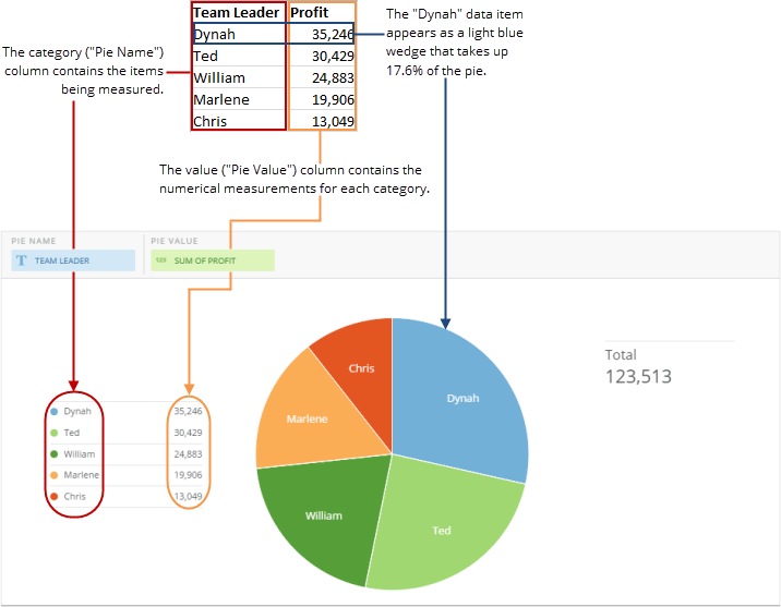
This type of chart requires two columns or rows of data from your DataSet—a category column or row containing the names of each wedge, and a value column or row containing the corresponding values for each wedge. The numbers in the values column or row do *not* need to add up to 100%. For information about value, category, and series data, see [Understanding Chart Data](/s/article/360043428693 "Understanding Chart Data").

In the Analyzer, you choose the columns containing the data for your Pie chart. For more information about choosing data columns, see [Applying DataSet Columns to Your Chart](/s/article/360043428713 "Applying DataSet Columns to Your Chart").

For more information about formatting charts in the Analyzer, see [KPI Card Building Part 2: The Analyzer](/s/article/360043428673 "KPI Card Building Part 2: The Card Builder").

The following graphic shows you how the data from the category and value columns in a typical column-based spreadsheet is converted into a Pie chart:

<Frame>
  <img alt="" src="https://mintcdn.com/domoinc-openapi-sync-dataflows/D4XP-ZUu0hZKYNDT/images/kb/ka05w00000123mi-00N5w00000Ri7BU-0EM5w000005vP5y.png?fit=max&auto=format&n=D4XP-ZUu0hZKYNDT&q=85&s=721007a508996fde5580480584aef5ca" style={{width: 716, height: 557}} width="716" height="557" data-path="images/kb/ka05w00000123mi-00N5w00000Ri7BU-0EM5w000005vP5y.png" />
</Frame>

## Customizing Pie charts

You can customize the appearance of a Pie chart by editing its [**Chart Properties**](/s/article/360042925154). For information about all chart properties, see Chart Properties. The unique properties of Pie charts and Pie chart sub-types include the following:

<Note>
  **Note:** If you use a COUNT(DISTINCT) or SUM(DISTINCT) Beast Mode calculation in your pie value column, the "TOTAL" value for the pie will show the sum of those counts individually. However, if you use that same calculation within your summary number, the total value is derived from the distinct values in the DataSet as a whole. These two values may then appear to be different in your chart. This is because the grouping of the Pie chart counts the distinct values for that grouping, not for the DataSet as a whole. For more information about Beast Mode, see [Configuring Your Chart Summary Number](/s/article/360043428753 "Transforming Data Using Beast Mode").
</Note>

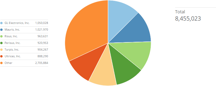
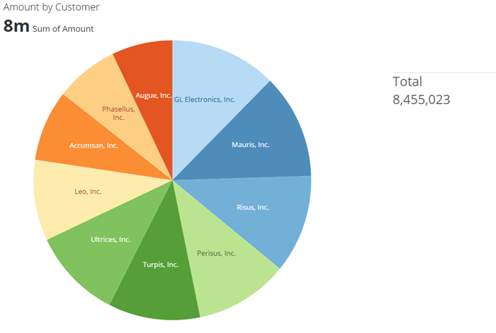
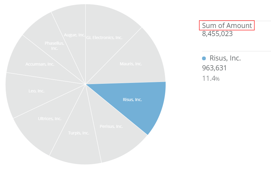
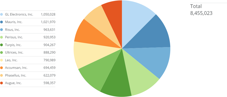
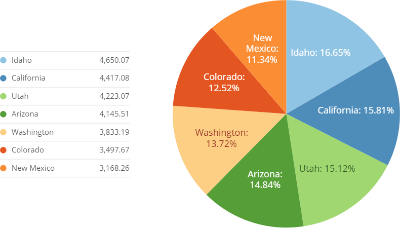
<table border="1" cellpadding="1" cellspacing="1" data-aura-rendered-by="33:200;a"><thead><tr><th colspan="1" rowspan="1"><p> Property </p></th><th colspan="1" rowspan="1"><p> Description </p></th><th colspan="1" rowspan="1"><p> Example </p></th></tr></thead><tbody><tr><td colspan="1" rowspan="1"><p> General > Maximum Slices Before 'Other' </p></td><td colspan="1" rowspan="1"><p> Determines the number of slices in the chart that are represented as unique slices—all remaining slices in the chart are aggregated into an "Other" slice. In the example at right, the user entered "6" as the <b> Maximum Slices Before Other </b> value; therefore, the first five slices appear as unique slices, and the remaining slices are grouped into an "Other" slice. </p></td><td colspan="1" rowspan="1"><p><a target="_blank" title="/@api/deki/files/35/aggregated_other_slices.png"><img alt="" src="https://mintcdn.com/domoinc-openapi-sync-dataflows/U1MglXZKeJZebGlP/images/kb/ka05w00000123l4-00N5w00000Ri7BU-0EM5w000005vP1j.png?fit=max&auto=format&n=U1MglXZKeJZebGlP&q=85&s=2824a33734b9c6ab17a080909c7eaf7d" width="708" height="284" data-path="images/kb/ka05w00000123l4-00N5w00000Ri7BU-0EM5w000005vP1j.png" /></a></p></td></tr><tr><td colspan="1" rowspan="1"><p> General > Value Format </p></td><td colspan="1" rowspan="1"><p> Determines whether currency symbols are appended to values. </p></td><td colspan="1" rowspan="1"><p> — </p></td></tr><tr><td colspan="1" rowspan="1"><p> General > Value Decimal Places </p></td><td colspan="1" rowspan="1"><p> Determines the number of decimal places in values. </p></td><td colspan="1" rowspan="1"><p> — </p></td></tr><tr><td colspan="1" rowspan="1"><p> General > Percent Value Decimal Places </p></td><td colspan="1" rowspan="1"><p> Determines the number of decimal places in percent values. </p></td><td colspan="1" rowspan="1"><p> — </p></td></tr><tr><td colspan="1" rowspan="1"><p> General > Hide Pie Labels </p></td><td colspan="1" rowspan="1"><p> Determines whether labels appear for pie slices in the Details view for a Pie chart. </p></td><td colspan="1" rowspan="1"><p> — </p></td></tr><tr><td colspan="1" rowspan="1"> General > Unsorted Data </td><td colspan="1" rowspan="1"> Determines whether or not the slices in a Pie chart are arranged automatically from highest to lowest value. By default, you cannot change the sort order by selecting different options in the <b> Sorting </b> menu. However, if you check the <b> Unsorted Data </b> box, you can use the <b> Sorting </b> menu to change the sort order. For more information, see <a href="/s/article/360043428733" target="_blank" title="Sorting the Data in Your Chart"> Sorting the Data in Your Chart </a>. </td><td colspan="1" rowspan="1"> — </td></tr><tr><td colspan="1" rowspan="1"> Legend > Hide Legend </td><td colspan="1" rowspan="1"> When this option is selected, no legend appears next to your Pie or Donut chart. The example shows a Pie chart in which the legend has been hidden. </td><td colspan="1" rowspan="1"><a target="_blank" title="/@api/deki/files/4713/pie_no_legend.png"><img alt="" src="https://mintcdn.com/domoinc-openapi-sync-dataflows/U1MglXZKeJZebGlP/images/kb/ka05w00000123l4-00N5w00000Ri7BU-0EM5w000005vP1p.png?fit=max&auto=format&n=U1MglXZKeJZebGlP&q=85&s=5ccfd1c8cdb0eca4a3c0bb6ee92c3f48" width="700" height="471" data-path="images/kb/ka05w00000123l4-00N5w00000Ri7BU-0EM5w000005vP1p.png" /></a></td></tr><tr><td colspan="1" rowspan="1"> Legend > Display in Legend </td><td colspan="1" rowspan="1"> Determines whether values from your DataSet display as literal values or as their corresponding percentages in your Pie chart. For example, a value from your DataSet might be "26" but take up 35.9% of the pie. Therefore, if you selected <b> Value Only </b> for this property, the legend item would read "26," and if you selected <b> Percentage </b>, the legend item would read "35.9%." If you selected <b> No Label </b>, only the name of each slice would appear in the legend. </td><td colspan="1" rowspan="1" /></tr><tr><td colspan="1" rowspan="1"><p> Hover Legend > Hide Legend </p></td><td colspan="1" rowspan="1"><p> When this option is selected, the "hover legend," which normally appears when you mouse over a slice in your Pie or Donut chart, is hidden from view. </p></td><td colspan="1" rowspan="1"><p> — </p></td></tr><tr><td colspan="1" rowspan="1"><p> Hover Legend > Title Text </p></td><td colspan="1" rowspan="1"><p> Lets you customize the summary text that appears above your Pie or Donut chart's hover legend area (which normally reads "Total"). </p><p> The example shows a Pie chart in which this text has been customized to read "Sum of Amount." </p></td><td colspan="1" rowspan="1"><p><a target="_blank" title="/@api/deki/files/4714/pie_hover_legend_text.png"><img alt="" src="https://mintcdn.com/domoinc-openapi-sync-dataflows/U1MglXZKeJZebGlP/images/kb/ka05w00000123l4-00N5w00000Ri7BU-0EM5w000005vP23.png?fit=max&auto=format&n=U1MglXZKeJZebGlP&q=85&s=5f0694b593540aaeba34d982a7251376" width="911" height="567" data-path="images/kb/ka05w00000123l4-00N5w00000Ri7BU-0EM5w000005vP23.png" /></a></p></td></tr><tr><td colspan="1" rowspan="1"><p> Hover Legend > Title Value </p></td><td colspan="1" rowspan="1"><p> Lets you specify an aggregation type for the summary value in your Pie or Donut chart's hover legend. By default all of the data in your chart is totaled, but you can change this to show the average, minimum, or maximum amount in the chart. </p></td><td colspan="1" rowspan="1"><p> — </p></td></tr><tr><td colspan="1" rowspan="1"><p> Hover Legend > Hide Percent Value </p></td><td colspan="1" rowspan="1"><p> When this option is selected, the percent of total value that appears when you mouse over a slice in your Pie or Donut chart does not appear. </p></td><td colspan="1" rowspan="1"> — </td></tr><tr><td colspan="1" rowspan="1"><p> Data Label Settings > Hide Labels </p></td><td colspan="1" rowspan="1"><p> Hides the labels that normally appear on the slices in your Pie chart. </p><p> The example shows a Pie chart in which labels have been hidden. </p></td><td colspan="1" rowspan="1"><a target="_blank" title="/@api/deki/files/4715/pie_no_data_labels.png"><img alt="pie_no_data_labels.png" src="https://mintcdn.com/domoinc-openapi-sync-dataflows/U1MglXZKeJZebGlP/images/kb/ka05w00000123l4-00N5w00000Ri7BU-0EM5w000005vP25.png?fit=max&auto=format&n=U1MglXZKeJZebGlP&q=85&s=6cf02351f7adf68ec4282ecabe341ccb" width="787" height="337" data-path="images/kb/ka05w00000123l4-00N5w00000Ri7BU-0EM5w000005vP25.png" /></a></td></tr><tr><td colspan="1" rowspan="1"><p> Data Label Settings > Text </p></td><td colspan="1" rowspan="1"><p> Specifies text to replace the default text in labels in Pie charts. The example at right shows a Pie chart in which the user has implemented a macro to show the value for each state. For more information about creating data label text, including a list of available macros, see <a href="/s/article/360043429693" target="_blank" title="Formatting Data Label and Hover Text in Your Chart"> Formatting Data Label and Hover Text in Your Chart </a>. </p></td><td colspan="1" rowspan="1"><a target="_blank" title="/@api/deki/files/4716/pie_data_label_macro.png"><img alt="" src="https://mintcdn.com/domoinc-openapi-sync-dataflows/U1MglXZKeJZebGlP/images/kb/ka05w00000123l4-00N5w00000Ri7BU-0EM5w000005vP1t.png?fit=max&auto=format&n=U1MglXZKeJZebGlP&q=85&s=1657fbf157987bde14c88cafb1f2245b" width="790" height="450" data-path="images/kb/ka05w00000123l4-00N5w00000Ri7BU-0EM5w000005vP1t.png" /></a></td></tr><tr><td colspan="1" rowspan="1"> Data Label Settings > Font Size </td><td colspan="1" rowspan="1"> Lets you increase or decrease the font size for the labels in your Pie chart. If you choose the default setting ("Auto"), an optimal font size for your labels is determined based on the amount of space in each slice. </td><td colspan="1" rowspan="1"> — </td></tr></tbody></table>