> ## Documentation Index
> Fetch the complete documentation index at: https://domoinc-openapi-sync-dataflows.mintlify.site/llms.txt
> Use this file to discover all available pages before exploring further.
# Outliers Chart
## Intro
An outliers chart is nearly identical to a basic line chart but allows you to call out any points you deem to be outliers. Be aware that the line in an outliers chart is built from X and Y coordinate pairs, *not* from date-time values as in a typical line chart. However, you can use numbers to represent time periods. For example, in the graphic further down in this topic, the numbers in the "X-axis" column represent months in a time scale.
This chart type does *not* currently include algorithms to identify outlier points. You must identify these points yourself in the DataSet you use to power the chart. However, you can use tools such as R and Python to help you identify these outliers.
## Powering outliers charts
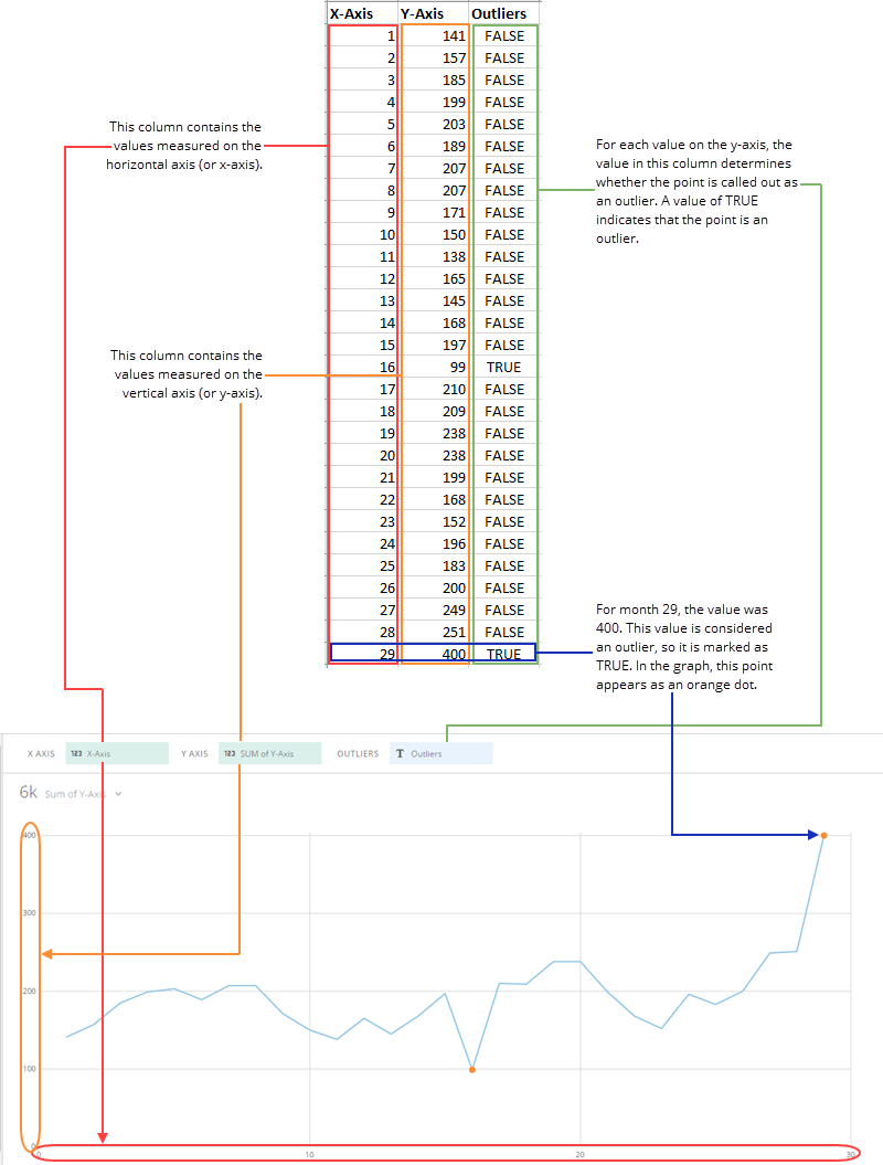
Outliers charts require three columns or rows of data from your DataSet. Two of these contain the X and Y coordinate values for each point, as in a [scatter plot chart](/s/article/360042924694 "Scatter Plot Graph"). The third column contains a value of TRUE or FALSE for each coordinate pair. If the point is considered an outlier, the value should be TRUE; if it is not an outlier, the value should be FALSE. For an example, see the graphic below.
For information about value, category, and series data, see [Understanding Chart Data](/s/article/360043428693 "Understanding Chart Data").
In the Analyzer, you choose the columns containing the data for your outliers chart. For more information about choosing data columns, see [Applying DataSet Columns to Your Chart](/s/article/360043428713 "Applying DataSet Columns to Your Chart").
For more information about formatting charts in the Analyzer, see [KPI Card Building Part 2: The Analyzer](/s/article/360043428673 "KPI Card Building Part 2: The Analyzer").
The following graphic shows you how the data from a typical column-based spreadsheet is converted into an outliers chart. (For clarification purposes, the values in the "X-Axis" column represent months.)
 ## Customizing outliers charts
You can customize the appearance of an outliers chart by editing its **Chart Properties**. For information about all chart properties, see [Chart Properties](/s/article/360042925154 "Chart Properties").
## Customizing outliers charts
You can customize the appearance of an outliers chart by editing its **Chart Properties**. For information about all chart properties, see [Chart Properties](/s/article/360042925154 "Chart Properties").