> ## Documentation Index
> Fetch the complete documentation index at: https://domoinc-openapi-sync-dataflows.mintlify.site/llms.txt
> Use this file to discover all available pages before exploring further.

# Nested Bar Chart

## Intro

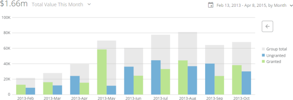
In a nested bar chart, the total values for all categories are represented as gray bars, and the values for all series are represented as smaller, colored bars and are shown side-by-side or stacked on top of each other within the bars for their respective categories. Vertical and horizontal subtypes are available for nested bar charts.

Domo also includes a version of the nested bar chart with trendlines for comparison. For more information, see [Nested bar with line chart](/s/article/360043429393 "Nested Bar with Line Graph").

## Powering nested bar charts

A nested bar chart requires three columns or rows of data from your DataSet—one for categories, one for the series in each category, and one for values. For information about value, category, and series data, see [Understanding Chart Data](/s/article/360043428693 "Understanding Chart Data").

In the Analyzer, you choose the columns containing the data for your nested bar chart. For more information about choosing data columns, see [Applying DataSet Columns to Your Chart](/s/article/360043428713 "Applying DataSet Columns to Your Chart").

For more information about formatting charts in the Analyzer, see [KPI Card Building Part 2: The Analyzer](/s/article/360043428673 "KPI Card Building Part 2: The Card Builder").

The following graphic shows you how the data from a typical column-based spreadsheet is converted into a vertical nested bar chart:

<Frame>
  <img alt="" src="https://mintcdn.com/domoinc-openapi-sync-dataflows/KRKoASQJgRuO8wHw/images/kb/ka05w00000123mx-00N5w00000Ri7BU-0EM5w000005vP6G.png?fit=max&auto=format&n=KRKoASQJgRuO8wHw&q=85&s=611c452469abb41f6577b32df84964e2" style={{width: 712, height: 700}} width="712" height="700" data-path="images/kb/ka05w00000123mx-00N5w00000Ri7BU-0EM5w000005vP6G.png" />
</Frame>

The following graphic shows you how the data from the same column-based spreadsheet is converted into a horizontal nested bar chart:

<Frame>
  <img alt="" src="https://mintcdn.com/domoinc-openapi-sync-dataflows/KRKoASQJgRuO8wHw/images/kb/ka05w00000123mx-00N5w00000Ri7BU-0EM5w000005vP6K.png?fit=max&auto=format&n=KRKoASQJgRuO8wHw&q=85&s=2c406c2089967239af1d7013d4dc0164" style={{width: 712, height: 764}} width="712" height="764" data-path="images/kb/ka05w00000123mx-00N5w00000Ri7BU-0EM5w000005vP6K.png" />
</Frame>

## Customizing nested bar charts

You can customize the appearance of a nested bar chart by editing its **Chart Properties**. For information about all chart properties, see [Chart Properties](/s/article/360042925154 "Chart Properties"). Unique properties of nested bar charts include the following. You can click a thumbnail image to see a larger image.

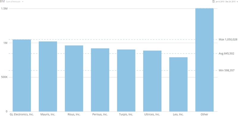
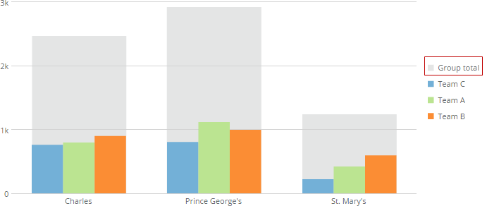
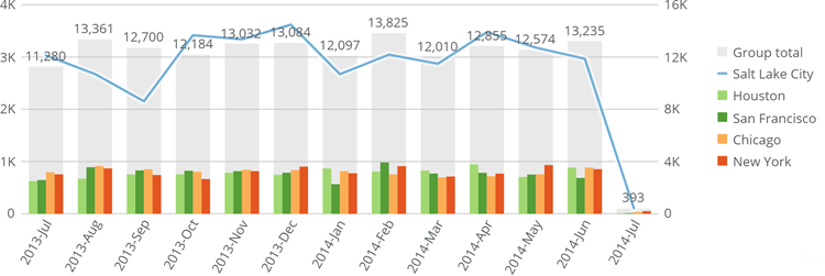
<table border="1" cellpadding="1" cellspacing="1" data-aura-rendered-by="33:202;a"><thead><tr><th colspan="1" rowspan="1"><p> Property </p></th><th colspan="1" rowspan="1"><p> Description </p></th><th colspan="1" rowspan="1"><p> Example </p></th></tr></thead><tbody><tr><td colspan="1" rowspan="1"><p> General > Sort Each Category </p></td><td colspan="1" rowspan="1"><p> Allows you to sort the items in each individual category in most kinds of multi-series bar and lollipop charts. You can choose an ascending or descending sort. If you select <b> Default </b>, the default sort is applied. This option does not work when the <b> Value Scale > Log Scale </b> box is checked. </p><p> In the example at right, bars within all categories are sorted in descending order. </p></td><td colspan="1" rowspan="1"><p><a target="_blank" title="/@api/deki/files/4171/sort_each_category.png"><img alt="" src="https://mintcdn.com/domoinc-openapi-sync-dataflows/U1MglXZKeJZebGlP/images/kb/ka05w00000123km-00N5w00000Ri7BU-0EM5w000005vOzS.png?fit=max&auto=format&n=U1MglXZKeJZebGlP&q=85&s=489eb9cfc6359f2c782eb6b53955eca5" width="600" height="206" data-path="images/kb/ka05w00000123km-00N5w00000Ri7BU-0EM5w000005vOzS.png" /></a></p></td></tr><tr><td colspan="1" rowspan="1"><p> General > Sort on Totals </p></td><td colspan="1" rowspan="1"><p> Allows you to sort categories in many kinds of bar and lollipop charts by their total values, in either ascending or descending order. If you select <b> Default </b>, the default sort is applied. This option does not work when the chart has automatic time scaling applied. (You can turn off automatic time scaling by checking the box for <b> Category Scale > Never Use Time Scale </b>. </p><p> In the example at right, the categories are sorted by their totals in ascending order. </p></td><td colspan="1" rowspan="1"><p><a target="_blank" title="/@api/deki/files/4170/sort_on_totals.png"><img alt="" src="https://mintlify.s3.us-west-1.amazonaws.com/domoinc-openapi-sync-dataflows/images/kb/ka05w00000123km-00N5w00000Ri7BU-0EM5w000005vOzh.png" /></a></p></td></tr><tr><td colspan="1" rowspan="1"><p> General > Maximum Bars </p></td><td colspan="1" rowspan="1"><p> Allows you to specify the number of bars that appear in your bar chart. Data for all remaining bars is lumped into a single "Other" bar (unless you hide this bar using the <b> Hide 'Other' Bar </b> toggle. </p><p> The example at right shows a bar chart in which the maximum number of bars has been set to 7. </p></td><td colspan="1" rowspan="1"><p><a target="_blank" title="/@api/deki/files/5982/maximum_bars.png"><img alt="maximum_bars.png" src="https://mintcdn.com/domoinc-openapi-sync-dataflows/KRKoASQJgRuO8wHw/images/kb/ka05w00000123mx-00N5w00000Ri7BU-0EM5w000005vP6O.png?fit=max&auto=format&n=KRKoASQJgRuO8wHw&q=85&s=c1d6d535d46241a6332166bb7a285007" width="800" height="390" data-path="images/kb/ka05w00000123mx-00N5w00000Ri7BU-0EM5w000005vP6O.png" /></a></p></td></tr><tr><td colspan="1" rowspan="1"><p> General > Hide 'Other' Bars </p></td><td colspan="1" rowspan="1"><p> Hides or shows the "Other" bar that appears when you set a maximum number of bars using the <b> Maximum Bars </b> option. </p></td><td colspan="1" rowspan="1"><p> — </p></td></tr><tr><td colspan="1" rowspan="1"><p> General > Group Legend Text </p></td><td colspan="1" rowspan="1"><p> Lets you specify the legend text for the "group bars" (the vertical gray bars that show the totals for each category). In the example, the default group bar legend text has been replaced with the words "Grand Total." </p></td><td colspan="1" rowspan="1"><a target="_blank" title="/@api/deki/files/1323/vertical_nested_group_legend.png"><img alt="" src="https://mintcdn.com/domoinc-openapi-sync-dataflows/KRKoASQJgRuO8wHw/images/kb/ka05w00000123mx-00N5w00000Ri7BU-0EM5w000005vP6P.png?fit=max&auto=format&n=KRKoASQJgRuO8wHw&q=85&s=5e802c63d9c47069238ffcb66e8abf64" width="691" height="292" data-path="images/kb/ka05w00000123mx-00N5w00000Ri7BU-0EM5w000005vP6P.png" /></a></td></tr><tr><td colspan="1" rowspan="1"><p> General > Hide Group in Legend </p></td><td colspan="1" rowspan="1"><p> Hides the legend text for the "group bars" (the vertical gray bars that show the total for each category. </p></td><td colspan="1" rowspan="1"> — </td></tr><tr><td colspan="1" rowspan="1"><p> Data Label Settings > Show Group Total </p></td><td colspan="1" rowspan="1"><p> Determines whether data labels appear over the gray "total" bars in nested bar charts. The chart at right shows an example of this. </p></td><td colspan="1" rowspan="1"><p><a target="_blank" title="/@api/deki/files/5310/show_group_total.png"><img alt="show_group_total.png" src="https://mintcdn.com/domoinc-openapi-sync-dataflows/D4XP-ZUu0hZKYNDT/images/kb/ka05w00000123mw-00N5w00000Ri7BU-0EM5w000005vP6D.png?fit=max&auto=format&n=D4XP-ZUu0hZKYNDT&q=85&s=85a9904cb236ad4c5653f8a894d64c38" width="750" height="251" data-path="images/kb/ka05w00000123mw-00N5w00000Ri7BU-0EM5w000005vP6D.png" /></a></p></td></tr></tbody></table>