> ## Documentation Index
> Fetch the complete documentation index at: https://domoinc-openapi-sync-dataflows.mintlify.site/llms.txt
> Use this file to discover all available pages before exploring further.

# Multi-Value Gauge

### Intro

A gauge is a simple chart that indicates progress towards meeting a target. A multi-value gauge displays the current value of your as DataSet as a numeral, along with the degree of change for the gauge data, whether positive or negative. You can aggregate the current value of the gauge using any of a variety of aggregation functions (sum, average, minimum or maximum value, etc.). You can also show the degree of change as a percentage or a value. In addition, a number of other customization options are available.

This chart type is useful when you want to see a change in value quickly, without having to interpret bars, lines, etc. This gauge is similar to a [single value gauge](/s/article/360043429293 "Single Value Gauge"), which displays the current value without the degree of change indicator.

***

### Power a Multi-Value Gauge

A Multi-Value Gauge requires only one column or row of data in your DataSet, which should contain the values. You can also include an optional column for grouping your data. In most cases, this will be a date column; this way, your change value will reflect changes in the data over time. Finally, you can apply a column of target values to the gauge by clicking the **Tooltips** icon at the top of the screen, then dragging the desired column into the **Target Values** field that opens. Target values are not reflected in the gauge itself but may be referenced using certain chart properties, which are discussed later in this article.

Learn about [Understanding Chart Data](/s/article/360043428693 "Understanding Chart Data") and [Chart Properties](/s/article/360042925154 "Setting Properties for Gauges").

In Analyzer, you choose the columns containing the data for your Multi-Value Gauge. To learn more about choosing data columns, see [Applying DataSet Columns to Your Chart](/s/article/360043428713 "Applying DataSet Columns to Your Chart").

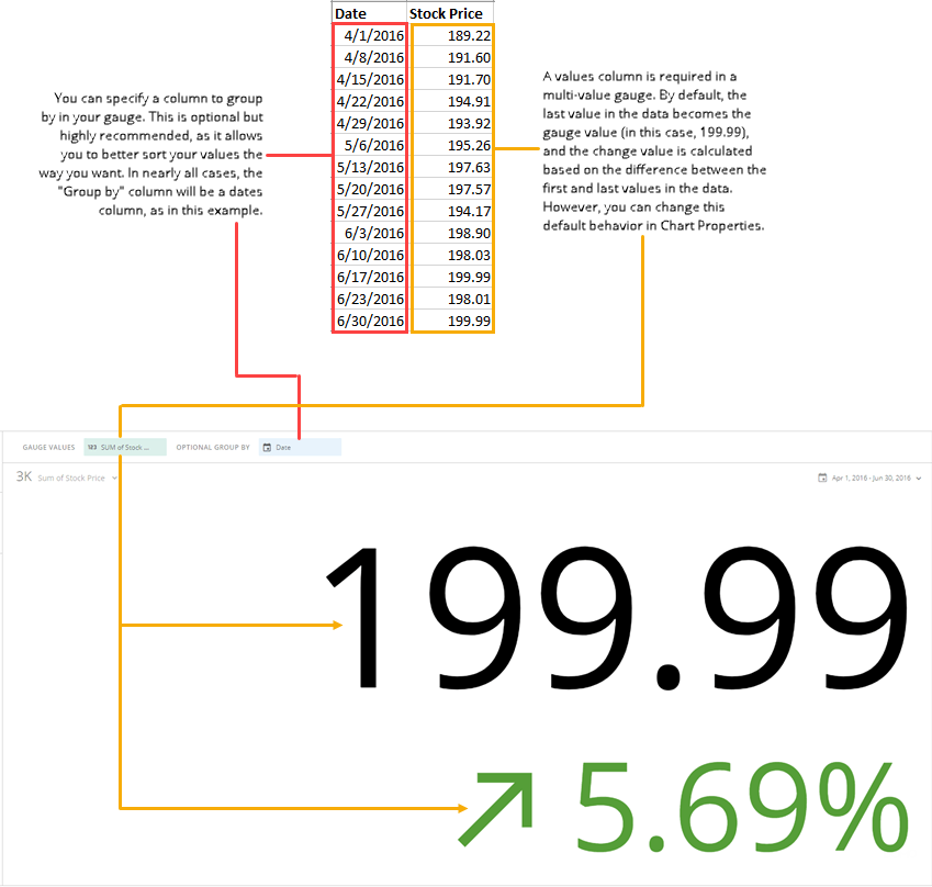
The following graphic shows you how the data from the category and value columns in a typical column-based spreadsheet is converted into a Multi-Value Gauge:

<Frame>
  <img alt="multivalue_gauge_spreadsheet_example.png" src="https://mintcdn.com/domoinc-openapi-sync-dataflows/7il5zODxajeeXiuu/images/kb/ka0Vq000000Dicj-00N5w00000Ri7BU-0EM5w000005vP6w.png?fit=max&auto=format&n=7il5zODxajeeXiuu&q=85&s=0e8e2958031d4cce5882a7d586053823" style={{width: 700, height: 666}} width="849" height="808" data-path="images/kb/ka0Vq000000Dicj-00N5w00000Ri7BU-0EM5w000005vP6w.png" />
</Frame>

### Unique Properties — Multi-Value Gauge

You can customize the appearance of a multi-value gauge by editing its **Chart Properties**. For information about all chart properties, see [Setting Properties for Gauges](/s/article/360042925354 "Chart Properties").

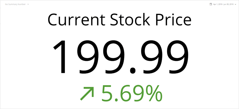
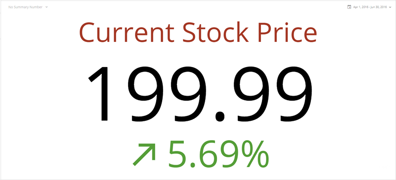
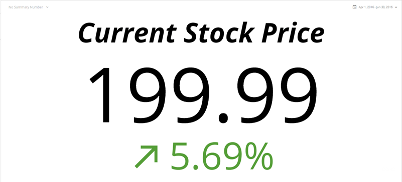
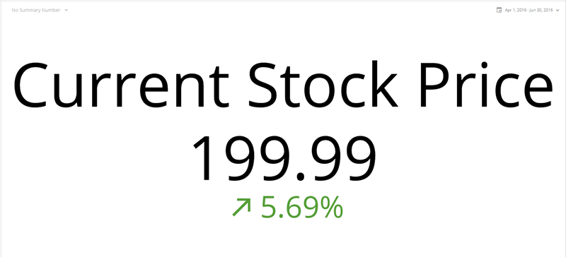
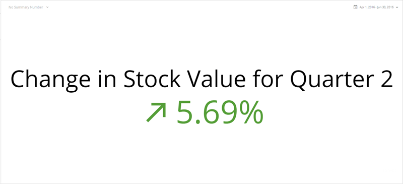
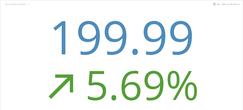
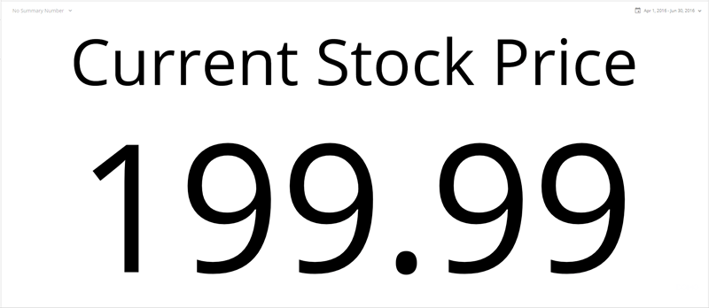
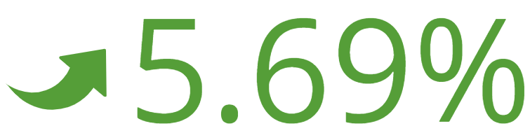
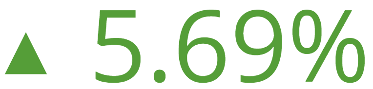
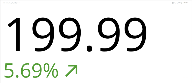
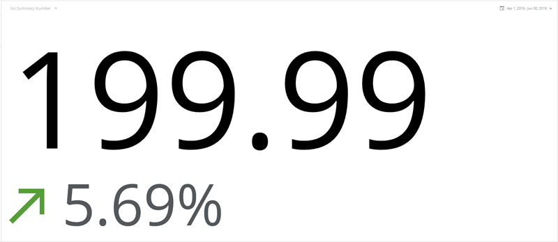
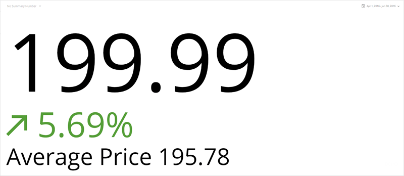
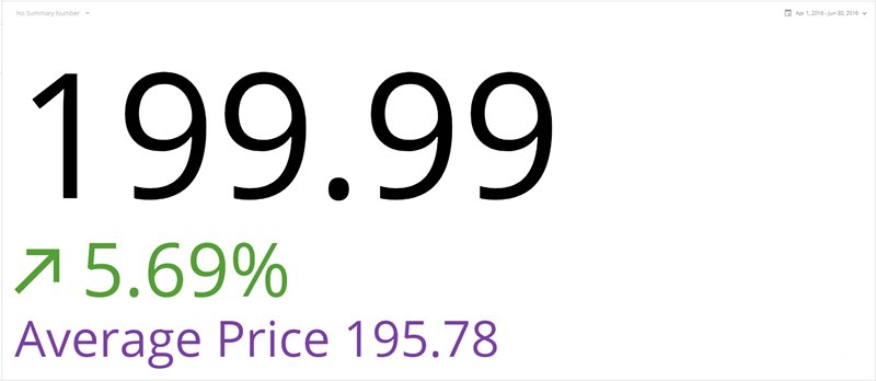
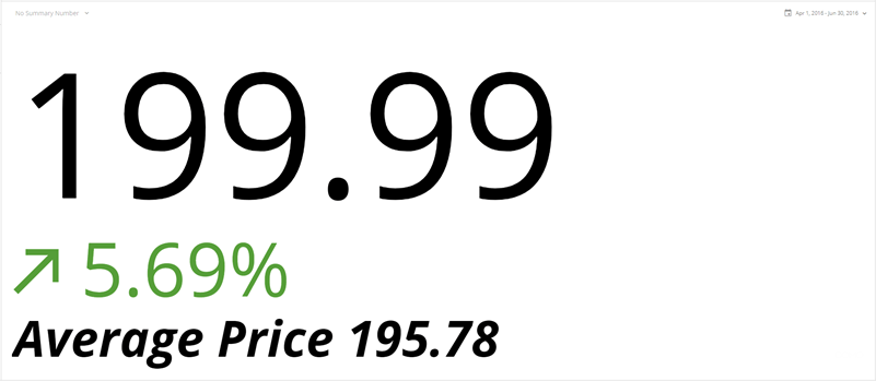
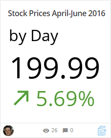
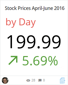
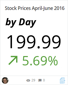
<table border="1" cellpadding="1" cellspacing="1" data-aura-rendered-by="33:202;a"><thead><tr><th colspan="1" rowspan="1"><p> Property </p></th><th colspan="1" rowspan="1"><p> Description </p></th><th colspan="1" rowspan="1"><p> Example </p></th></tr></thead><tbody><tr><td colspan="1" rowspan="1"><p> Title Options > Text </p></td><td colspan="1" rowspan="1"><p> Lets you add a title to your gauge. The title text actually appears within the content area of the gauge (so it is separate from the card name). The title is incorporated into the layout you have selected in <b> General </b> > <b> Layout </b>. In the example, it is used with the <b> Center Vertical </b> layout. </p></td><td colspan="1" rowspan="1"><p /><p><img alt="title options text.png" src="https://mintcdn.com/domoinc-openapi-sync-dataflows/7il5zODxajeeXiuu/images/kb/ka0Vq000000Dicj-00N5w00000Ri7BU-0EM5w000006wNaj.jpg?fit=max&auto=format&n=7il5zODxajeeXiuu&q=85&s=cc40eceb23725dc9674252f2a734dfa4" style={{width: 401, height: 183}} width="800" height="365" data-path="images/kb/ka0Vq000000Dicj-00N5w00000Ri7BU-0EM5w000006wNaj.jpg" /></p><p /></td></tr><tr><td colspan="1" rowspan="1"><p> Title Options > Color </p></td><td colspan="1" rowspan="1"><p> Lets you set the color for your title. You can choose colors from a color picker, enter a hexadecimal value, or change the opacity using a slider. This option is only available when text has been entered into the <b> Title Options </b> > <b> Text </b> field. </p></td><td colspan="1" rowspan="1"><p><img alt="title option color.png" src="https://mintcdn.com/domoinc-openapi-sync-dataflows/7il5zODxajeeXiuu/images/kb/ka0Vq000000Dicj-00N5w00000Ri7BU-0EM5w000006wNay.jpg?fit=max&auto=format&n=7il5zODxajeeXiuu&q=85&s=472f4c36f61eea95a70a4ec0c7f60093" style={{width: 401, height: 183}} width="801" height="365" data-path="images/kb/ka0Vq000000Dicj-00N5w00000Ri7BU-0EM5w000006wNay.jpg" /></p></td></tr><tr><td colspan="1" rowspan="1"><p> Title Options > Style </p></td><td colspan="1" rowspan="1"><p> Lets you choose the style for your title. You can choose bold, italic, or bold with italic. This option is only available when text has been entered into the <b> Title Options </b> > <b> Text </b> field. </p><p> In the example, the <b> Bold Italic </b> style is used. </p></td><td colspan="1" rowspan="1"><p><img alt="title option style.png" src="https://mintcdn.com/domoinc-openapi-sync-dataflows/7il5zODxajeeXiuu/images/kb/ka0Vq000000Dicj-00N5w00000Ri7BU-0EM5w000006wNbD.jpg?fit=max&auto=format&n=7il5zODxajeeXiuu&q=85&s=ad19d819eed8082be2039a1d5b7fe8c7" style={{width: 401, height: 182}} width="801" height="364" data-path="images/kb/ka0Vq000000Dicj-00N5w00000Ri7BU-0EM5w000006wNbD.jpg" /></p></td></tr><tr><td colspan="1" rowspan="1"><p> Title Options > Size </p></td><td colspan="1" rowspan="1"><p> Lets you set the size of your title in relation to the other text in the gauge. A variety of sizes is available. <b> X-Small </b> is the default. </p><p> In the example, the <b> X-Large </b> size is used. </p></td><td colspan="1" rowspan="1"><p><img alt="title option size.png" src="https://mintcdn.com/domoinc-openapi-sync-dataflows/7il5zODxajeeXiuu/images/kb/ka0Vq000000Dicj-00N5w00000Ri7BU-0EM5w000006wNbI.jpg?fit=max&auto=format&n=7il5zODxajeeXiuu&q=85&s=9312ea6e51111abe18bc90611eb62b7c" style={{width: 400, height: 182}} width="800" height="364" data-path="images/kb/ka0Vq000000Dicj-00N5w00000Ri7BU-0EM5w000006wNbI.jpg" /></p></td></tr><tr><td colspan="1" rowspan="1"><p> Value Options > Hide </p></td><td colspan="1" rowspan="1"><p> Lets you hide the value of the gauge. This is useful when you <em> only </em> want your users to see the degree of change rather than a specific value. </p></td><td colspan="1" rowspan="1"><p><img alt="title option hide.png" src="https://mintcdn.com/domoinc-openapi-sync-dataflows/7il5zODxajeeXiuu/images/kb/ka0Vq000000Dicj-00N5w00000Ri7BU-0EM5w000006wNbN.jpg?fit=max&auto=format&n=7il5zODxajeeXiuu&q=85&s=e7f282e9a2dd369dfd6b4260d481962b" style={{width: 401, height: 183}} width="800" height="365" data-path="images/kb/ka0Vq000000Dicj-00N5w00000Ri7BU-0EM5w000006wNbN.jpg" /></p></td></tr><tr><td colspan="1" rowspan="1"><p> Value Options > Value </p></td><td colspan="1" rowspan="1"><p> Lets you specify the value for the gauge. A variety of calculations are available for determining the value: </p><table border="1"><tbody><tr><td colspan="1" rowspan="1"> Last Value </td><td colspan="1" rowspan="1"> The last value in the DataSet is used. This is the default option. </td></tr><tr><td colspan="1" rowspan="1"> First Value </td><td colspan="1" rowspan="1"> The first value in the chart is used. </td></tr><tr><td colspan="1" rowspan="1"> Sum </td><td colspan="1" rowspan="1"> The total of all of the values in the chart is used. </td></tr><tr><td colspan="1" rowspan="1"> Average </td><td colspan="1" rowspan="1"> The average of all of the values in the chart is used. </td></tr><tr><td colspan="1" rowspan="1"> Minimum </td><td colspan="1" rowspan="1"> The lowest value out of all values in the chart is used. </td></tr><tr><td colspan="1" rowspan="1"> Maximum </td><td colspan="1" rowspan="1"> The highest value out of all values in the chart is used. </td></tr><tr><td colspan="1" rowspan="1"> Count </td><td colspan="1" rowspan="1"> The number of individual values in the chart is used. </td></tr></tbody></table></td><td colspan="1" rowspan="1"><p> — </p></td></tr><tr><td colspan="1" rowspan="1"><p> Value Options > Size </p></td><td colspan="1" rowspan="1"><p> Lets you set the size of the gauge value in relation to the other text in the gauge. A variety of sizes is available. <b> Medium </b> is the default. </p></td><td colspan="1" rowspan="1"><p> — </p></td></tr><tr><td colspan="1" rowspan="1"><p> Value Options > Color </p></td><td colspan="1" rowspan="1"><p> Lets you set the color for your gauge value. You can choose colors from a color picker, enter a hexadecimal value, or change the opacity using a slider. </p><p> In the example, the value has been set to blue. </p></td><td colspan="1" rowspan="1"><img alt="value options color.png" src="https://mintcdn.com/domoinc-openapi-sync-dataflows/7il5zODxajeeXiuu/images/kb/ka0Vq000000Dicj-00N5w00000Ri7BU-0EM5w000006wNfP.jpg?fit=max&auto=format&n=7il5zODxajeeXiuu&q=85&s=0b8da014ea9366048f4e2eb128391861" style={{width: 401, height: 182}} width="800" height="364" data-path="images/kb/ka0Vq000000Dicj-00N5w00000Ri7BU-0EM5w000006wNfP.jpg" /></td></tr><tr><td colspan="1" rowspan="1"><p> Value Options > Use Change Color </p></td><td colspan="1" rowspan="1"><p> Lets you dynamically match the color of the gauge value to that of the change value. If another color has been selected for the gauge value, it will be overridden by the change value color. </p></td><td colspan="1" rowspan="1"> — </td></tr><tr><td colspan="1" rowspan="1"><p> Change Value Options > Hide </p></td><td colspan="1" rowspan="1"><p> Lets you hide the change value of the gauge. This is useful when you <em> only </em> want your users to see the specific value rather than the degree of change. </p></td><td colspan="1" rowspan="1"><img alt="change value options hide.png" src="https://mintcdn.com/domoinc-openapi-sync-dataflows/7il5zODxajeeXiuu/images/kb/ka0Vq000000Dicj-00N5w00000Ri7BU-0EM5w000006wNfU.jpg?fit=max&auto=format&n=7il5zODxajeeXiuu&q=85&s=95bb5193f858675788851681f8564cd3" style={{width: 400, height: 174}} width="800" height="348" data-path="images/kb/ka0Vq000000Dicj-00N5w00000Ri7BU-0EM5w000006wNfU.jpg" /></td></tr><tr><td colspan="1" rowspan="1"><p> Change Value Options > Value </p></td><td colspan="1" rowspan="1"><p> Lets you specify whether the degree of change in your chart is represented as a percentage (default) or a change in the specific value. </p></td><td colspan="1" rowspan="1"> — </td></tr><tr><td colspan="1" rowspan="1"><p> Change Value Options > Data </p></td><td colspan="1" rowspan="1"><p> Determines how the degree of change in the gauge is calculated. A variety of calculations are available for determining the degree of change: </p><table border="1"><tbody><tr><td colspan="1" rowspan="1"> First and Last Values </td><td colspan="1" rowspan="1"> The difference between the first and last values in your DataSet is used. This is the default setting. </td></tr><tr><td colspan="1" rowspan="1"> Last 2 Values </td><td colspan="1" rowspan="1"> The difference between the last two values in your DataSet is used. </td></tr><tr><td colspan="1" rowspan="1"> Last and X Periods Ago </td><td colspan="1" rowspan="1"> The difference between the last value and the specified number of date grain periods as determined from your DataSet. For example, if your DataSet was broken down by week, and you entered <b> 3 </b> in the <b> Periods Ago </b> field, your change value would be the difference between the last value in the DataSet and the value for three weeks ago. </td></tr><tr><td colspan="1" rowspan="1"> Last Target Value and Last Value </td><td colspan="1" rowspan="1"> The difference between the last value in your <b> Gauge Values </b> column and the last value in your <b> Target Values </b> column. Note that the field for applying a target values column appears only when you click <b> Tooltips </b> in the toolbar at the top of Analyzer. </td></tr><tr><td colspan="1" rowspan="1"> Penultimate Target Value and Penultimate Value </td><td colspan="1" rowspan="1"> The difference between the second-to-last value in your <b> Gauge Values </b> column and the second-to-last value in your <b> Target Values </b> column. Note that the field for applying a target values column appears only when you click <b> Tooltips </b> in the toolbar at the top of Analyzer. </td></tr></tbody></table></td><td colspan="1" rowspan="1"> — </td></tr><tr><td colspan="1" rowspan="1"><p> Change Value Options > Periods Ago </p></td><td colspan="1" rowspan="1"><p> Lets you specify the number of past date grain periods to use in your calculation when <b> Last and X </b><b> Periods Ago </b> is selected in the <b> Change Value Options </b> > <b> Data </b> menu. </p><p> For example, if your DataSet was broken down by week, and you entered <b> 3 </b> in the <b> Periods Ago </b> field, your change value would be the difference between the last value in the DataSet and the value for three weeks ago. </p></td><td colspan="1" rowspan="1"> — </td></tr><tr><td colspan="1" rowspan="1"><p> Change Value Options > Size </p></td><td colspan="1" rowspan="1"><p> Lets you set the size of the change value in relation to the other text in the gauge. A variety of sizes is available. <b> Small </b> is the default. </p></td><td colspan="1" rowspan="1"> — </td></tr><tr><td colspan="1" rowspan="1"><p> Change Value Options > Hover Text </p></td><td colspan="1" rowspan="1"><p> Lets you specify the hover text that appears when a user mouses over the change value in the gauge. A variety of replacement macros is available. For more information, see <a href="/s/article/360043429693" target="_blank"> Formatting Data Label and Hover Text in Your Chart </a>. </p></td><td colspan="1" rowspan="1"> — </td></tr><tr><td colspan="1" rowspan="1"><p> Change Value Options > Direction Indicator </p></td><td colspan="1" rowspan="1"><p> Specifies whether the symbol used to represent change in the change value is an arrow (default), a curved arrow, or a triangle. Examples of all three of these are shown at right. </p></td><td colspan="1" rowspan="1"><p><img alt="arrow indicator.png" src="https://mintcdn.com/domoinc-openapi-sync-dataflows/7il5zODxajeeXiuu/images/kb/ka0Vq000000Dicj-00N5w00000Ri7BU-0EM5w000006wNfj.jpg?fit=max&auto=format&n=7il5zODxajeeXiuu&q=85&s=17f96f43b41a803871e675c8eabeb18c" style={{width: 300, height: 76}} width="774" height="196" data-path="images/kb/ka0Vq000000Dicj-00N5w00000Ri7BU-0EM5w000006wNfj.jpg" /></p><p><img alt="curved arrow indicator.png" src="https://mintcdn.com/domoinc-openapi-sync-dataflows/7il5zODxajeeXiuu/images/kb/ka0Vq000000Dicj-00N5w00000Ri7BU-0EM5w000006wNfo.jpg?fit=max&auto=format&n=7il5zODxajeeXiuu&q=85&s=7717dc360214975b3e2b04708b42fd5d" style={{width: 299, height: 75}} width="755" height="190" data-path="images/kb/ka0Vq000000Dicj-00N5w00000Ri7BU-0EM5w000006wNfo.jpg" /></p><p><img alt="triangle indicator.png" src="https://mintcdn.com/domoinc-openapi-sync-dataflows/7il5zODxajeeXiuu/images/kb/ka0Vq000000Dicj-00N5w00000Ri7BU-0EM5w000006wNft.jpg?fit=max&auto=format&n=7il5zODxajeeXiuu&q=85&s=9c5c48cdf1a95f22e02aeb31059a9d03" style={{width: 301, height: 72}} width="764" height="183" data-path="images/kb/ka0Vq000000Dicj-00N5w00000Ri7BU-0EM5w000006wNft.jpg" /></p></td></tr><tr><td colspan="1" rowspan="1"><p> Change Value Options > Indicator Position </p></td><td colspan="1" rowspan="1"><p> Lets you specify whether the change indicator symbol next to your gauge's change value appears before the value (the default) or after (which is shown in the example at right). </p></td><td colspan="1" rowspan="1"><p><img alt="indicator position.png" src="https://mintcdn.com/domoinc-openapi-sync-dataflows/7il5zODxajeeXiuu/images/kb/ka0Vq000000Dicj-00N5w00000Ri7BU-0EM5w000006wNfy.jpg?fit=max&auto=format&n=7il5zODxajeeXiuu&q=85&s=bd2a3a6674c07723380f64c03659fbd6" style={{width: 400, height: 174}} width="800" height="348" data-path="images/kb/ka0Vq000000Dicj-00N5w00000Ri7BU-0EM5w000006wNfy.jpg" /></p></td></tr><tr><td colspan="1" rowspan="1"><p> Change Value Options > Color Indicator Only </p></td><td colspan="1" rowspan="1"><p> When checked, only the indicator symbol will take on the color specified in <b> Change Value Options </b> > <b> Positive Color </b> or <b> Change Value Options </b> > <b> Negative Color </b>. The change value itself will appear dark gray. </p></td><td colspan="1" rowspan="1"><p><img alt="color indicator only.png" src="https://mintcdn.com/domoinc-openapi-sync-dataflows/7il5zODxajeeXiuu/images/kb/ka0Vq000000Dicj-00N5w00000Ri7BU-0EM5w000006wNg3.jpg?fit=max&auto=format&n=7il5zODxajeeXiuu&q=85&s=c691e5d974f6a75359dfb88a77f74aa6" style={{width: 400, height: 174}} width="800" height="348" data-path="images/kb/ka0Vq000000Dicj-00N5w00000Ri7BU-0EM5w000006wNg3.jpg" /></p></td></tr><tr><td colspan="1" rowspan="1"><p> Change Value Options > Reverse Color Direction </p></td><td colspan="1" rowspan="1"><p> When checked, positive values are shown using the color you have selected in the <b> Change Value Options </b> > <b> Negative Color </b> menu, and negative values are shown using the color you have selected in the <b> Change Value Options </b> > <b> Positive Color </b> menu. This is useful in scenarios where positive values are associated with negative sentiment such as the number of bugs reported in a software application. </p></td><td colspan="1" rowspan="1"><p> — </p></td></tr><tr><td colspan="1" rowspan="1"><p> Change Value Options > Value Format </p></td><td colspan="1" rowspan="1"><p> Determines whether the general number format for your change value. Options include <b> Number </b> (which includes no special formatting), <b> Currency </b> (in which a currency symbol is affixed), and <b> Percentage </b> (in which a percent symbol is affixed). </p></td><td colspan="1" rowspan="1"><p> — </p></td></tr><tr><td colspan="1" rowspan="1"><p> Change Value Options > Positive Color </p></td><td colspan="1" rowspan="1"><p> Lets you specify the color associated with positive change in your change value. You can choose colors from a color picker, enter a hexadecimal value, or change the opacity using a slider. The default color is green. </p></td><td colspan="1" rowspan="1"><p> — </p></td></tr><tr><td colspan="1" rowspan="1"><p> Change Value Options > Negative Color </p></td><td colspan="1" rowspan="1"><p> Lets you specify the color associated with negative change in your change value. You can choose colors from a color picker, enter a hexadecimal value, or change the opacity using a slider. The default color is red. </p></td><td colspan="1" rowspan="1"><p> — </p></td></tr><tr><td colspan="1" rowspan="1"><p> Additional Text Options > Text </p></td><td colspan="1" rowspan="1"><p> Lets you specify additional text to appear under the regular content in the gauge. A variety of replacement macros is available for dynamically including calculations in the text. For example, in the screenshot at right, the gauge shows the average stock price for the period in addition to the gauge value and change value. For more information about macros, see <a href="/s/article/360043429693" target="_blank"> Formatting Data Label and Hover Text in Your Chart </a>. </p></td><td colspan="1" rowspan="1"><p><img alt="additional text text.png" src="https://mintcdn.com/domoinc-openapi-sync-dataflows/7il5zODxajeeXiuu/images/kb/ka0Vq000000Dicj-00N5w00000Ri7BU-0EM5w000006wNg8.jpg?fit=max&auto=format&n=7il5zODxajeeXiuu&q=85&s=ce31291f211124d1ac0d24b37969ecca" style={{width: 400, height: 174}} width="800" height="348" data-path="images/kb/ka0Vq000000Dicj-00N5w00000Ri7BU-0EM5w000006wNg8.jpg" /></p></td></tr><tr><td colspan="1" rowspan="1"><p> Additional Text Options > Color </p></td><td colspan="1" rowspan="1"><p> Lets you specify the color used for additional text in the gauge. You can choose colors from a color picker, enter a hexadecimal value, or change the opacity using a slider. The default color is black. This option is only available if additional text has been added using the <b> Additional Text Options </b> > <b> Text </b> field. </p></td><td colspan="1" rowspan="1"><p><img alt="additional text color.png" src="https://mintcdn.com/domoinc-openapi-sync-dataflows/7il5zODxajeeXiuu/images/kb/ka0Vq000000Dicj-00N5w00000Ri7BU-0EM5w000006wNgD.jpg?fit=max&auto=format&n=7il5zODxajeeXiuu&q=85&s=e30aed995153a79a95ee217c7935bb3e" style={{width: 400, height: 174}} width="800" height="348" data-path="images/kb/ka0Vq000000Dicj-00N5w00000Ri7BU-0EM5w000006wNgD.jpg" /></p></td></tr><tr><td colspan="1" rowspan="1"><p> Additional Text Options > Style </p></td><td colspan="1" rowspan="1"><p> Lets you choose the style for your additional text. You can choose bold, italic, or bold with italic. This option is only available when text has been entered into the <b> Additional Text </b> > <b> Text </b> field. </p><p> In the example, the <b> Bold Italic </b> style is used. </p></td><td colspan="1" rowspan="1"><p><img alt="additional text style.png" src="https://mintcdn.com/domoinc-openapi-sync-dataflows/7il5zODxajeeXiuu/images/kb/ka0Vq000000Dicj-00N5w00000Ri7BU-0EM5w000006wNgI.jpg?fit=max&auto=format&n=7il5zODxajeeXiuu&q=85&s=bc258d2d3e247e072f0206abb78ac187" style={{width: 402, height: 175}} width="801" height="349" data-path="images/kb/ka0Vq000000Dicj-00N5w00000Ri7BU-0EM5w000006wNgI.jpg" /></p></td></tr><tr><td colspan="1" rowspan="1"><p> Additional Text Options > Size </p></td><td colspan="1" rowspan="1"><p> Lets you set the size of the additional text in relation to the other text in the gauge. A variety of sizes is available. If you do not scale to fill the chart space, this will be a fixed size. This option is only available when text has been entered into the <b> Additional Text </b> > <b> Text </b> field. </p></td><td colspan="1" rowspan="1"><p> — </p></td></tr><tr><td colspan="1" rowspan="1"><p> Date Grain Options > Show </p></td><td colspan="1" rowspan="1"><p> Determines whether to show the date grain (e.g. "by Day" for day-based DataSets) in multivalue gauges with the layout (<b> General </b> > <b> Layout </b> ) set to <b> Domo Summary 1 </b> or <b> Domo Summary 2 </b>. </p></td><td colspan="1" rowspan="1"><p><img alt="data grain show.png" src="https://mintcdn.com/domoinc-openapi-sync-dataflows/7il5zODxajeeXiuu/images/kb/ka0Vq000000Dicj-00N5w00000Ri7BU-0EM5w000006wNgN.jpg?fit=max&auto=format&n=7il5zODxajeeXiuu&q=85&s=913d680b3f7fe8c2adb9b9ecb7248571" style={{width: 201, height: 250}} width="227" height="282" data-path="images/kb/ka0Vq000000Dicj-00N5w00000Ri7BU-0EM5w000006wNgN.jpg" /></p></td></tr><tr><td colspan="1" rowspan="1"><p> Date Grain Options > Color </p></td><td colspan="1" rowspan="1"><p> Lets you specify the color used for date grain elements in the gauge. You can choose colors from a color picker, enter a hexadecimal value, or change the opacity using a slider. The default color is black. This option is only available if you have enabled date grain elements by selecting <b> Date Grain Options </b> > <b> Show </b>. </p><p> Date grain elements only appear in the gauge when you select <b> Domo Summary 1 </b> or <b> Domo Summary 2 </b> in <b> General </b> > <b> Layout </b>. </p><p> In the example, this color has been set to red. </p></td><td colspan="1" rowspan="1"><p><img alt="data grain color.png" src="https://mintcdn.com/domoinc-openapi-sync-dataflows/7il5zODxajeeXiuu/images/kb/ka0Vq000000Dicj-00N5w00000Ri7BU-0EM5w000006wNgS.jpg?fit=max&auto=format&n=7il5zODxajeeXiuu&q=85&s=231aba03c935e07294950e23906e1ba2" style={{width: 199, height: 247}} width="227" height="282" data-path="images/kb/ka0Vq000000Dicj-00N5w00000Ri7BU-0EM5w000006wNgS.jpg" /></p></td></tr><tr><td colspan="1" rowspan="1"><p> Date Grain Options > Style </p></td><td colspan="1" rowspan="1"><p> Lets you choose the style for your date grain elements. You can choose bold, italic, or bold with italic. This option is only available if you have enabled date grain elements by selecting <b> Date Grain Options </b> > <b> Show </b>. </p><p> Date grain elements only appear in the gauge when you select <b> Domo Summary 1 </b> or <b> Domo Summary 2 </b> in <b> General </b> > <b> Layout </b>. </p><p> In the example, the <b> Bold Italic </b> style is used. </p></td><td colspan="1" rowspan="1"><p><img alt="data grain style.png" src="https://mintcdn.com/domoinc-openapi-sync-dataflows/7il5zODxajeeXiuu/images/kb/ka0Vq000000Dicj-00N5w00000Ri7BU-0EM5w000006wNgX.jpg?fit=max&auto=format&n=7il5zODxajeeXiuu&q=85&s=b3ac9b425326c9bbc3cda7f6ecf6ccdd" style={{width: 200, height: 248}} width="227" height="282" data-path="images/kb/ka0Vq000000Dicj-00N5w00000Ri7BU-0EM5w000006wNgX.jpg" /></p></td></tr><tr><td colspan="1" rowspan="1"><p> Date Grain Options > Size </p></td><td colspan="1" rowspan="1"><p> Lets you set the size of the date grain elements in relation to the other text in the gauge. A variety of sizes is available. If you do not scale to fill the chart space, this will be a fixed size. </p><p> This option is only available if you have enabled date grain elements by selecting <b> Date Grain Options </b> > <b> Show </b>. </p><p> Date grain elements only appear in the gauge when you select <b> Domo Summary 1 </b> or <b> Domo Summary 2 </b> in <b> General </b> > <b> Layout </b>. </p></td><td colspan="1" rowspan="1"><p> — </p></td></tr></tbody></table>