> ## Documentation Index
> Fetch the complete documentation index at: https://domoinc-openapi-sync-dataflows.mintlify.site/llms.txt
> Use this file to discover all available pages before exploring further.
# Category Scatter Chart
## Intro
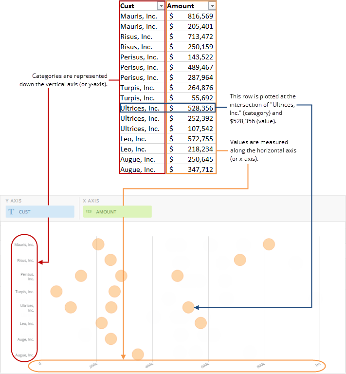
A category scatter chart is similar to a [scatter plot chart](/s/article/360042924694 "Scatter Plot Graph") in that items are plotted using X-Y coordinates—for every x and y value pair, a bubble is plotted on the chart. However, whereas in a scatter plot chart points are plotted at the intersection of two values, a category scatter chart includes both a value scale and a category scale, and bubbles are plotted at the intersection of each category-value pairing. Categories are represented down the y-axis and values are measured along the x-axis, as in horizontal bar charts.
## Powering category scatter charts
A category scatter chart requires two columns of data in your DataSet—one for categories and one for values. For information about value and category data, see [Understanding Chart Data](/s/article/360043428693 "Understanding Chart Data").
In the Analyzer, you choose the columns containing the data for your category scatter chart. For more information, see [Applying DataSet Columns to Your Chart](/s/article/360043428713 "Applying DataSet Columns to Your Chart").
For more information about formatting charts in the Analyzer, see [Visualization Card Building Part 2: The Analyzer](/s/topic/0TO5w000000ZaoUGAS "KPI Card Building Part 2: The Card Builder").
The following graphic shows you how the data from the category and value columns in a typical column-based spreadsheet is converted into a category scatter chart:
 ## Customizing category scatter charts
You can customize the appearance of a category scatter chart by editing its **Chart Properties**. For information about all chart properties, see [Chart Properties](/s/topic/0TO5w000000ZaodGAC "Chart Properties").
## Customizing category scatter charts
You can customize the appearance of a category scatter chart by editing its **Chart Properties**. For information about all chart properties, see [Chart Properties](/s/topic/0TO5w000000ZaodGAC "Chart Properties").