> ## Documentation Index
> Fetch the complete documentation index at: https://domoinc-openapi-sync-dataflows.mintlify.site/llms.txt
> Use this file to discover all available pages before exploring further.

# > Bar Charts

export const InlineImage = ({src, alt = '', height = '1.6em'}) => {
  return <img noZoom src={src} alt={alt} style={{
    display: 'inline',
    verticalAlign: 'start',
    height: height,
    margin: '0'
  }} />;
};

Bar graphs are used to measure quantities or amounts. There are usually two axes, one vertical and one horizontal. One of these axes generally displays the items being measured, and the other displays a numerical scale for measuring the items. The lengths of the bars represent the quantities for the items.

The following tables list the types of Bar graphs available in Domo. You can click a thumbnail image to see a larger image.

#### Vertical Bar Graphs

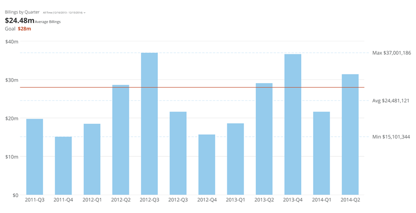
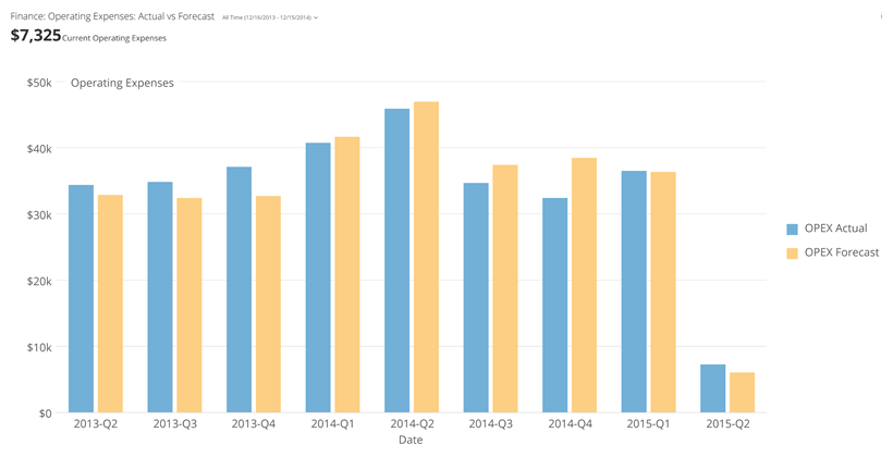
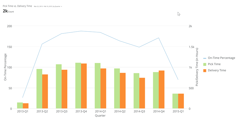
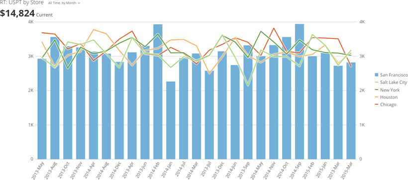
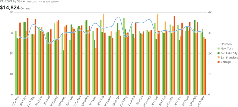
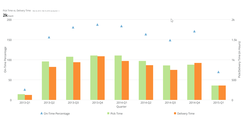
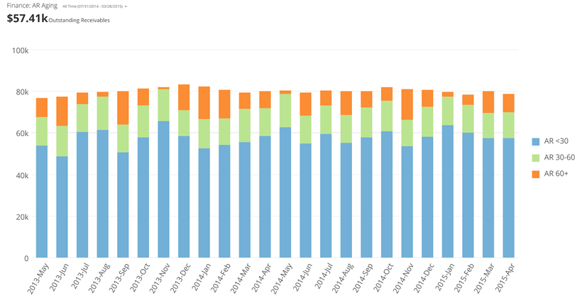
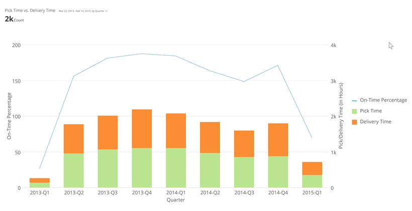
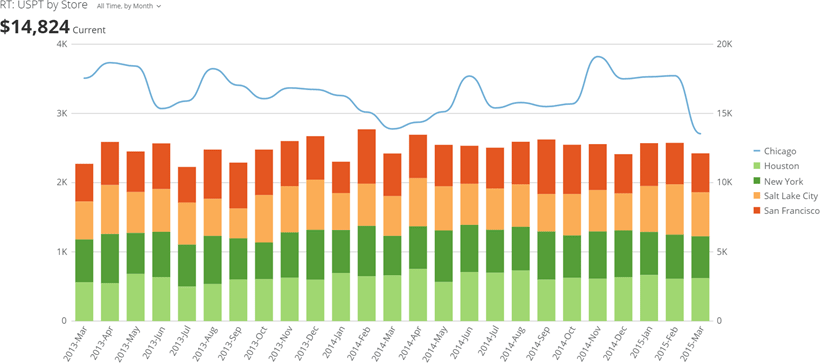
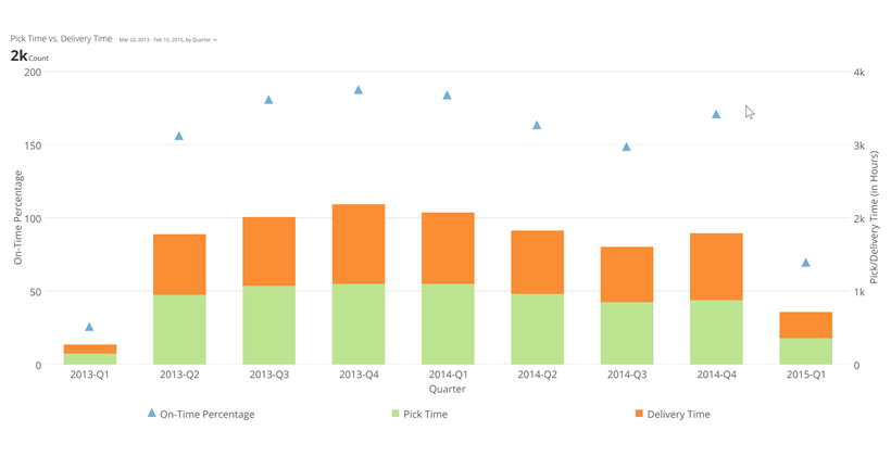
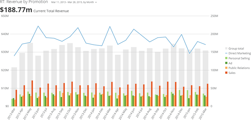
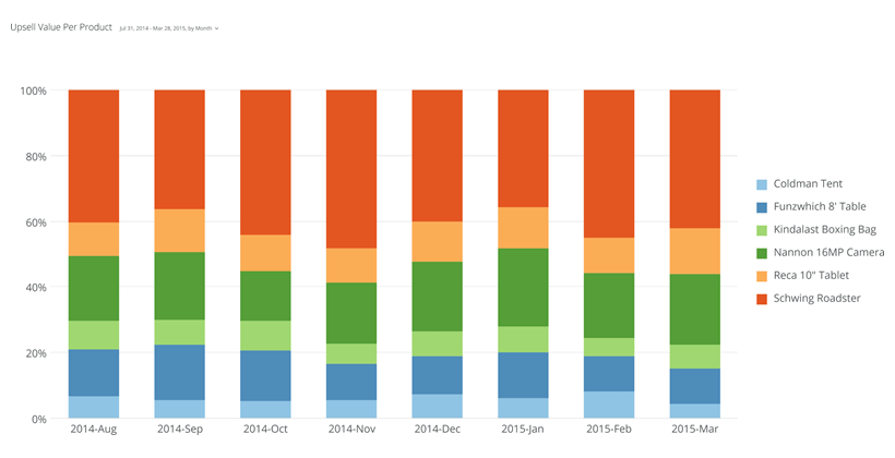
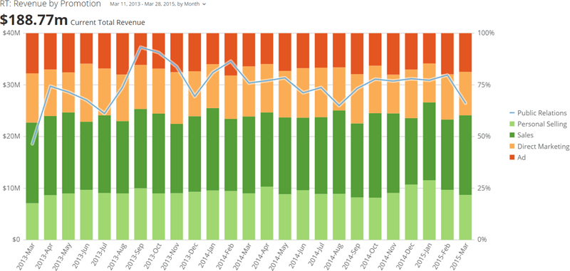
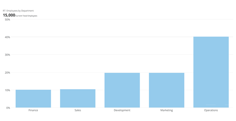
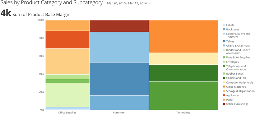
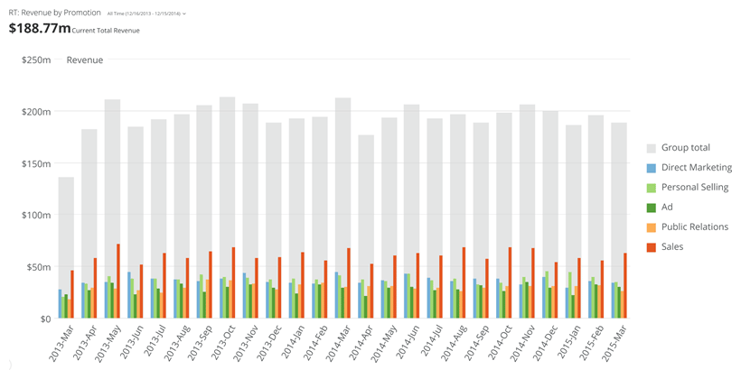
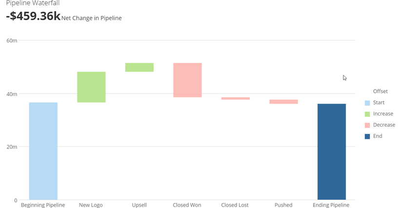
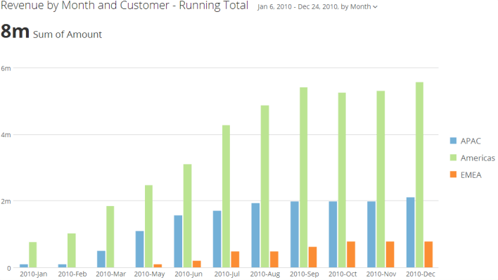
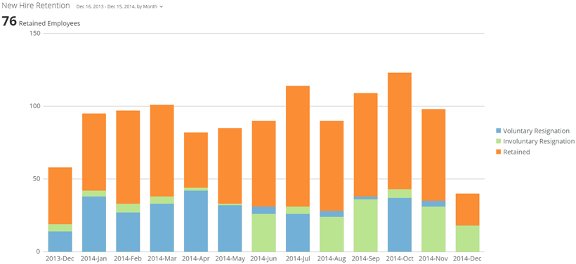
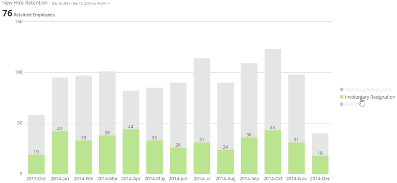
<table border="1" cellpadding="1" cellspacing="1" data-aura-rendered-by="33:202;a"><tbody><tr><th colspan="1" rowspan="1"><p> Chart Type </p></th><th colspan="1" rowspan="1"><p> Description </p></th><th colspan="1" rowspan="1"><p> Example </p></th></tr><tr><td colspan="1" rowspan="1"><p> Vertical Bar graph </p><p><InlineImage src="/images/kb/ka0Vq000000CqxJ-00N5w00000Ri7BU-0EM5w000005vPFq.png" /></p></td><td colspan="1" rowspan="1"><p> In a vertical Bar graph, the most common type of bar graph, the categories are represented along the x-axis, or horizontal axis, and the values are represented along the y-axis, or vertical axis. </p><p> For more information, see <a href="/s/article/360043428493" target="_self" title="Bar Graph"> Bar Chart </a>. </p></td><td colspan="1" rowspan="1"><p><img alt="vertical_bar_kpi_example.png" src="https://mintcdn.com/domoinc-openapi-sync-dataflows/-IX1yvR06x5dt-zq/images/kb/ka0Vq000000CqxJ-00N5w00000Ri7BU-0EM5w000005vPFM.png?fit=max&auto=format&n=-IX1yvR06x5dt-zq&q=85&s=fe36d827881cada662103513276dc4f2" width="820" height="420" data-path="images/kb/ka0Vq000000CqxJ-00N5w00000Ri7BU-0EM5w000005vPFM.png" /></p></td></tr><tr><td colspan="1" rowspan="1"><p> Vertical Grouped Bar graph </p><p><InlineImage src="/images/kb/ka0Vq000000CqxJ-00N5w00000Ri7BU-0EM5w000005vPGQ.png" /></p></td><td colspan="1" rowspan="1"><p> A vertical Grouped Bar graph is a type of bar graph in which multiple sets of data items are compared, with a single color used to denote a specific series across all the sets. In this way you can compare more information in a single graph. </p><p> For more information, see <a href="/s/article/360042924614" target="_self" title="Grouped Bar Graph"> Grouped Bar Chart </a>. </p></td><td colspan="1" rowspan="1"><p><img alt="vertical_multibar_kpi_example.png" src="https://mintcdn.com/domoinc-openapi-sync-dataflows/-IX1yvR06x5dt-zq/images/kb/ka0Vq000000CqxJ-00N5w00000Ri7BU-0EM5w000005vPFA.png?fit=max&auto=format&n=-IX1yvR06x5dt-zq&q=85&s=b746b719acd5b7c126c0ef0d8596bf12" width="820" height="420" data-path="images/kb/ka0Vq000000CqxJ-00N5w00000Ri7BU-0EM5w000005vPFA.png" /></p></td></tr><tr><td colspan="1" rowspan="1"><p> Vertical Grouped Bar with Line graph </p><p><InlineImage src="/images/kb/ka0Vq000000CqxJ-00N5w00000Ri7BU-0EM5w000005vPGE.png" /></p></td><td colspan="1" rowspan="1"><p> A Grouped Bar with Line graph is a combination of a Line graph and a Grouped Bar graph. It includes two y-axes, one on each side of the graph. One of these is used to measure the values along the line, and the other is used to measure the values of the bars. By default, the first data item appears as a line and all the others appear as bars; however, you can change this in <b> Chart Properties </b>. This type of graph is useful in situations in which you need to show a trend along with the specific quantities or amounts associated with that trend. </p><p> For more information, see <a href="/s/article/360043429153" target="_self" title="Grouped Bar with Line Graph"> Grouped Bar with Line Chart </a>. </p></td><td colspan="1" rowspan="1"><p><img alt="line_bar_kpi_example.png" src="https://mintcdn.com/domoinc-openapi-sync-dataflows/-IX1yvR06x5dt-zq/images/kb/ka0Vq000000CqxJ-00N5w00000Ri7BU-0EM5w000005vPF7.png?fit=max&auto=format&n=-IX1yvR06x5dt-zq&q=85&s=de02aaacb048a38e45ccd0fde8dc84e3" width="820" height="420" data-path="images/kb/ka0Vq000000CqxJ-00N5w00000Ri7BU-0EM5w000005vPF7.png" /></p></td></tr><tr><td colspan="1" rowspan="1"><p> Vertical Line with Grouped Bar graph </p><p><InlineImage src="/images/kb/ka0Vq000000CqxJ-00N5w00000Ri7BU-0EM5w000005vPFX.png" /></p></td><td colspan="1" rowspan="1"><p> This graph type is exactly the same as a Grouped Bar with Line graph except that by default, the first data item appears as a bar and all of the others appear as lines. As with a Grouped Bar with Line graph, you can change this default behavior in <b> Chart Properties </b>. </p><p> For more information, see <a href="/s/article/360043429153" target="_self" title="Grouped Bar with Line Graph"> Grouped Bar with Line Chart </a>. </p></td><td colspan="1" rowspan="1"><p><img alt="line_with_grouped_bar.png" src="https://mintcdn.com/domoinc-openapi-sync-dataflows/-IX1yvR06x5dt-zq/images/kb/ka0Vq000000CqxJ-00N5w00000Ri7BU-0EM5w000005vPFL.png?fit=max&auto=format&n=-IX1yvR06x5dt-zq&q=85&s=4d8723a148194aefc5cb42325e29f5a0" width="820" height="363" data-path="images/kb/ka0Vq000000CqxJ-00N5w00000Ri7BU-0EM5w000005vPFL.png" /></p></td></tr><tr><td colspan="1" rowspan="1"><p> Vertical Grouped Bar with Curved Line graph </p><p><InlineImage src="/images/kb/ka0Vq000000CqxJ-00N5w00000Ri7BU-0EM5w000005vPFw.png" /></p></td><td colspan="1" rowspan="1"><p> This graph type is exactly the same as a Grouped Bar with Line graph except that the line segments are curved instead of straight. </p><p> For more information, see <a href="/s/article/360043429153" target="_self" title="Grouped Bar with Line Graph"> Grouped Bar with Line Chart </a>. </p></td><td colspan="1" rowspan="1"><p><img alt="line_bar_curved_kpi_example.png" src="https://mintcdn.com/domoinc-openapi-sync-dataflows/_XUBQXMuNz8Oy5Tm/images/kb/ka0Vq000000CqxJ-00N5w00000Ri7BU-0EM5w000005vPGB.png?fit=max&auto=format&n=_XUBQXMuNz8Oy5Tm&q=85&s=77fbe58d25e72e59b77826d6a246bd8c" width="820" height="370" data-path="images/kb/ka0Vq000000CqxJ-00N5w00000Ri7BU-0EM5w000005vPGB.png" /></p></td></tr><tr><td colspan="1" rowspan="1"><p> Vertical Grouped Bar with Symbols graph </p><p><InlineImage src="/images/kb/ka0Vq000000CqxJ-00N5w00000Ri7BU-0EM5w000005vPGA.png" /></p></td><td colspan="1" rowspan="1"><p> A Grouped Bar with Symbols graph is the same as a Grouped Bar with Line graph, except that it includes symbols instead of lines. </p><p> For more information, see <a href="/s/article/360043429153" target="_self" title="Grouped Bar with Line Graph"> Grouped Bar with Line Chart </a>. </p></td><td colspan="1" rowspan="1"><p><img alt="symbol_bar_kpi_example.png" src="https://mintcdn.com/domoinc-openapi-sync-dataflows/_XUBQXMuNz8Oy5Tm/images/kb/ka0Vq000000CqxJ-00N5w00000Ri7BU-0EM5w000005vPG5.png?fit=max&auto=format&n=_XUBQXMuNz8Oy5Tm&q=85&s=e18df880588db48448135af1cd385f49" width="820" height="420" data-path="images/kb/ka0Vq000000CqxJ-00N5w00000Ri7BU-0EM5w000005vPG5.png" /></p></td></tr><tr><td colspan="1" rowspan="1"><p> Vertical Stacked Bar graph </p><p><InlineImage src="/images/kb/ka0Vq000000CqxJ-00N5w00000Ri7BU-0EM5w000005vPGV.png" /></p></td><td colspan="1" rowspan="1"><p> In a vertical Stacked Bar graph, categories are represented as bars, as in a basic Bar graph, but the bars are composed of series that are "stacked" on top of each other, with each series representing its value. </p><p> For more information, see <a href="/s/article/360042923334" target="_self" title="Stacked Bar Graph"> Stacked Bar Graph </a>. </p></td><td colspan="1" rowspan="1"><p><img alt="vertical_stacked_bar_kpi_example.png" src="https://mintcdn.com/domoinc-openapi-sync-dataflows/-IX1yvR06x5dt-zq/images/kb/ka0Vq000000CqxJ-00N5w00000Ri7BU-0EM5w000005vPFN.png?fit=max&auto=format&n=-IX1yvR06x5dt-zq&q=85&s=f2b6b8542e4ea067cd901fe4084bd4ff" width="820" height="420" data-path="images/kb/ka0Vq000000CqxJ-00N5w00000Ri7BU-0EM5w000005vPFN.png" /></p></td></tr><tr><td colspan="1" rowspan="1"><p> Vertical Stacked Bar with Line graph </p><p><InlineImage src="/images/kb/ka0Vq000000CqxJ-00N5w00000Ri7BU-0EM5w000005vPFT.png" /></p></td><td colspan="1" rowspan="1"><p> A Stacked Bar with Line graph combines the features of a Line graph and a vertical Stacked Bar graph. There are two y-axes, one on the left and the other on the right. The y-axis on the left measures the values along the line, and the one on the right measures the values of the bars. </p><p> For more information, see <a href="/s/article/360043428053" target="_self" title="Stacked Bar with Line Graph"> Stacked Bar with Line Graph </a>. </p></td><td colspan="1" rowspan="1"><p><img alt="line_stacked_bar_kpi_example.png" src="https://mintcdn.com/domoinc-openapi-sync-dataflows/-IX1yvR06x5dt-zq/images/kb/ka0Vq000000CqxJ-00N5w00000Ri7BU-0EM5w000005vPF4.png?fit=max&auto=format&n=-IX1yvR06x5dt-zq&q=85&s=002b71706d4dbf67f955bdfcc39e26dd" width="820" height="420" data-path="images/kb/ka0Vq000000CqxJ-00N5w00000Ri7BU-0EM5w000005vPF4.png" /></p></td></tr><tr><td colspan="1" rowspan="1"><p> Vertical Stacked Bar with Curved Line graph </p><p><InlineImage src="/images/kb/ka0Vq000000CqxJ-00N5w00000Ri7BU-0EM5w000005vPFf.png" /></p></td><td colspan="1" rowspan="1"><p> This graph type is exactly the same as a Stacked Bar with Line graph except that the line segments are curved instead of straight. </p><p> For more information, see <a href="/s/article/360043428053" target="_blank" title="Stacked Bar with Line Graph"> Stacked Bar with Line Graph </a>. </p></td><td colspan="1" rowspan="1"><p><img alt="stacked_bar_with_curved_line_kpi_example.png" src="https://mintcdn.com/domoinc-openapi-sync-dataflows/_XUBQXMuNz8Oy5Tm/images/kb/ka0Vq000000CqxJ-00N5w00000Ri7BU-0EM5w000005vPGZ.png?fit=max&auto=format&n=_XUBQXMuNz8Oy5Tm&q=85&s=b14fef06639777f06452cc95d174c991" width="820" height="363" data-path="images/kb/ka0Vq000000CqxJ-00N5w00000Ri7BU-0EM5w000005vPGZ.png" /></p></td></tr><tr><td colspan="1" rowspan="1"><p> Vertical Stacked Bar with Symbols graph </p><p><InlineImage src="/images/kb/ka0Vq000000CqxJ-00N5w00000Ri7BU-0EM5w000005vPFU.png" /></p></td><td colspan="1" rowspan="1"><p> A Stacked Bar with Symbols graph is the same as a Stacked Bar with Line graph, except that it includes symbols instead of lines. </p><p> For more information, see <a href="/s/article/360043428053" target="_blank" title="Stacked Bar with Line Graph"> Stacked Bar with Line Graph </a>. </p></td><td colspan="1" rowspan="1"><p><img alt="stacked_symbol_kpi_example.png" src="https://mintcdn.com/domoinc-openapi-sync-dataflows/_XUBQXMuNz8Oy5Tm/images/kb/ka0Vq000000CqxJ-00N5w00000Ri7BU-0EM5w000005vPGO.png?fit=max&auto=format&n=_XUBQXMuNz8Oy5Tm&q=85&s=3119de4d520872f234802fcea0dee919" width="820" height="420" data-path="images/kb/ka0Vq000000CqxJ-00N5w00000Ri7BU-0EM5w000005vPGO.png" /></p></td></tr><tr><td colspan="1" rowspan="1"><p> Vertical Nested Bar graph </p><p><InlineImage src="/images/kb/ka0Vq000000CqxJ-00N5w00000Ri7BU-0EM5w000005vPFt.png" /></p></td><td colspan="1" rowspan="1"><p> In a vertical Nested Bar graph, the total values for all categories are represented as vertical gray bars, and the values for all series are represented as smaller, colored bars and are shown side-by-side in the bars for their respective categories. </p><p> For more information, see <a href="/s/article/360042924794" target="_self" title="Nested Bar Graph"> Nested Bar Chart </a>. </p></td><td colspan="1" rowspan="1"><p><img alt="vertical_nested_bar_kpi_example.png" src="https://mintlify.s3.us-west-1.amazonaws.com/domoinc-openapi-sync-dataflows/images/kb/ka0Vq000000CqxJ-00N5w00000Ri7BU-0EM5w000005vPFh.png" /></p></td></tr><tr><td colspan="1" rowspan="1"><p> Vertical Nested Bar with Line graph </p><p><InlineImage src="/images/kb/ka0Vq000000CqxJ-00N5w00000Ri7BU-0EM5w000005vPFy.png" /></p></td><td colspan="1" rowspan="1"><p> This graph is a combination of a Grouped Bar with Line graph and Vertical Nested Bar graph. Total values for all categories are represented as vertical gray bars. Of the series, the first series in the legend is represented as a line and all of the other series are represented as smaller, colored bars within their respective category bars. The line and gray total bars are measured on the left vertical axis, and the colored series bars are measured on the right axis. </p><p> For more information, see <a href="/s/article/360043429393" target="_self"> Nested Bar with Line Chart </a>. </p></td><td colspan="1" rowspan="1"><p><img alt="vertical_nested_bar_line_kpi_example.png" src="https://mintcdn.com/domoinc-openapi-sync-dataflows/_XUBQXMuNz8Oy5Tm/images/kb/ka0Vq000000CqxJ-00N5w00000Ri7BU-0EM5w000005vPGH.png?fit=max&auto=format&n=_XUBQXMuNz8Oy5Tm&q=85&s=75e4b587fbe8a6c89b8c9fd39803e581" width="820" height="393" data-path="images/kb/ka0Vq000000CqxJ-00N5w00000Ri7BU-0EM5w000005vPGH.png" /></p></td></tr><tr><td colspan="1" rowspan="1"><p> Vertical 100% Stacked Bar graph </p><p><InlineImage src="/images/kb/ka0Vq000000CqxJ-00N5w00000Ri7BU-0EM5w000005vPFR.png" /></p></td><td colspan="1" rowspan="1"><p> A vertical 100% Stacked Bar graph is a vertical Stacked Bar graph in which each series in a category represents a percentage of that category, similar to a Pie-type graph. </p><p> For more information, see <a href="/s/article/360043428993" target="_self" title="100% Stacked Bar Graph"> 100% Stacked Bar Chart </a>. </p></td><td colspan="1" rowspan="1"><p><img alt="vertical_percent_bar.png" src="https://mintcdn.com/domoinc-openapi-sync-dataflows/-IX1yvR06x5dt-zq/images/kb/ka0Vq000000CqxJ-00N5w00000Ri7BU-0EM5w000005vPFJ.png?fit=max&auto=format&n=-IX1yvR06x5dt-zq&q=85&s=bffe57b396752350f5e1e09c25aa6284" width="820" height="420" data-path="images/kb/ka0Vq000000CqxJ-00N5w00000Ri7BU-0EM5w000005vPFJ.png" /></p></td></tr><tr><td colspan="1" rowspan="1"><p> Vertical 100% Stacked Bar with Line graph </p><p><InlineImage src="/images/kb/ka0Vq000000CqxJ-00N5w00000Ri7BU-0EM5w000005vPF3.png" /></p></td><td colspan="1" rowspan="1"><p> A 100% Stacked Bar with Line graph is the same as a 100% Stacked Bar graph in that each series in a percentage stack represents a percentage of that category. It also includes one or more trendlines, similar to our other bar-line combination graphs. </p><p> For more information, see <a href="/s/article/360042923854" target="_self" title="100% Stacked Bar with Line Graph"> 100% Stacked Bar with Line Chart </a>. </p></td><td colspan="1" rowspan="1"><img alt="vertical_percent_bar_line_kpi_example.png" src="https://mintcdn.com/domoinc-openapi-sync-dataflows/_XUBQXMuNz8Oy5Tm/images/kb/ka0Vq000000CqxJ-00N5w00000Ri7BU-0EM5w000005vPGR.png?fit=max&auto=format&n=_XUBQXMuNz8Oy5Tm&q=85&s=a4b448b54eb0731a1ac489be4fe787ce" width="800" height="381" data-path="images/kb/ka0Vq000000CqxJ-00N5w00000Ri7BU-0EM5w000005vPGR.png" /></td></tr><tr><td colspan="1" rowspan="1"><p> Vertical Percent of Total graph </p><p><InlineImage src="/images/kb/ka0Vq000000CqxJ-00N5w00000Ri7BU-0EM5w000005vPFK.png" /></p></td><td colspan="1" rowspan="1"><p> A vertical Percent of Total graph is a vertical Bar graph with a percent scale instead of a value scale—each category bar represents the relative size of its value as a percentage rather than the actual value. Percent of Total graphs are essentially Pie graphs with bars; however, because no legend is required to match names with categories, these graphs are actually easier to read and interpret than Pie-type graphs. </p><p> For more information, see <a href="/s/article/360043429453" target="_blank" title="Percent of Total Graph"> Percent of Total Graph </a>. </p></td><td colspan="1" rowspan="1"><p><img alt="vertical_percent_of_total_kpi_example.png" src="https://mintcdn.com/domoinc-openapi-sync-dataflows/_XUBQXMuNz8Oy5Tm/images/kb/ka0Vq000000CqxJ-00N5w00000Ri7BU-0EM5w000005vPGW.png?fit=max&auto=format&n=_XUBQXMuNz8Oy5Tm&q=85&s=21aae97e3b0a2bb2cbecc75dd4361ae3" width="820" height="420" data-path="images/kb/ka0Vq000000CqxJ-00N5w00000Ri7BU-0EM5w000005vPGW.png" /></p></td></tr><tr><td colspan="1" rowspan="1"><p> Vertical Marimekko graph </p><p><InlineImage src="/images/kb/ka0Vq000000CqxJ-00N5w00000Ri7BU-0EM5w000005vPGX.png" /></p></td><td colspan="1" rowspan="1"><p> A Marimekko graph is somewhat similar to a 100% Stacked Bar graph in that items within categories represent a percentage of a category, as in a Pie-type graph. However, it is different in that it represents values through column width as well as height, making it easier to see differences in the values of different items. </p><p> For more information, see <a href="/s/article/360042924734" target="_self" title="Marimekko Graph"> Marimekko Chart </a>. </p></td><td colspan="1" rowspan="1"><p><img alt="vertical_marimekko_kpi_example.png" src="https://mintcdn.com/domoinc-openapi-sync-dataflows/_XUBQXMuNz8Oy5Tm/images/kb/ka0Vq000000CqxJ-00N5w00000Ri7BU-0EM5w000005vPGK.png?fit=max&auto=format&n=_XUBQXMuNz8Oy5Tm&q=85&s=95420abb2de898b58e2f9a757e5cb000" width="820" height="370" data-path="images/kb/ka0Vq000000CqxJ-00N5w00000Ri7BU-0EM5w000005vPGK.png" /></p></td></tr><tr><td colspan="1" rowspan="1"><p> Pareto graph </p><p><InlineImage src="/images/kb/ka0Vq000000CqxJ-00N5w00000Ri7BU-0EM5w000005vPFc.png" /></p></td><td colspan="1" rowspan="1"><p> A Pareto graph is a bar graph with categories ordered according to the size of their data item (largest to smallest). A line above the bars shows the cumulative value of all of the data items to that point. A Pareto graph has two scales—one on the left that measures the actual data values, and one on the right that measures the percentage of the total value of the data series. These graphs are useful for discerning the impact of certain categories of data on a data series, and they allow you to see those categories that most (or least) contributed to the entire series. </p><p> For more information, see <a href="/s/article/360043429433" target="_blank" title="Pareto Graph"> Pareto Graph </a>. </p></td><td colspan="1" rowspan="1"><p><img alt="pareto_kpi_example.png" src="https://mintcdn.com/domoinc-openapi-sync-dataflows/-IX1yvR06x5dt-zq/images/kb/ka0Vq000000CqxJ-00N5w00000Ri7BU-0EM5w000005vPFH.png?fit=max&auto=format&n=-IX1yvR06x5dt-zq&q=85&s=cc796fcd1e9c91f6ea9034f0c0c818cf" width="820" height="420" data-path="images/kb/ka0Vq000000CqxJ-00N5w00000Ri7BU-0EM5w000005vPFH.png" /></p></td></tr><tr><td colspan="1" rowspan="1"><p> Vertical Grouped and Stacked Bar graph </p><p><InlineImage src="/images/kb/ka0Vq000000CqxJ-00N5w00000Ri7BU-0EM5w000005vPG6.png" /></p></td><td colspan="1" rowspan="1"><p> Grouped and Stacked Bar graphs combine the features of Grouped Bar and Stacked Bar graphs. In a Grouped and Stacked Bar graph, the first two series of a category are shown side by side, and all additional series are shown as segments in one or both bars. This kind of chart is useful in situations when you want to compare a primary series (such as a series representing sales data for your company headquarters) against several secondary series (such as those series representing sales data for branch offices). In vertical Grouped and Stacked Bar graphs, categories appear on the horizontal axis (or x-axis) and values are measured along the vertical axis (or y-axis). </p><p> For more information, see <a href="/s/article/360042924574" target="_self"> Grouped and Stacked Bar Chart </a>. </p></td><td colspan="1" rowspan="1"><p><img alt="vertical_multistacked_kpi_example.png" src="https://mintlify.s3.us-west-1.amazonaws.com/domoinc-openapi-sync-dataflows/images/kb/ka0Vq000000CqxJ-00N5w00000Ri7BU-0EM5w000005vPFx.png" /></p></td></tr><tr><td colspan="1" rowspan="1"><p> Vertical Grouped and Stacked Bar with Line graph </p><p><InlineImage src="/images/kb/ka0Vq000000CqxJ-00N5w00000Ri7BU-0EM5w000005vPGY.png" /></p></td><td colspan="1" rowspan="1"><p> A Grouped and Stacked Bar with Line graph is a combination of a vertical Grouped and Stacked Bar graph and a Stacked Bar with Line graph. As in a Stacked Bar with Line graph, two value scales are present and series can appear as either lines or bars; this chart type also gives you the ability to divide series segments between bars, as in a Grouped and Stacked Bar graph. As with standard Grouped and Stacked Bar graphs, this chart type is useful when you want to compare a primary series against several secondary series; however, because it includes a trendline, it is more compatible with time-series data than a regular Grouped and Stacked Bar graph. </p><p> For more information, see <a href="/s/article/360042924594" target="_self" title="Grouped and Stacked Bar with Line Graph"> Grouped and Stacked Bar with Line Chart </a>. </p></td><td colspan="1" rowspan="1"><p><img alt="multistacked_line_kpi_example.png" src="https://mintlify.s3.us-west-1.amazonaws.com/domoinc-openapi-sync-dataflows/images/kb/ka0Vq000000CqxJ-00N5w00000Ri7BU-0EM5w000005vPFi.png" /></p></td></tr><tr><td colspan="1" rowspan="1"><p> Vertical Bullet graph </p><p><InlineImage src="/images/kb/ka0Vq000000CqxJ-00N5w00000Ri7BU-0EM5w000005vPFv.png" /></p></td><td colspan="1" rowspan="1"><p> Bullet graphs are used to depict progress towards a goal, and contain two or more ranges (for example, "poor," "average," and "excellent"). Unlike other kinds of gauges, which represent a single data value, Bullet graphs can measure multiple data values in a smaller space, providing a richer and more meaningful viewing experience. In Vertical Bullet graphs, categories appear on the horizontal axis (or x-axis) and the category values are measured along the vertical axis (or y-axis). </p><p> For more information, see <a href="/s/article/360042924154" target="_self" title="Bullet Graph"> Bullet Chart </a>. </p></td><td colspan="1" rowspan="1"><p><img alt="vertical_bullet_graph_kpi_example.png" src="https://mintcdn.com/domoinc-openapi-sync-dataflows/-IX1yvR06x5dt-zq/images/kb/ka0Vq000000CqxJ-00N5w00000Ri7BU-0EM5w000005vPFf.png?fit=max&auto=format&n=-IX1yvR06x5dt-zq&q=85&s=39c624aab2ccf98bd975ac52d81aaf00" width="42" height="22" data-path="images/kb/ka0Vq000000CqxJ-00N5w00000Ri7BU-0EM5w000005vPFf.png" /></p></td></tr><tr><td colspan="1" rowspan="1"><p> Vertical Waterfall graph </p><p><InlineImage src="/images/kb/ka0Vq000000CqxJ-00N5w00000Ri7BU-0EM5w000005vPFO.png" /></p></td><td colspan="1" rowspan="1"><p> Waterfall graphs are essentially Bar graphs that show a series of profits and losses for a specified time period, together with a summary bar showing the amount remaining at the end of the time period. Profits appear as green bars, losses appear as red bars, and start and summary bars appear as blue bars. By default, Waterfall graphs display only value and category data, but you can show summary bars for individual series by checking a box in <b> Chart Properties </b>. In vertical Waterfall graphs, categories appear on the horizontal axis (or x-axis) and category values are measured along the vertical axis (or y-axis). </p><p> For more information, see <a href="/s/article/360043429613" target="_blank" title="Waterfall Graph"> Waterfall Graph </a>. </p></td><td colspan="1" rowspan="1"><p><img alt="waterfall_kpi_example.png" src="https://mintcdn.com/domoinc-openapi-sync-dataflows/_XUBQXMuNz8Oy5Tm/images/kb/ka0Vq000000CqxJ-00N5w00000Ri7BU-0EM5w000005vPGP.png?fit=max&auto=format&n=_XUBQXMuNz8Oy5Tm&q=85&s=1bd61caad6979bcf47ab523cf0efc6ef" width="820" height="427" data-path="images/kb/ka0Vq000000CqxJ-00N5w00000Ri7BU-0EM5w000005vPGP.png" /></p></td></tr><tr><td colspan="1" rowspan="1"><p> Vertical Running Total Bar graph </p><p><InlineImage src="/images/kb/ka0Vq000000CqxJ-00N5w00000Ri7BU-0EM5w000005vPFu.png" /></p></td><td colspan="1" rowspan="1"><p> In a Running Total Bar graph, each successive category bar shows the cumulative value of all categories up to that point in the succession. In a Running Total Bar graph, each category contains only one series, so only one bar displays for each data point. </p><p> For more information, see <a href="/s/article/360042924974" target="_blank" title="Running Total Bar Graph"> Running Total Bar Graph </a>. </p></td><td colspan="1" rowspan="1"><p><img alt="running_total_single_kpi_example.png" src="https://mintlify.s3.us-west-1.amazonaws.com/domoinc-openapi-sync-dataflows/images/kb/ka0Vq000000CqxJ-00N5w00000Ri7BU-0EM5w000005vPGb.png" /></p></td></tr><tr><td colspan="1" rowspan="1"><p> Vertical Running Total Grouped Bar graph </p><p><InlineImage src="/images/kb/ka0Vq000000CqxJ-00N5w00000Ri7BU-0EM5w000005vPG3.png" /></p></td><td colspan="1" rowspan="1"><p> In a Running Total Grouped Bar graph, multiple series are present for two or more categories, and these series are shown side by side, as in a vertical Grouped Bar Graph. Each series bar shows the cumulative value for all series bars in that category up to that point. </p><p> For more information, see <a href="/s/article/360042924994" target="_blank" title="Running Total Grouped Bar Graph"> Running Total Grouped Bar Graph </a>. </p></td><td colspan="1" rowspan="1"><p><img alt="running_total_grouped_kpi_example.png" src="https://mintcdn.com/domoinc-openapi-sync-dataflows/_XUBQXMuNz8Oy5Tm/images/kb/ka0Vq000000CqxJ-00N5w00000Ri7BU-0EM5w000005vPG8.png?fit=max&auto=format&n=_XUBQXMuNz8Oy5Tm&q=85&s=d2491f86734ad1d0f90ea0203c4b1515" width="708" height="398" data-path="images/kb/ka0Vq000000CqxJ-00N5w00000Ri7BU-0EM5w000005vPG8.png" /></p></td></tr><tr><td colspan="1" rowspan="1"><p> Vertical Running Total Stacked Bar graph </p><p><InlineImage src="/images/kb/ka0Vq000000CqxJ-00N5w00000Ri7BU-0EM5w000005vPGI.png" /></p></td><td colspan="1" rowspan="1"><p> In a Running Total Stacked Bar graph, multiple series are present for two or more categories, and these series are shown stacked on top of each other, as in a vertical Stacked Bar Graph. Each bar in a stack shows the cumulative value for all series bars in that category up to that point. </p><p> For more information, see <a href="/s/article/360042924674" target="_blank" title="Running Total Stacked Bar Graph"> Running Total Stacked Bar Graph </a>. </p></td><td colspan="1" rowspan="1"><p><img alt="running_total_stacked_kpi_example.png" src="https://mintcdn.com/domoinc-openapi-sync-dataflows/-IX1yvR06x5dt-zq/images/kb/ka0Vq000000CqxJ-00N5w00000Ri7BU-0EM5w000005vPFc.png?fit=max&auto=format&n=-IX1yvR06x5dt-zq&q=85&s=2cbd81650f97a5497f338f8506643262" width="42" height="24" data-path="images/kb/ka0Vq000000CqxJ-00N5w00000Ri7BU-0EM5w000005vPFc.png" /></p></td></tr><tr><td colspan="1" rowspan="1"><p> Vertical Overlay Bar graph </p><p><InlineImage src="/images/kb/ka0Vq000000CqxJ-00N5w00000Ri7BU-0EM5w000005vPFZ.png" /></p></td><td colspan="1" rowspan="1"><p> A Vertical Overlay Bar is similar to a standard Stacked Bar graph except that instead of being stacked, all series items begin from the baseline, so overlapping of series items occurs in a category when multiple series are present. In its initial non-rollover state, an Overlay graph is rather meaningless, as shown in the first example at right. However, by mousing over a series item in the legend, you can see just that series in the chart, as shown in the second example at right. In many applications this may be more useful than a Stacked Bar because you can more quickly compare series items in different categories. (In a Stacked Bar this is difficult because series in different categories do not usually begin from the same baseline.) </p><p> For more information, see <a href="/s/article/360043429413" target="_blank" title="Overlay Bar Graph"> Overlay Bar Graph </a>. </p></td><td colspan="1" rowspan="1"><p><a target="_blank" title="/@api/deki/files/3355/vertical_overlay_bar_kpi_example_default.png"><img alt="" src="https://mintcdn.com/domoinc-openapi-sync-dataflows/D4XP-ZUu0hZKYNDT/images/kb/ka05w00000123mu-00N5w00000Ri7BU-0EM5w000005vP6L.png?fit=max&auto=format&n=D4XP-ZUu0hZKYNDT&q=85&s=babc56a2589ed375975dfd32210a10e5" width="820" height="376" data-path="images/kb/ka05w00000123mu-00N5w00000Ri7BU-0EM5w000005vP6L.png" /></a></p><p /><p><img alt="vertical_overlay_bar_kpi_example_mouseover.png" src="https://mintcdn.com/domoinc-openapi-sync-dataflows/D4XP-ZUu0hZKYNDT/images/kb/ka05w00000123mu-00N5w00000Ri7BU-0EM5w000005vP6H.png?fit=max&auto=format&n=D4XP-ZUu0hZKYNDT&q=85&s=49a2c663ae0d995a5090d4bf8332880b" width="820" height="378" data-path="images/kb/ka05w00000123mu-00N5w00000Ri7BU-0EM5w000005vP6H.png" /></p></td></tr><tr><td colspan="1" rowspan="1"><p> Vertical Histogram graph </p><p><InlineImage src="/images/kb/ka0Vq000000CqxJ-00N5w00000Ri7BU-0EM5w000005vPFr.png" /></p></td><td colspan="1" rowspan="1"><p> A Histogram is a chart type, usually used for statistical analysis, that represents the frequency at which certain ranges of values appear in a DataSet. For example, you could create a histogram showing the frequency at which specific height ranges appear in a group. In a vertical Histogram, values are represented along the x-axis as ranges, and categories are counted and represented numerically on the y-axis. </p><p> For more information, see <a href="/s/article/360043429193" target="_blank" title="Histogram"> Histogram </a>. </p></td><td colspan="1" rowspan="1"><p><img alt="vertical_histogram_kpi_example.png" src="https://mintlify.s3.us-west-1.amazonaws.com/domoinc-openapi-sync-dataflows/images/kb/ka0Vq000000CqxJ-00N5w00000Ri7BU-0EM5w000005vPGa.png" /></p></td></tr></tbody></table>

#### Horizontal Bar Graphs

<table border="1" cellpadding="1" cellspacing="1" data-aura-rendered-by="33:209;a"><tbody><tr><th colspan="1" rowspan="1"><p> Chart Type </p></th><th colspan="1" rowspan="1"><p> Description </p></th><th colspan="1" rowspan="1"><p> Example </p></th></tr><tr><td colspan="1" rowspan="1"><p> Horizontal Bar graph </p><p><InlineImage src="/images/kb/kb/ka0Vq000000CqxJ-00N5w00000Ri7BU-0EM5w000005vPFg.png" /></p></td><td colspan="1" rowspan="1"><p> A horizontal Bar graph has the same basic concept as a vertical Bar graph, but the x- and y-axes are reversed; that is, the categories are represented along the y-axis, or vertical axis, and the values are represented along the x-axis, or horizontal axis. </p><p> For more information, see <a href="/s/article/360043428493" target="_self" title="Bar Graph"> Bar Chart </a> . </p></td><td colspan="1" rowspan="1"><p><img alt="horizontal_bar_kpi_example.png" src="https://mintlify.s3.us-west-1.amazonaws.com/domoinc-openapi-sync-dataflows/images/kb/kb/ka0Vq000000CqxJ-00N5w00000Ri7BU-0EM5w000005vPFk-1.png" /></p></td></tr><tr><td colspan="1" rowspan="1"><p> Horizontal Grouped Bar graph </p><p><InlineImage src="/images/kb/kb/ka0Vq000000CqxJ-00N5w00000Ri7BU-0EM5w000005vPFY-1.png" /></p></td><td colspan="1" rowspan="1"><p> A horizontal Grouped Bar graph has the same basic concept as a vertical Grouped Bar graph, but the x- and y-axes are reversed, so that the categories are represented along the y-axis, or vertical axis, and the values are represented along the x-axis, or horizontal axis. </p><p> For more information, see <a href="/s/article/360042924614" target="_self" title="Grouped Bar Graph"> Grouped Bar Chart </a> . </p></td><td colspan="1" rowspan="1"><p><img alt="horizontal_multibar_kpi_example.png" src="https://mintlify.s3.us-west-1.amazonaws.com/domoinc-openapi-sync-dataflows/images/kb/kb/ka0Vq000000CqxJ-00N5w00000Ri7BU-0EM5w000005vPGF.png" /></p></td></tr><tr><td colspan="1" rowspan="1"><p> Horizontal Grouped Bar with Line graph </p><p><InlineImage src="/images/kb/kb/ka0Vq000000CqxJ-00N5w00000Ri7BU-0EM5w000005vPFd.png" /></p></td><td colspan="1" rowspan="1"><p> A horizontal Grouped Bar with Line graph has the same basic concept as a vertical Grouped Bar with Line graph, but the x- and y-axes are reversed, so that the categories are represented along the y-axis, or vertical axis, and the values are represented along the x-axes, or horizontal axes. Bars are measured on the bottom x-axis and lines are measured on the top x-axis. </p><p> For more information, see <a href="/s/article/360043429153" target="_self" title="Grouped Bar with Line Graph"> Grouped Bar with Line Chart </a> . </p></td><td colspan="1" rowspan="1"><p><img alt="horizontal_line_bar_kpi_example.png" src="https://mintlify.s3.us-west-1.amazonaws.com/domoinc-openapi-sync-dataflows/images/kb/kb/ka0Vq000000CqxJ-00N5w00000Ri7BU-0EM5w000005vPFW-1.png" /></p></td></tr><tr><td colspan="1" rowspan="1"><p> Horizontal Grouped Bar with Symbols graph </p><p><InlineImage src="/images/kb/kb/ka0Vq000000CqxJ-00N5w00000Ri7BU-0EM5w000005vPG0.png" /></p></td><td colspan="1" rowspan="1"><p> A horizontal Grouped Bar with Symbols graph is the same as a horizontal Grouped Bar with Line graph but uses symbols instead of lines. </p><p> For more information, see <a href="/s/article/360043429153" target="_self" title="Grouped Bar with Line Graph"> Grouped Bar with Line Chart </a> . </p></td><td colspan="1" rowspan="1"><p><img alt="horizontal_symbol_bar_kpi_example.png" src="https://mintlify.s3.us-west-1.amazonaws.com/domoinc-openapi-sync-dataflows/images/kb/kb/ka0Vq000000CqxJ-00N5w00000Ri7BU-0EM5w000005vPGN.png" /></p></td></tr><tr><td colspan="1" rowspan="1"><p> Horizontal Stacked Bar graph </p><p><InlineImage src="/images/kb/kb/ka0Vq000000CqxJ-00N5w00000Ri7BU-0EM5w000005vPGM.png" /></p></td><td colspan="1" rowspan="1"><p> A horizontal Stacked bar graph has the same basic concept as a vertical Stacked Bar graph, but the x- and y-axes are reversed, so the series appear side-by-side in the chart rather than stacked on top of each other. </p><p> For more information, see <a href="/s/article/360042923334" target="_blank" title="Stacked Bar Graph"> Stacked Bar Chart </a> . </p></td><td colspan="1" rowspan="1"><p><img alt="horizontal_stacked_bar_kpi_example.png" src="https://mintlify.s3.us-west-1.amazonaws.com/domoinc-openapi-sync-dataflows/images/kb/kb/ka0Vq000000CqxJ-00N5w00000Ri7BU-0EM5w000005vPG9.png" /></p></td></tr><tr><td colspan="1" rowspan="1"><p> Horizontal Stacked Bar with Line graph </p><p><InlineImage src="/images/kb/kb/ka0Vq000000CqxJ-00N5w00000Ri7BU-0EM5w000005vPFB.png" /></p></td><td colspan="1" rowspan="1"><p> A horizontal Stacked Bar with Line graph has the same basic concept as a vertical Stacked Bar with Line graph, but the x- and y-axes are reversed, so that the categories are represented along the y-axis, or vertical axis, and the values are represented along the x-axis, or horizontal axis. Bars are measured on the bottom x-axis and lines are measured on the top x-axis. </p><p> For more information, see <a href="/s/article/360043428053" target="_blank" title="Stacked Bar with Line Graph"> Stacked Bar with Line Chart </a> . </p></td><td colspan="1" rowspan="1"><p><img alt="horizontal_stacked_bar_with_line_kpi_example.png" src="https://mintlify.s3.us-west-1.amazonaws.com/domoinc-openapi-sync-dataflows/images/kb/kb/ka0Vq000000CqxJ-00N5w00000Ri7BU-0EM5w000005vPFP.png" /></p></td></tr><tr><td colspan="1" rowspan="1"><p> Horizontal Stacked Bar with Symbols graph </p><p><InlineImage src="/images/kb/kb/ka0Vq000000CqxJ-00N5w00000Ri7BU-0EM5w000005vPFQ-1.png" /></p></td><td colspan="1" rowspan="1"><p> A horizontal Stacked Bar with Symbols graph is the same as a horizontal Stacked Bar with Line graph but uses symbols instead of lines. </p><p> For more information, see <a href="/s/article/360043428053" target="_blank" title="Stacked Bar with Line Graph"> Stacked Bar with Line Chart </a> . </p></td><td colspan="1" rowspan="1"><p><img alt="horizontal_stacked_bar_with_symbols_kpi_example.png" src="https://mintlify.s3.us-west-1.amazonaws.com/domoinc-openapi-sync-dataflows/images/kb/kb/ka0Vq000000CqxJ-00N5w00000Ri7BU-0EM5w000005vPFG-1.png" /></p></td></tr><tr><td colspan="1" rowspan="1"><p> Horizontal Nested Bar graph </p><p><InlineImage src="/images/kb/kb/ka0Vq000000CqxJ-00N5w00000Ri7BU-0EM5w000005vPGS.png" /></p></td><td colspan="1" rowspan="1"><p> A horizontal Nested Bar graph has the same basic concept as a vertical Nested Bar graph, but the x- and y- axes are reversed, so the bars extend to the right instead of vertically. </p><p> For more information, see <a href="/s/article/360042924794" target="_self" title="Nested Bar Graph"> Nested Bar Chart </a> . </p></td><td colspan="1" rowspan="1"><p><img alt="horizontal_nested_bar_kpi_example.png" src="https://mintlify.s3.us-west-1.amazonaws.com/domoinc-openapi-sync-dataflows/images/kb/kb/ka0Vq000000CqxJ-00N5w00000Ri7BU-0EM5w000005vPF5.png" /></p></td></tr><tr><td colspan="1" rowspan="1"><p> Horizontal Nested Bar with Line graph </p><p><InlineImage src="/images/kb/kb/ka0Vq000000CqxJ-00N5w00000Ri7BU-0EM5w000005vPF1.png" /></p></td><td colspan="1" rowspan="1"><p> A horizontal Nested Bar with Line graph has the same basic concept as a vertical Nested Bar with Line graph, but the x- and y- axes are reversed, so the bars extend to the right instead of vertically, and the line goes from top to bottom. </p><p> For more information, see <a href="/s/article/360043429393" target="_self"> Nested Bar with Line Chart </a> . </p></td><td colspan="1" rowspan="1"><p><img alt="horizontal_nested_bar_with_line_kpi_example.png" src="https://mintlify.s3.us-west-1.amazonaws.com/domoinc-openapi-sync-dataflows/images/kb/kb/ka0Vq000000CqxJ-00N5w00000Ri7BU-0EM5w000005vPFm-1.png" /></p></td></tr><tr><td colspan="1" rowspan="1"><p> Horizontal Marimekko graph </p><p><InlineImage src="/images/kb/kb/ka0Vq000000CqxJ-00N5w00000Ri7BU-0EM5w000005vPEz.png" /></p></td><td colspan="1" rowspan="1"><p> A horizontal Marimekko graph has the same basic concept as a vertical Marimekko graph but the categories are on the x-axis and the percent scale is on the y-axis, so the rectangles extend left to right instead of top to bottom. </p><p> For more information, see <a href="/s/article/360042924734" target="_self"> Marimekko Chart </a> . </p></td><td colspan="1" rowspan="1"><p><img alt="horizontal_marimekko_kpi_example.png" src="https://mintlify.s3.us-west-1.amazonaws.com/domoinc-openapi-sync-dataflows/images/kb/kb/ka0Vq000000CqxJ-00N5w00000Ri7BU-0EM5w000005vPFl-1.png" /></p></td></tr><tr><td colspan="1" rowspan="1"><p> Horizontal 100% Stacked Bar graph </p><p><InlineImage src="/images/kb/kb/ka0Vq000000CqxJ-00N5w00000Ri7BU-0EM5w000005vPGJ.png" /></p></td><td colspan="1" rowspan="1"><p> A horizontal 100% Stacked Bar graph has the same basic concept as a vertical 100% Stacked Bar graph, but the x- and y-axes are reversed, so the series appear side-by-side in the chart rather than stacked on top of each other. </p><p> For more information, see <a href="/s/article/360043428993" target="_self" title="100% Stacked Bar Graph"> 100% Stacked Bar Chart </a> . </p></td><td colspan="1" rowspan="1"><p><img alt="horizontal_percent_bar.png" src="https://mintlify.s3.us-west-1.amazonaws.com/domoinc-openapi-sync-dataflows/images/kb/kb/ka0Vq000000CqxJ-00N5w00000Ri7BU-0EM5w000005vPF0.png" /></p></td></tr><tr><td colspan="1" rowspan="1"><p> Horizontal 100% Stacked Bar with Line graph </p><p><InlineImage src="/images/kb/kb/ka0Vq000000CqxJ-00N5w00000Ri7BU-0EM5w000005vPFV-1.png" /></p></td><td colspan="1" rowspan="1"><p> A 100% Stacked Bar with Line graph is the same as a 100% Stacked Bar graph in that each series in a percentage stack represents a percentage of that category. It also includes one or more trendlines, similar to our other bar-line combination graphs. </p><p> For more information, see <a href="/s/article/360042923854" target="_self" title="100% Stacked Bar with Line Graph"> 100% Stacked Bar with Line Chart </a> . </p></td><td colspan="1" rowspan="1"><img alt="horizontal_percent_bar_line_kpi_example.png" src="https://mintlify.s3.us-west-1.amazonaws.com/domoinc-openapi-sync-dataflows/images/kb/kb/ka0Vq000000CqxJ-00N5w00000Ri7BU-0EM5w000005vPFE.png" /></td></tr><tr><td colspan="1" rowspan="1"><p> Horizontal Percent of Total graph </p><p><InlineImage src="/images/kb/kb/ka0Vq000000CqxJ-00N5w00000Ri7BU-0EM5w000005vPGC.png" /></p></td><td colspan="1" rowspan="1"><p> A horizontal Percent of Total graph is the same as a vertical Percent of Total graph, but the x and y axes are reversed, so that the percent scale appears on the bottom and the categories on the left. </p><p> For more information, see <a href="/s/article/360043429453" target="_blank" title="Percent of Total Graph"> Percent of Total Graph </a> . </p></td><td colspan="1" rowspan="1"><p><img alt="horizontal_percent_of_total_kpi_example.png" src="https://mintlify.s3.us-west-1.amazonaws.com/domoinc-openapi-sync-dataflows/images/kb/kb/ka0Vq000000CqxJ-00N5w00000Ri7BU-0EM5w000005vPF6.png" /></p></td></tr><tr><td colspan="1" rowspan="1"><p> Horizontal Grouped and Stacked Bar graph </p><p><InlineImage src="/images/kb/kb/ka0Vq000000CqxJ-00N5w00000Ri7BU-0EM5w000005vPFj-1.png" /></p></td><td colspan="1" rowspan="1"><p> Horizontal Grouped and Stacked Bar graphs have the same basic concept as vertical Grouped and Stacked Bar graphs, but the x- and y-axes are switched, so that the categories appear on the vertical axis and the values are measured along the horizontal axis. </p><p> For more information, see <a href="/s/article/360042924574" target="_self" title="Grouped and Stacked Bar Graph"> Grouped and Stacked Bar Chart </a> . </p></td><td colspan="1" rowspan="1"><p><img alt="horizontal_multistacked_kpi_example.png" src="https://mintlify.s3.us-west-1.amazonaws.com/domoinc-openapi-sync-dataflows/images/kb/kb/ka0Vq000000CqxJ-00N5w00000Ri7BU-0EM5w000005vPGD.png" /></p></td></tr><tr><td colspan="1" rowspan="1"><p> Horizontal Grouped and Stacked with Line graph </p><p><InlineImage src="/images/kb/kb/ka0Vq000000CqxJ-00N5w00000Ri7BU-0EM5w000005vPGL.png" /></p></td><td colspan="1" rowspan="1"><p> This chart type is the same as a vertical Grouped and Stacked with Line graph, , but the x- and y-axes are switched, so that the categories appear on the vertical axis and the values are measured along the horizontal axes. </p><p> For more information, see <a href="/s/article/360042924594" target="_self"> Grouped and Stacked Bar with Line Chart </a> . </p></td><td colspan="1" rowspan="1"><p><img alt="horizontal_grouped_and_stacked_with_line.png" src="https://mintlify.s3.us-west-1.amazonaws.com/domoinc-openapi-sync-dataflows/images/kb/kb/ka0Vq000000CqxJ-00N5w00000Ri7BU-0EM5w000005vPFs.png" /></p></td></tr><tr><td colspan="1" rowspan="1"><p> Horizontal Bullet graph </p><p><InlineImage src="/images/kb/kb/ka0Vq000000CqxJ-00N5w00000Ri7BU-0EM5w000005vPFe-1.png" /></p></td><td colspan="1" rowspan="1"><p> Horizontal Bullet graphs have the same basic concept as vertical Bullet graphs, but the x- and y-axes are switched, so that the categories appear on the vertical axis and the values are measured along the horizontal axis. </p><p> For more information, see <a href="/s/article/360042924154" target="_self" title="Bullet Graph"> Bullet Chart </a> . </p></td><td colspan="1" rowspan="1"><p><img alt="horizontal_bullet_graph_kpi_example.png" src="https://mintlify.s3.us-west-1.amazonaws.com/domoinc-openapi-sync-dataflows/images/kb/kb/ka0Vq000000CqxJ-00N5w00000Ri7BU-0EM5w000005vPGT.png" /></p></td></tr><tr><td colspan="1" rowspan="1"><p> Horizontal Waterfall graph </p><p><InlineImage src="/images/kb/kb/ka0Vq000000CqxJ-00N5w00000Ri7BU-0EM5w000005vPG2.png" /></p></td><td colspan="1" rowspan="1"><p> Horizontal Waterfall graphs have the same basic concept as vertical Waterfall graphs, but the x- and y-axes are switched, so that the categories appear on the vertical axis and the values are measured along the horizontal axis. </p><p> For more information, see <a href="/s/article/360043429613" target="_blank" title="Waterfall Graph"> Waterfall Graph </a> . </p></td><td colspan="1" rowspan="1"><p><img alt="horizontal_waterfall_kpi_example.png" src="https://mintlify.s3.us-west-1.amazonaws.com/domoinc-openapi-sync-dataflows/images/kb/kb/ka0Vq000000CqxJ-00N5w00000Ri7BU-0EM5w000005vPGG.png" /></p></td></tr><tr><td colspan="1" rowspan="1"><p> Horizontal Running Total Bar graph </p><p><InlineImage src="/images/kb/kb/ka0Vq000000CqxJ-00N5w00000Ri7BU-0EM5w000005vPFa-1.png" /></p></td><td colspan="1" rowspan="1"><p> Horizontal Running Total Bar graphs are the same as vertical Running Total Bar graphs, but the x- and y-axes are switched, so that the categories appear on the vertical axis and the values are measured along the horizontal axis. </p><p> For more information, see <a href="/s/article/360042924974" target="_blank" title="Running Total Bar Graph"> Running Total Bar Graph </a> . </p></td><td colspan="1" rowspan="1"><p><img alt="horizontal_running_total.png" src="https://mintlify.s3.us-west-1.amazonaws.com/domoinc-openapi-sync-dataflows/images/kb/kb/ka0Vq000000CqxJ-00N5w00000Ri7BU-0EM5w000005vPFn-1.png" /></p></td></tr><tr><td colspan="1" rowspan="1"><p> Horizontal Running Total Grouped Bar graph </p><p><InlineImage src="/images/kb/kb/ka0Vq000000CqxJ-00N5w00000Ri7BU-0EM5w000005vPGU.png" /></p></td><td colspan="1" rowspan="1"><p> Horizontal Running Total Grouped Bar graphs are the same as vertical Running Total Grouped Bar graphs, but the x- and y-axes are switched, so that the categories appear on the vertical axis and the values are measured along the horizontal axis. </p><p> For more information, see <a href="/s/article/360042924994" target="_blank" title="Running Total Grouped Bar Graph"> Running Total Grouped Bar Graph </a> . </p></td><td colspan="1" rowspan="1"><p><img alt="horizontal_running_total_grouped.png" src="https://mintlify.s3.us-west-1.amazonaws.com/domoinc-openapi-sync-dataflows/images/kb/kb/ka0Vq000000CqxJ-00N5w00000Ri7BU-0EM5w000005vPF9.png" /></p></td></tr><tr><td colspan="1" rowspan="1"><p> Horizontal Running Total Stacked Bar graph </p><p><InlineImage src="/images/kb/kb/ka0Vq000000CqxJ-00N5w00000Ri7BU-0EM5w000005vPF8.png" /></p></td><td colspan="1" rowspan="1"><p> Horizontal Running Total Stacked Bar graphs are the same as vertical Running Total Stacked Bar graphs, but the x- and y-axes are switched, so that the categories appear on the vertical axis and the values are measured along the horizontal axis. </p><p> For more information, see <a href="/s/article/360042924674" target="_blank" title="Running Total Stacked Bar Graph"> Running Total Stacked Bar Graph </a> . </p></td><td colspan="1" rowspan="1"><p><img alt="horizontal_running_total_stacked.png" src="https://mintlify.s3.us-west-1.amazonaws.com/domoinc-openapi-sync-dataflows/images/kb/kb/ka0Vq000000CqxJ-00N5w00000Ri7BU-0EM5w000005vPFp-1.png" /></p></td></tr><tr><td colspan="1" rowspan="1"><p> Funnel Bars graph </p><p><InlineImage src="/images/kb/kb/ka0Vq000000CqxJ-00N5w00000Ri7BU-0EM5w000005vPG4.png" /></p></td><td colspan="1" rowspan="1"><p> A Funnel Bars graph is a combination of a Funnel graph and a horizontal Bar graph. This graph type shows differences between one stage in a process (such as a sales cycle) and the next. For each stage in the process, the data for the previous round drops off, so that only the relationships between the current round and all subsequent rounds is shown. In essence, this chart type shows "what's left" after each stage in a process. The example at right shows a Funnel Bars graph for a typical sales cycle. Each subsequent stage depicts the number of potential customers who have progressed to that stage. </p><p> For more information, see <a href="/s/article/360043429113" target="_self" title="Funnel Graph"> Funnel Chart </a> . </p></td><td colspan="1" rowspan="1"><p><img alt="funnel_bars_kpi_example.png" src="https://mintlify.s3.us-west-1.amazonaws.com/domoinc-openapi-sync-dataflows/images/kb/kb/ka0Vq000000CqxJ-00N5w00000Ri7BU-0EM5w000005vPFo-1.png" /></p></td></tr><tr><td colspan="1" rowspan="1"><p> Horizontal Overlay Bar graph </p><p><InlineImage src="/images/kb/kb/ka0Vq000000CqxJ-00N5w00000Ri7BU-0EM5w000005vPFS-1.png" /></p></td><td colspan="1" rowspan="1"><p> A horizontal Overlay Bar graph is the same as a vertical Overlay Bar graph, x- and y-axes are switched, so that the categories appear on the vertical axis and the values are measured along the horizontal axis. </p><p> For more information, see <a href="/s/article/360043429413" target="_self"> Overlay Bar Graph </a> . </p></td><td colspan="1" rowspan="1"><p><img alt="horizontal_overlay_bar_kpi_example.png" src="https://mintlify.s3.us-west-1.amazonaws.com/domoinc-openapi-sync-dataflows/images/kb/kb/ka0Vq000000CqxJ-00N5w00000Ri7BU-0EM5w000005vPFD-1.png" /></p></td></tr><tr><td colspan="1" rowspan="1"><p> Horizontal Histogram graph </p><p><InlineImage src="/images/kb/kb/ka0Vq000000CqxJ-00N5w00000Ri7BU-0EM5w000005vPG7.png" /></p></td><td colspan="1" rowspan="1"><p> A horizontal Histogram is the same as a vertical Histogram, but the axes are reversed, so that category counts appear on the horizontal x-axis and value ranges appear on the vertical y-axis. </p><p> For more information, see <a href="/s/article/360043429193" target="_blank" title="Histogram"> Histogram </a> . </p></td><td colspan="1" rowspan="1"><p><img alt="horizontal_histogram_kpi_example.png" src="https://mintlify.s3.us-west-1.amazonaws.com/domoinc-openapi-sync-dataflows/images/kb/kb/ka0Vq000000CqxJ-00N5w00000Ri7BU-0EM5w000005vPFI-1.png" /></p></td></tr></tbody></table>

#### Miscellaneous Bar Graphs

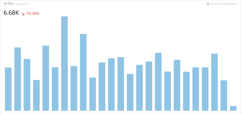
Though technically a vertical Bar graph, the Spark Bar graph is included here because it is vastly different in many respects from standard Bar graphs. This graph type is found in the **Other Charts** category in the Chart Picker.

<table border="1" cellpadding="1" cellspacing="1" data-aura-rendered-by="33:202;a"><thead><tr><th colspan="1" rowspan="1"><p> Chart Type </p></th><th colspan="1" rowspan="1"><p> Description </p></th><th colspan="1" rowspan="1"><p> Example </p></th></tr><tr><td colspan="1" rowspan="1"><p> Spark Bar graph </p><p><InlineImage src="/images/kb/ka0Vq000000CqxJ-00N5w00000Ri7BU-0EM5w000005vPFb.png" /></p></td><td colspan="1" rowspan="1"><p> A Spark Bar graph is essentially a Bar graph with no axes (providing a cleaner, uncluttered experience) and a built-in gauge that by default shows the degree of change between the first and last data points in the graph. Spark Bar graphs are excellent for quickly showing relative rises and falls in data over time. </p><p> For more information, see <a href="/s/article/360043429333" target="_blank" title="Spark Bar Graph"> Spark Bar Graph </a>. </p></td><td colspan="1" rowspan="1"><p><img alt="spark_bar_kpi_example.png" src="https://mintcdn.com/domoinc-openapi-sync-dataflows/WU9_nv8qBSXeO2YZ/images/kb/ka05w00000129w0-00N5w00000Ri7BU-0EM5w000005vOlC.png?fit=max&auto=format&n=WU9_nv8qBSXeO2YZ&q=85&s=6a168d3bab168afe47e79d14981176d6" width="800" height="377" data-path="images/kb/ka05w00000129w0-00N5w00000Ri7BU-0EM5w000005vOlC.png" /></p></td></tr></thead></table>