> ## Documentation Index
> Fetch the complete documentation index at: https://domoinc-openapi-sync-dataflows.mintlify.site/llms.txt
> Use this file to discover all available pages before exploring further.

# > Line Charts

export const InlineImage = ({src, alt = '', height = '1.6em'}) => {
  return <img noZoom src={src} alt={alt} style={{
    display: 'inline',
    verticalAlign: 'start',
    height: height,
    margin: '0'
  }} />;
};

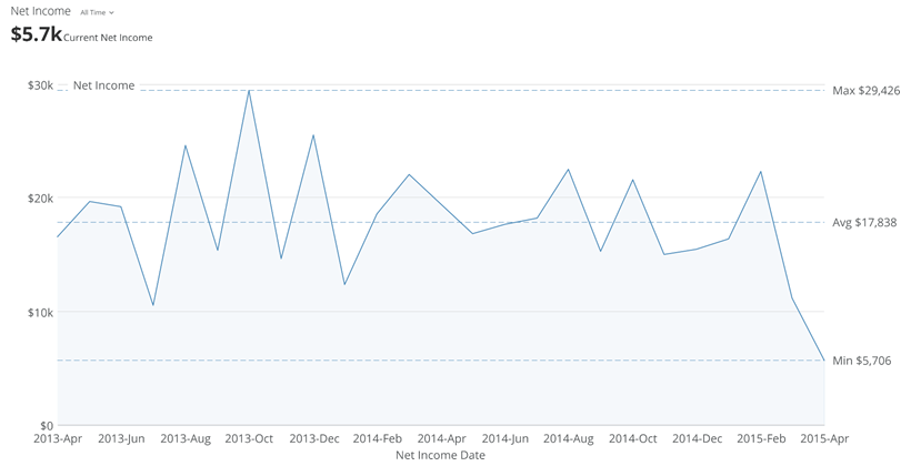
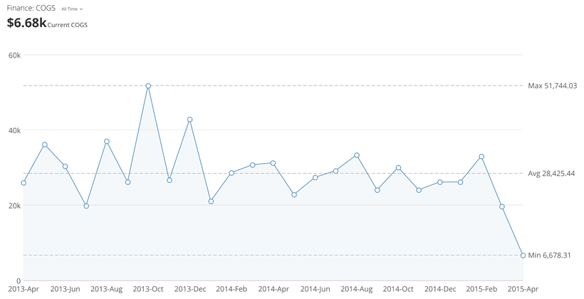
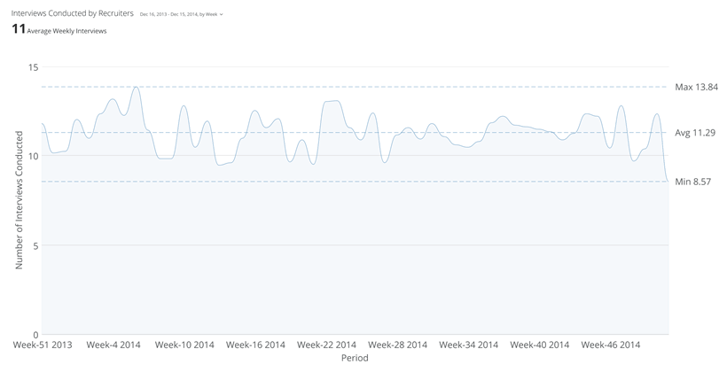
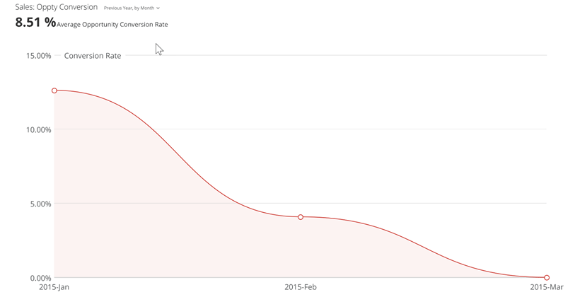
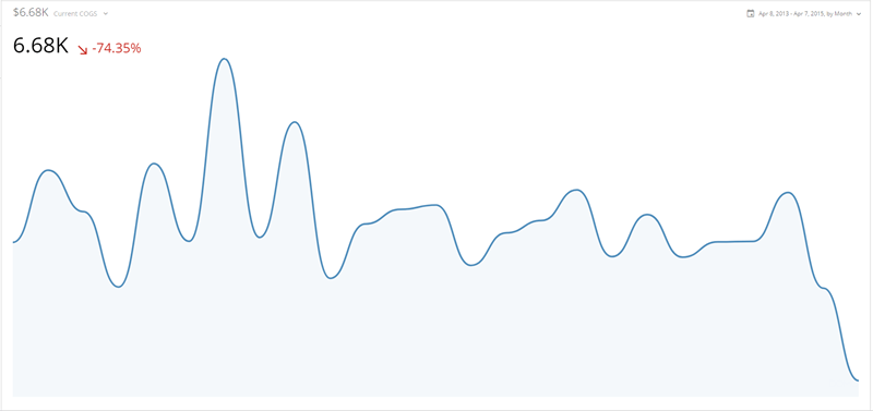
Line charts are most often used to represent trends over time. Data items in a line chart are represented by points, and these are connected by a line. Some types of line charts, such as grouped bar with line charts, combine lines with elements found in other types of charts.

The following tables list the types of line charts available in Domo. You can click a thumbnail image to see a larger image.

#### Horizontal line charts

Line charts are usually displayed with the line running left to right, with the value scale on the vertical axis and the category scale on the horizontal axis. There are 12 such chart types in Domo (counting 5 line-bar combination-type charts, which in the Chart Picker in Domo are found under the Bar charts section).

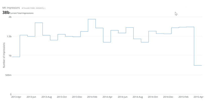
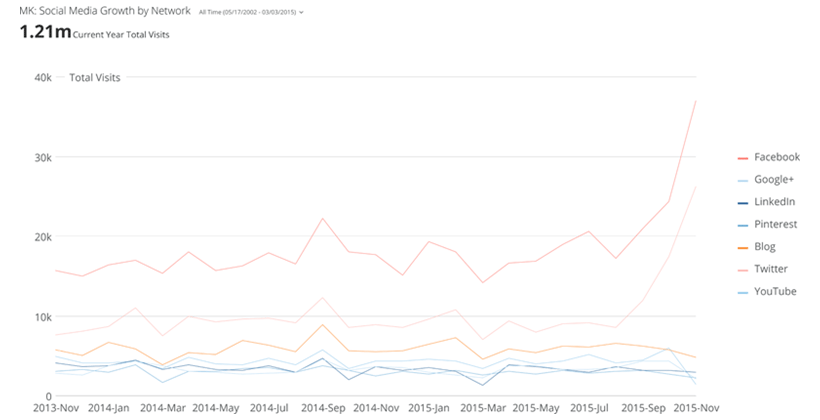
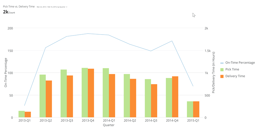
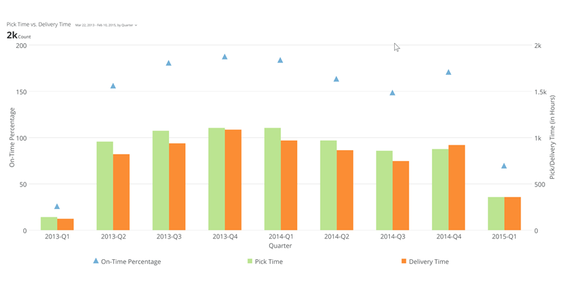
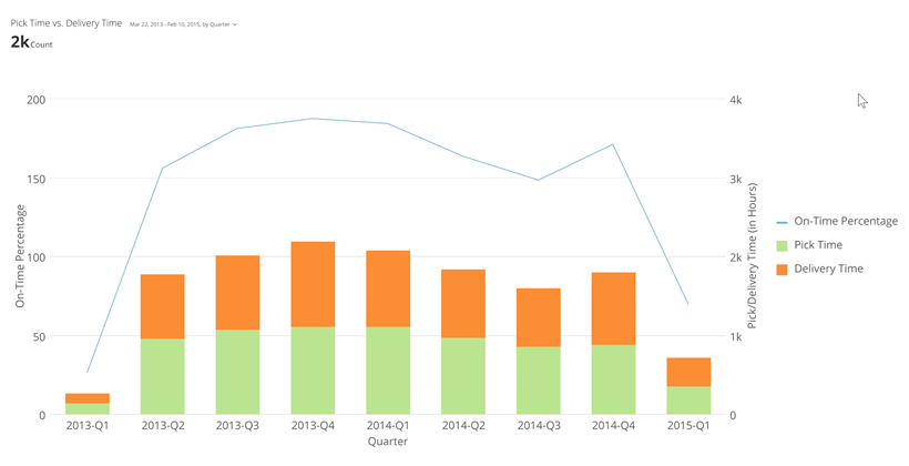
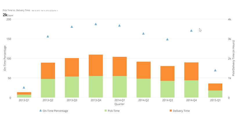
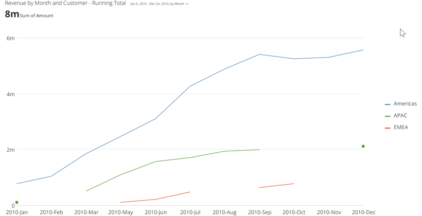
<table border="1" cellpadding="1" cellspacing="1" data-aura-rendered-by="33:202;a"><thead><tr><th colspan="1" rowspan="1"><p> Chart Type </p></th><th colspan="1" rowspan="1"><p> Description </p></th><th colspan="1" rowspan="1"><p> Example </p></th></tr></thead><tbody><tr><td colspan="1" rowspan="1"><p> Line chart </p><p><InlineImage src="/images/kb/ka0Vq000000CrBp-00N5w00000Ri7BU-0EM5w000005vPEy.png" /></p></td><td colspan="1" rowspan="1"><p> Basic line charts use a single trendline to display data. </p><p> For more information, see <a href="/s/article/360043429233" target="_self" title="Line Graph"> Line chart </a>. </p></td><td colspan="1" rowspan="1"><p><a target="_blank" title="line_kpi_example.png"><img alt="" src="https://mintcdn.com/domoinc-openapi-sync-dataflows/_XUBQXMuNz8Oy5Tm/images/kb/ka0Vq000000CrBp-00N5w00000Ri7BU-0EM5w000005vPEx.png?fit=max&auto=format&n=_XUBQXMuNz8Oy5Tm&q=85&s=8356b2ac01aaa968ebe6d10c0192e9a8" width="820" height="420" data-path="images/kb/ka0Vq000000CrBp-00N5w00000Ri7BU-0EM5w000005vPEx.png" /></a></p></td></tr><tr><td colspan="1" rowspan="1"><p> Symbol line chart </p><p><InlineImage src="/images/kb/ka0Vq000000CrBp-00N5w00000Ri7BU-0EM5w000005vPGu.png" /></p></td><td colspan="1" rowspan="1"><p> A symbol line chart is a sub-type of the basic line chart in which symbols are included at each data point. </p><p> For more information, see <a href="/s/article/360043429233" target="_self" title="Line Graph"> Line chart </a>. </p></td><td colspan="1" rowspan="1"><p><a target="_blank" title="line_symbol_kpi_example.png"><img alt="" src="https://mintcdn.com/domoinc-openapi-sync-dataflows/_XUBQXMuNz8Oy5Tm/images/kb/ka0Vq000000CrBp-00N5w00000Ri7BU-0EM5w000005vPGl.png?fit=max&auto=format&n=_XUBQXMuNz8Oy5Tm&q=85&s=873576e0f4688bd3d3aca4e16330cf0f" width="820" height="420" data-path="images/kb/ka0Vq000000CrBp-00N5w00000Ri7BU-0EM5w000005vPGl.png" /></a></p></td></tr><tr><td colspan="1" rowspan="1"><p> Curved line chart </p><p><InlineImage src="/images/kb/ka0Vq000000CrBp-00N5w00000Ri7BU-0EM5w000005vPGm.png" /></p></td><td colspan="1" rowspan="1"><p> A curved line chart is a sub-type of the basic line chart in which points are connected by curved lines instead of straight lines. </p><p> For more information, see <a href="/s/article/360043429233" target="_self" title="Line Graph"> Line chart </a>. </p></td><td colspan="1" rowspan="1"><p><a target="_blank" title="https://domo-prod.mindtouch.us/@api/deki/files/191/curved_line_kpi_example.png?origin=mt-web"><img alt="" src="https://mintcdn.com/domoinc-openapi-sync-dataflows/_XUBQXMuNz8Oy5Tm/images/kb/ka0Vq000000CrBp-00N5w00000Ri7BU-0EM5w000005vPH1.png?fit=max&auto=format&n=_XUBQXMuNz8Oy5Tm&q=85&s=404a6071acd95d619a0ab8f4316b5255" width="820" height="420" data-path="images/kb/ka0Vq000000CrBp-00N5w00000Ri7BU-0EM5w000005vPH1.png" /></a></p></td></tr><tr><td colspan="1" rowspan="1"><p> Curved symbol line chart </p><p><InlineImage src="/images/kb/ka0Vq000000CrBp-00N5w00000Ri7BU-0EM5w000005vPGp.png" /></p></td><td colspan="1" rowspan="1"><p> A curved symbol line chart is the same as a curved line chart except that it includes symbols at each data point. </p><p> For more information, see <a href="/s/article/360043429233" target="_self" title="Line Graph"> Line chart </a>. </p></td><td colspan="1" rowspan="1"><p><a target="_blank" title="https://domo-prod.mindtouch.us/@api/deki/files/193/curved_symbol_line_kpi_example.png?origin=mt-web"><img alt="" src="https://mintcdn.com/domoinc-openapi-sync-dataflows/_XUBQXMuNz8Oy5Tm/images/kb/ka0Vq000000CrBp-00N5w00000Ri7BU-0EM5w000005vPH3.png?fit=max&auto=format&n=_XUBQXMuNz8Oy5Tm&q=85&s=3e26484433286f02f676b99b49a4ab2d" width="820" height="420" data-path="images/kb/ka0Vq000000CrBp-00N5w00000Ri7BU-0EM5w000005vPH3.png" /></a></p></td></tr><tr><td colspan="1" rowspan="1"><p> Step line </p><p><InlineImage src="/images/kb/ka0Vq000000CrBp-00N5w00000Ri7BU-0EM5w000005vPH9.png" /></p></td><td colspan="1" rowspan="1"><p> A step line is a sub-type of the basic line chart in which step lines are used instead of straight lines. </p><p> For more information, see <a href="/s/article/360043429233" target="_self" title="Line Graph"> Line chart </a>. </p></td><td colspan="1" rowspan="1"><p><a target="_blank" title="https://domo-prod.mindtouch.us/@api/deki/files/1032/step_line_kpi_example.png?origin=mt-web"><img alt="" src="https://mintcdn.com/domoinc-openapi-sync-dataflows/_XUBQXMuNz8Oy5Tm/images/kb/ka0Vq000000CrBp-00N5w00000Ri7BU-0EM5w000005vPH6.png?fit=max&auto=format&n=_XUBQXMuNz8Oy5Tm&q=85&s=d42d198fa3e67a3ea779b588fc3f9b7a" width="820" height="420" data-path="images/kb/ka0Vq000000CrBp-00N5w00000Ri7BU-0EM5w000005vPH6.png" /></a></p></td></tr><tr><td colspan="1" rowspan="1"><p> Multi-line chart </p><p><InlineImage src="/images/kb/ka0Vq000000CrBp-00N5w00000Ri7BU-0EM5w000005vPGh.png" /></p></td><td colspan="1" rowspan="1"><p> A multi-line chart is a basic line chart with one or more additional lines that represent comparison trends. </p><p> For more information, see <a href="/s/article/360042924754" target="_self" title="Multi-Line Graph"> Multi-line chart </a>. </p></td><td colspan="1" rowspan="1"><p><a target="_blank" title="https://domo-prod.mindtouch.us/@api/deki/files/1037/two_trendline_example.png?origin=mt-web"><img alt="" src="https://mintcdn.com/domoinc-openapi-sync-dataflows/_XUBQXMuNz8Oy5Tm/images/kb/ka0Vq000000CrBp-00N5w00000Ri7BU-0EM5w000005vPH0.png?fit=max&auto=format&n=_XUBQXMuNz8Oy5Tm&q=85&s=be62d65839fa8b2d1bb937fb781a1c52" width="820" height="420" data-path="images/kb/ka0Vq000000CrBp-00N5w00000Ri7BU-0EM5w000005vPH0.png" /></a></p></td></tr><tr><td colspan="1" rowspan="1"><p> Grouped bar with line chart </p><p><InlineImage src="/images/kb/ka0Vq000000CrBp-00N5w00000Ri7BU-0EM5w000005vPGq.png" /></p></td><td colspan="1" rowspan="1"><p> A grouped bar with line chart is a combination of a line chart and a grouped bar chart. It includes two y-axes, one on each side of the chart. One of these is used to measure the values along the line, and the other is used to measure the values of the bars. This type of chart is useful in situations in which you need to show a trend along with the specific quantities or amounts associated with that trend. </p><p> For more information, see <a href="/s/article/360043429153" target="_self" title="Grouped Bar with Line Graph"> Grouped Bar with Line chart </a>. </p></td><td colspan="1" rowspan="1"><p><a target="_blank" title="line_bar_kpi_example.png"><img alt="" src="https://mintcdn.com/domoinc-openapi-sync-dataflows/-IX1yvR06x5dt-zq/images/kb/ka0Vq000000CqxJ-00N5w00000Ri7BU-0EM5w000005vPF7.png?fit=max&auto=format&n=-IX1yvR06x5dt-zq&q=85&s=de02aaacb048a38e45ccd0fde8dc84e3" width="820" height="420" data-path="images/kb/ka0Vq000000CqxJ-00N5w00000Ri7BU-0EM5w000005vPF7.png" /></a></p></td></tr><tr><td colspan="1" rowspan="1"><p> Grouped bar with symbols chart </p><p><InlineImage src="/images/kb/ka0Vq000000CrBp-00N5w00000Ri7BU-0EM5w000005vPH2.png" /></p><p /></td><td colspan="1" rowspan="1"><p> A grouped bar with symbols chart is the same as a grouped bar with line chart, except that it includes symbols instead of lines. </p><p> For more information, see <a href="/s/article/360043429153" target="_self" title="Grouped Bar with Line Graph"> Grouped Bar with Line chart </a>. </p></td><td colspan="1" rowspan="1"><p><a target="_blank" title="symbol_bar_kpi_example.png"><img alt="" src="https://mintcdn.com/domoinc-openapi-sync-dataflows/_XUBQXMuNz8Oy5Tm/images/kb/ka0Vq000000CqxJ-00N5w00000Ri7BU-0EM5w000005vPG5.png?fit=max&auto=format&n=_XUBQXMuNz8Oy5Tm&q=85&s=e18df880588db48448135af1cd385f49" width="820" height="420" data-path="images/kb/ka0Vq000000CqxJ-00N5w00000Ri7BU-0EM5w000005vPG5.png" /></a></p></td></tr><tr><td colspan="1" rowspan="1"><p> Stacked bar with line chart </p><p><InlineImage src="/images/kb/ka0Vq000000CrBp-00N5w00000Ri7BU-0EM5w000005vPGy.png" /></p></td><td colspan="1" rowspan="1"><p> A stacked bar with line chart combines the features of a line chart and a vertical stacked bar chart. There are two y-axes, one on the left and the other on the right. The y-axis on the left measures the values along the line, and the one on the right measures the values of the bars. </p><p> For more information, see <a href="/s/article/360043428053" target="_blank" title="Stacked Bar with Line Graph"> Stacked Bar with Line chart </a>. </p></td><td colspan="1" rowspan="1"><p><a target="_blank" title="/@api/deki/files/746/line_stacked_bar_kpi_example.png"><img alt="" src="https://mintcdn.com/domoinc-openapi-sync-dataflows/-IX1yvR06x5dt-zq/images/kb/ka0Vq000000CqxJ-00N5w00000Ri7BU-0EM5w000005vPF4.png?fit=max&auto=format&n=-IX1yvR06x5dt-zq&q=85&s=002b71706d4dbf67f955bdfcc39e26dd" width="820" height="420" data-path="images/kb/ka0Vq000000CqxJ-00N5w00000Ri7BU-0EM5w000005vPF4.png" /></a></p></td></tr><tr><td colspan="1" rowspan="1"><p> Stacked bar with symbols chart </p><p><InlineImage src="/images/kb/ka0Vq000000CrBp-00N5w00000Ri7BU-0EM5w000005vPGn.png" /></p></td><td colspan="1" rowspan="1"><p> A stacked bar with symbols chart is the same as a stacked bar with line chart, except that it includes symbols instead of lines. </p><p> For more information, see <a href="/s/article/360043428053" target="_blank" title="Stacked Bar with Line Graph"> Stacked Bar with Line chart </a>. </p></td><td colspan="1" rowspan="1"><p><a target="_blank" title="/@api/deki/files/1033/stacked_symbol_kpi_example.png"><img alt="" src="https://mintcdn.com/domoinc-openapi-sync-dataflows/_XUBQXMuNz8Oy5Tm/images/kb/ka0Vq000000CqxJ-00N5w00000Ri7BU-0EM5w000005vPGO.png?fit=max&auto=format&n=_XUBQXMuNz8Oy5Tm&q=85&s=3119de4d520872f234802fcea0dee919" width="820" height="420" data-path="images/kb/ka0Vq000000CqxJ-00N5w00000Ri7BU-0EM5w000005vPGO.png" /></a></p></td></tr><tr><td colspan="1" rowspan="1"><p> Grouped and stacked bar with line chart </p><p><InlineImage src="/images/kb/ka0Vq000000CrBp-00N5w00000Ri7BU-0EM5w000005vPGr.png" /></p></td><td colspan="1" rowspan="1"><p> A grouped and stacked bar with line chart is a combination of a vertical grouped and stacked bar chart and a stacked bar with line chart. As in a stacked bar with line chart, two value scales are present and series can appear as either lines or bars; this chart type also gives you the ability to divide series segments between bars, as in a grouped and stacked bar chart. As with standard grouped and stacked bar charts, this chart type is useful when you want to compare a primary series against several secondary series; however, because it includes a trendline, it is more compatible with time-series data than a regular grouped and stacked bar chart. </p><p> For more information, see <a href="/s/article/360042924594" target="_self" title="Grouped and Stacked Bar with Line Graph"> Grouped and Stacked Bar with Line chart </a>. </p></td><td colspan="1" rowspan="1"><p><a target="_blank" title="/@api/deki/files/821/multistacked_line_kpi_example.png"><img alt="" src="https://mintlify.s3.us-west-1.amazonaws.com/domoinc-openapi-sync-dataflows/images/kb/ka0Vq000000CqxJ-00N5w00000Ri7BU-0EM5w000005vPFi.png" /></a></p></td></tr><tr><td colspan="1" rowspan="1"><p> Running total line chart </p><p><InlineImage src="/images/kb/ka0Vq000000CrBp-00N5w00000Ri7BU-0EM5w000005vPEw.png" /></p></td><td colspan="1" rowspan="1"><p> In a running total line chart, each data point shows the cumulative value of all data points up to that point. If more than one series is present, each series displays as its own individual line. </p><p> For more information, see <a href="/s/article/360043429253" target="_blank" title="Running Total Line Graph"> Running Total Line chart </a>. </p></td><td colspan="1" rowspan="1"><p><a target="_blank" title="/@api/deki/files/1023/running_total_line_kpi_example.png"><img alt="" src="https://mintcdn.com/domoinc-openapi-sync-dataflows/_XUBQXMuNz8Oy5Tm/images/kb/ka0Vq000000CrBp-00N5w00000Ri7BU-0EM5w000005vPGx.png?fit=max&auto=format&n=_XUBQXMuNz8Oy5Tm&q=85&s=b3cf1ec3e9ef280879c12c5fa72a010d" width="820" height="420" data-path="images/kb/ka0Vq000000CrBp-00N5w00000Ri7BU-0EM5w000005vPGx.png" /></a></p></td></tr></tbody></table>

#### Vertical line charts

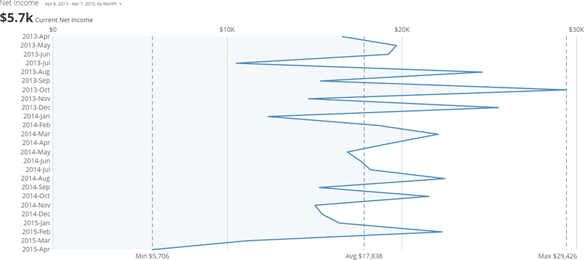
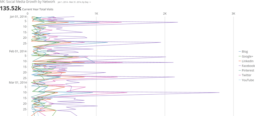
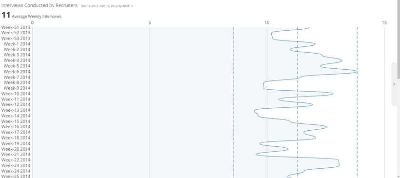
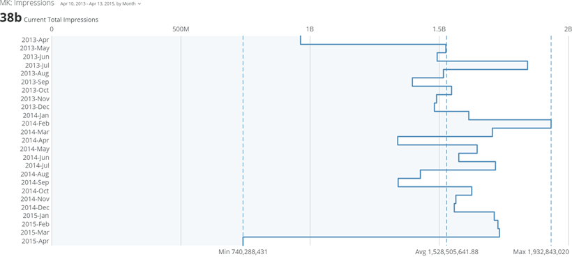
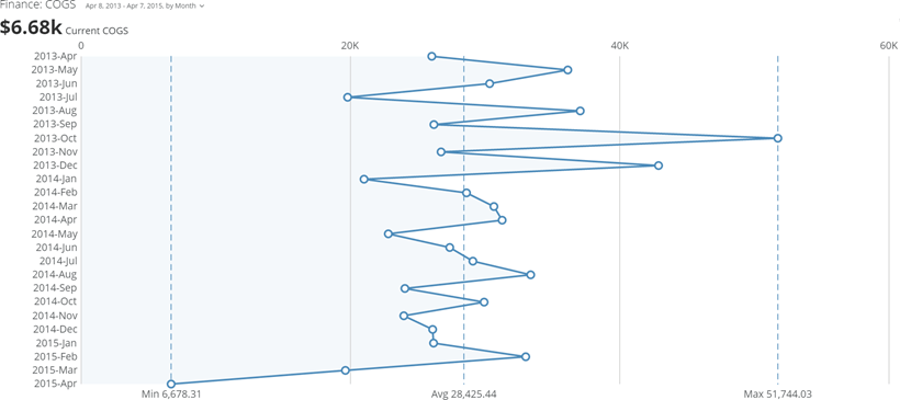
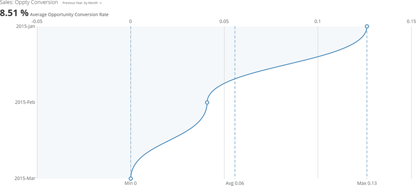
Less commonly, line charts can be displayed with values on the horizontal axis and categories on the vertical axis. If the chart exceeds the vertical confines of the display area, scroll bars appear so users can scroll to see more of the chart. There are 5 types of vertical line charts in Domo.

<table border="1" cellpadding="1" cellspacing="1" data-aura-rendered-by="33:202;a"><thead><tr><th colspan="1" rowspan="1"><p> Chart Type </p></th><th colspan="1" rowspan="1"><p> Description </p></th><th colspan="1" rowspan="1"><p> Example </p></th></tr><tr><td colspan="1" rowspan="1"><p> Vertical line chart </p><p><InlineImage src="/images/kb/ka0Vq000000CrBp-00N5w00000Ri7BU-0EM5w000005vPH5.png" /></p></td><td colspan="1" rowspan="1"><p> A vertical line chart includes one or more lines that represent comparison trends. The chart in the first example includes only one trendline so the chart appears solid blue. The chart in the second example includes multiple lines. </p><p> For more information, see <a href="/s/article/360043429233" target="_self" title="Line Graph"> Line chart </a>. </p></td><td colspan="1" rowspan="1"><p><a target="_blank" title="/@api/deki/files/3333/vertical_line_kpi_example.png"><img alt="" src="https://mintcdn.com/domoinc-openapi-sync-dataflows/1pUbNiMC_kZqIvej/images/kb/ka05w00000129vL-00N5w00000Ri7BU-0EM5w000005vOmP.png?fit=max&auto=format&n=1pUbNiMC_kZqIvej&q=85&s=9eba412b2e9e96d5eff5fc3289441b13" width="820" height="366" data-path="images/kb/ka05w00000129vL-00N5w00000Ri7BU-0EM5w000005vOmP.png" /></a></p><p><a target="_blank" title="/@api/deki/files/3338/vertical_multiline_kpi_example.png"><img alt="vertical_multiline_kpi_example.png" src="https://mintcdn.com/domoinc-openapi-sync-dataflows/_XUBQXMuNz8Oy5Tm/images/kb/ka0Vq000000CrBp-00N5w00000Ri7BU-0EM5w000005vPHA.png?fit=max&auto=format&n=_XUBQXMuNz8Oy5Tm&q=85&s=45de790b842c2da37ed53bfd114184f5" width="820" height="375" data-path="images/kb/ka0Vq000000CrBp-00N5w00000Ri7BU-0EM5w000005vPHA.png" /></a></p></td></tr><tr><td colspan="1" rowspan="1"><p> Vertical curved line chart </p><p><InlineImage src="/images/kb/ka0Vq000000CrBp-00N5w00000Ri7BU-0EM5w000005vPHE.png" /></p></td><td colspan="1" rowspan="1"><p> A vertical curved line chart is a sub-type of the basic vertical line chart in which points are connected by curved lines instead of straight lines. </p><p> For more information, see <a href="/s/article/360043429233" target="_self" title="Line Graph"> Line chart </a>. </p></td><td colspan="1" rowspan="1"><p><a target="_blank" title="/@api/deki/files/3334/vertical_line_curved_kpi_example.png"><img alt="vertical_line_curved_kpi_example.png" src="https://mintcdn.com/domoinc-openapi-sync-dataflows/_XUBQXMuNz8Oy5Tm/images/kb/ka0Vq000000CrBp-00N5w00000Ri7BU-0EM5w000005vPGw.png?fit=max&auto=format&n=_XUBQXMuNz8Oy5Tm&q=85&s=3388decfe4f0d81b816af96a55493fe3" width="820" height="365" data-path="images/kb/ka0Vq000000CrBp-00N5w00000Ri7BU-0EM5w000005vPGw.png" /></a></p></td></tr><tr><td colspan="1" rowspan="1"><p> Vertical step line chart </p><p><InlineImage src="/images/kb/ka0Vq000000CrBp-00N5w00000Ri7BU-0EM5w000005vPGs.png" /></p></td><td colspan="1" rowspan="1"><p> A vertical step line chart is a sub-type of the basic line chart in which step lines are used instead of straight lines. </p><p> For more information, see <a href="/s/article/360043429233" target="_self" title="Line Graph"> Line chart </a>. </p></td><td colspan="1" rowspan="1"><p><a target="_blank" title="/@api/deki/files/3335/vertical_line_step_kpi_example.png"><img alt="vertical_line_step_kpi_example.png" src="https://mintcdn.com/domoinc-openapi-sync-dataflows/_XUBQXMuNz8Oy5Tm/images/kb/ka0Vq000000CrBp-00N5w00000Ri7BU-0EM5w000005vPHC.png?fit=max&auto=format&n=_XUBQXMuNz8Oy5Tm&q=85&s=51fd1dc46edbae0bb11411a6b0f165f4" width="820" height="371" data-path="images/kb/ka0Vq000000CrBp-00N5w00000Ri7BU-0EM5w000005vPHC.png" /></a></p></td></tr><tr><td colspan="1" rowspan="1"><p> Vertical symbol line chart </p><p><InlineImage src="/images/kb/ka0Vq000000CrBp-00N5w00000Ri7BU-0EM5w000005vPH8.png" /></p></td><td colspan="1" rowspan="1"><p> A vertical symbol line chart is a sub-type of the basic vertical line chart in which symbols are included at each data point. </p><p> For more information, see <a href="/s/article/360043429233" target="_self" title="Line Graph"> Line chart </a>. </p></td><td colspan="1" rowspan="1"><p><a target="_blank" title="/@api/deki/files/3336/vertical_line_symbol_kpi_example.png"><img alt="vertical_line_symbol_kpi_example.png" src="https://mintcdn.com/domoinc-openapi-sync-dataflows/_XUBQXMuNz8Oy5Tm/images/kb/ka0Vq000000CrBp-00N5w00000Ri7BU-0EM5w000005vPGi.png?fit=max&auto=format&n=_XUBQXMuNz8Oy5Tm&q=85&s=271411705c6d8e20f12f9b25527abd08" width="820" height="365" data-path="images/kb/ka0Vq000000CrBp-00N5w00000Ri7BU-0EM5w000005vPGi.png" /></a></p></td></tr><tr><td colspan="1" rowspan="1"><p> Vertical curved symbol line chart </p><p><InlineImage src="/images/kb/ka0Vq000000CrBp-00N5w00000Ri7BU-0EM5w000005vPGz.png" /></p></td><td colspan="1" rowspan="1"><p> A vertical curved symbol line chart is the same as a vertical curved line chart except that it includes symbols at each data point. </p><p> For more information, see <a href="/s/article/360043429233" target="_self" title="Line Graph"> Line chart </a>. </p></td><td colspan="1" rowspan="1"><p><a target="_blank" title="/@api/deki/files/3337/vertical_line_curved_symbol_kpi_example.png"><img alt="vertical_line_curved_symbol_kpi_example.png" src="https://mintcdn.com/domoinc-openapi-sync-dataflows/_XUBQXMuNz8Oy5Tm/images/kb/ka0Vq000000CrBp-00N5w00000Ri7BU-0EM5w000005vPGv.png?fit=max&auto=format&n=_XUBQXMuNz8Oy5Tm&q=85&s=0df1b74de4754eae9cc514569df4a1e6" width="820" height="366" data-path="images/kb/ka0Vq000000CrBp-00N5w00000Ri7BU-0EM5w000005vPGv.png" /></a></p></td></tr></thead></table>

#### Miscellaneous line charts

Though technically a horizontal line chart, the spark line chart is included here because it is vastly different in many respects from standard line charts. This chart type is found in the **Other Charts** category in the Chart Picker.

<table border="1" cellpadding="1" cellspacing="1" data-aura-rendered-by="33:202;a"><thead><tr><th colspan="1" rowspan="1"><p> Chart Type </p></th><th colspan="1" rowspan="1"><p> Description </p></th><th colspan="1" rowspan="1"><p> Example </p></th></tr><tr><td colspan="1" rowspan="1"><p> Spark line chart </p><p><InlineImage src="/images/kb/ka0Vq000000CrBp-00N5w00000Ri7BU-0EM5w000005vPGt.png" /></p></td><td colspan="1" rowspan="1"><p> A spark line chart is essentially a line chart with no axes (providing a cleaner, uncluttered experience) and a built-in gauge that by default shows the degree of change between the first and last data points in the chart. Spark line charts are excellent for quickly showing relative rises and falls in data over time. </p><p> For more information, see <a href="/s/article/360043429353" target="_blank" title="Spark Line Graph"> Spark line chart </a>. </p></td><td colspan="1" rowspan="1"><p><a target="_blank" title="/@api/deki/files/5436/spark_line_kpi_example.png"><img alt="spark_line_kpi_example.png" src="https://mintcdn.com/domoinc-openapi-sync-dataflows/1pUbNiMC_kZqIvej/images/kb/ka05w00000129vu-00N5w00000Ri7BU-0EM5w000005wKj3.png?fit=max&auto=format&n=1pUbNiMC_kZqIvej&q=85&s=4174eb1593ad7a63248ced331c839459" width="800" height="377" data-path="images/kb/ka05w00000129vu-00N5w00000Ri7BU-0EM5w000005wKj3.png" /></a></p></td></tr></thead></table>