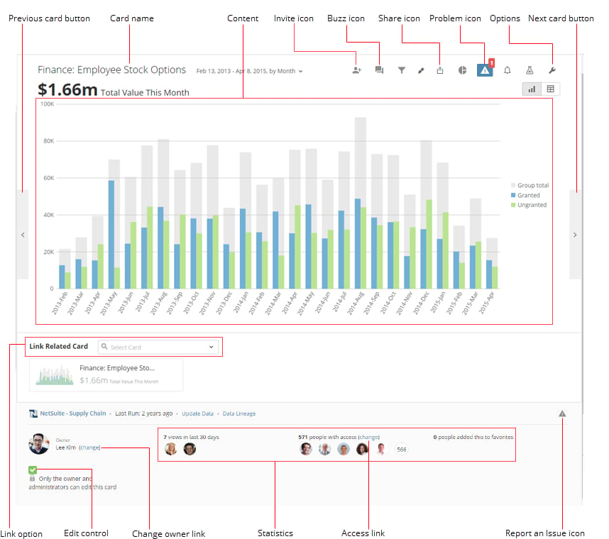
 You can learn more about these components and options in the following table:
Name | Description |
|---|---|
Previous Card button | Opens the Details view for the previous Card on the page. When you mouse over the icon, a thumbnail image of the previous Card appears. |
Card name | The name of this Card. The process for naming a Card depends on the Card type. For example, for a Visualization Card, you specify the name of the Card in Analyzer; for a Doc Card, the original filename is used unless you indicate a custom name; for a notebook Card, you specify a name when you create the Card; and so on. If you click the name of a Card, you can view its description (if one has been given) along with a list of pages the Card is found in. For information about changing the name of a Visualization Card, see Editing the Name or Description of a Visualization Card . |
Content | Shows the actual data represented on this Card. You may be able to interact with the content, depending on the Card type. |
| Invite icon | Lets you share this Card with specified team members and invite them to join Domo, all in a single action. If you do not have share access for this Card, the button only allows you to invite users, not share the Card. For more information, see Inviting Others to Join Domo . |
| Buzz icon | Opens the Buzz channel for this Card. For more information, see Chatting in Buzz . |
| Share icon | Provides access to share options for this Card:
For more information about sharing access, see Exporting Visualization Cards . |
Problem icon | Opens the Issues Reported tab for this chart. In this tab, you can read about reported issues, report new issues, and mark issues as resolved. For more information, see Reporting Issues with Cards . |
Options icon | Displays a menu of options for this Card, such as Share , Follow on Buzz , and so on. For more information about these options, see Details view Options menu . |
Next Card button | Opens the Details view for the next Card on the page. When you mouse over the icon, a thumbnail image of the next Card appears. |
Link option | Allows you to create a link between this Details view and the Details view for another Card. For more information, see Linking Related Cards . |
Edit control | Allows you to restrict editing to the Card owner and users with an "Admin" default security role or a custom role with the Manage All Cards, Pages and Apps (App Studio) grant enabled. If you do not meet any of these criteria, the checkbox and accompanying text do not appear. For more information, see Restricting Edit Capability for a Card . |
Change owner link | Allows you to change the owner assigned to this Card. If the Card is a template Card that has not yet been assigned an owner, this link reads Assign an owner to this Card . For more information, see Assigning or Changing a Card Owner . |
Statistics | Provides statistics for the number of times the Details page has been viewed in the Domo product, including Embed views, since Card creation. Statistics also displays the number of users who have access to this Card and the who have added the Card to their Favorites. |
Access link | Allows you to specify who has access to this Card. For more information, see Sharing and Removing Access to Content . |
Report an Issue icon | Allows you to write a description of an issue in this Card and send it to the Card owner and any followers via email/text. The report message is also posted to Buzz. When a Card has reported issues, a warning icon appears on the Card. You can click the warning icon to view the Issues Reported tab of the Details view. For more information, see Reporting Issues with Cards . |
Name | Description |
|---|---|
Map zoom buttons | Allow you to zoom in and out of maps. You can also pan across a map by clicking on the map and dragging. |
Map cities toggle | Hides or shows cities in geographical maps. When this is turned on, you can progressively show more cities by zooming in closer and closer on the map. |
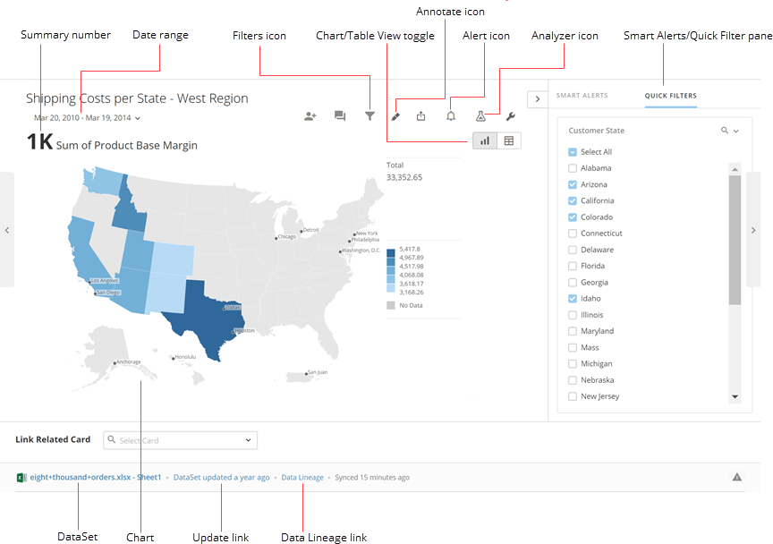 (For information about the toolbar icons not called out in the preceding screenshot, see [General Details view layout](#h_12b20538-0f15-4647-af7d-cbc0a69685bb "#General_Details_view_layout").)
You can learn more about these components and options in the following table:
(For information about the toolbar icons not called out in the preceding screenshot, see [General Details view layout](#h_12b20538-0f15-4647-af7d-cbc0a69685bb "#General_Details_view_layout").)
You can learn more about these components and options in the following table:
Name | Description |
|---|---|
| Summary number | The single value in a chart that best represents the data in that chart. For more information about configuring summary numbers, see Configuring Your Chart Summary Number . |
Date range | The period of time and date grain (that is, the unit of time by which the data is shown) represented by the data in this chart. A date range appears only if the chart is powered by a date column. You can change the date range in the Details view by clicking on the range and selecting the desired Filter from the list. For more information about implementing a date range and/or grain in a chart, see Adding Filters to Your Chart . |
Filters icon | Opens the Filters tab for this chart. In this tab, you can add, edit, or remove Filters for the chart. For more information, see Filtering Data in a Card Details View . |
Chart/Table view toggle | Switches between the Chart and Table views for this Details view. |
Annotate icon | Provides access to annotation options for this Card. These options are as follows:
|
Alert icon | Opens the Alerts tab. In this tab, you can set, edit, and delete alerts. For more information, see Notifications and Alerts . |
Analyzer icon | Opens the Analyzer view for this Visualization Card. In this view you can edit various details of the Card, such as applied columns, chart properties, filters, sorts, Beast Mode calculations, color rules, and more. You can also open the Analyzer view by selecting Edit in Analyzer in the |
| Quick Filters pane | If this pane is not open, you can open it by selecting Here you can view any Quick Filters that have been added to this Visualization Card. Quick Filters are pre-defined filters you can use to create a self-guided experience for others to explore data on a Card and answer questions for themselves. Any user who opens the Details view for this Card can show or hide columns quickly and easily just by checking or unchecking the boxes for those columns in the Quick Filter pane. For more information, see Applying Quick Filters . |
DataSet | Indicates the name of a DataSet being used to power this Card. If a Card is being powered by multiple DataSets, all of these DataSets appear in the Details view. You can click the name of a DataSet to see the details for that DataSet in the Data Center. |
Chart | Represents your data as a graph, table, or map. You can click graph elements such as bars, line points, or pie wedges to see the data filtered for those elements or to see any drill path layers. For more information, see Drilling into Data . |
Update link | Allows you to update the DataSet for this chart. For more information, see Updating or Refreshing the DataSet for a Visualization Card . |
| Data Lineage link | Opens the Data Lineage for this chart. This shows you all of the DataSets being used to power this chart and their relationships with each other. For more information, see Viewing the Lineage of a DataSet in Analyzer . |
Name | Description |
|---|---|
Chart picker icon | Lets you change the chart type for the currently displayed chart without having to first open Analyzer. In contrast to the chart type picker in Analyzer, which only shows icons for each chart type, the Details view chart type picker shows you actual thumbnail versions of each available chart type with your chart data applied. The chart type picker only displays thumbnails for chart types that are compatible with your data. If your chart has a chart type not compatible with any other charts (such as a Calendar chart), the |
Edit in Analyzer option | A |
History option | A |
PDP (Personalized Data Permissions) | If PDP (Personalized Data Permissions) has been set on the DataSet powering this Card, a |
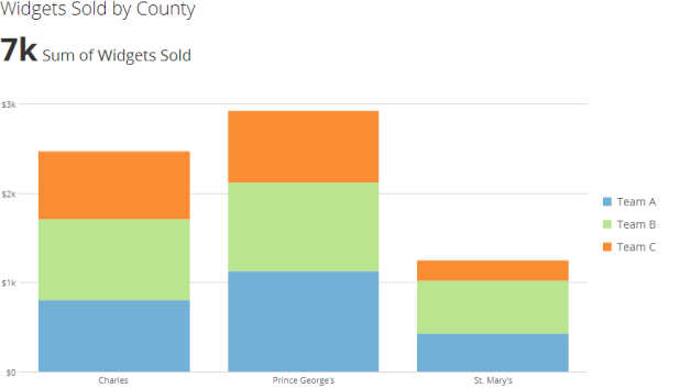 In most Visualization Cards, you can drill down on any chart element (bar, pie wedge, state, etc.) to see the data filtered for that chart element. If a Card has drill path layers, you can click a chart element to drill down to see underlying data for the associated column. For more information about adding a drill path, see [Drilling into Data](/s/article/360042923994 "Adding Drill Path to Your Chart").
You can also add Filters to the chart data while in this view. For more information, see [Filtering Data in a Card Details View](/s/article/360042924014 "Filtering Data in a Card Details View").
In the **Chart** view (and also in the **Table** view, described in the next section), you can access tabs with different functionality. These include the **Filters**, **Issues Reported**, and **Alerts** tabs. You can open a tab by clicking its link in the top right corner of the screen.
##### Filters tab
When you click
In most Visualization Cards, you can drill down on any chart element (bar, pie wedge, state, etc.) to see the data filtered for that chart element. If a Card has drill path layers, you can click a chart element to drill down to see underlying data for the associated column. For more information about adding a drill path, see [Drilling into Data](/s/article/360042923994 "Adding Drill Path to Your Chart").
You can also add Filters to the chart data while in this view. For more information, see [Filtering Data in a Card Details View](/s/article/360042924014 "Filtering Data in a Card Details View").
In the **Chart** view (and also in the **Table** view, described in the next section), you can access tabs with different functionality. These include the **Filters**, **Issues Reported**, and **Alerts** tabs. You can open a tab by clicking its link in the top right corner of the screen.
##### Filters tab
When you click 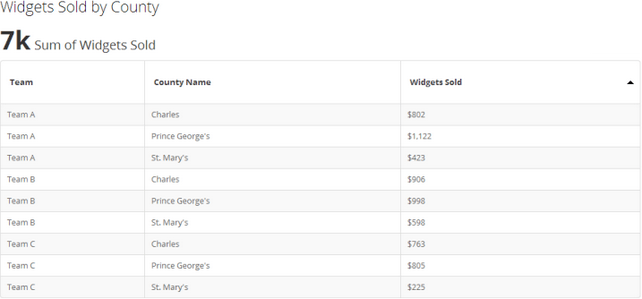 The column header labels that appear in this view are the same as those in the DataSet powering the Card. However, you can change the column header labels in the **Edit** view for the Card. For more information, see [Editing the Column Header Labels for Your Chart Table View](/s/article/360042924194 "Editing the Column Header Labels for Your Chart Table View").
You can change the sorting for any column in the table by clicking the up or down arrow to the right of a column heading. For example, in the table in the preceding screenshot, clicking the arrow to the right of "Widgets Sold" would cause the numerical data to be sorted from high to low.
#### Analyzer
In the **Analyzer** view, you can change elements of the Visualization Card, such as its name, description, chart type, applied DataSet columns, Filters, and sorting criteria. For more information about the **Analyzer** view, see [Analyzer Layout](/s/article/360042924034 "Card Builder Layout").
This view is only accessible by users with "Admin," "Privileged," or "Editor" default security roles OR a custom security role with the "Edit Cards" privilege enabled. For more information about default security roles, see [Managing Custom Roles](/s/article/360043438973).
#### History view
In the **History** view, you can see all past versions of this Visualization Card. A new version is created every time you save the Card. When you open this view, a list of versions is shown, with the specific changes for each version. Also, if the updating user added a comment to explain why certain changes were made, the comment is shown as well.
The column header labels that appear in this view are the same as those in the DataSet powering the Card. However, you can change the column header labels in the **Edit** view for the Card. For more information, see [Editing the Column Header Labels for Your Chart Table View](/s/article/360042924194 "Editing the Column Header Labels for Your Chart Table View").
You can change the sorting for any column in the table by clicking the up or down arrow to the right of a column heading. For example, in the table in the preceding screenshot, clicking the arrow to the right of "Widgets Sold" would cause the numerical data to be sorted from high to low.
#### Analyzer
In the **Analyzer** view, you can change elements of the Visualization Card, such as its name, description, chart type, applied DataSet columns, Filters, and sorting criteria. For more information about the **Analyzer** view, see [Analyzer Layout](/s/article/360042924034 "Card Builder Layout").
This view is only accessible by users with "Admin," "Privileged," or "Editor" default security roles OR a custom security role with the "Edit Cards" privilege enabled. For more information about default security roles, see [Managing Custom Roles](/s/article/360043438973).
#### History view
In the **History** view, you can see all past versions of this Visualization Card. A new version is created every time you save the Card. When you open this view, a list of versions is shown, with the specific changes for each version. Also, if the updating user added a comment to explain why certain changes were made, the comment is shown as well.
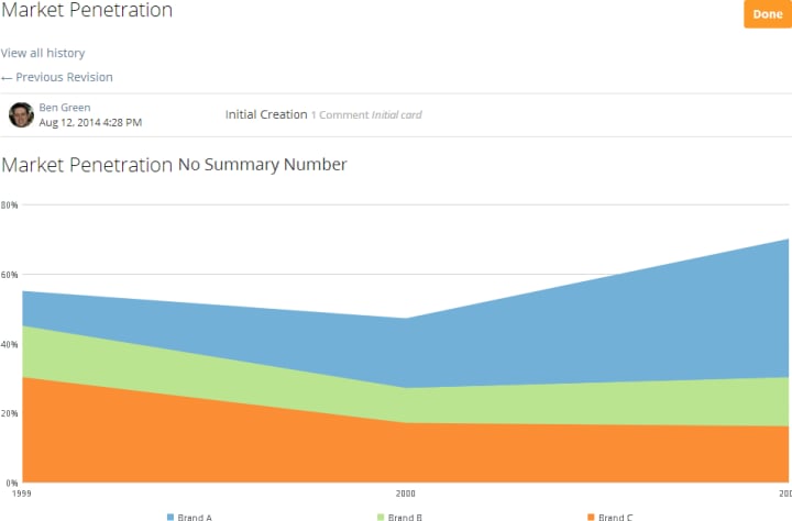
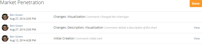 When you click **View** for a version of the Visualization Card in the list, that version displays. While in this mode, you can see the previous or next version in the list by clicking **Previous revision** or **Next revision**, respectively. You can return to the version listing by clicking **View all history**.
 ## Doc Card Details view
In the Details view for a Doc Card, you have access to many options not available in Details views for other Card types. For example, you can
* download the document,
* edit the name and description for the document,
* see the upload history for the document,
* view and download old versions of the document,
* refresh the source file, and
* open the document in a "reading view" that provides easier readability and navigation.
The following screenshot shows components and options in the Doc Card Details view layout not found in Details views for other Card types:
## Doc Card Details view
In the Details view for a Doc Card, you have access to many options not available in Details views for other Card types. For example, you can
* download the document,
* edit the name and description for the document,
* see the upload history for the document,
* view and download old versions of the document,
* refresh the source file, and
* open the document in a "reading view" that provides easier readability and navigation.
The following screenshot shows components and options in the Doc Card Details view layout not found in Details views for other Card types:
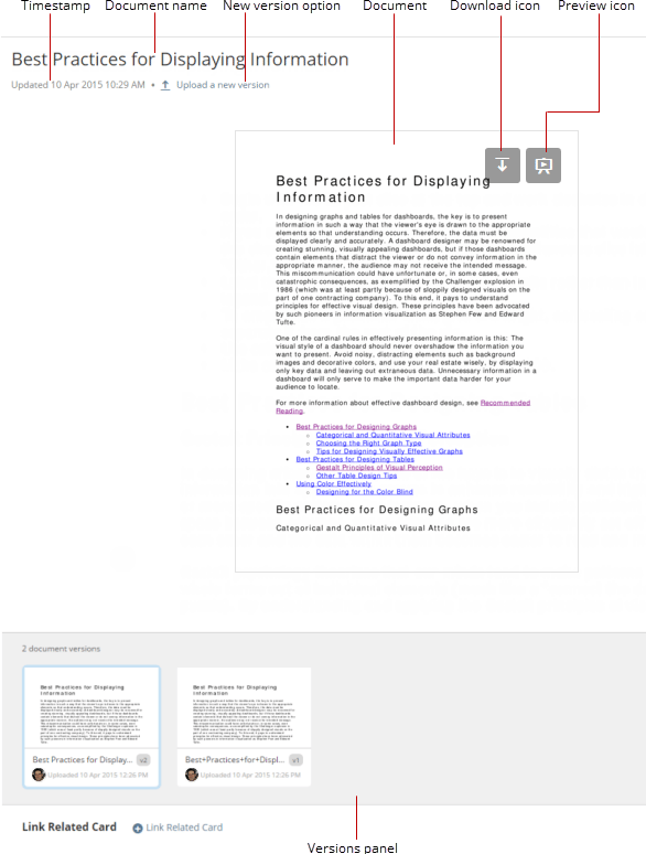 You can learn more about these components and options in the following table:
Name | Description |
|---|---|
Timestamp | Shows the date and time when this document was last updated. |
Document name | Shows the name of this document. You can rename the document by clicking the name and typing the new name. |
New version option | Allows you to upload a new version of this document. All versions of a document appear as thumbnails in the Versions panel. For more information, see Updating a Doc Card . |
Document | The uploaded document or image. If the document consists of more than one page, you can navigate between pages using the navigation buttons that appear when you mouse over the document. |
Download icon | Lets you download this document to your own computer. If you select a non-current version of the document in the Versions panel, this is the version that is downloaded when you click this icon. For more information, see Downloading a Document from Domo . |
| Preview icon | Opens the preview mode for this document. For more information, see Previewing a Document . |
Versions panel | Displays all versions of this document as thumbnails. When you click any version of the document in this panel, that version replaces the one currently appearing in this page. However, if you leave the Details view, the current version of the document is restored. You can open or close the Versions panel using |
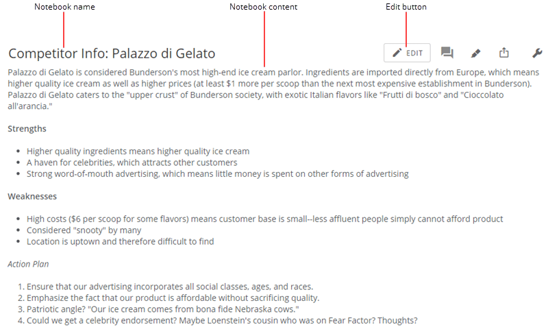 You can learn more about these components and options in the following table:
Name | Description |
|---|---|
Notebook name | The name of this Notebook. By default the name of a Notebook is (Creator)'s Notebook (date) , but if you are the Card owner you can change the name by clicking and editing the text. If you are not the Card owner, you cannot edit the name. |
Notebook content | The text for this Notebook. If you are the Card owner, you can edit the text by clicking anywhere within it and making your changes. If you are not the Card owner, you cannot edit the text. |
Edit button | Allows you to open the edit view for the Notebook. For information about the available edit options, see Adding a Notebook Card . |
 You can learn more about these components and options in the following table:
Name | Description |
|---|---|
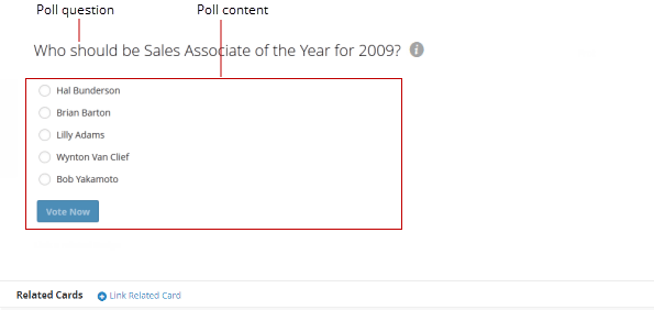
Poll question | The question for this poll, which also functions as the name. You can click the question to see the pages in which the poll Card is found. |
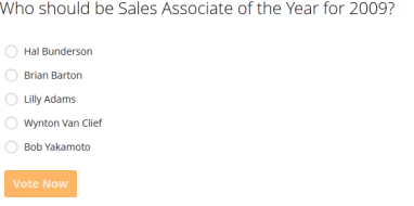
Poll content | The content of the poll. The preceding screenshot shows the content for the Chart view, which differs depending on whether you have already voted in the poll. |
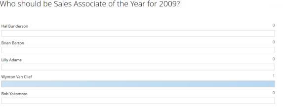
 If you have already voted, this view shows the results of the poll up to this point. This is the view that is shown in the following screenshot.
 #### Edit view
You can access the **Edit** view in the
#### Edit view
You can access the **Edit** view in the 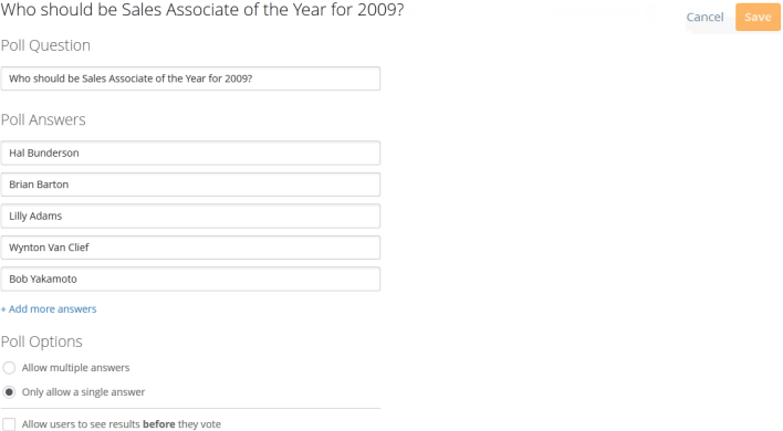 To return to the **Chart** view from the **Edit** view, click **Save** or **Cancel**.
The layout of this view is the same as the page that appears when you create a poll. For more information about creating a poll, see [Adding a Poll Card to Domo](/s/article/360042925694 "Adding a Poll Card to Domo").
## Sumo Card Details view
In the Details view for a Sumo Card, you have access to many options not available in Details views for other Card types. For example, you can
* see both views of the table—the **Column View** and **Pivot View**,
* edit the Sumo Card name, description, DataSet, and formatting, and
* enter an "analyze" mode in which you can make formatting changes that apply only to you.
The following screenshot shows components and options in the Sumo Card Details view layout not found in Details views for other Card types. This screenshot shows **Pivot View**; however, most of these components are found in **Column View** as well.
To return to the **Chart** view from the **Edit** view, click **Save** or **Cancel**.
The layout of this view is the same as the page that appears when you create a poll. For more information about creating a poll, see [Adding a Poll Card to Domo](/s/article/360042925694 "Adding a Poll Card to Domo").
## Sumo Card Details view
In the Details view for a Sumo Card, you have access to many options not available in Details views for other Card types. For example, you can
* see both views of the table—the **Column View** and **Pivot View**,
* edit the Sumo Card name, description, DataSet, and formatting, and
* enter an "analyze" mode in which you can make formatting changes that apply only to you.
The following screenshot shows components and options in the Sumo Card Details view layout not found in Details views for other Card types. This screenshot shows **Pivot View**; however, most of these components are found in **Column View** as well.
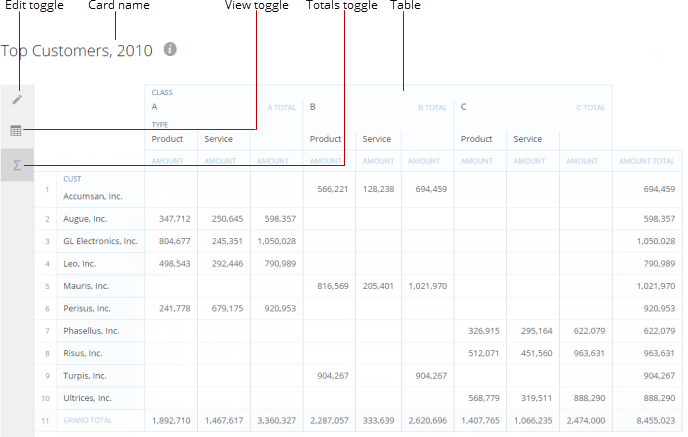 You can learn more about these components and options in the following table:
Name | Description |
|---|---|
Edit toggle | In either view, hides/shows the columns on the left side of the screen that you can add or remove from your Sumo table. |
Card name | Shows the name of this Sumo Card. You can also click the name to see the description for the Card if one has been specified, along with the names of the pages it is found in. (You can also see this information by clicking the "i" icon.) You can change the name and description of a Sumo Card in the Edit view. |
View toggle | Let you switch between the Column View and Pivot View . These essentially show you two different views of a Sumo table. Column View shows a standard column-based view, and Pivot View presents the data in a more complex and powerful pivot table, like those created using Microsoft Excel. For more information about what you can do in both views, see Sumo Editor Layout . |
Totals toggle | Shows/hides all "Total" rows and columns in the Sumo table. |
Table | Shows the Sumo table. The table appears in a standard column-based format in Column View and as a more complex pivot table in Pivot View . Vertical and/or horizontal scroll bars are provided in both views if there is more data than will fit on the screen. In Pivot View , when you scroll vertically, the totals column on the right also scrolls vertically, but the totals row along the bottom remains in place; this lets you always see the sum of all values in a column. Conversely, when you scroll horizontally, the totals row along the bottom scrolls, and the totals column on the right remains in place. Also in Pivot View , when you apply an aggregation, the totals reflect the aggregation you have applied, not just the sum of a row or column. For example, if you select Average as your aggregation, the total for each row and column is the average of all the averages in that row or column. |
Name | Description |
|---|---|
Edit in Analyzer (Visualization Cards only) | Opens the Edit view for this Card. For more information about this view for a Visualization Card, see Visualization Card Building Part 2: The Analyzer . |
History | Opens the History view for this chart. |
Full Screen | Opens the full-screen mode for a Card. This viewing mode provides much but not all of the same functionality found in the standard Details view, such as the ability to set Quick Filters and change chart types. The full-screen mode persists until you leave the Details view, so if you navigate to another Card using a link , that Card will also appear in the full-screen mode. This mode is available for all types of Cards. |
Edit Drill Path (Visualization Cards only) | Allows you to add new drill layers or edit the drill path for this chart. For more information, see Adding Drill Path to Your Chart . |
| Embed Card | Allows you to embed Domo Cards into SSO-enabled websites, portals, or applications. You do this by copying an automatically generated HTML string from Domo and pasting it into the website, portal, or application as an iFrame or via a JavaScript API. Domo Embed is available for all types of Cards. For more information, see Sharing Cards Outside of Domo Using Domo Embed . |
Add to Favorites | Allows you to mark or unmark this Visualzation Card as a Favorite. When you add a Card as a Favorite, it appears in your Favorites page; when you remove a Card as a Favorite, it is removed from your Favorites page. For more information about Favorites, see Adding Cards as Favorites . |
Notify Me on Issues/Do Not Notify Me on Issues | Adds this Card to your "Following" queue, meaning you are notified when anyone reports an issue on this Card. If the Card is already in your "Following" queue, this option reads Do Not Notify Me on Issues . Choosing this option removes the Card from your "Following" queue. |
Move / Copy | Allows you to move or copy this Card to a different page. Cards copied in this way are still linked, so changes made to one copy are made to all other copies. For more information, see Moving or Copying Cards to Other Pages . |
Save As (formerly called Duplicate) | Allows you to create a new instance of this Card. Duplicated Cards are completely separate from the originals; changes made to one are not made to the other. For more information, see Duplicating Cards . |
Schedule as Report | Lets you set a report schedule for this Card. For more information, see Scheduling Reports . |
Edit Scheduled Reports | Opens the manager interface for scheduled reports. For more information, see Managing your scheduled reports . |
Send Now | Allows you to send this Card via email to a Domo user. For more information, see Sending a scheduled report immediately . |
Feedback to Domo | Allows you to send Domo a request to change the Card. |
Connect / Update Data (Visualization Cards only) | Opens the Connect to Data dialog for this chart, in which you can upload an existing DataSet or a new Excel or Google spreadsheet. For more information, see Updating or Refreshing the DataSet for a Visualization Card . |
Delete | Deletes this Card from Domo, including all copied versions. Duplicate versions are not deleted. For more information about copying and duplicating Cards, see Duplicating Cards , respectively. The Delete option is available in Details views. For more information about deleting a Card from Domo, see Deleting Cards from Domo . |